
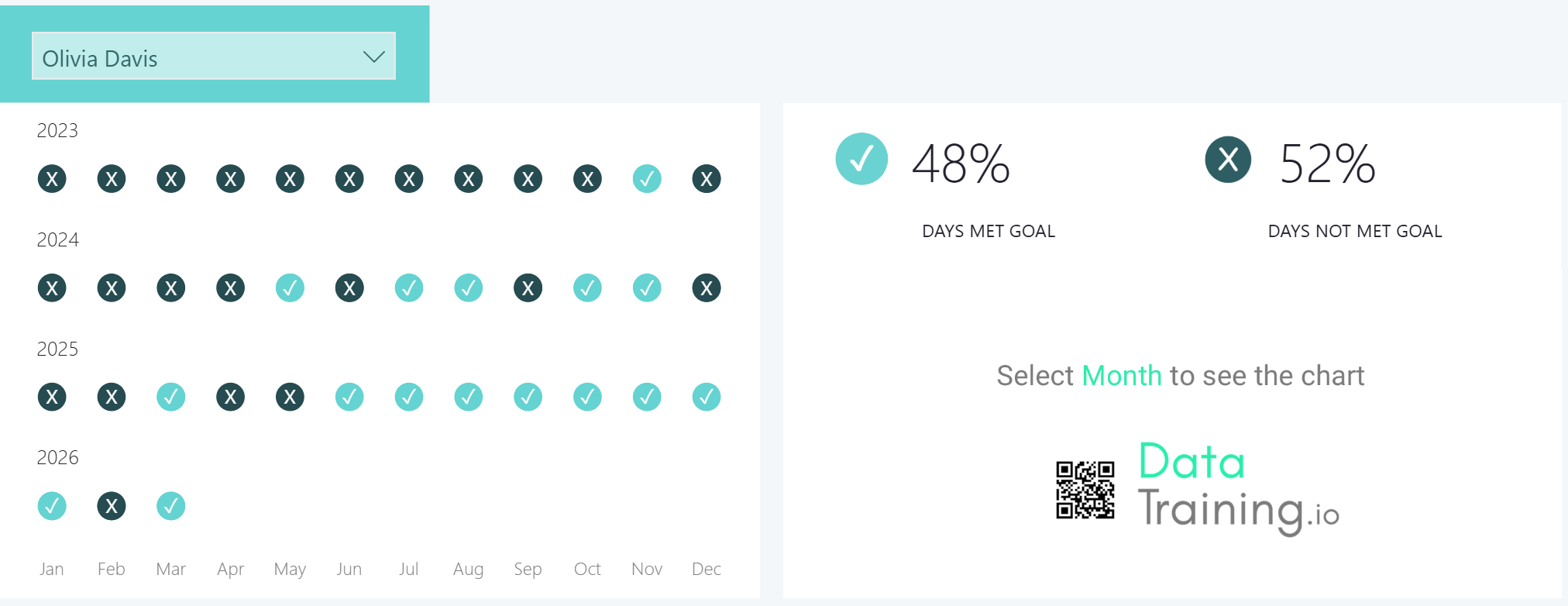
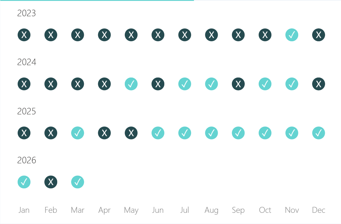
The most common questions in any analytical report is a simple one: in which months did we hit our target, and in which months did we fall short? Power BI gives you a really clean way to answer that with a visual that shows a colour-coded marker for each month, and when you click on one, the day-by-day breakdown appears right next to it.
The setup is pretty more straightforward than it looks. Everything here is built on a native line chart with a few formatting tricks applied - no custom visuals, no external tools.
What we're building
In our example, we have a dropdown where we can select the employee. Below it, a chart that shows month-by-month whether that employee hit their target, broken down by year. Clicking any marker filters a second chart on the right that shows the day-by-day detail for that month and besides that we also 2 cards that summarizes the percentage of goal met. However we will be focusing on building the month-by-month visual here.
You might be wondering why don’t I build this with a table / Matrix visual or a line chart with data labels, well you can try but then it has its own formatting and hover inconsistencies. Hence we are building it this way - with a simple native line chart with a few formatting tricks applied along the way.
1. Start with a line chart and set up the x-axis
- Add a new line chart visual.
- From your date table, drag the short month name field onto the x-axis.
2. Add small multiples to break the chart down by year
To show a separate row for each year, drag your Year field onto the Small multiples field well.
By default this creates a grid layout. To stack the years vertically, go to Format -> Small multiples -> set Rows to 4 and Columns to 1
A few quick tidying steps at this point:
A few quick tidying steps at this point:
- If the year labels aren't showing, reduce the title font size or switch to a smaller font type - this frees up enough space for the labels to appear.
- Turn the visual title off to give the year labels more room.
- Turn off the borders between small multiples. This is also in the Small multiples section of the Format pane.

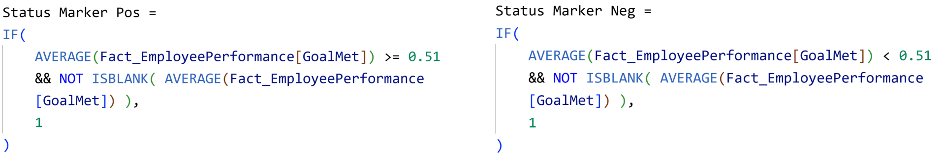
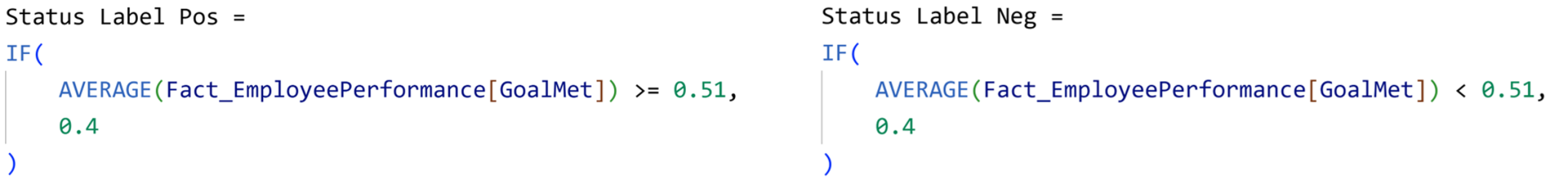
3. Write the target status measures
We have 2 simple measures here - one for months where the target was hit, one for months where it wasn't.
Drag both measures onto the y-axis of your line chart.
4. Clean up the axes and grid lines
At this point the chart is taking shape but still has a lot of visual noise. Clean it up as follows:
At this point the chart is taking shape but still has a lot of visual noise. Clean it up as follows:
- Grid lines: Turn the grid lines off. (Note: Ensure you remove the gridlines first before you turn off the y axis values or you will see the gridlines greyed out. Then you have to turn on the values back in order to turn off the gridline. This is a known quirk in the interface.)
- Y-axis: turn off the axis values and title.
- X-axis: set the label colour to a neutral gray and reduce the font size slightly.
- Legend: turn it off entirely.
5. Turn on markers and make the lines invisible
In the formatting pane,
In the formatting pane,
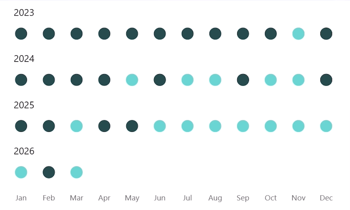
- Markers - turn on for all the series
- Set size to 10 so they are clearly visible.
Now for the lines themselves - rather than turning the lines off entirely (which can cause a bug where clicks on labels are not recognized), set the line colour for each series to white. This makes the lines invisible while preserving the click interaction correctly.
Then go back to Markers and set the colours you want. A bright green works well for positive months. For negative months, a dark neutral or gray reads clearly.
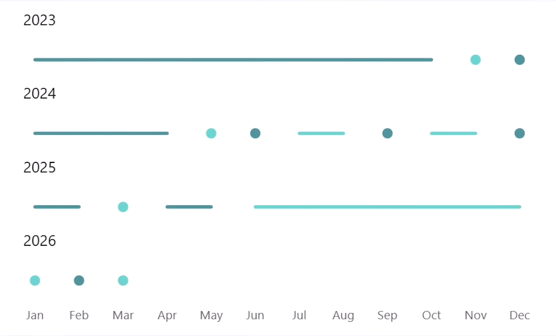
Again in the formatting pane, go to the y-axis and set the range manually: minimum 0, maximum 1.5. This creates a small buffer that pushes the dots upward and aligns them more naturally with the corresponding year label above.
Turn the tooltip off in the Properties section - it isn't needed here.
Now we are almost there, but we want to display the cross and checks on the markers to make it even better and intuitive.
6. Add icon labels on the markers
To display check marks and crosses on the markers, you need a small workaround. Power BI does not currently support placing data labels directly on top of a marker - only above, below, or beside it.
To display check marks and crosses on the markers, you need a small workaround. Power BI does not currently support placing data labels directly on top of a marker - only above, below, or beside it.
The solution is to add two additional measures that plot at a slightly lower value (0.4), giving us a position just beneath the main markers where we can anchor a data label that visually sits on top.
The two additional measures look like this:
Add both to the y-axis. Then:
- Turn off markers for these two new series.
- Turn off the lines for these two new series.
- Turn on data labels for all series, then turn them off for the original positive and negative marker series - leaving them on only for the two label series.
- Set the data label colour to white so they show up against the coloured markers.
Now change what the labels display. For the positive label series, go to Data labels, select the series, and change the Value field to a measure that returns a check mark character. For the negative series, point it to a measure that returns a cross character. These can be any Unicode characters or symbols you prefer. For example, I have the following simple measures setup to handle that.

If the icons appear slightly off-centre, adjust the 0.4 value in the label measures up or down until the positioning looks right, or resize the visual vertically.
7. Final tidying
As you resize the visual, the x-axis title may reappear.
7. Final tidying
As you resize the visual, the x-axis title may reappear.
Go to the x-axis settings and turn the title off again.
At this point the chart should match the target state - clean markers, no visible lines, year labels clearly separated, and icons sitting neatly on each dot.
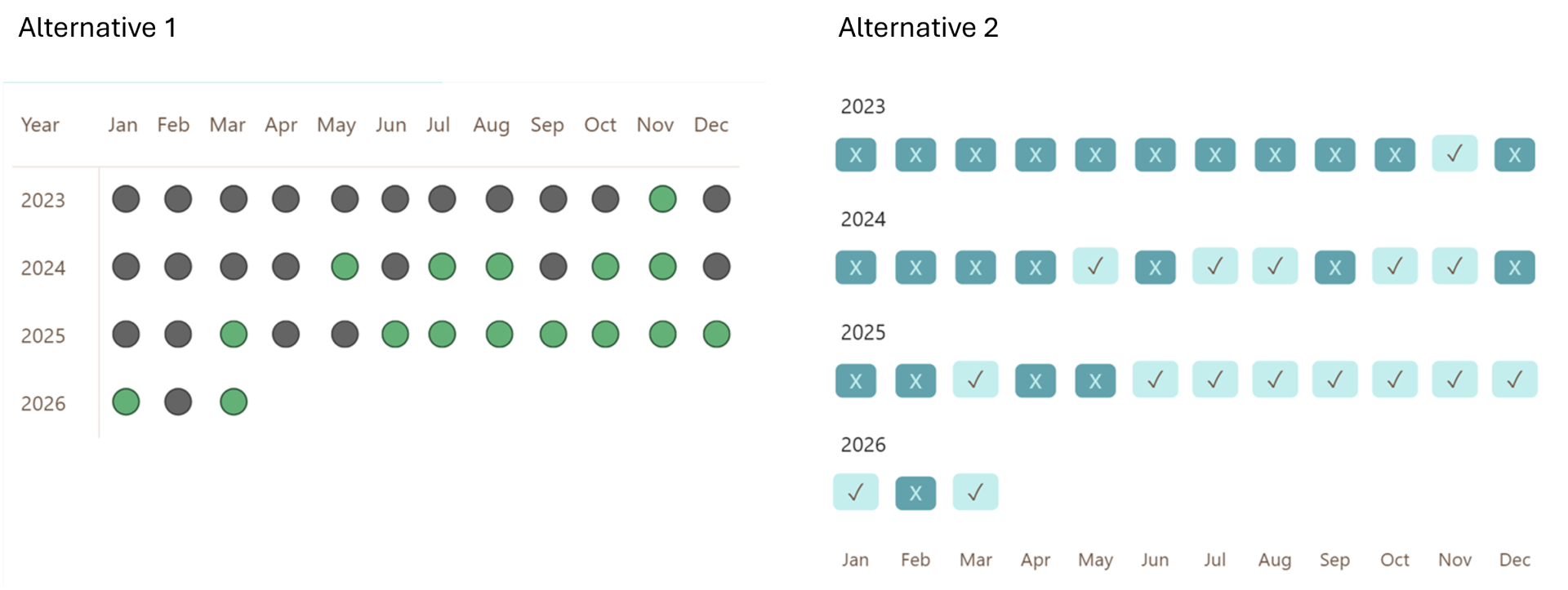
Why this approach over the alternatives
Two other approaches are worth knowing about - and understanding why this one is better.
Two other approaches are worth knowing about - and understanding why this one is better.
The first alternative is a matrix with conditional formatting icons. It works, but the hover effect is visually unpleasant and clicking a cell produces an awkward highlight across the entire row and column header.
The second alternative uses data labels with background fill instead of markers. The downside is that you lose the ability to customise the marker shape, and the click interaction is less precise - it becomes unclear which month you have selected.
The marker-based line chart approach avoids both problems. Clicking a dot clearly highlights that month, greys out everything else, and leaves no visual clutter behind. It also gives you full flexibility over marker shapes, icon styles, and data label content.
That's all it takes - a native line chart, few status measures, and a handful of formatting steps to build a clean, interactive target tracker directly in Power BI.
Hope you like it!
Hope you like it!
Give it a try and see how it works for you! I’d love to hear what you think or see how you use this trick in your own reports.
How to Power BI
Watch it here

COMPANY
Write your awesome label here.
Embedding Power BI in Power Point
Intro Session