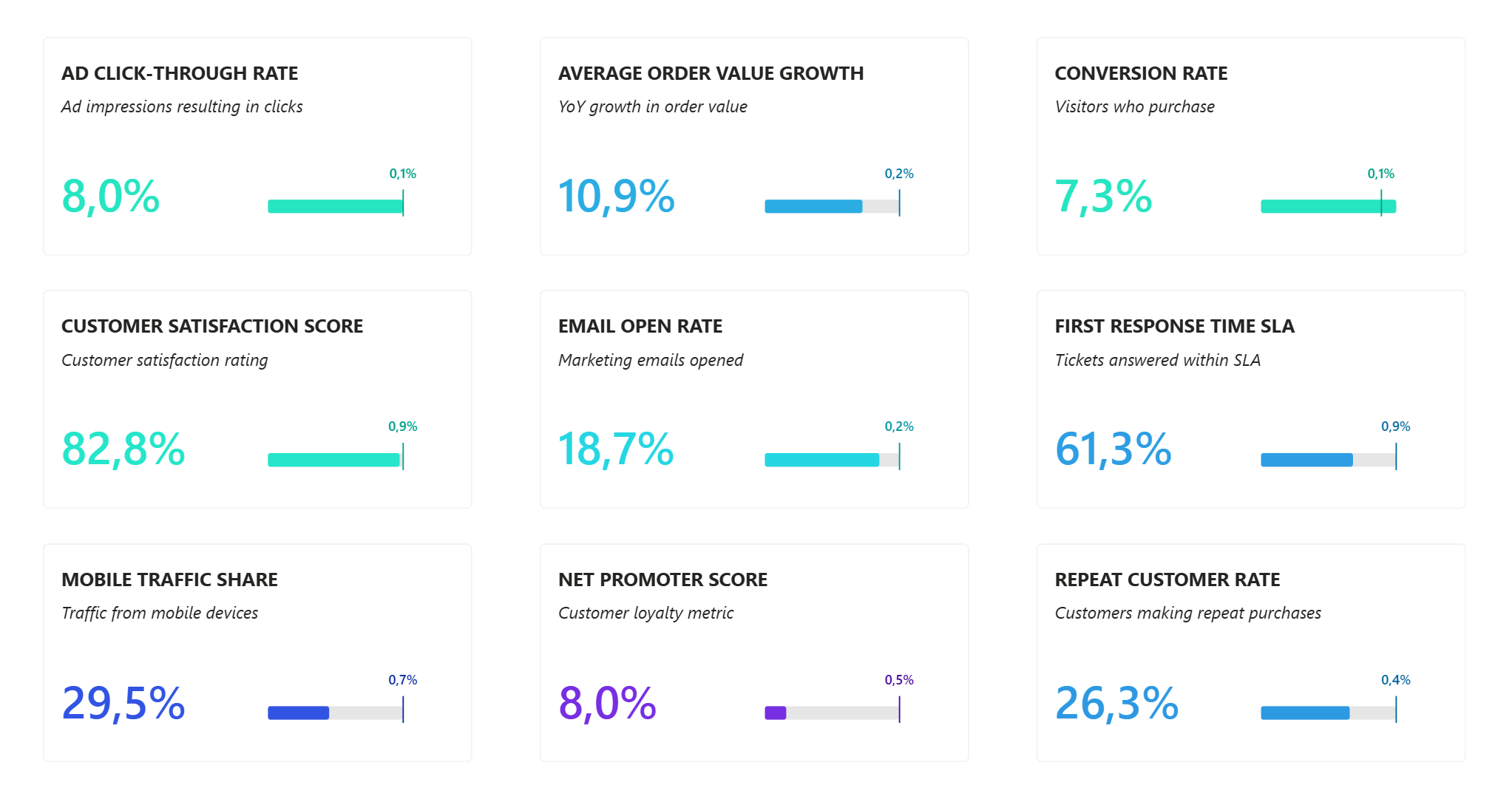
There's one request that we get on almost every Power BI project - creating an overview page of all the KPIs so you can quickly see what's working and what's not.
Let me show you how to create a beautiful KPI overview like you see below.
Step 1: Start with the Card Visual- Add a new card visual to your report
- Make it almost as big as the page
- Position it at the center
Common mistake to avoid: Don't add KPI measures directly yet - this will gray out category options and force you to set up conditional formatting for each card one by one.
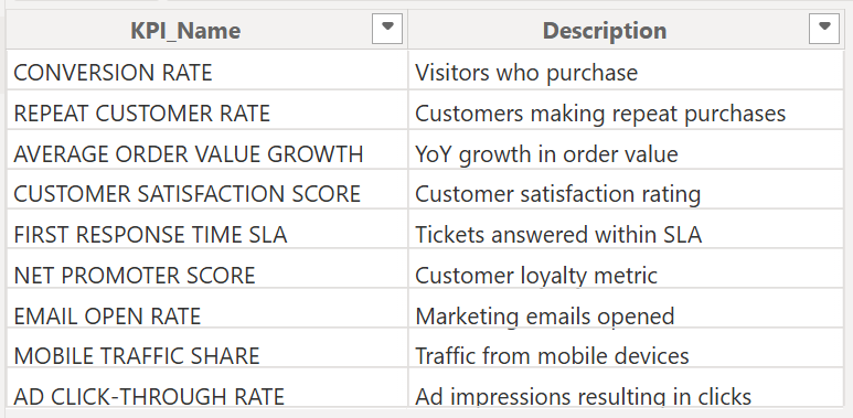
Step 2: Create a Helper Table
We're going to create a small helper table:
-
Go to Home → Enter Data
- Create two columns - KPI Name, KPI Description
- Fill out all of your KPIs one by one
- Name the table something nice like "KPIs"
- Load it
This disconnected table is the key to making everything else easier.
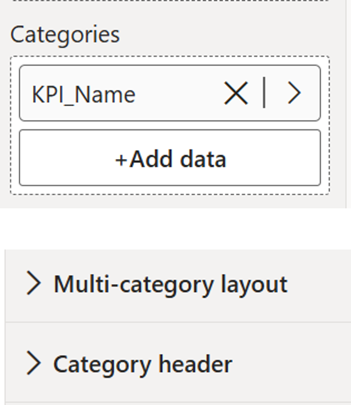
Step 3: Use the Helper Table in Your Visual
- Drag KPI Name from your KPI table onto the card visual
- Multicategory Layout and Category Header options are now active in the formatting pane
This creates categories instead of individual cards, which allows bulk formatting later.
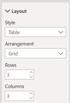
Step 4: Configure the Grid Layout
- Go to Multicategory Layout → Layout
- Choose Tiles
- Set up a 3×3 grid (adjust to your needs)
Step 5: Add Your KPI Values
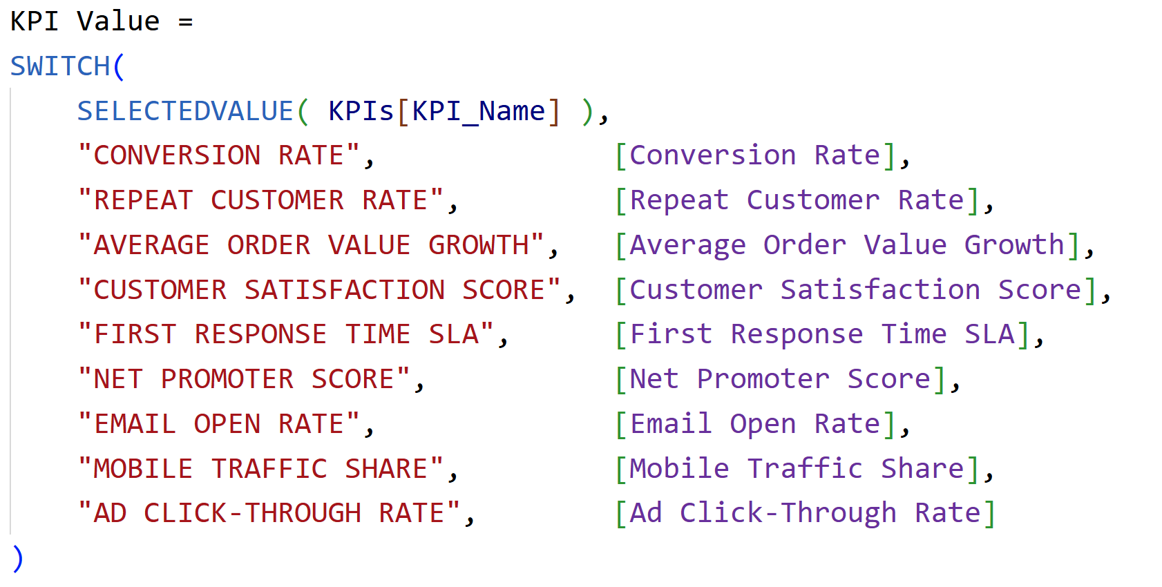
- Create a measure called "KPI Value" that pulls in the right measure for each KPI
- Drag this measure to your card visual on Values
- Verify all KPI values display correctly
Watch out: Make sure measure names match exactly with names in your KPI table.
Step 6: Create the Double Header
First, let's get rid of the label for the callout. Go to
Callout and turn the label off. Now for the tricky part, creating that nice double header where we have the KPI name with the description right underneath it. The problem? The category header title has no subtitle option, and the cards don't have this functionality built in either - so we need a little workaround using
"Reference Labels".
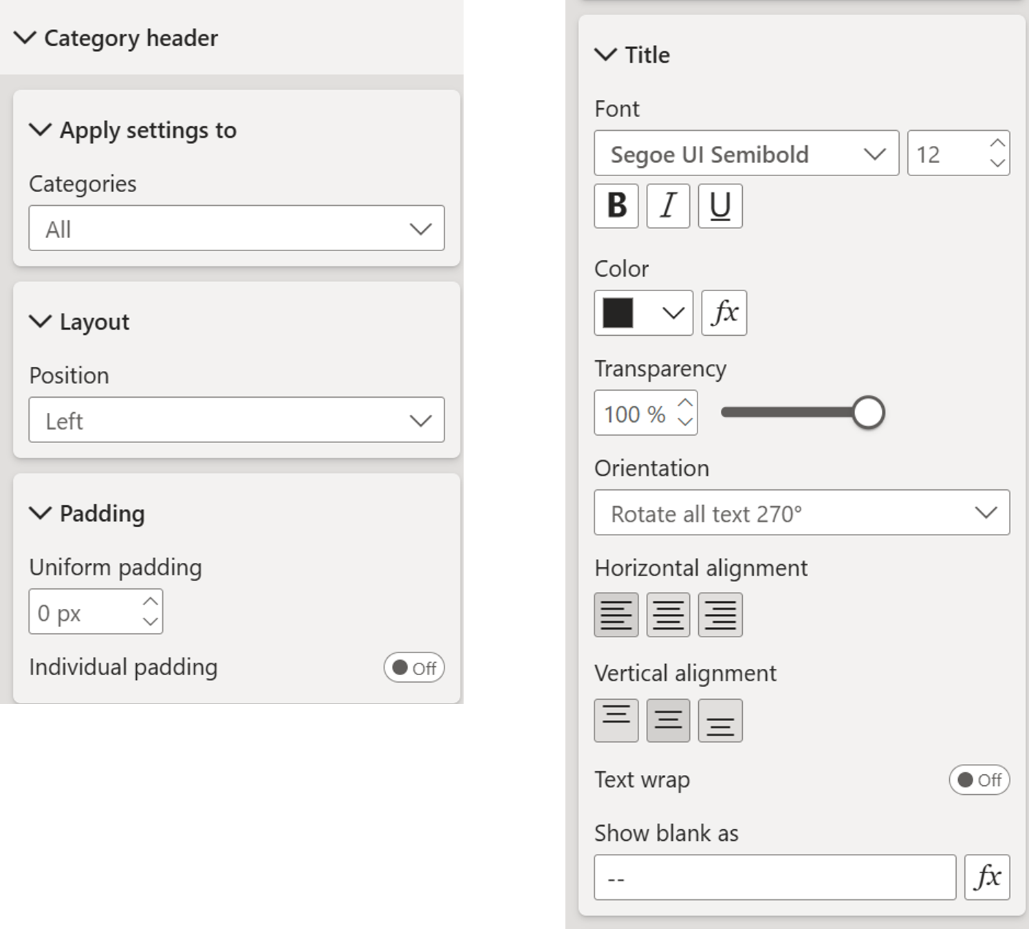
Make Headers Invisible
- Go to Category Header → Layout → Choose Left
- Go to Title → Set orientation to “Rotate all text 270 deg”
- Make the font small
- Put transparency to 100%
- Turn Background off
- Set padding to zero
- Turn off the border in Multicategory Layout
- Set gap to zero
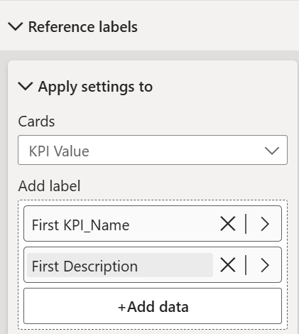
Add Reference Labels
- Scroll down to Reference Labels
- Choose series: KPI Value
- Add KPI Name and Description
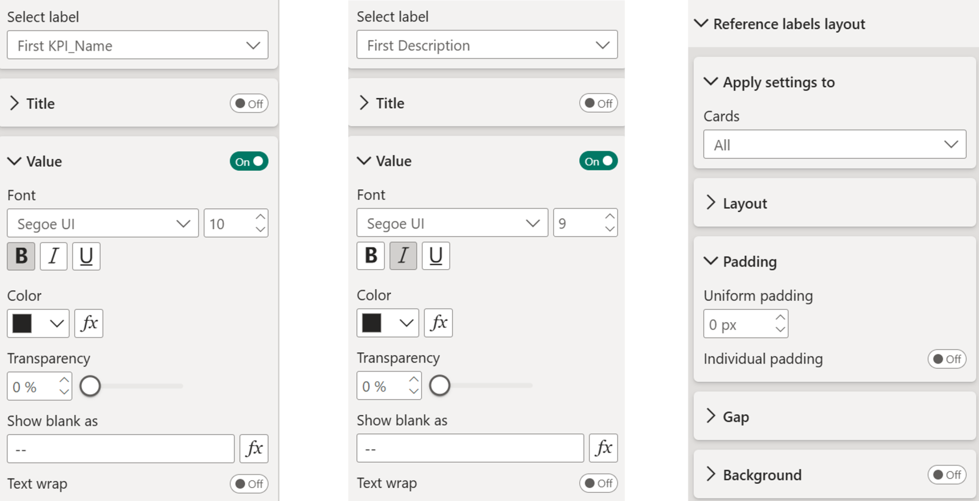
- Turn off the title for labels
- Make fonts smaller and adjust as needed
- Make the description italic and even smaller to distinguish it
- Go to Reference Label Layout section - Turn off the gray background and set padding to 0
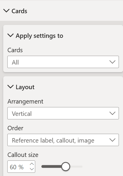
Reorder Elements- Go to Cards → Layout → Order
- Set to: Reference Label → Callout → Image
- Adjust callout size (maybe 60%)
- Turn off the divider if you prefer
Keep fine-tuning along the way for perfect spacing!
Step 7: Apply Conditional Formatting
Now it's time to apply conditional formatting to all of our KPI values. We want to compare them to our targets (goals).
- Go to Card → Select the series KPI Value (not "All")
- Then go to Value → Field Value
- Select your conditional formatting measure
Important: You must select the specific series, not "All". If you don't select the specific series, the measure won't calculate with the KPI filter context applied.
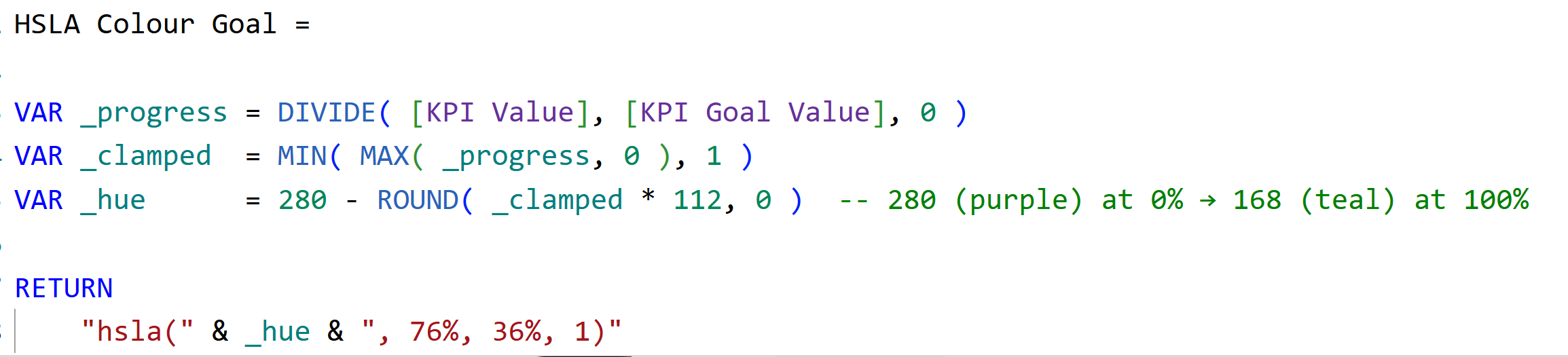
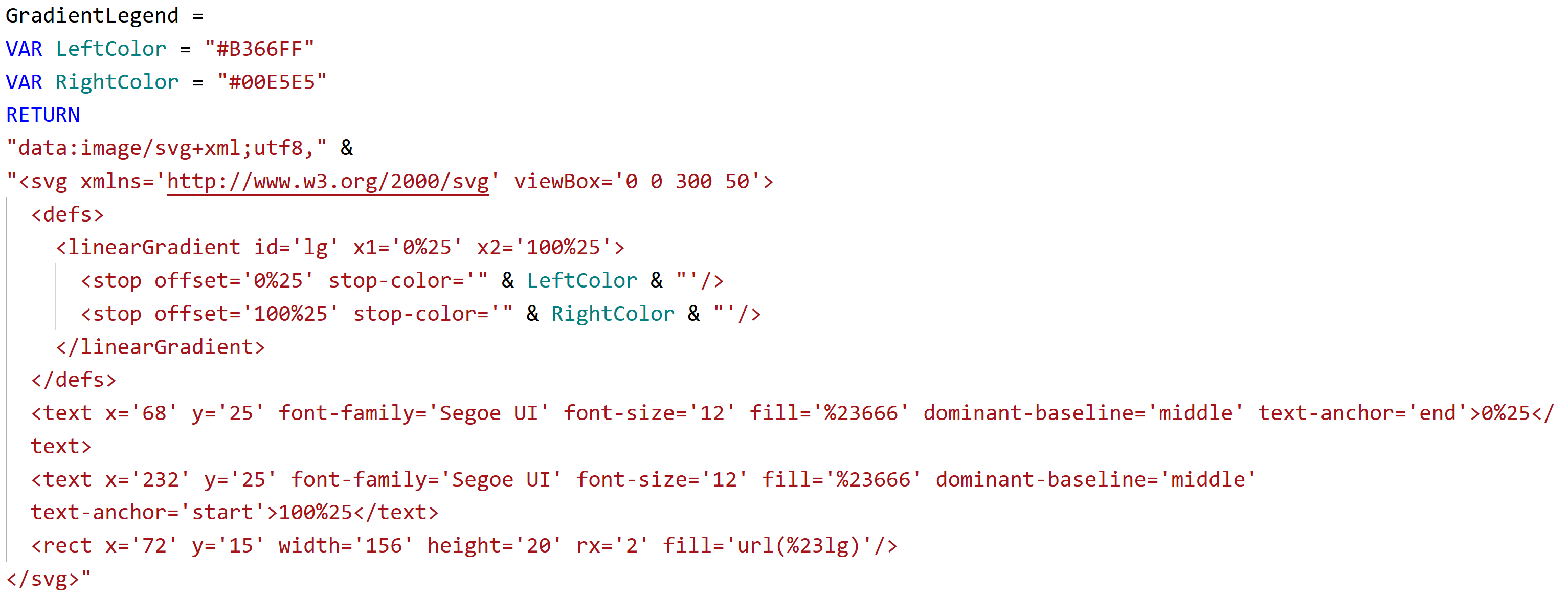
Here's my conditional formatting measure:
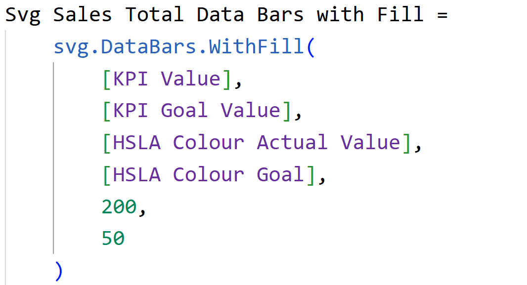
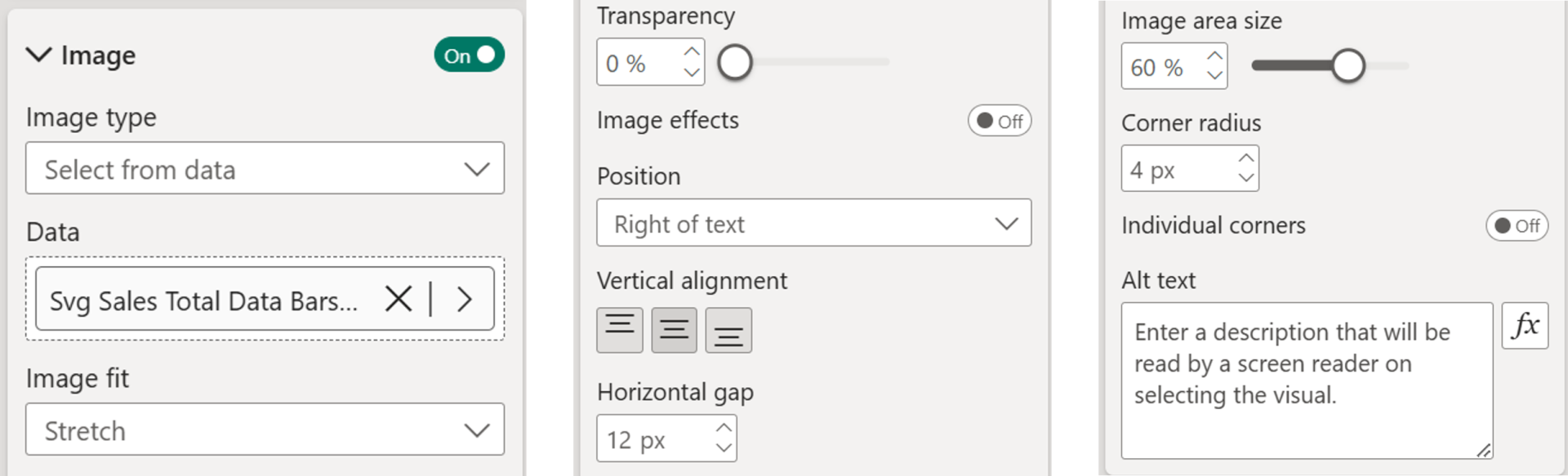
Step 8: Add SVG Data Bars
Now it is time to add the data bars using an SVG measure and add it to the setup. In short, it works like this.
- Go to Callout → Cards (Select the KPI Value)
- Go to Images - Select From Data
- Choose your SVG measure
- Set fit to Fit
- Position on the right of text
- Increase image area size to about 60%
Here is my SVG measure which uses a UDF (you can download the file using the link below the video to copy over the UDF).
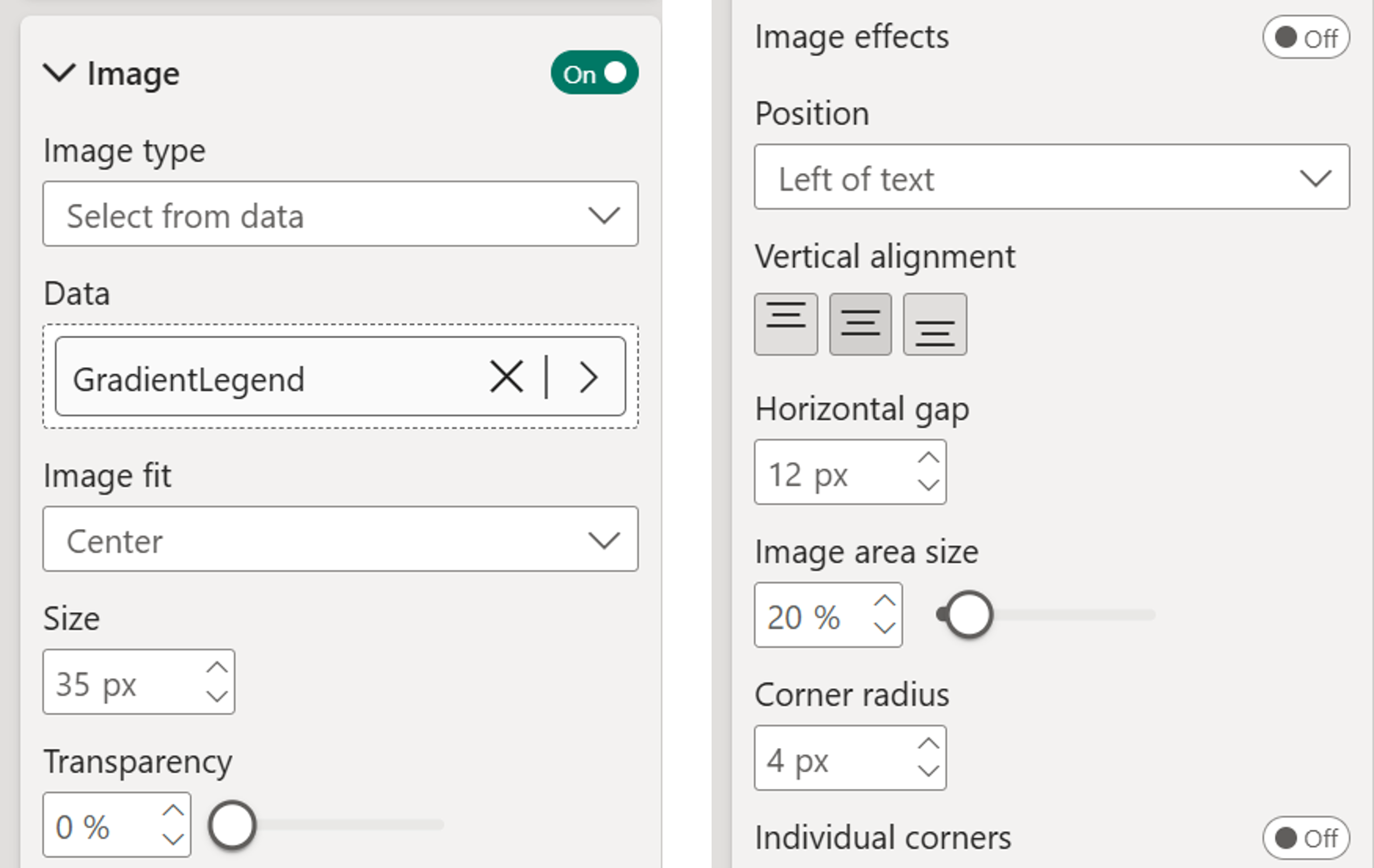
Step 9: Add a Legend
- Create an SVG measure for the legend and set data category to Image URL
- Add this measure to a new card visual
- Go to Callout → Image → Turn on → Select from data
- Turn off label and value
- Set size to 35-40%
- Go to Cards section → Turn off border and background
- Add a text box above with "Goal Attainment" (font size 8)

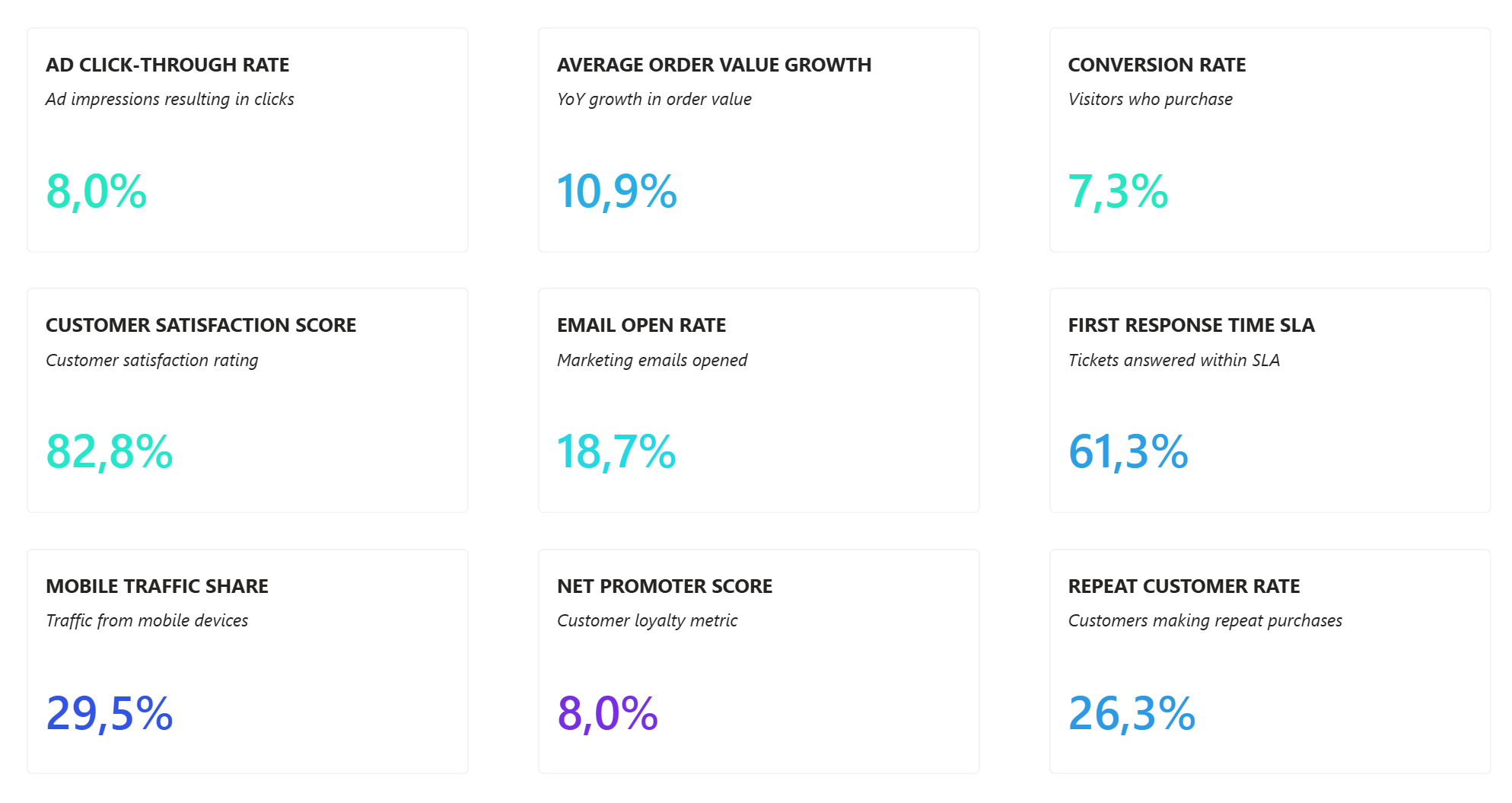
That's it, you now have a KPI overview with:
- Double titles (KPI name + description)
- Conditional formatting gradient
- SVG data bars
- Clean, professional layout
Hope you like it!
Give it a try and see how it works for you! I’d love to hear what you think or see how you use this trick in your own reports.

