Map visuals in Power BI have always felt a little underwhelming. Lots of options, but never quite enough. That just changed. The January 2026 update to the Azure Map visual brings something Power BI developers have wanted for a long time - the ability to use custom icons on your maps. No more boring bubbles.
What we are working with
The old map visual is being replaced by the Azure Map. It was already a step up, but this latest update takes it further. You can now swap out the default bubble markers for any icon you want, that change their size dynamically based on a data field, rotate them based on a direction value, and colour them using conditional formatting. All of that, built natively into the visual.
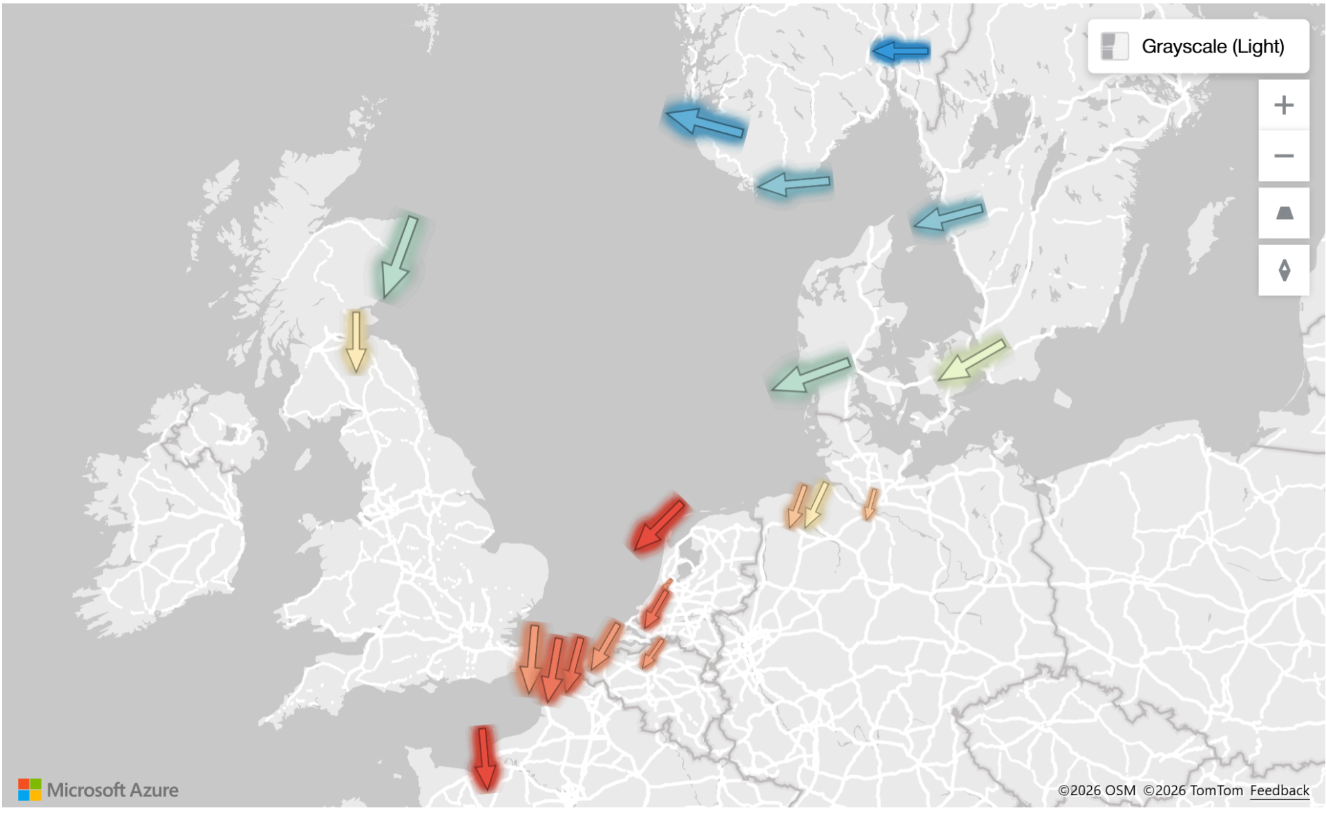
To walk through this, we are using a dataset of wind farms across Europe. Each station has a latitude, longitude, wind direction, wind speed, temperature, and humidity. A practical dataset that lets us put all of these new features to proper use.
Step 1 : Set up the Azure Map visual
- Insert the new map visual
- Make it big
For location, use latitude and longitude rather than a country field. A country field will just drop a dot in the middle of the country, which is not useful when you need precise station locations. Here is how to set it up:
- Set the data category on your latitude field to Latitude and on your longitude field to Longitude
- Set summarization on both to Do Not Summarize
- Drag both fields onto the corresponding Latitude and Longitude field wells in the build panel
Step 2 : Switch from bubbles to custom icons
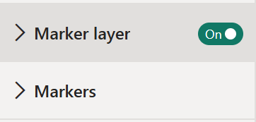
Go to the formatting pane. You will now see Marker Layer and Markers - this is what changed in the new update. Previously there was only a Bubble Layer.
To switch to custom icons:
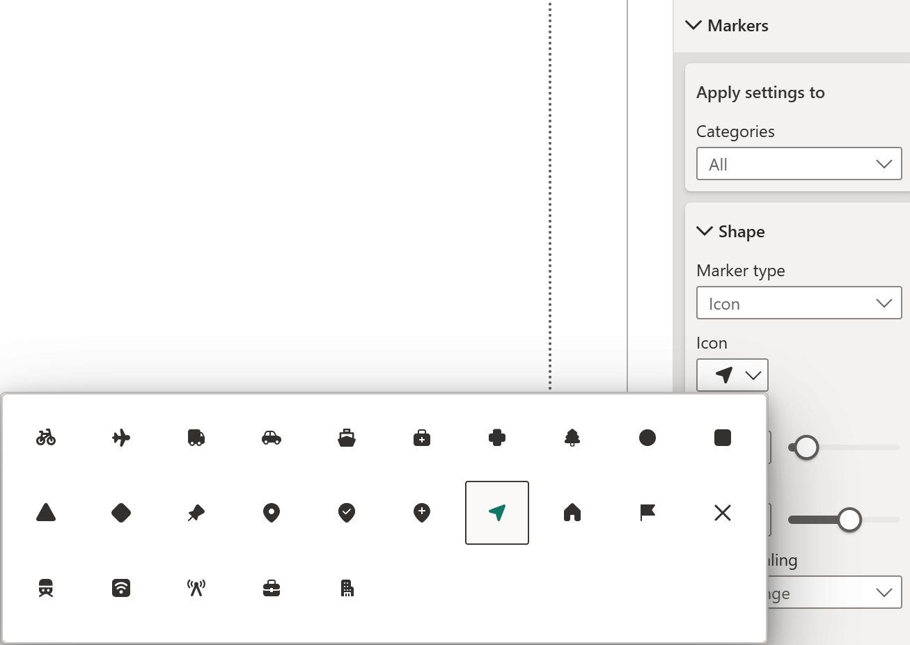
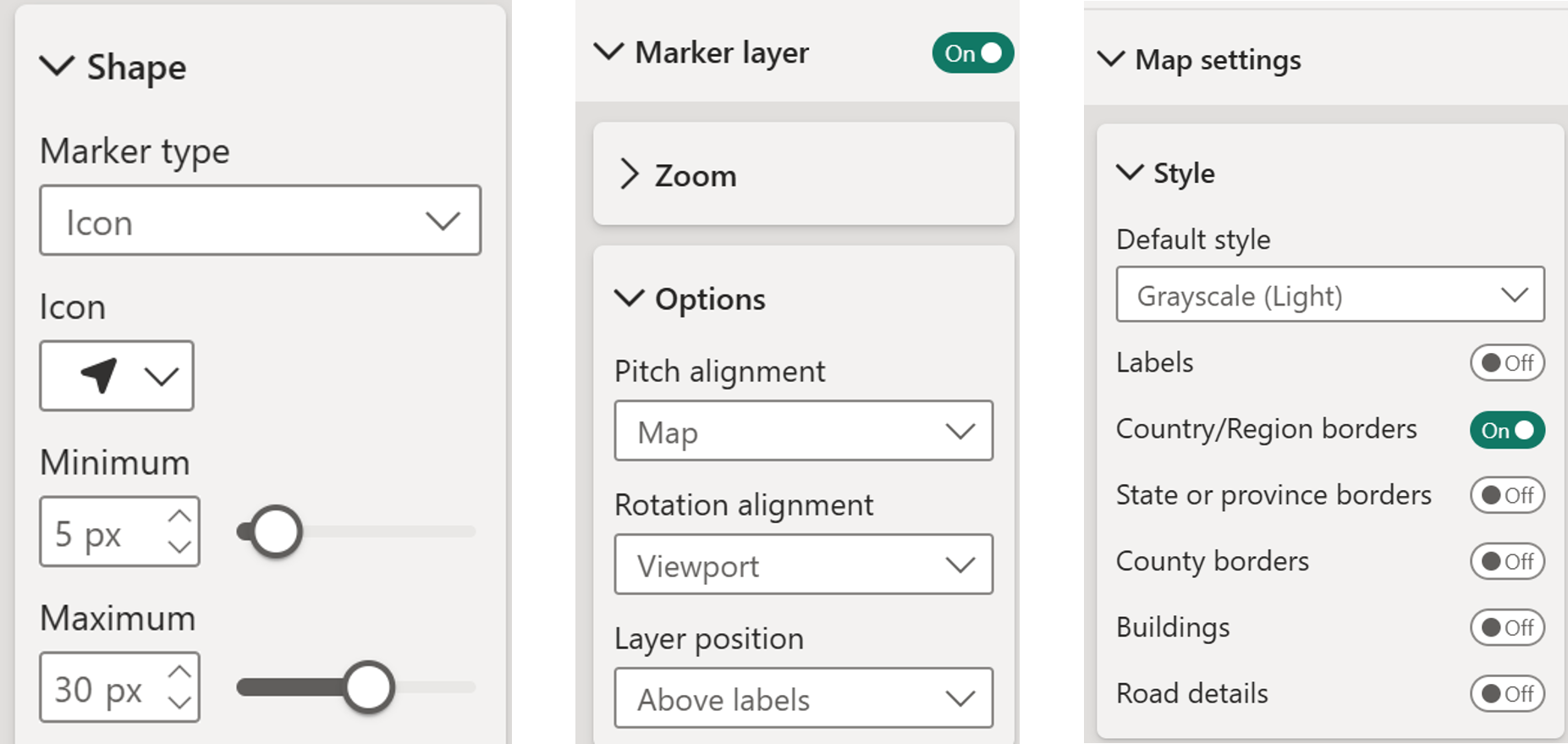
- Open Markers in the formatting pane
- Find Marker Type and click the dropdown
- Choose Icon to browse the built-in icon library
- Pick an icon that fits your data and increase the size so it is clearly visible on the map
One thing worth noting: unlike Tableau, you cannot yet add your own icons to the built-in library by dropping files into a folder. There is a workaround for that using the Image option, which I will be explaining in later part.
Step 3 : Rotate icons based on a data field
Under Markers, there is a
Rotation field. This is where it gets genuinely interesting. To set it up:
- Click the field value button next to Rotation
- Select Wind Direction from your dataset
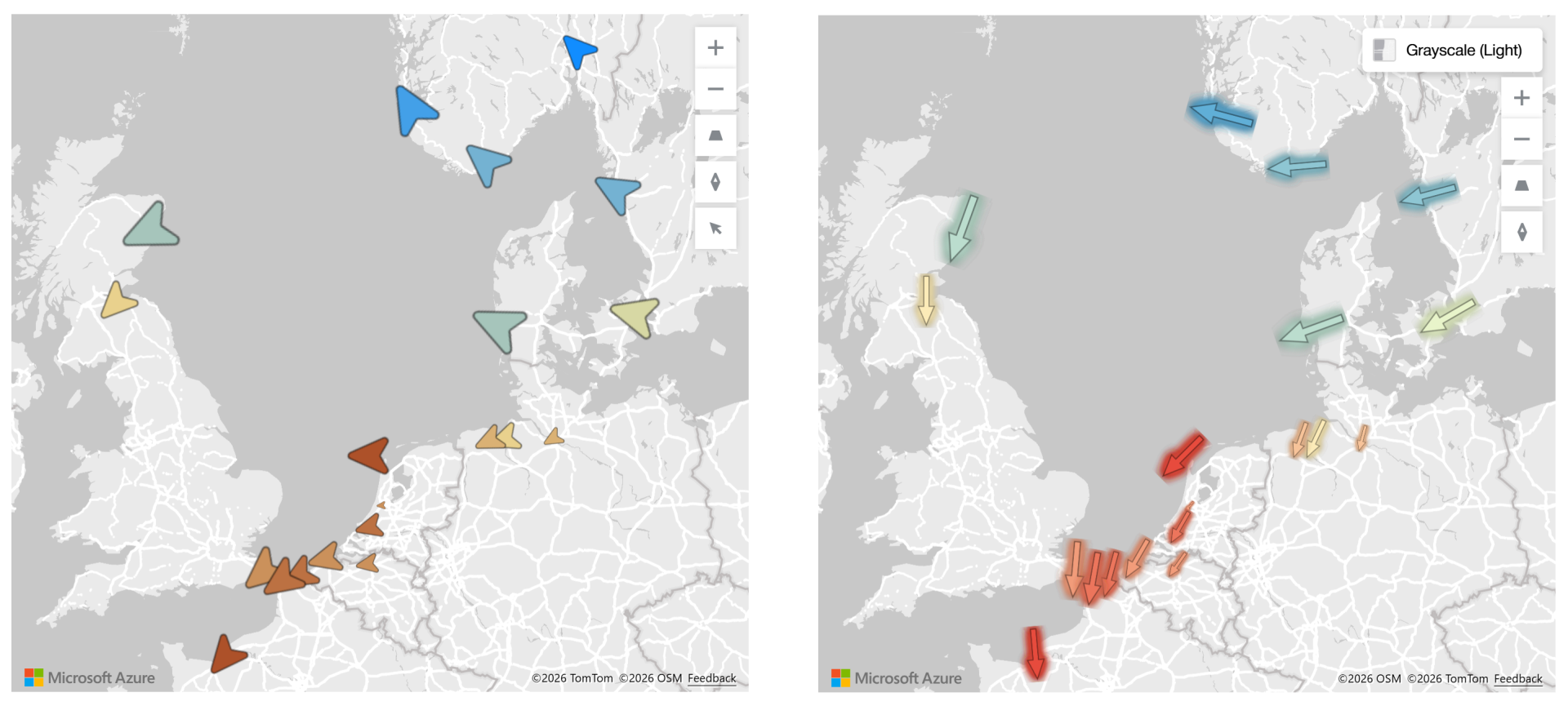
The icons will now point in the actual direction the wind is blowing at each station. The same idea applies to any moving asset - aircraft, ships, delivery trucks. If you have a directional value in your data, you can now reflect it visually on the map.
To finish off the styling:
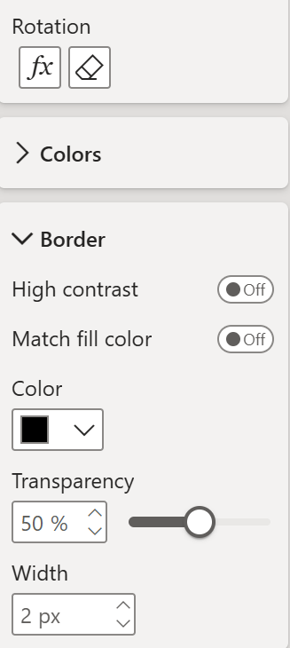
- Go to Borders under Markers and add a light border around the icons to help them stand out
- Add a bit of transparency to the border to keep it from looking too heavy
Step 4 : Size icons dynamically- Go to the build panel and add Wind Speed to the Size field well
- The icons will immediately scale based on wind speed at each station
- If the sizing feels too extreme, go to Markers in the formatting pane and adjust the size values - bringing the Maximum down to around 30 and the Minimum to around 5 works well, so the smaller icons are still visible but nothing is overpowering
You may also notice the icons appearing behind the map labels. To fix that:
- Go to Marker Layer in the formatting pane
- Set Label Position to Above Labels
If you do not need labels at all, you can clean up the base map further:
- Go to Map Settings, then Style
- Turn off any map layers you do not need, keeping only country and region borders for a cleaner look
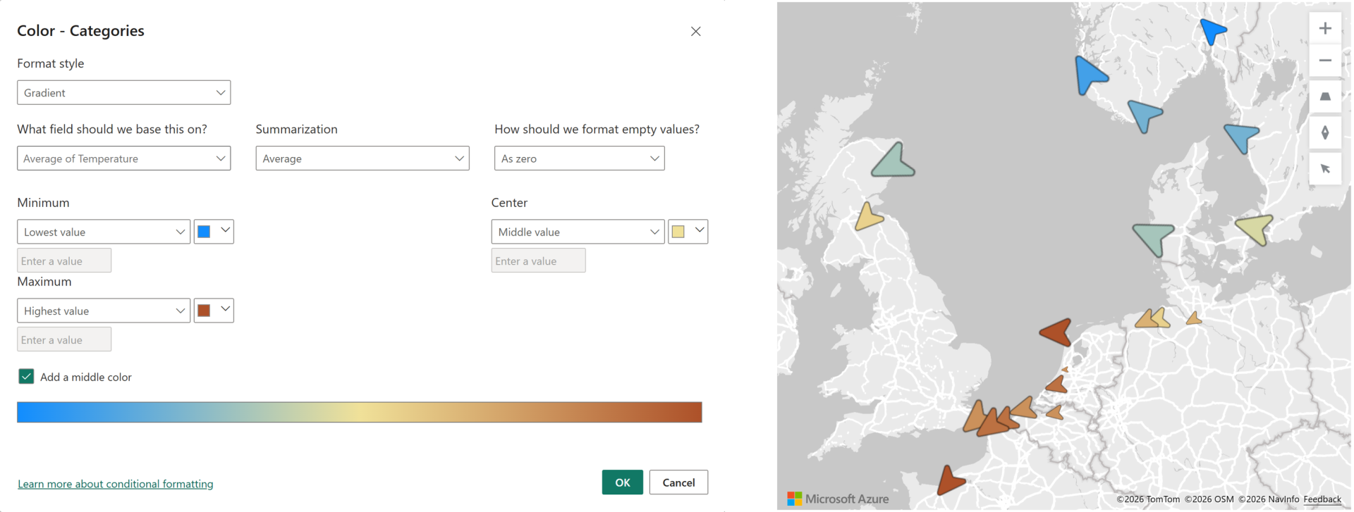
Step 5 : Colour icons by a data field- Go to Markers in the formatting pane and scroll down to Colors
- Click the FX button to open conditional formatting
- Choose Gradient
- Set the base field to Temperature
- Add a middle colour - light yellow works well
- Set the high end to red and the low end to blue
The result is a map where wind direction, wind speed, and temperature are all readable at a single glance. Three dimensions of data in one clean visual.
Bonus: Using custom images as icons
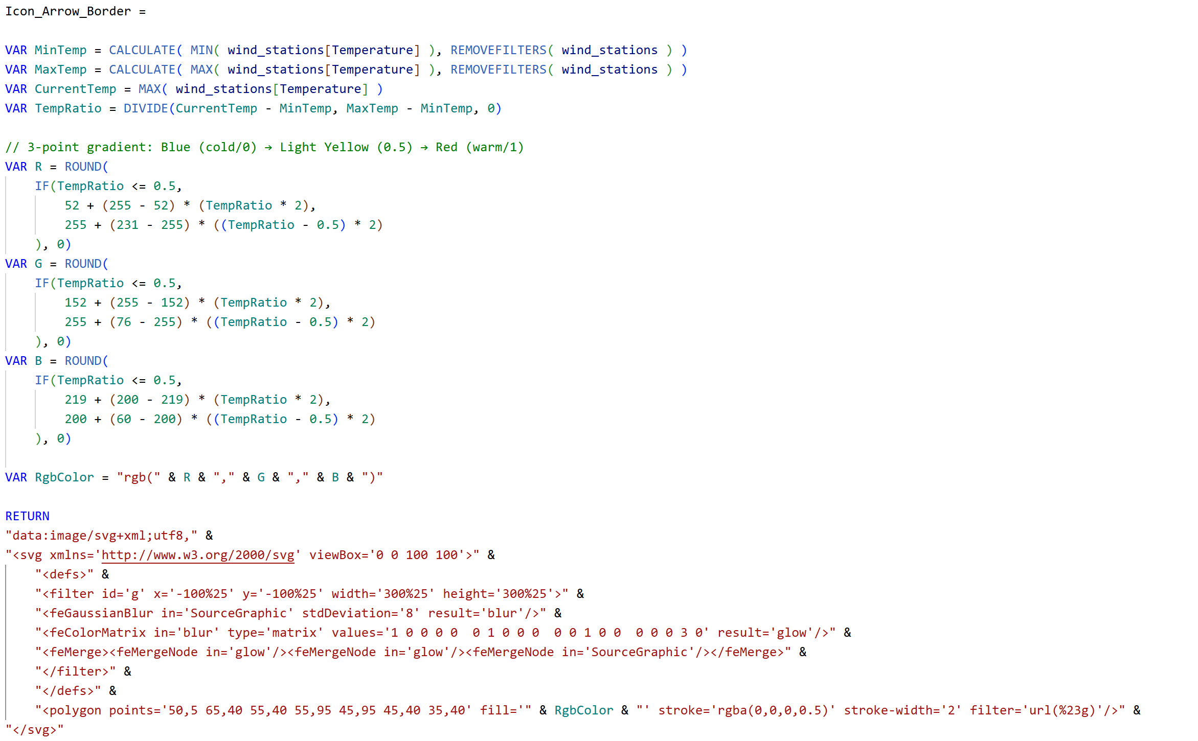
To use fully custom icons that are not in the built-in library, switch to the Image marker type. Here is the full setup:
- Ask an AI tool - Claude, ChatGPT, or similar to generate an SVG icon for you. Ask it specifically to format the output as a DAX measure returning an SVG that can be used in Power BI
- Paste the output into a new measure in your model
- Go to Measure Tools and set the Data Category to Image URL
- Go back to the map, open Markers in the formatting pane
- Set Marker Type to Image
- Click the FX button next to Image to open conditional formatting, set it to Field Value, and select your measure.
One downside of this approach: when using custom image icons, the Colors option in the formatting pane becomes greyed out. You lose the ability to apply conditional colour formatting through the visual settings.
The workaround is to build the colour logic directly into your SVG measure. The below measure does exactly that. It calculates the min and max temperature, maps each station on that range, and applies an RGB gradient that goes from blue to yellow to red, with a border and glow added on top. AI handles all of this well if you describe what you need clearly.
That's it, Custom icons on the Azure Map might look like a small feature addition on paper. In practice it is a meaningful step forward. Being able to rotate, size, and colour icons dynamically - and to bring in fully custom SVG images when the built-in set is not enough opens up map visuals that were simply not possible before in Power BI. And let's hope it keeps evolving for better!
Hope you like it!
Give it a try and see how it works for you! I’d love to hear what you think or see how you use this trick in your own reports.

