How to Power BI
Watch it here
Launch Power BI Reportsthat bring your organization
to a fully data-driven world.
to a fully data-driven world.
Power BI Launch
After years of consulting we have developed a holistic solution for launching Power BI Reports in 3 months. From key metrics discovery, to report design, implementation and stakeholders' training. We know precisely how to launch Power BI reports that drive organizations' growth.
Power BI Trainings
Our technical trainings for report developers instantly upskill your teams. Alongside our unique business user trainings the improvement in overall organizational data literacy becomes immediately actionable.

Take your Skills to the Next Level
Power BI Trainings
__________
ULTIMATE TEAM TRAINING
__________
This training takes Power BI developers team from beginner/intermediate to advanced. End result? A team that can build reports from data import, transformation, through model, DAX calculations to out-of-the-box visuals.
for teams
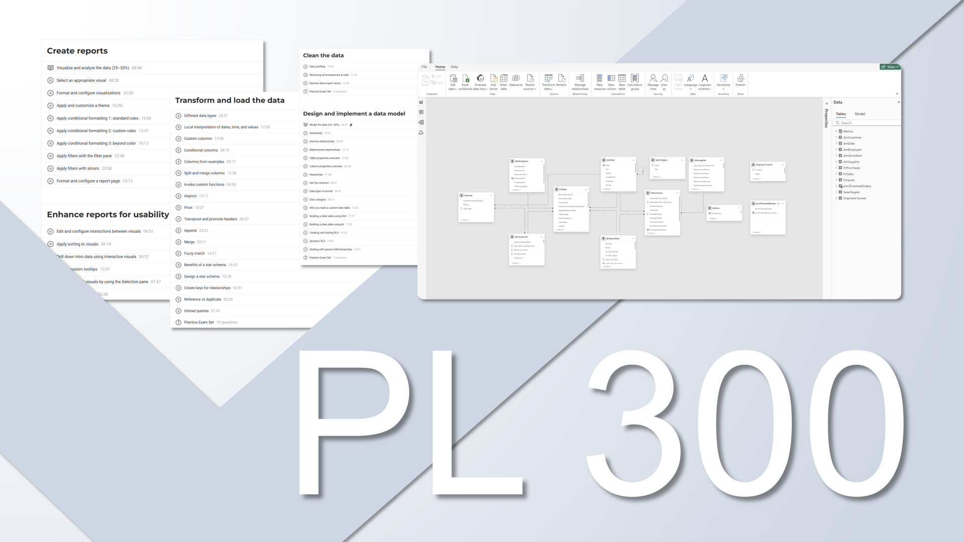
DATA ANALYST
PL-300
__________
Everything you need to build Power BI reports and gain real-world skills. Whether you're looking to improve reporting skills or advance career with passing PL 300, our training prepares you for success at every step.
self-paced