
User Defined Functions (UDFs) in Power BI - Three practical ways to put it to use
If you have ever written the same DAX logic in five different measures and then had to update all five when something changed - you already know the pain this feature solves. User Defined Functions, or UDFs, let you write a piece of logic once, store it in your model, and call it like any other built-in DAX function. Cleaner models, less repetition, and a much easier life when business rules change.
Apr 10
/
datatraining
Here are three practical examples that show just how far UDFs can take you.
What are UDFs?
What are UDFs?
UDFs let you package DAX logic into a named function with parameters, and then call it from measures, calculated columns, or even other UDFs - all within your semantic model. Instead of copy-pasting logic and hoping you remember to update every instance, you define it once and the whole model benefits.
You define UDFs in DAX Query View, and once saved to the model, they are under the Functions node in Model Explorer - right alongside your measures and tables.
Getting Started
- Make sure you're on the latest version of Power BI
- Enable UDFs under preview features (Settings > Preview Features > DAX User-Defined Functions)
Example 1 - A greeting that knows what time it is ☀️⛅🌙
A fun one to start with - and more useful than it sounds. This UDF returns a time-appropriate greeting based on the current hour, with an optional Style parameter that lets you choose between plain text and an emoji version.
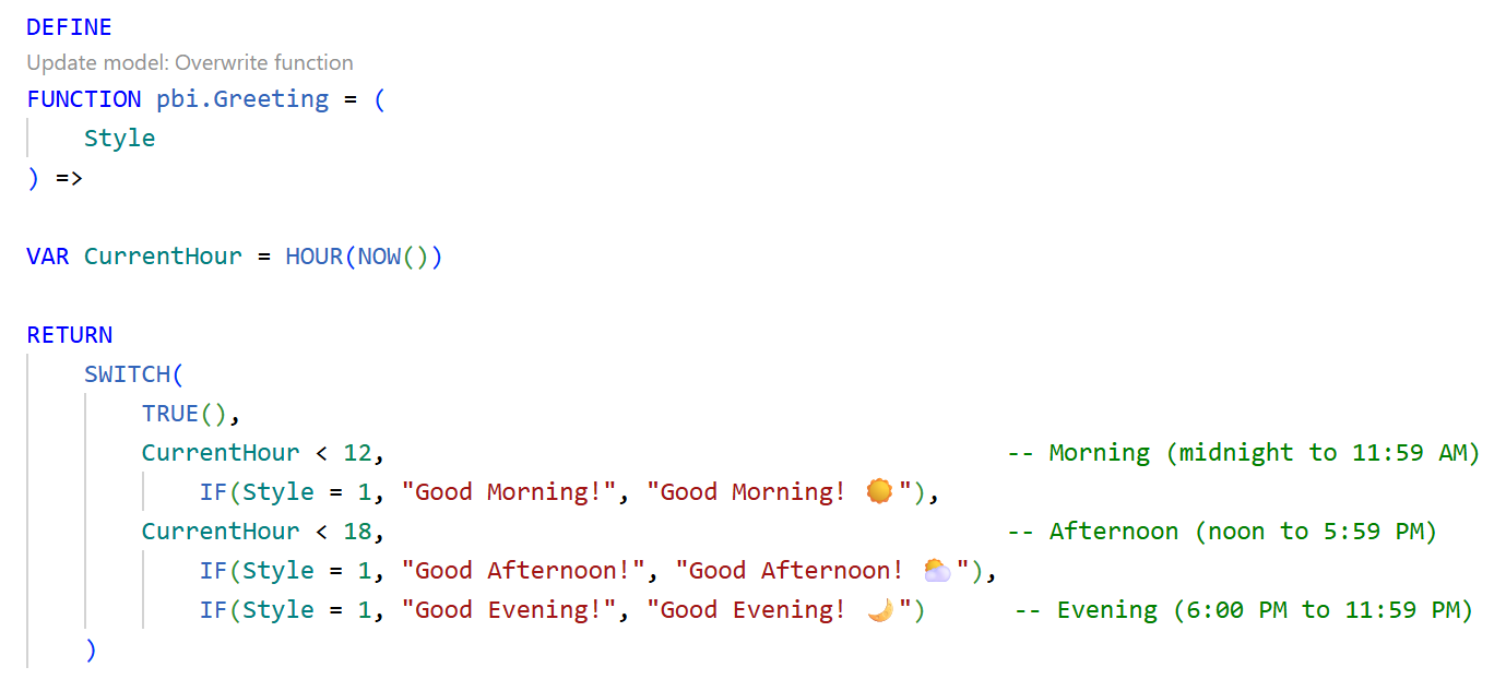
Pass Style = 1 for clean text. Pass = 2 and you get the emoji version. Drop it into any measure across your model with a single function call.

What makes this exciting is not the greeting itself - it is the pattern. A function that takes a parameter, applies logic, and returns a result. Once you have that idea in your head, the possibilities start to open up fast.
Example 2 - A last refresh indicator that always tells the truth
This one solves a very real problem. Users always want to know - is this data fresh? The pbi.LastRefresh UDF calculates exactly how long ago the data was last refreshed and returns a clean, human-readable string like "5 min ago", "2 h 15 min ago", or "1 d 3 h ago". No hardcoding. No manual updates. Just drop it into a card and it handles everything.
For this example, before you begin, create a "Refresh date" table that you will reference in your UDF. This gives you a single date column that captures the current timestamp every time the report refreshes. That is the anchor the LastRefresh UDF uses to calculate how long ago the data was last updated.
Power Query > Blank Query > "DateTime.LocalNow()" > To table option (convert to table).

Then write the below UDF,
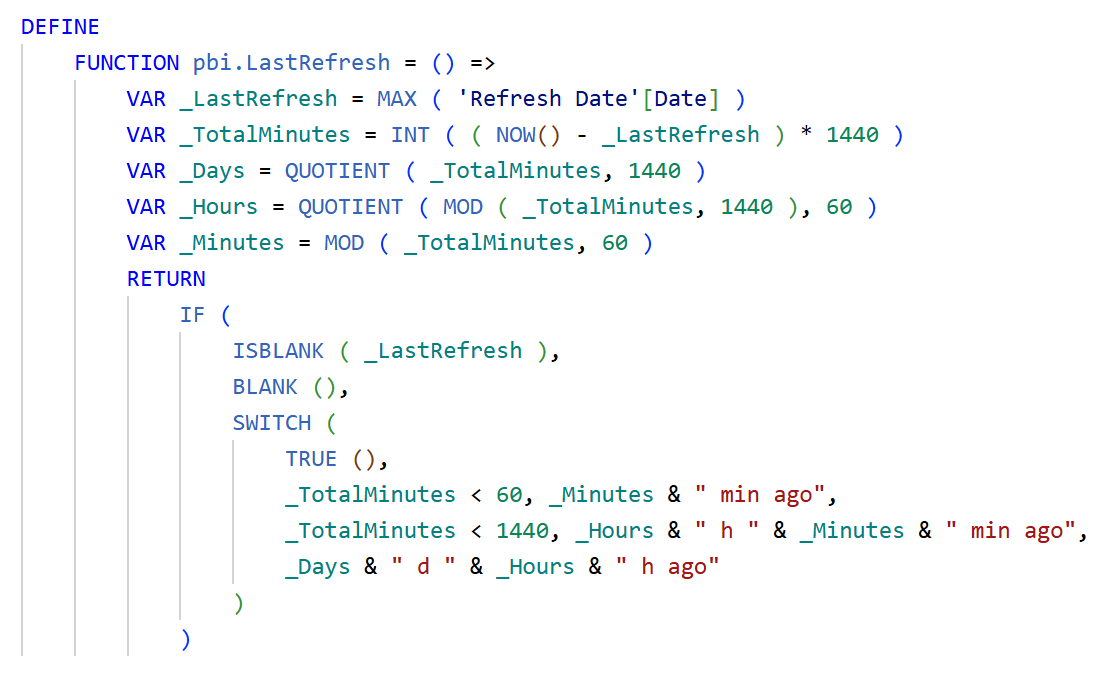
And reference the UDF in a measure. Then you can use this on a card or any visual.

The logic works in layers - under 60 minutes it shows minutes only, under a day it shows hours and minutes, beyond that it switches to days and hours. Write it once, call it in every report you build going forward.
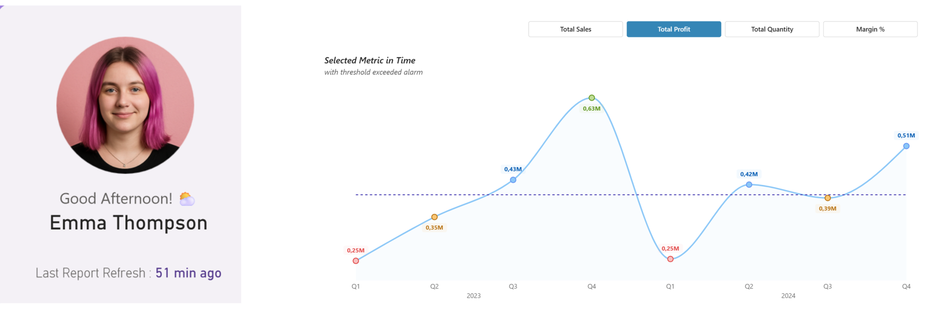
The example 1 and 2 combined results look like this on a card with formatting applied.
The example 1 and 2 combined results look like this on a card with formatting applied.

Example 3 - A dynamic alert line chart that color-codes performance automatically
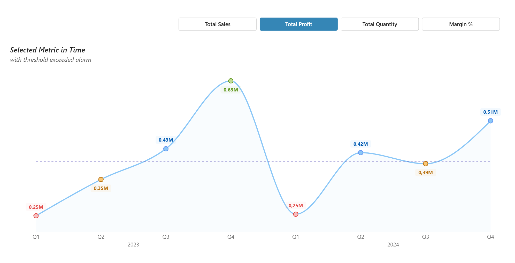
This one shows UDFs doing real analytical work. Define the alert logic once in pbi.AlertStatus and it works across every metric, every data point - no repeated conditions. The result is a line chart where alarm markers appear and color code automatically based on how each data point performs against its threshold.
This one shows UDFs doing real analytical work. Define the alert logic once in pbi.AlertStatus and it works across every metric, every data point - no repeated conditions. The result is a line chart where alarm markers appear and color code automatically based on how each data point performs against its threshold.
In our example
We are tracking four business metrics across 2023 and 2024, with each data point telling you at a glance whether performance was above target, on target, a warning, or below target.
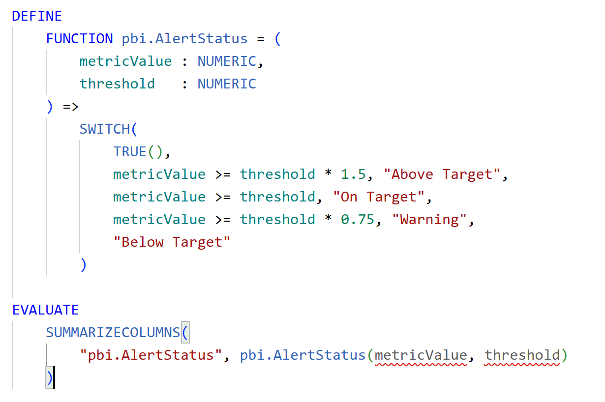
Step 1 - Create the UDF
We are tracking four business metrics across 2023 and 2024, with each data point telling you at a glance whether performance was above target, on target, a warning, or below target.
Step 1 - Create the UDF
This is the brain of the whole visual. Define pbi.AlertStatus in DAX Query View.
Pass in any metric value and a threshold, and it returns one of four statuses. Write it once, call it for any metric - that is the whole point.
Step 2 - Create the Field Parameter
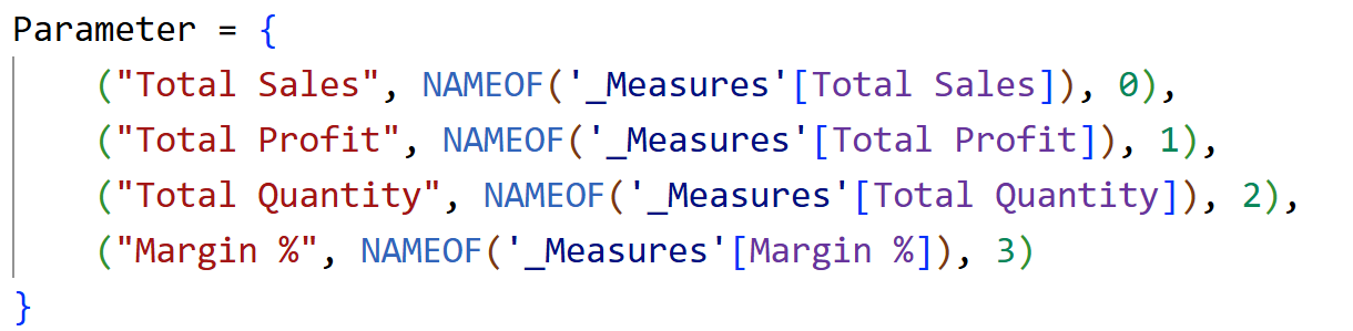
Assuming your four measures (Total Sales, Total Profit, Total Quantity, and Margin %) are already in the model,
Assuming your four measures (Total Sales, Total Profit, Total Quantity, and Margin %) are already in the model,
Go to Modeling - New Parameter - Fields and set up a parameter with all four metrics.
Add this as a slicer on the report and format it nicely into buttons – to switch metrics.
Step 3 - Create the Measures
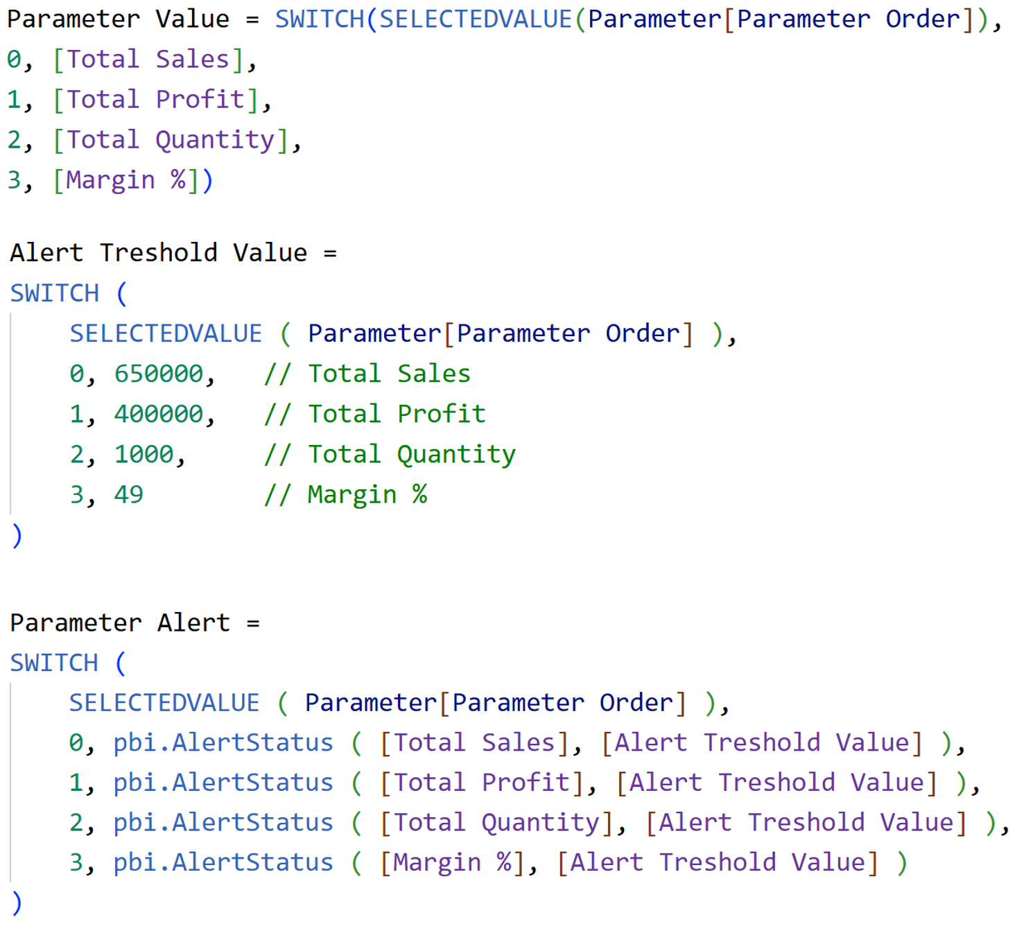
Three measures tie everything together.
Three measures tie everything together.
Parameter Value picks up whichever metric is currently selected.
Alert Threshold Value assigns a benchmark per metric - this is what the dotted reference line in the chart is based on.
Parameter Alert calls the UDF for whichever metric is active and returns the status.
Step 4 - Set Up the Line Chart
Insert a line chart and add the fields:
Insert a line chart and add the fields:
- X-axis - Year Hierarchy (Year and Quarter)
- Y-axis - Parameter Value, Alert Threshold Value
- Tooltips - Parameter Alert
That gives you the main metric line and the flat threshold reference line.
Step 5 - Add Visual Calculations
Step 5 - Add Visual Calculations
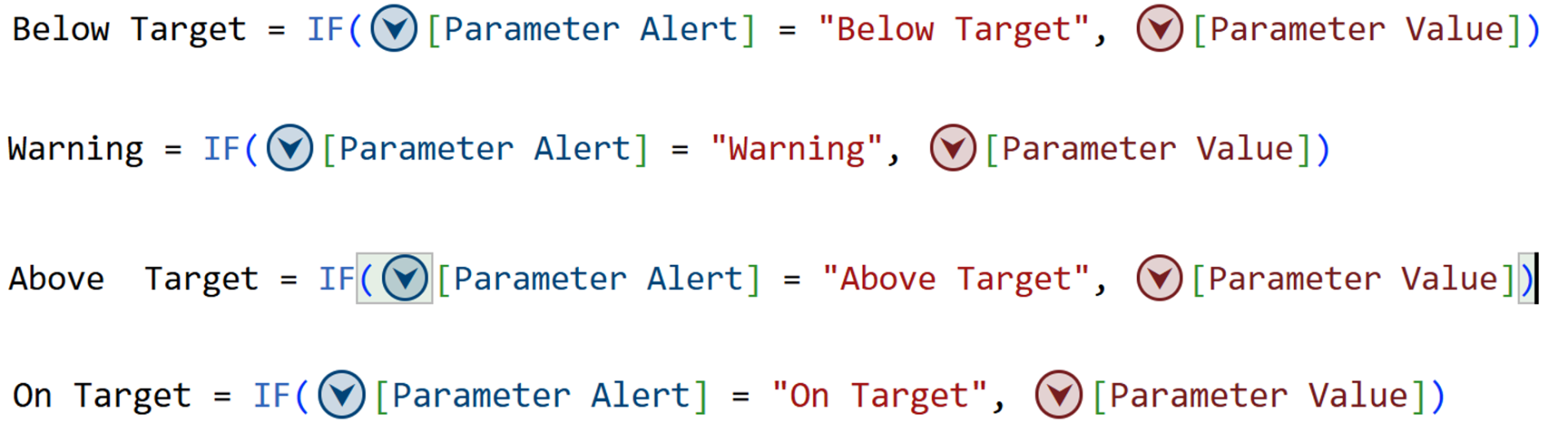
Open Visual Calculations and add these four - one per status. Each returns the metric value only when its status matches, and blank otherwise:
Add all four to the Y-axis. These become the markers (colored dots) on the main line - one color per status, driven entirely by the UDF logic underneath.
Step 6 - Declutter the visual
Step 7 - Format the Lines
- Turn off the legend
- Turn off all axis titles
- Turn off Y-axis values
- Rename the visual title as required
Step 7 - Format the Lines
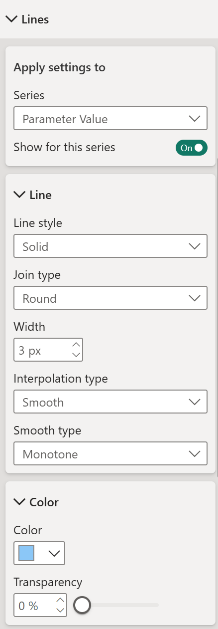
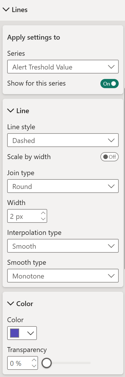
Go to Lines and apply settings per series:
Parameter Value
- Line style - Solid
- Join type - Round
- Width - 3px
- Interpolation type - Smooth (Monotone),
- Color of your preference
Alert Threshold Value
- Line style - Dashed
- Join type - Round
- Width - 2px
- Interpolation type - Smooth (Monotone),
- Color of your preference.
Below Target, Warning, Above Target, On Target Series
Turn off for these 4 series. These carry markers and data labels only, no line needed
Step 8 - Format the Shade Area
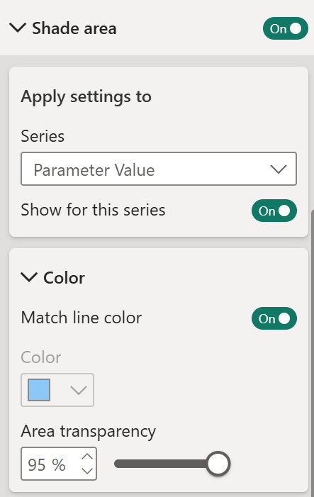
- Enable shade area only for the Parameter Value series.
- Turn on Match line color
- Set Area transparency to 95%.
Step 9 - Format the Markers
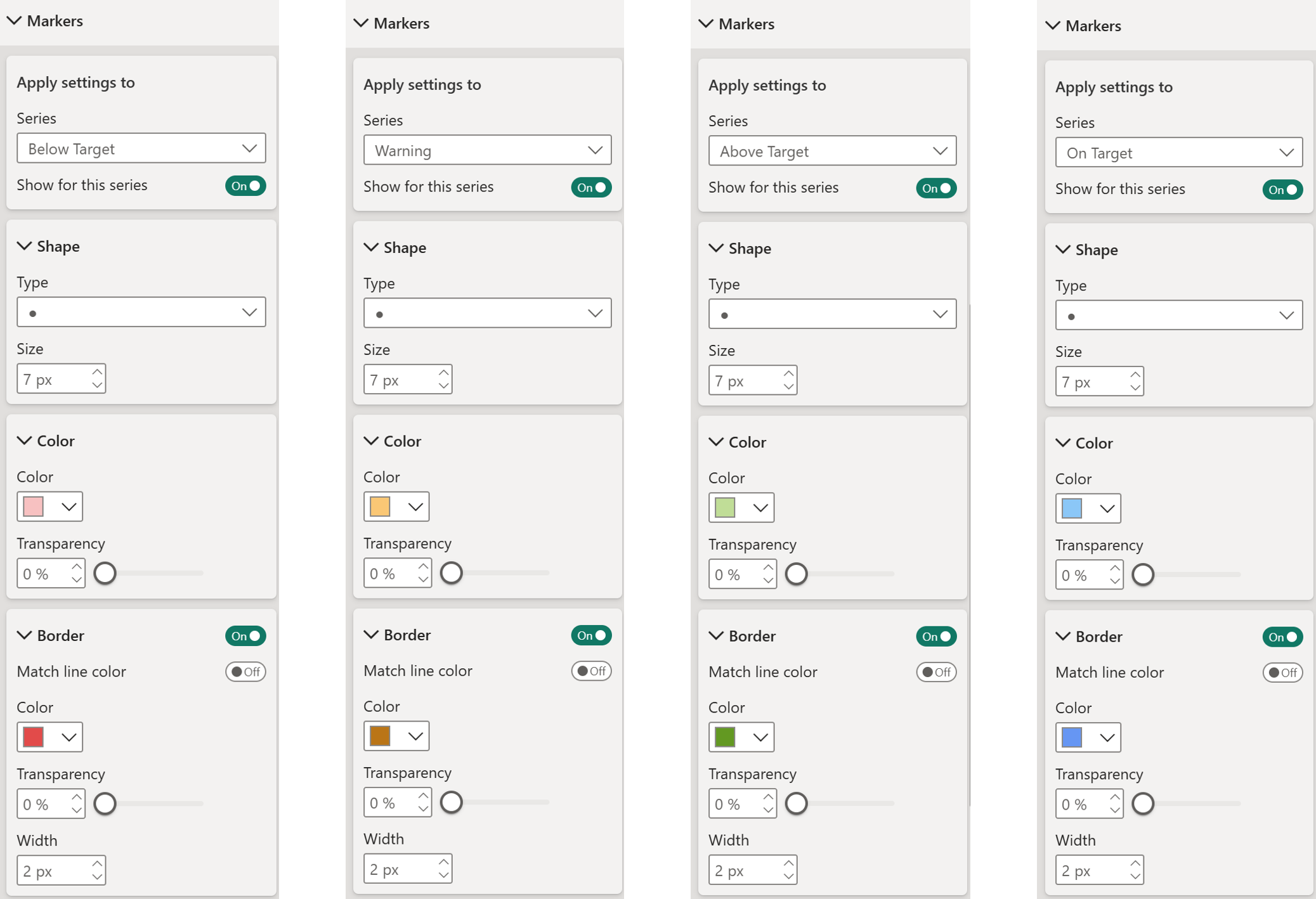
Go to Markers and configure each of the four status series – below target, warning, above target, on target.
Go to Markers and configure each of the four status series – below target, warning, above target, on target.
All four share the same base settings,
- Shape type – Circle
- Size – 7px
- Border – On
- Match line color – Off
- Width – 2px
- Set colors as per your preference (1 color for each - for both color and border color with a slight variation)
Turn off markers for the following series - Parameter Value and Alert Threshold Value.
Step 10 - Format the Data Labels
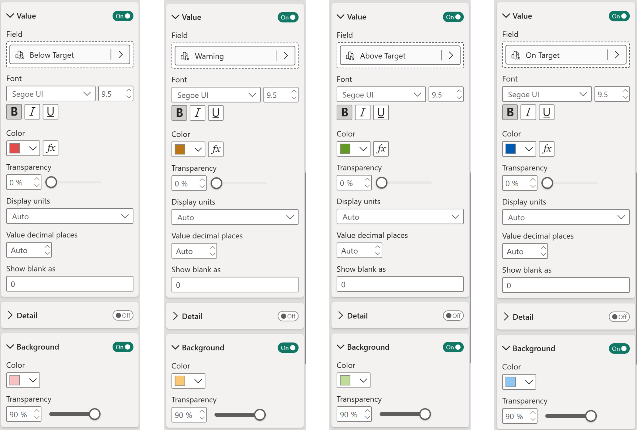
Go to Data Labels and configure each of the four status series – below target, warning, above target, on target.
Go to Data Labels and configure each of the four status series – below target, warning, above target, on target.
All four share the same base settings with values turned on and font set to “Bold”. Assign a color for each series matching the color set for markers border.
- Under “background”, set a lighter shade similar to the one used for text under “value”. (Example, Green for text, lighter green for background, likewise)
- Set transparency to 90%
Switch metric from the slicer and everything updates - the line, the threshold, the colored markers, the labels. One UDF doing all the status logic behind the scenes, for every metric, every data point, automatically.
That is three very different problems solved with the same idea - write the logic once, let the model do the rest. If this got you thinking about what else UDFs could do in your reports, we are running a full UDF course that goes much deeper. Check it out and take your Power BI knowledge to the next level.
That is three very different problems solved with the same idea - write the logic once, let the model do the rest. If this got you thinking about what else UDFs could do in your reports, we are running a full UDF course that goes much deeper. Check it out and take your Power BI knowledge to the next level.
Hope you like it!
Give it a try and see how it works for you! I’d love to hear what you think or see how you use this trick in your own reports.
How to Power BI

COMPANY
Write your awesome label here.
Embedding Power BI in Power Point
Intro Session