The visuals include:
- 100% stacked bar chart
- Diverging bar chart
- Small multiples chart
You’ll also learn the best data model structure and preparation steps for optimal flexibility and clarity.
1. Prepare the Survey Data
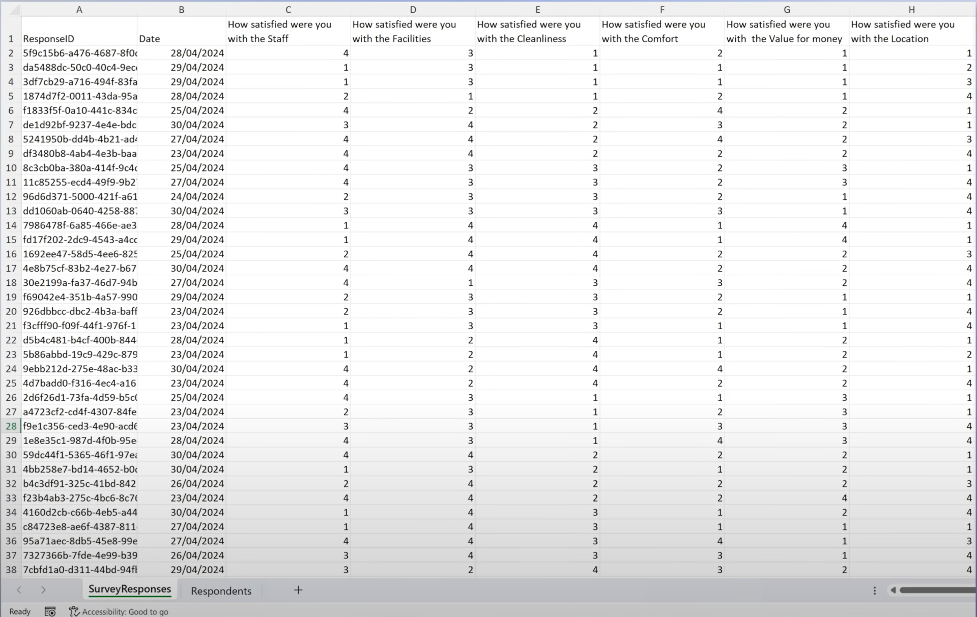
Data Structure
The survey covers 6 hotel-related questions rated from 1 (Very Bad) to 4 (Very Good).
Two main tables:
- Respondents Table: Metadata like age and gender.
- Survey Responses Table: Includes date, response ID, and ratings for each question.
Steps in Power Query
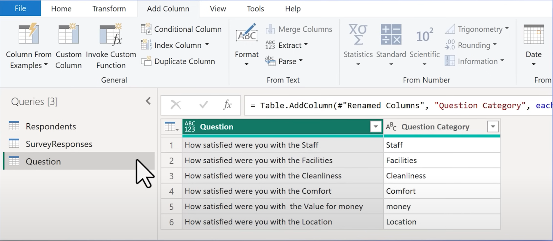
1. Unpivot Questions:
Convert wide format (columns for each question) into a vertical structure using Unpivot Other Columns.
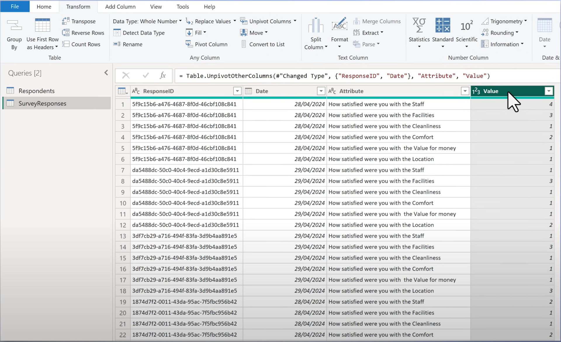
2. Rename Columns:- Attribute → Question
- Value → Answer
3. Create Dim Question Table:
- Right-click "Question" → Add as New Query
- Remove duplicates
- Add descriptive attributes (e.g. extract categories)
4. Create Index Column (Question ID):
To facilitate clean relationships in the data model.
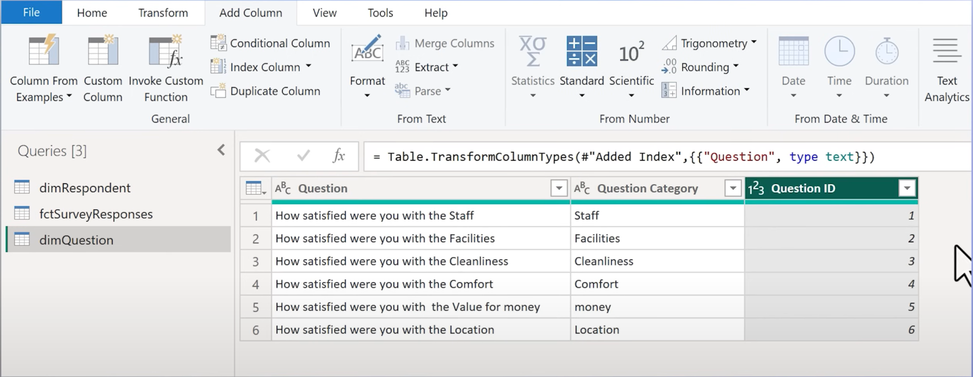
5. Merge into Fact Table:Merge dim_question into the fact table to replace text-based question with Question ID.
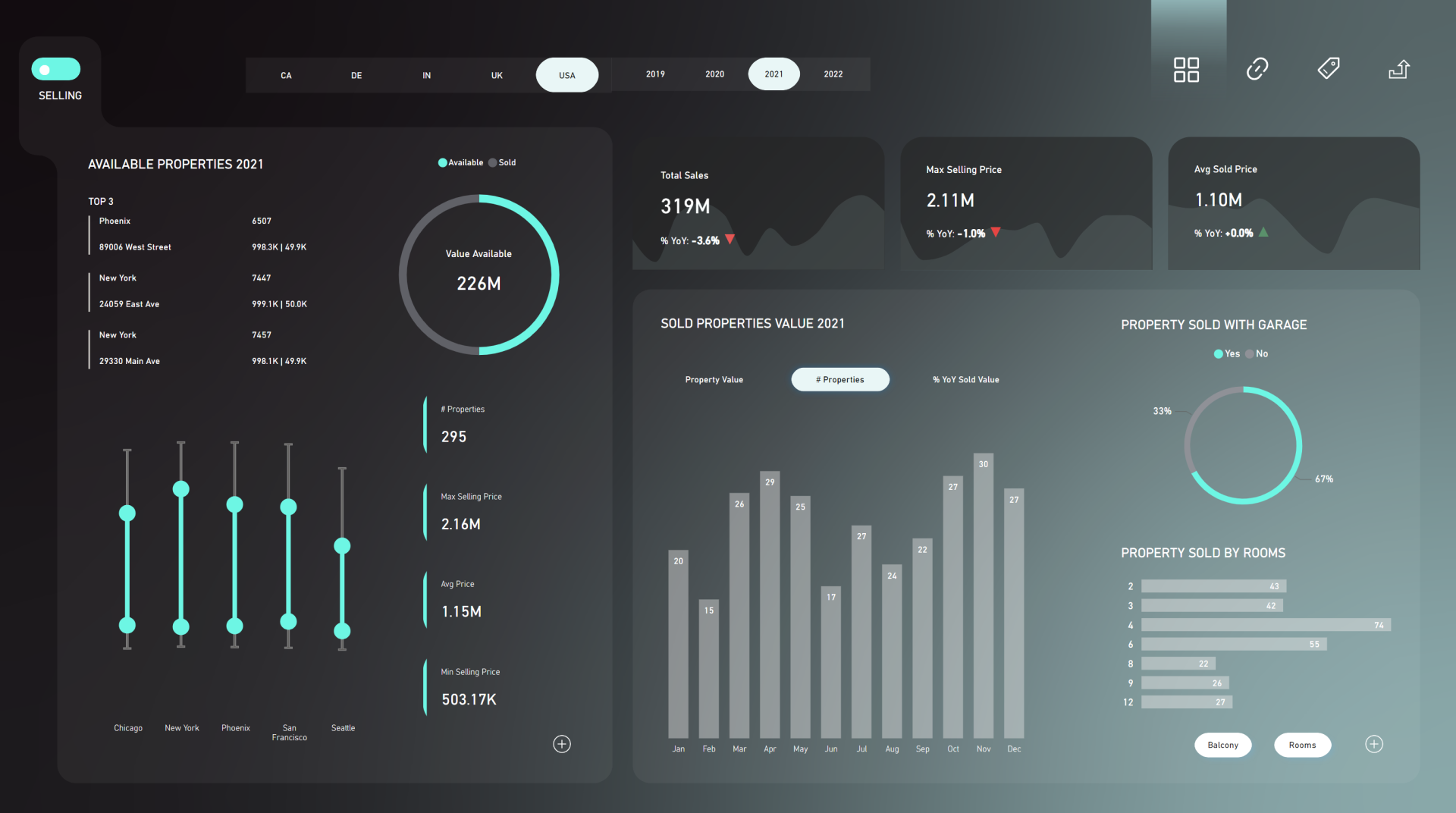
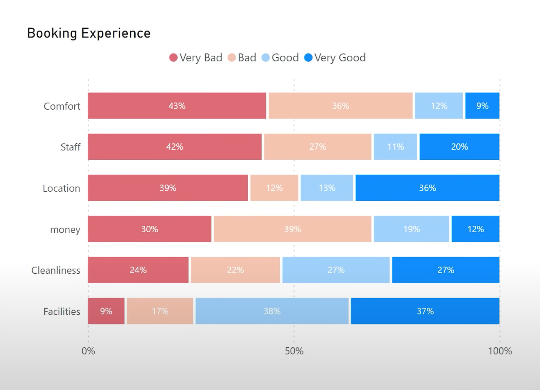
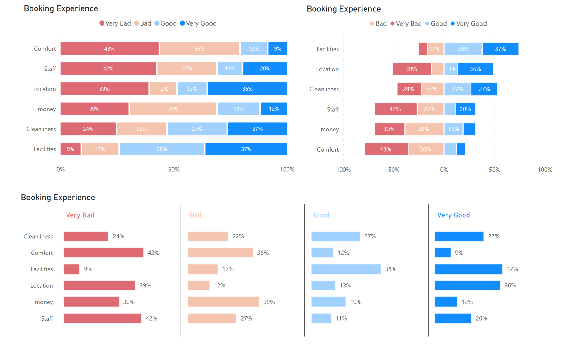
2. Chart 1: 100% Stacked Bar Chart
Goal: Show answer distributions by question in percentages.
Method 1: Using Individual Measures
Create 4 measures (Very Good, Good, Bad, Very Bad)
Count – Answer - VeryGood =
CALCULATE(
COUNTROWS('fctSurveyResponses'),
'fctSurveyResponses'[Answer] = 4
)
Repeat for others the only thing that changes is the filter of the answer.
Add measures to the 100% Stacked Bar Chart:
- Axis: Question Category
- Values: Each answer measure
Customize:
- Colors (blue to red)
- Labels (percentages, no decimals)
- Order of answers (Very Bad → Very Good)
- Names of the measures on the X-axis
- Add a space between series
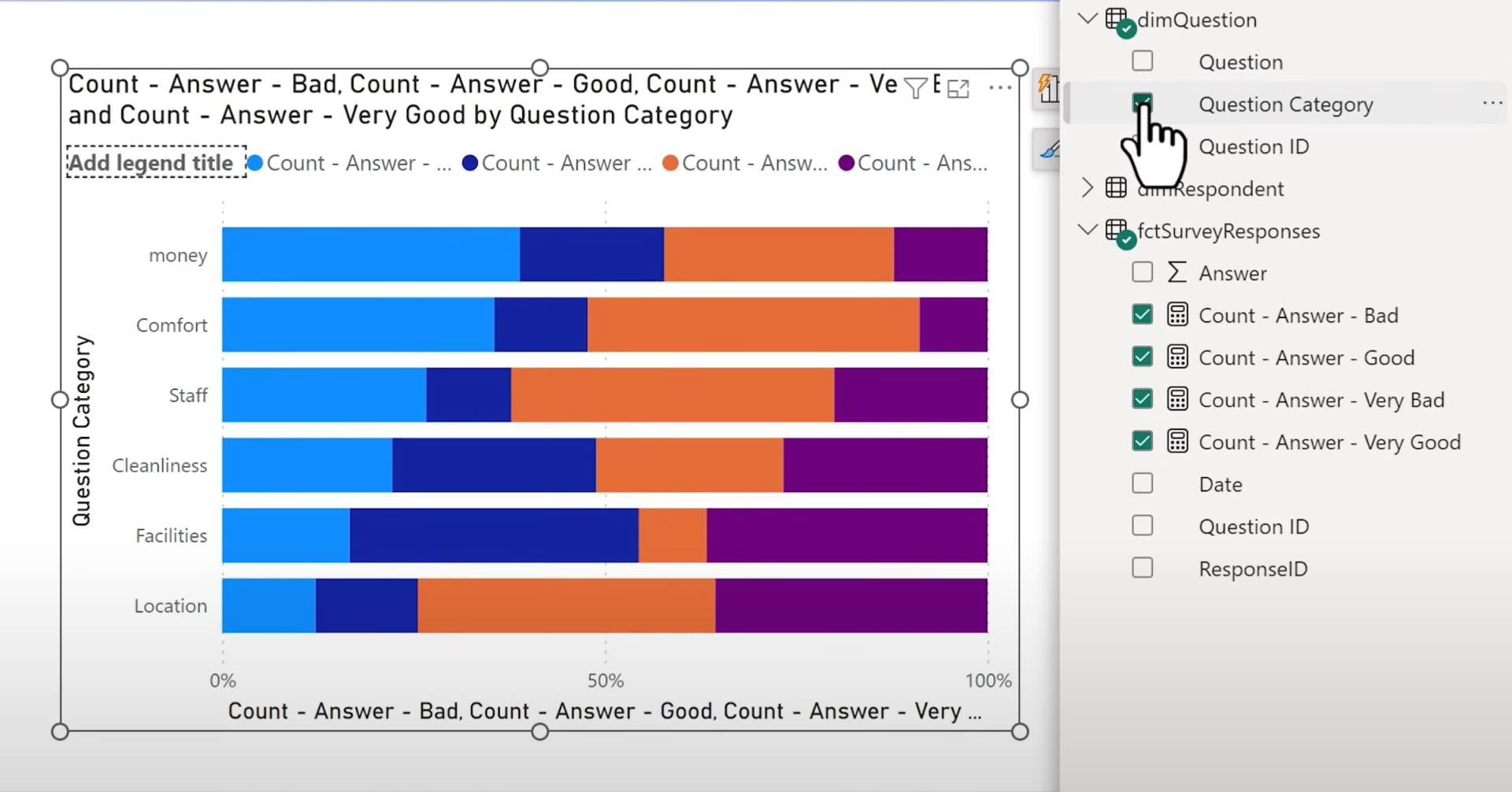
Method 2: Using Answer Category Column
Instead of multiple measures, add an Answer Category column in Power Query using conditional logic (e.g. 1 = Very Bad). Then:
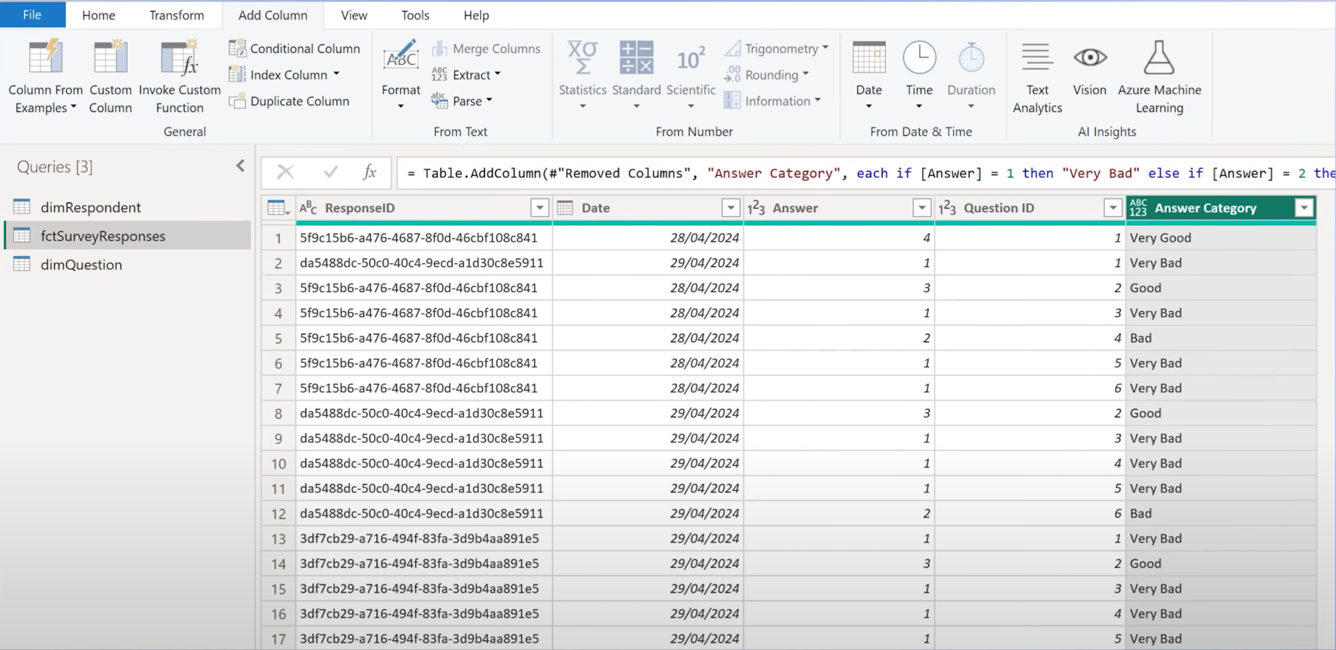
- Use a single count measure of the responses
- Set Answer Category as Legend
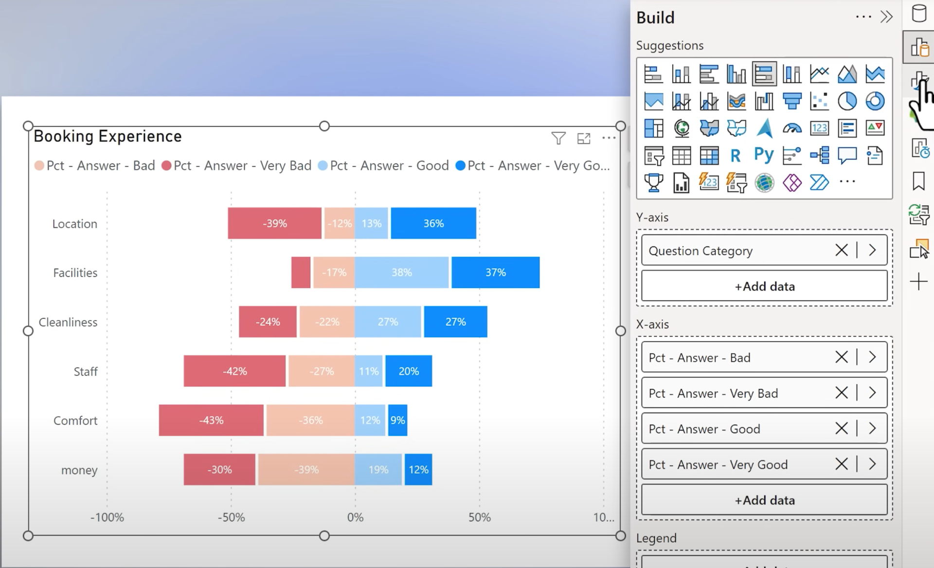
3. Chart 2: Diverging Bar Chart
Goal: Separate positive and negative responses visually.
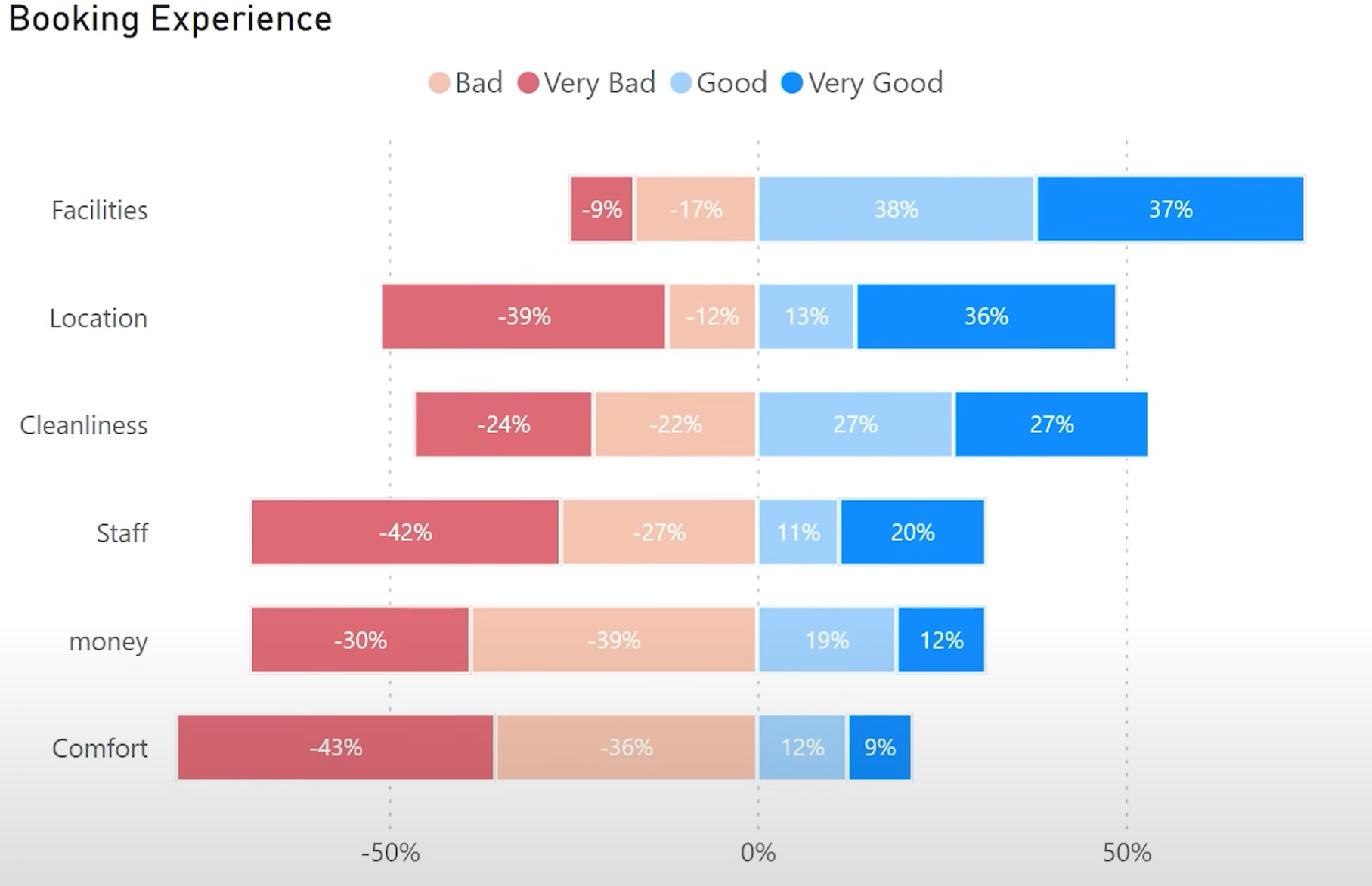
Setup
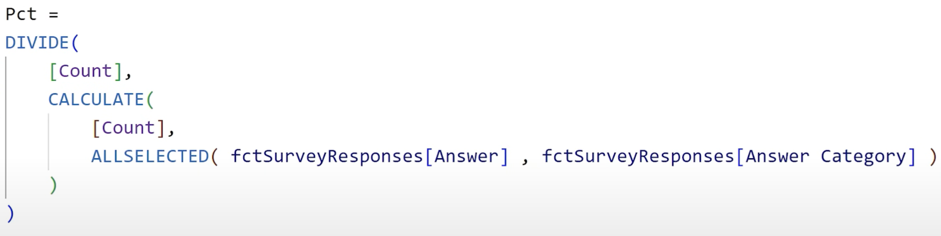
Create percentage measures like:
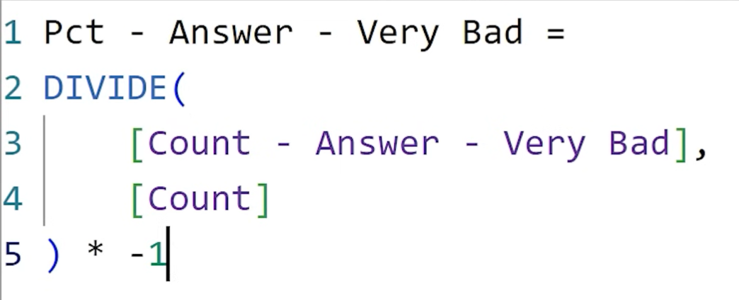
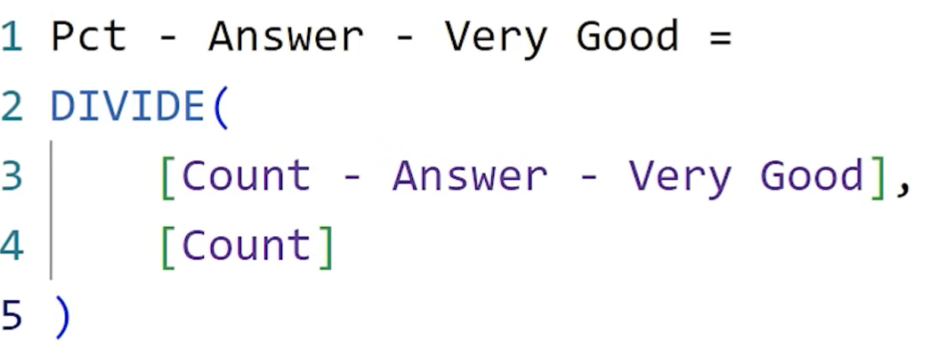
Use a
Stacked Bar Chart:- Left side: Negative (Very Bad, Bad)
- Right side: Positive (Good, Very Good)
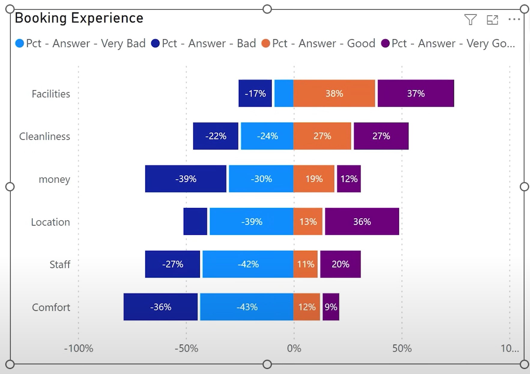
Change the formatting similar as before.
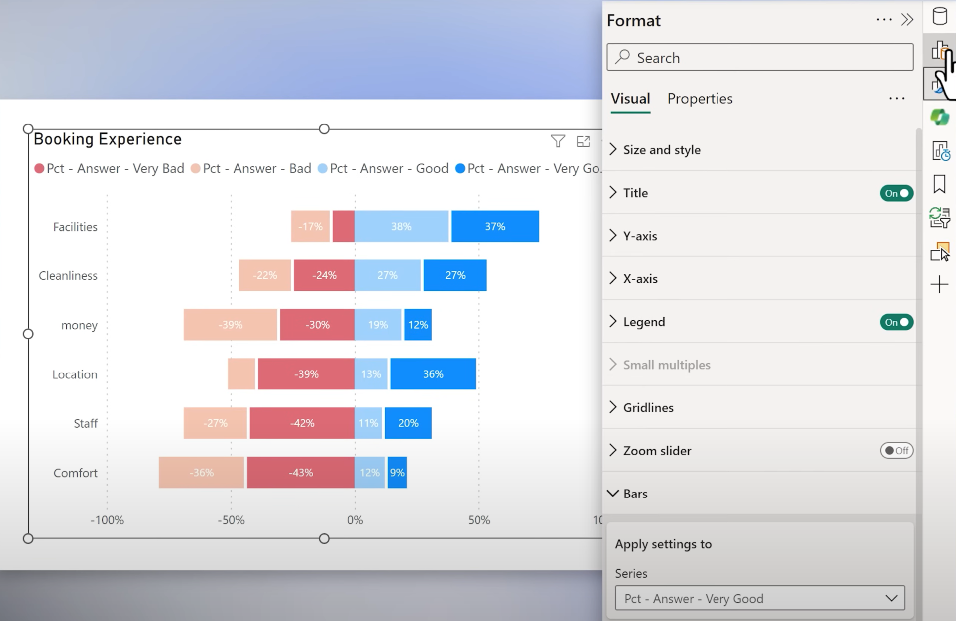
Fix sorting by organizing measures on the X-axis like this:
4. Chart 3: Small Multiples (Faceted Bar Charts)
Goal: Separate mini-charts per answer category.
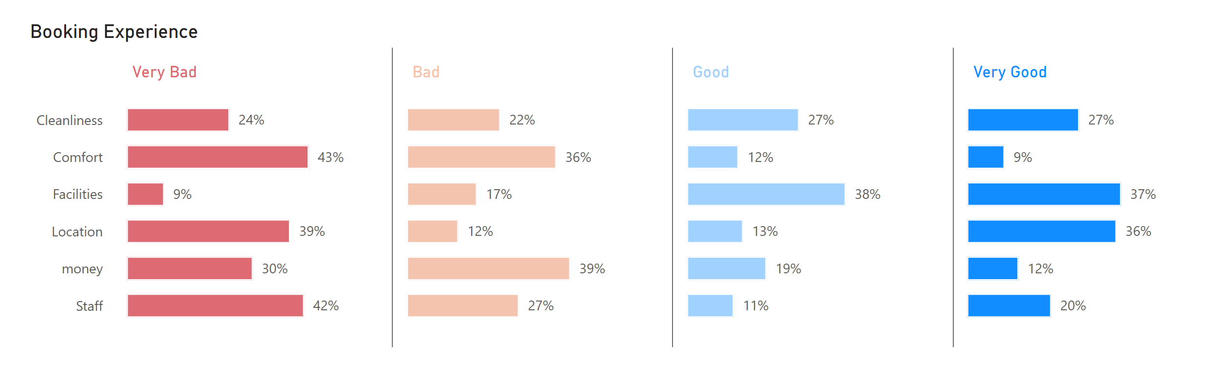
Setup
1. Create a single Percentage measure using ALLSELECTED.
2. Use the Stacked Bar Chart and apply Answer Category to Small Multiples.
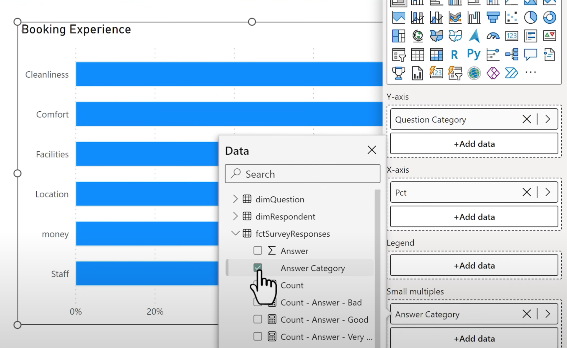
3. Set grid layout: 1 row, 4 columns.
4. Add conditional color formatting using a DAX measure with hex codes and SELECTEDVALUE.
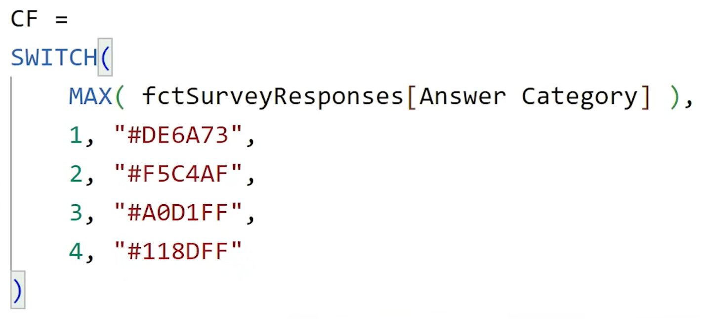
Apply color to both bars and titles using the fx button.
Final result:
|
Chart
|
Strength
|
Weakness
|
|
1. 100% Stacked
|
Clear comparison for ends (Very Good / Very Bad)
|
Hard to compare middle values
|
|
2. Diverging
|
Easier to compare negative vs. positive
|
Middle position can be less intuitive
|
|
3. Small Multiples
|
Most detailed, flexible
|
Takes more space, slightly complex setup
|
Conclusion
Each visual has its merits depending on what aspect of the survey insights you want to emphasize.
Choose based on:
- Audience familiarity
- Focus on positive/negative extremes
- Report layout constraints
Which chart would you use?
Hope you like it!
Give it a try and see how it works for you! I’d love to hear what you think or see how you use this trick in your own reports.