Every report has two audiences. The first wants a clean, simple view - how are we doing? The second wants to dig deeper - where exactly are the problems? This visual serves both, with a single toggle that switches between a clean performance view and a full diagnostic layer - all in one chart.
Here is how to build it in Power BI step by step. Let’s dive in!
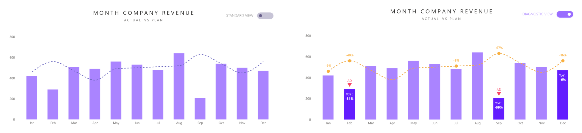
What we are building
A line and clustered column chart showing monthly actual revenue against plan. In the standard view it is clean and uncluttered. Flip the toggle and the diagnostic layer activates - negative YoY months get called out, months below plan are highlighted, and any month with a variance exceeding 40% against plan gets a red anomaly flag. Everything your stakeholder needs to ask the right questions, visible in seconds.
In our example
We are tracking monthly company revenue - actual versus plan - across a full year.
Step 1 - Set up the base visual
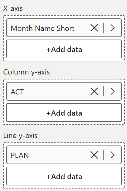
Insert a line and clustered column chart and start with just the essentials:
- X-axis - Month Name Short
- Column y-axis - ACT
- Line y-axis - PLAN
At this point you have a chart showing actual revenue as bars and the plan as a dashed line. This is the foundation everything else builds on.
Step 2 - Create the field parameter and toggle
Create a numeric field parameter to drive the toggle between the standard and diagnostic view.
Add the parameter as a button slicer on your report page and style it as a toggle - 0 for the standard view, 1 for the diagnostic view.

Step 3 - Create the supporting measures
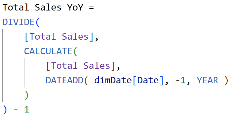
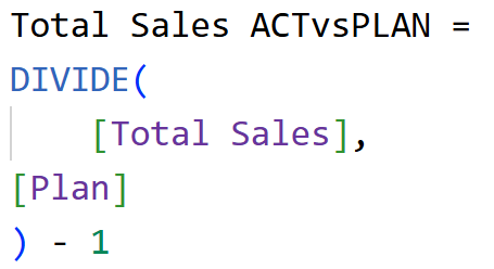
Two measures are needed before writing the visual calculations. These also need to be added to the Tooltip field well so they can be referenced inside the visual calculations - without them in the visual, the calculations will throw an error.
Total Sales YoY - calculates year-on-year growth as a percentage
Total Sales ACTvsPLAN - calculates actual versus plan variance as a percentage
Once created, add both measures to the Tooltip field well on the visual.
Step 4 - Create the visual calculations
Now add the visual calculations in this order. These are what power the diagnostic layer when the toggle is switched on.
YoY - highlights bars where year-on-year performance is negative. Only activates in diagnostic mode. Add to column y-axis.
PLAN 2 - returns the plan line in diagnostic mode in a different colour to draw attention to the gap. Add to line y-axis.
< PLAN - returns the plan value only for months where actual is below plan, in diagnostic mode. Add to line y-axis.
ANOMALY MARKER - flags months where actual vs plan variance exceeds 40% in either direction, positioning a marker just above the bar. Add to line y-axis.
AD - sits just below ANOMALY MARKER, carrying the AD text label. Same condition, slightly lower position. Add to line y-axis.
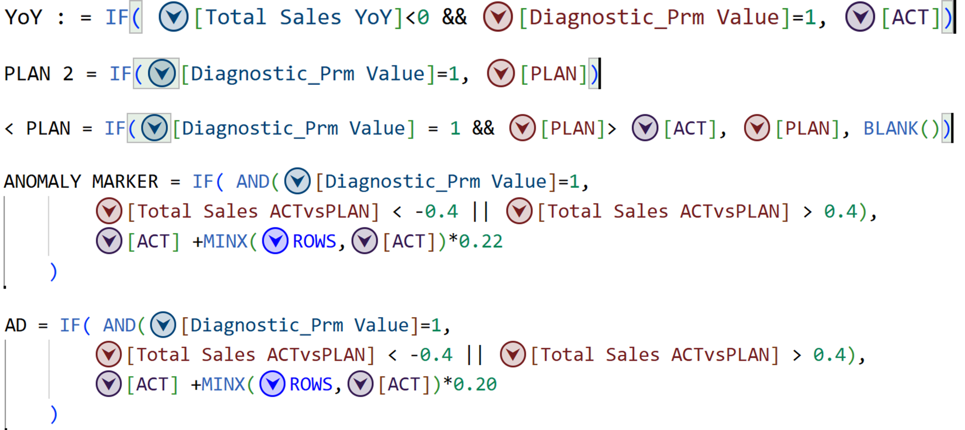
Once all visual calculations are added, your
build panel should look like this:
- X-axis - Month Name Short
- Column y-axis - ACT, YoY
- Line y-axis - PLAN, PLAN 2, < PLAN, ANOMALY MARKER, AD
- Tooltips - Diagnostic_Prm Value, Total Sales YoY, Total Sales ACTvsPLAN
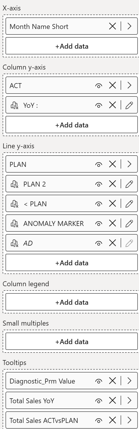
Step 5 - Declutter the visual
- Turn off the legend
- Turn off all axis titles
- Rename the visual title - for example "Monthly Revenue - Actual vs Plan"
- Adjust the y-axis range to give a little extra breathing room at the top
- Do the same for the secondary axis
Step 6 - Format the columns
Go to Columns -
ACT series:- Color - set color of your preference, transparency 0%
YoY series:
- Color - set color of your preference, transparency 0%
All series:
- Border - off
- Layout - Space between categories 47%, Space between series 100%, Overlap on, Flip overlap off
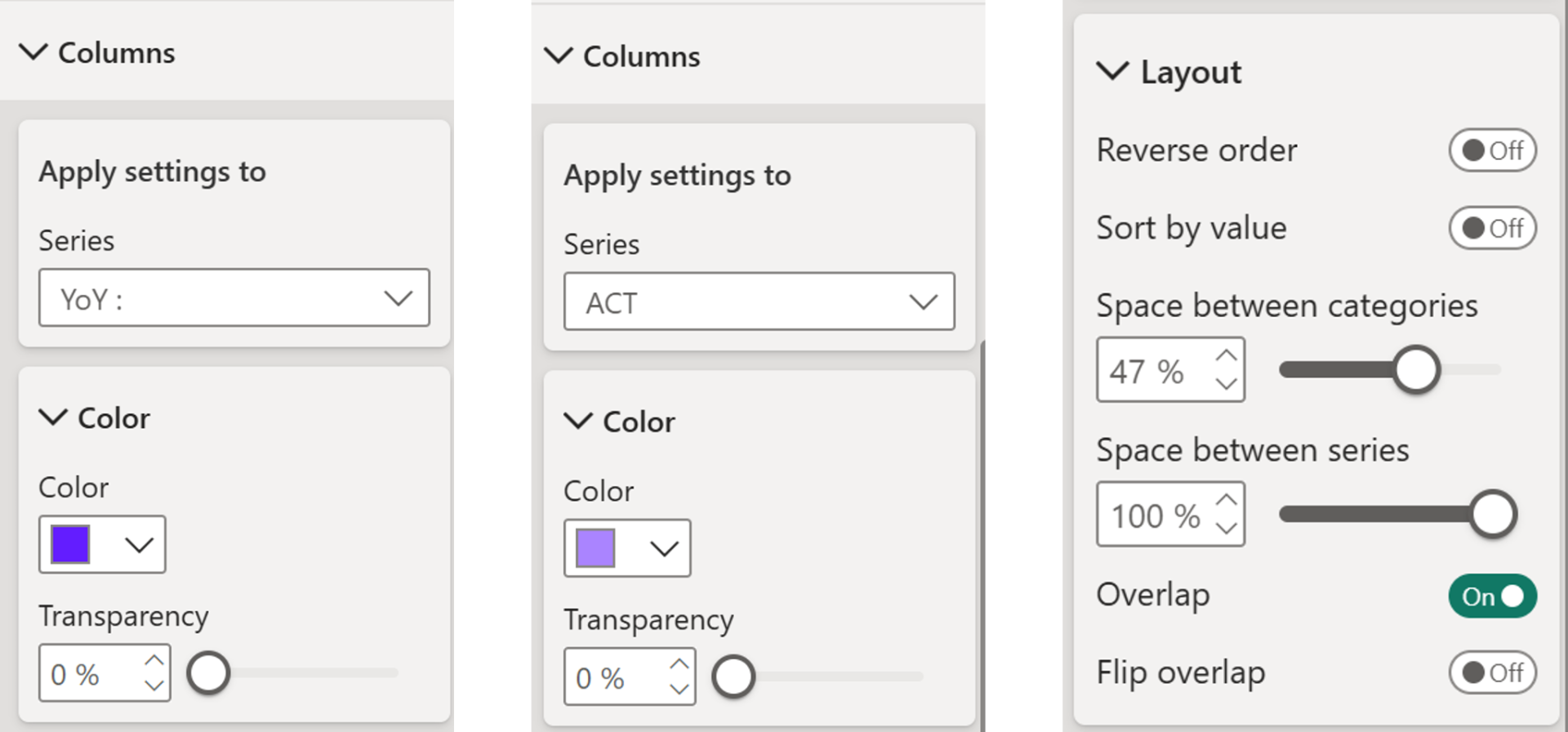
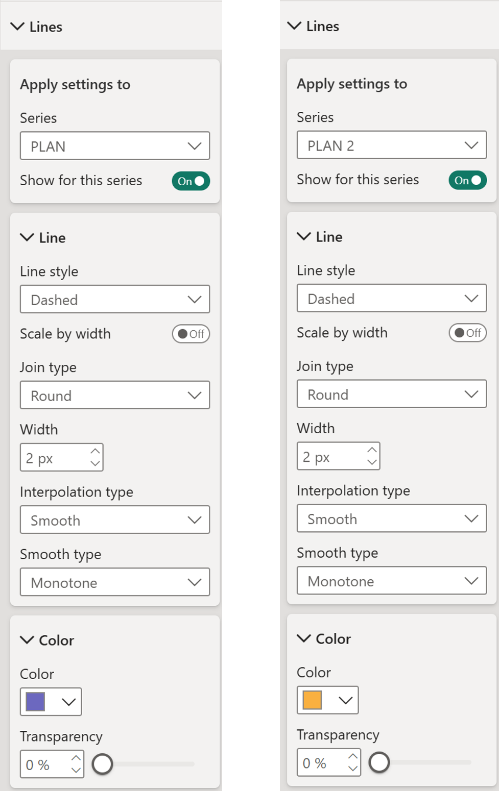
Step 7 - Format the linesGo to Lines -
PLAN series:- Show for this series - on
- Line style - Dashed
- Join type - Round
- Width - 2px
- Interpolation type - Smooth
- Smooth type - Monotone
- Color - set color of your preference, transparency 0%
PLAN 2 series:
- Same settings as PLAN
- Color - set color of your preference, transparency 0%
All other line series (less than PLAN, ANOMALY MARKER, AD):
- Turn off Show for this series - these series carry markers and data labels only, no visible line needed
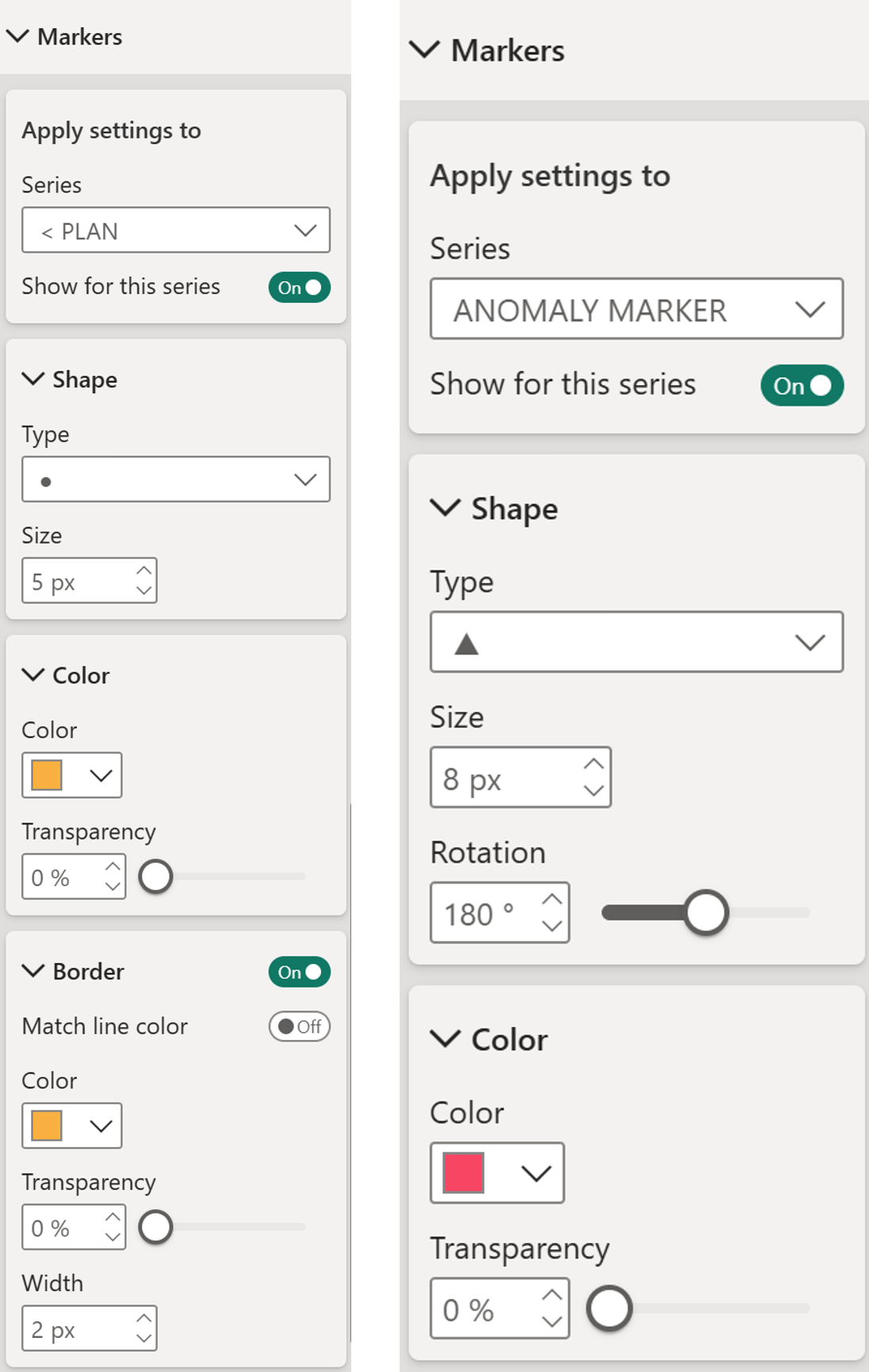
Step 8 - Format the markersGo to Markers -
< PLAN series:- Show for this series - on
- Shape - filled circle, 5px
- Color - set color of your preference, transparency 0%
- Border - on, match line color off, color (based on your choice), transparency 0%, width 2px
ANOMALY MARKER series: - Show for this series - on
- Shape - triangle, 8px, rotation 180 degrees
- Color - set color of your preference, transparency 0%
- Border – off
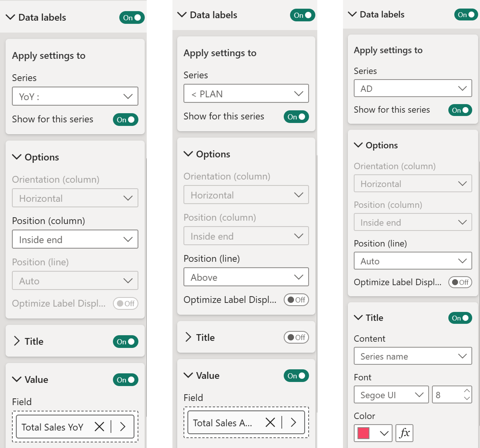
Step 9 - Format the data labelsGo to Data labels. Turn on only for the following series - all others off.
YoY series:
- Show for this series - on
- Title - on
- Value - on, field set to Total Sales YoY
< PLAN series:
- Show for this series - on
- Title - off
- Value - on, field set to Total Sales ACTvsPLAN
AD series:
- Show for this series - on
- Position - line Auto, optimize label display off
- Title - on, content Series name
And there you go! Two views, one chart, one toggle. The standard view is clean and presentation-ready. The diagnostic view tells the full story - which months missed plan, which dropped year-on-year, and which were so far off that they need immediate attention. No extra visuals, no complex drill-throughs. Just the right information, exactly when it is needed.
Hope you like it!
Give it a try and see how it works for you! I’d love to hear what you think or see how you use this trick in your own reports.