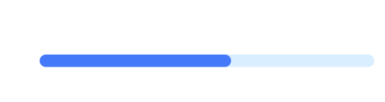
A Progress bar can add context, direction, and emphasis, making the status immediately clear.
The more important the KPI, the more visual weight it should carry.
A progress bar unfortunately doesn't come as a native Power BI visual, right out of the box. That doesn't mean however you need to rely on SVG or custom visual. We can build progress bars like below relatively easily with a few formatting tricks.
What We're Building
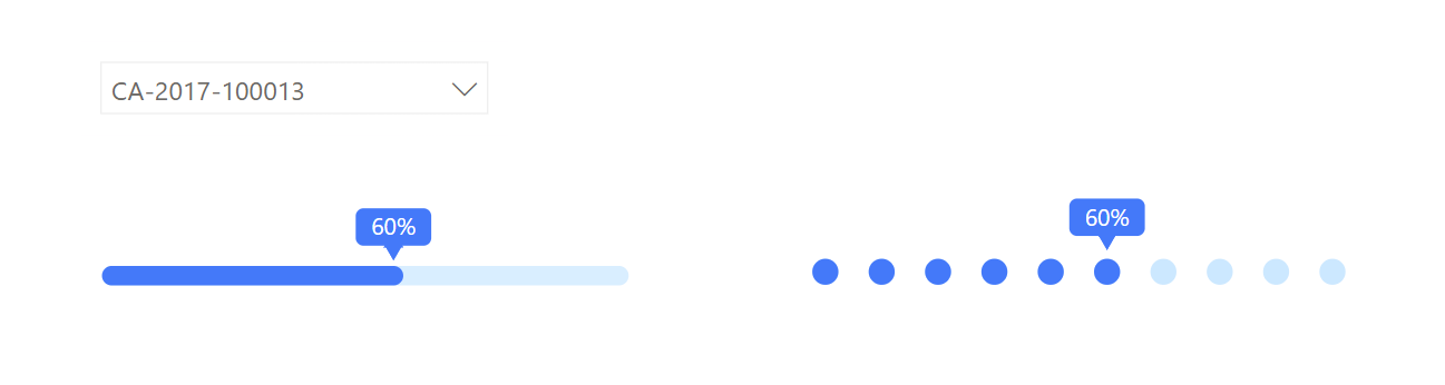
Two variations of progress bars:
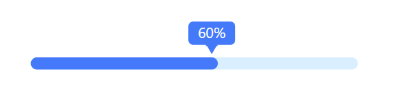
- A solid line-style progress bar with a floating percentage label and triangle indicator
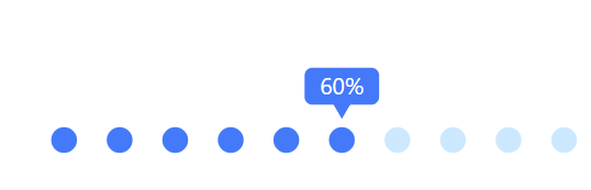
- A dotted/marker-style progress bar for a different visual aesthetic
Both are fully responsive and dynamically update when you filter by order, project, or any other slicer.
Step 1: Create the Foundation - A Line Chart
The base visual is a simple
line chart. We'll transform it into a progress bar by drawing two horizontal lines:
- One for the background (light blue, full width)
- One for the progress (solid blue, partial width based on your data)
Step 2: Build the X-Axis Helper Table
To create a line from 0% to 100%, we need a helper table.
Go to Modeling → New Table and generate the below series.
This creates values from 10% to 100% in 10% increments. If you need finer precision (like 61%), change the step to 0.01.
Drag the Value column onto your line chart's X-axis.

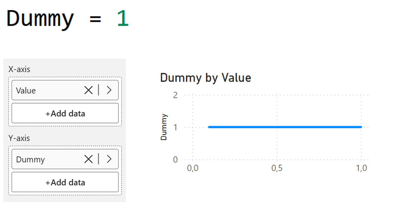
Step 3: Create a Dummy Measure for the Y-Axis
We need a flat horizontal line. Create a simple dummy measure to achieve this.
Add this to the Y-axis. And now, you've got a straight line.
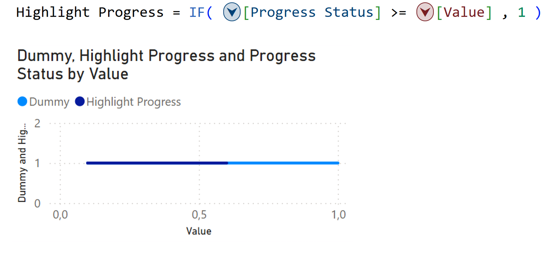
Step 4: Highlight the Progress with a Visual Calculation
Create a measure that returns the current progress percentage.
Add this to Tooltips (not Y-axis) so we can reference it in a visual calculation.

Now, add a Visual Calculation on the Y-axis which returns 1 for all X-axis values up to the progress point, creating the highlighted portion.
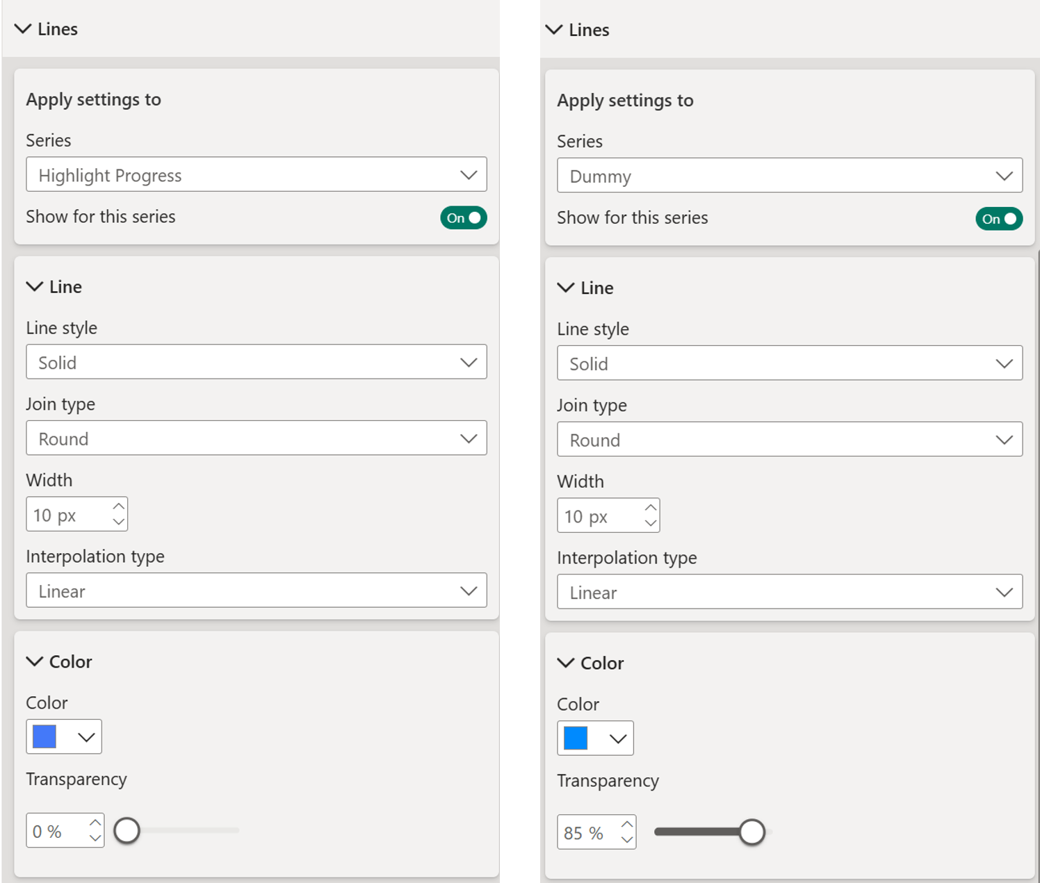
Step 5: Clean Up the Formatting
Time to declutter and turn off elements like the Title, Legend, X-axis labels, Y-axis labels and Background.
Then style the lines:
- Line thickness: 10 pixels
- Highlight Progress color: Solid blue
- Dummy line color: Same blue with 85% transparency
You now have a working progress bar that resizes beautifully.
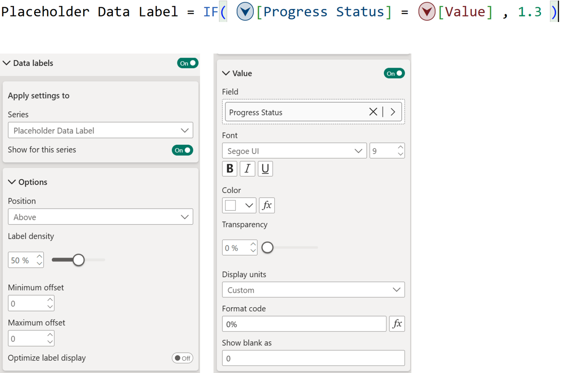
Step 6: Add the Percentage Callout
Add another visual calculation to place a data label at the progress endpoint.
Back in formatting:
Turn off the line for this series
Turn on data labels only for this series
Position: Above
Show value: Progress Status (formatted as percentage)
Style: White text on blue background
Optional: If you create the visual calculation and have it “1” instead of “1.3”, then you can achieve the result by playing around with the minimum and maximum label offset
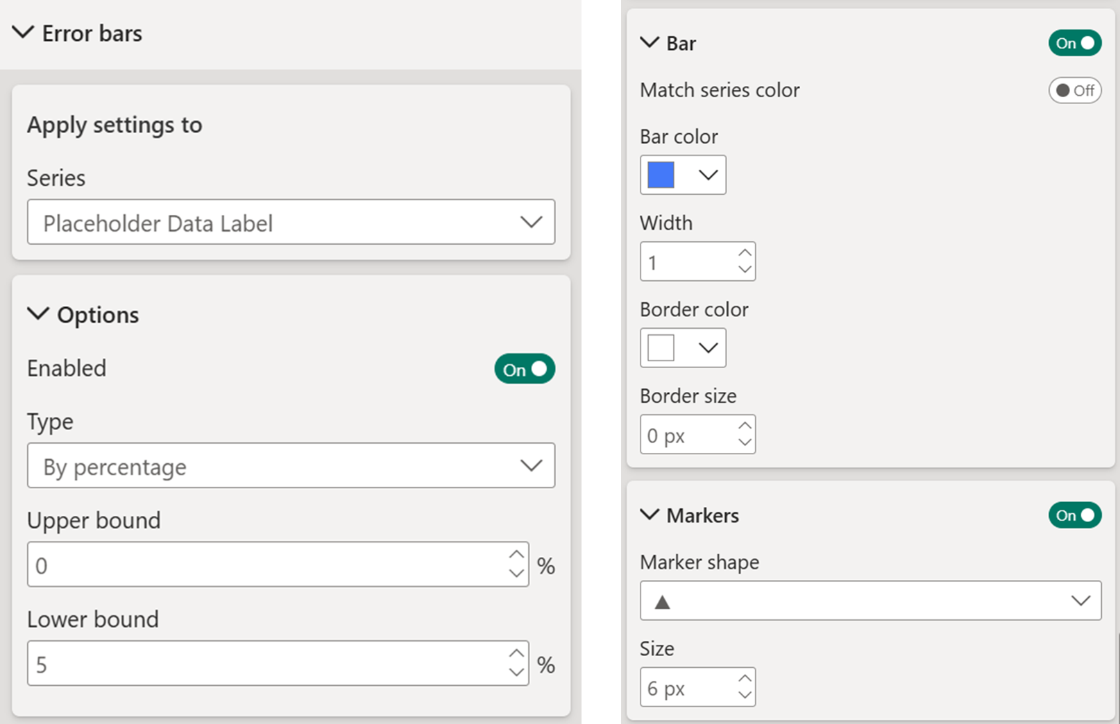
Step 7: The Finishing Touch - Triangle Indicator
This is where
error bars become your secret weapon.
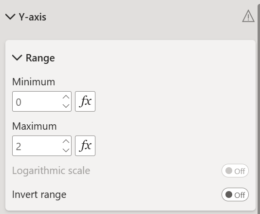
Before you setup the error bars, adjust the Y axis range.
Fix your Y-axis range (e.g., 0 to 2)
Select the Placeholder Data Label series and:
Turn on Error Bars
Set to By Percentage
Set bounds to something small (e.g., Upper: 0, Lower: 3-5%)
Change the marker shape to a triangle
Color it the same blue, remove the border
Adjust the data label offset so the triangle sits perfectly
behind the callout bubble.
Pro tip: Create a custom tooltip or turn off tooltips for a clean hover experience.
And there you go, a clean and sleek progress bar!
Bonus: Marker-Style Variation
Want dots instead of a line? Duplicate your visual and:
- Turn off all lines
- Turn on markers for both series
- Dummy markers: Size 8, 80% transparency
- Progress markers: Size 8, no transparency
That's it. Same logic, different look.
Hope you like it!
Give it a try and see how it works for you! I’d love to hear what you think or see how you use this trick in your own reports.

