
If you wish to emphasize particular dates or events in your line or area charts and provide additional contexts, such as the launch of a new product, the commencement of a new program or marketing campaign, or the joining of a new employee, and if you want to observe the subsequent changes following these notable occurrences, then continue reading for a comprehensive, step-by-step guide on creating line or area charts with highlighted events. We are going to use Custom Labels and Error bars to create a timeline chart without using any custom visuals.
1. Create a Table Containing Special Events
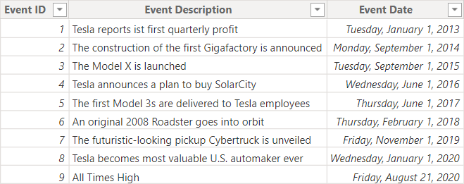
First of all, it is necessary to have a table for special events in your existing data model. This special events table should encompass columns such as the event ID, the specific date when the event took place, and a description providing details about the event. Subsequently, establish a relationship between this newly added table for special events and your existing Date table within the data model.
2. Add the Event Id to a Line chart
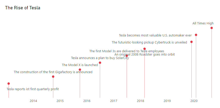
First, it’s better to visualize the special events. Therefore, add the Event id column to the line chart with the desired time interval on the x-axis. Next, set the stroke width of the line to zero and enable the markers. Additionally, if we want descriptions as labels for the markers, we will need to use Custom labels. To do this, navigate to the Data labels formatting section of the line chart and activate Custom labels. Finally, specify the Event description column as the field for the custom labels.

3. Create drop-down lines with Error Bars
To indicate the specific times at which special events occurred, we need to create drop-down lines extending down to the x-axis for the markers. To accomplish this, set the minimum value of the y-axis to either 0 or a value that improves the visibility of the markers. Furthermore, access the Error bars in the analyses tab of the line chart. Use a dummy measure with a value less than or equal to the minimum value specified for the y-axis. Set this measure as the lower bound of the error bar.
4. Add your desired calculation as a secondary y-axis
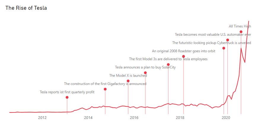
So far, we have visualized the special events as markers indicating specific dates. However, to observe the actual calculation of interest over time, such as total sales, number of orders, share price, etc., we need to add the desired measure to the secondary y-axis field of the line chart. After doing that, we should turn off the markers and data labels for the series added to the secondary y-axis, and to see the line, we need to set the stroke width of the line to 2 or a value greater than 0.
5. Use Error band to make an area chart
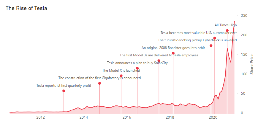
We can use the Error bars feature one more time to turn a line chart into an area chart. However, this time instead of activating the Bar option, we will turn on the Error band feature, which transforms the line chart into an area chart. To achieve this, utilize the dummy measure once again for the lower bound of the Error bar for the secondary y-axis series. Additionally, ensure that the minimum and maximum values of the secondary y-axis are properly set.
Conclusion
Line and area charts are highly beneficial for showing changes over time. However, they can be even more valuable if they incorporate special events. This blog post demonstrates a comprehensive guide on using Error bars and Custom labels to make a timeline visual. By following these step-by-step instructions, you can make a chart that effectively showcases the influence of special events over time.
How to Power BI
Watch it here
>LEARN WITH ME
Trainings
>EXPERT INSIGHTS
