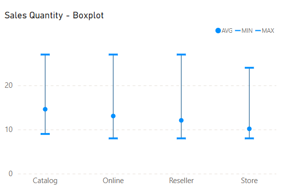
When you explore a dataset, depending only on averages might not tell you the whole story. Averages can easily be swayed by outliers, messing up how you understand things. And here's where the Box Plot provides a complete snapshot of your data's details.
A Box Plot is a statistical visualization that displays the distribution of a dataset. It consists of a rectangular "box" representing the interquartile range (IQR), and lines (whiskers) extend from the box to show the range of the data. It doesn't just highlight the median; it unfolds the full story, exposing the whole range, the interquartile range, and more.
Sadly, Power BI doesn't come with its own Box Plot visual. But don't worry; we've got some tricks ready to fix it.
Step 1: Choosing the Right Visualization
To start our journey, we pick a combo chart – Line and Stacked Column Chart visual. Just ensure the y-axis values for both the line and column parts are set to the same minimum and maximum.
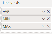
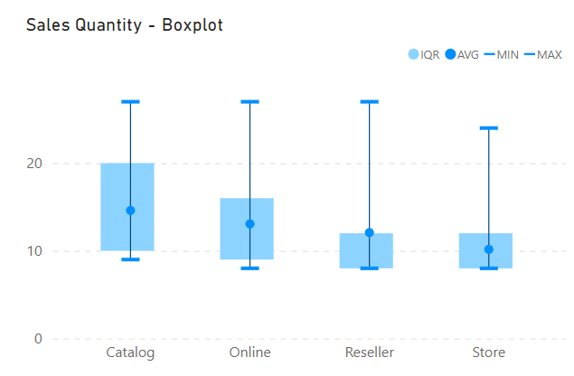
Step 2: Visualizing Min, Max, and Avg
Using the visual’s Line y-axis section, add these statistical measures—min, max, and avg. Set the stroke width of the lines to zero. Now, let's add some flair: transform the marker for minimum and maximum to a dash (-) type, and for the average, let it stand out with a circle marker. The final stroke of genius? Connect the markers with error bars, elegantly forming a line from the minimum marker to the maximum (or the other way around). This visual core will be the foundation of our Box Plot masterpiece.
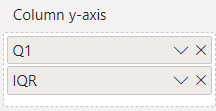
Step 3: Building the Box
Now, let's focus on the heart of the Box Plot—the Box itself. Add 25th percentile and the Interquartile Range (IQR) measures to the Column y-axis section of the visual. The IQR, the difference between the 25th and 75th percentiles, which represents the box of the box plot. To enhance clarity, set the color of the 25th percentile as the background—white in our case.

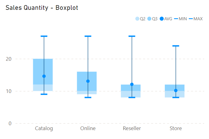
Step 4: Enhancing the Box Plot
Let's take our Box Plot to the next level with a subtle yet insightful variation. We'll highlight the median by introducing it as a line. After setting up the 25th percentile measure, add measures to represent the range from 25th to the median and from the median to the 75th percentile. To make it visually distinct, choose different colors for these two segments. This clever touch allows easy identification of the median within your Box Plot.


Conclusion: Unleashing the Power of Box Plots in Power BI
While Power BI lacks a dedicated Box Plot visual, our creative approach proves that using the Line and Stacked Column Chart visual unlocks the potential of Box Plots.
We've transformed the limitations into opportunities, showcasing the adaptability and ingenuity that Power BI developers can leverage.

