We will cover the reporting updates that stood out the most for this update, and share few practical examples along the way.
We'll be looking at
1. Date picker
2. Tooltip (Sentence Format)
3. Scatter plot - Auto fit markers
4. Axis Improvement - Round range
5. Card visual - Hover state for Images
6. Auto expand (Matrix Hierarchies)
7. Matrix & Table column width conditional formatting
8. Slicer - Selection Icon
1. Date Picker for Slicer Visual (Preview)
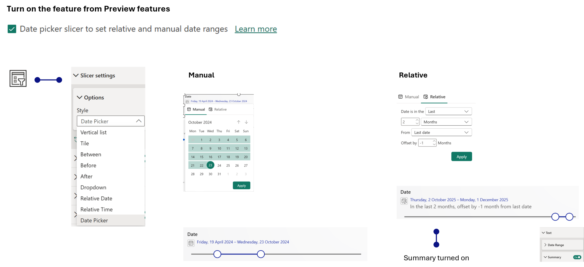
The built-in slicer now includes a new Date Picker mode, bringing relative and manual date selection together in a single experience. Instead of publishing a report with a static date range that quickly becomes outdated, you can define a relative default that automatically rolls forward as your data refreshes, while still allowing report consumers to switch to a custom range, single date, or slider whenever they need to.
This should significantly reduce report maintenance, particularly for monthly, quarterly, and rolling-period reports where date slicers often require manual updates.
To use this we have enable it in Preview features.
2. Tooltip (Sentence Format option - GA)
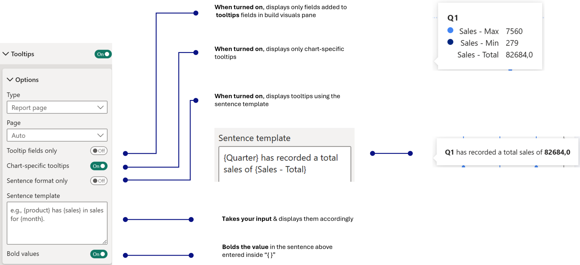
The new Sentence format only toggle is now generally available, making it easy to create descriptive tooltips without writing DAX or building dedicated tooltip pages.
Instead of simply listing field values, you can write natural-language sentences that reference tooltip fields, providing additional context and making insights much easier to understand.
This strikes a nice balance between the default tooltip and a fully custom tooltip page. It's simple to use, yet adds a surprising amount of storytelling to reports.
Few things to note,
- When all of the toggles are turned off, it displays all of them.
- If sentence is input, and if tooltip fields only (or) Chart-specific tooltips is selected, it displays the tooltip as per selection and the sentence as well
3. Scatter Chart - Auto fit Markers
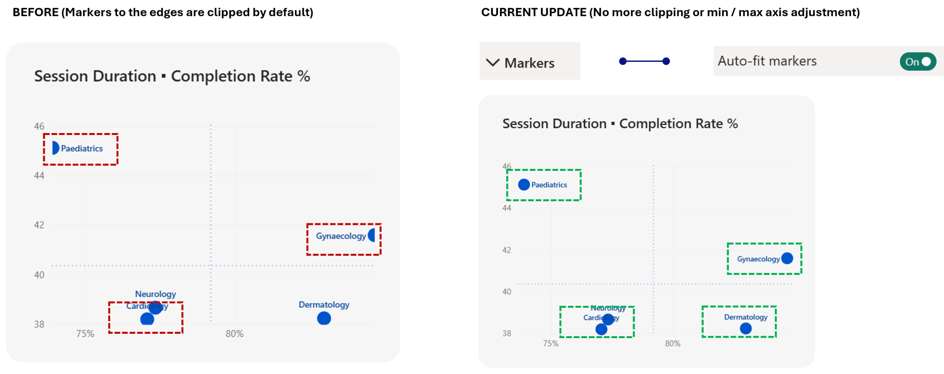
Scatter charts now include an Auto-fit markers option that automatically adjusts the plot area to ensure markers and bubbles remain fully visible, even when they're positioned near the edges of the chart.
Previously, avoiding clipped markers often meant manually adjusting axis ranges or building dynamic axis measures. Now, Power BI handles that for you.
Another great quality-of-life improvement. It quietly removes one of those formatting tasks that most developers have had to deal with at some point.
4. Axis Improvements - Round Range
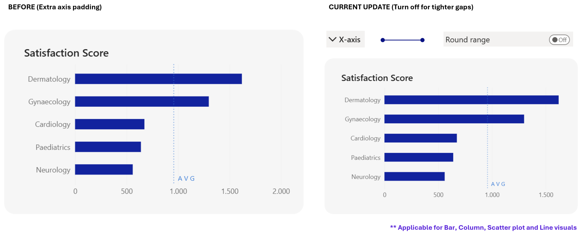
Bar and column charts now offer more control over axis behavior with the new Round Range option. By turning it off, you can remove the extra padding between the axis and your data, allowing bars or columns to start flush against the axis. The update also ensures that enabling data labels no longer changes the automatically calculated axis range.
While subtle, these improvements make it easier to create tighter, more consistent chart layouts.
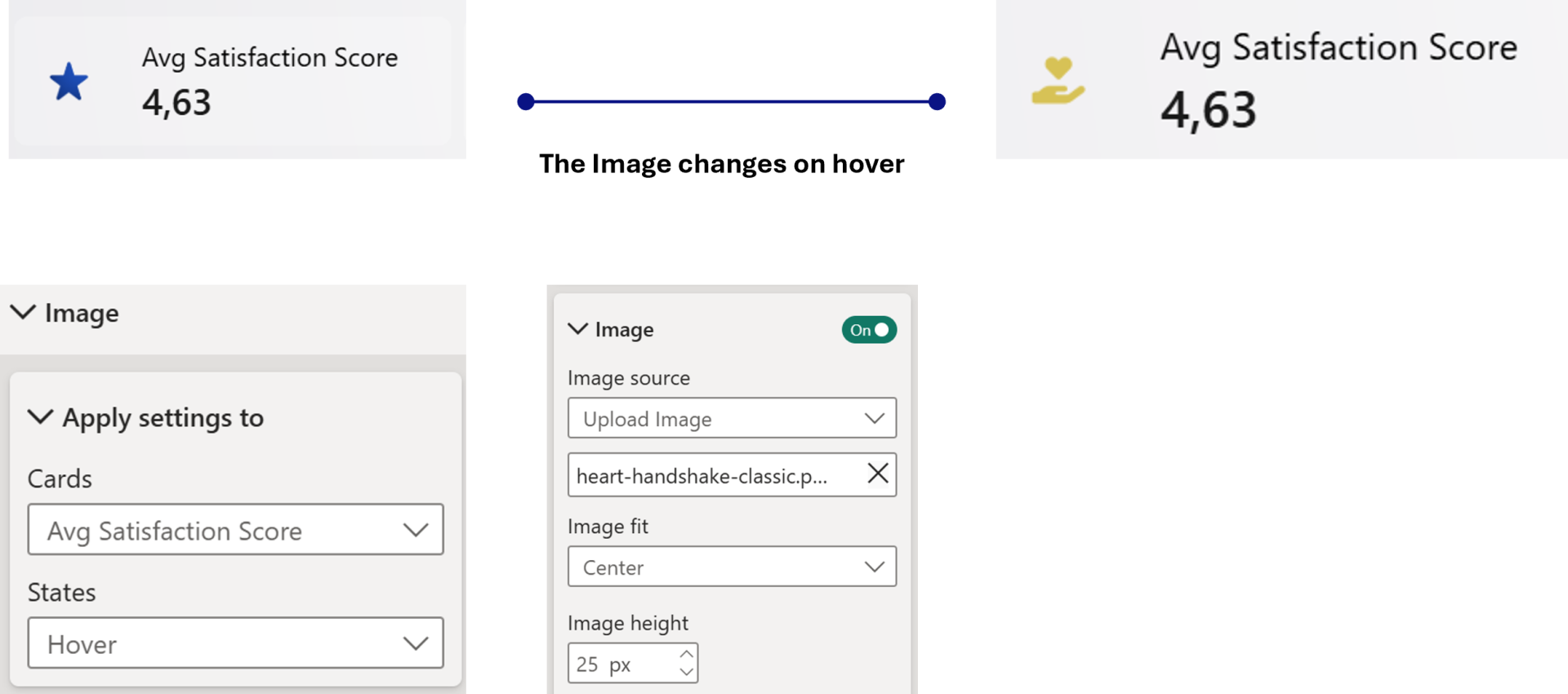
5. Hover State for Images - Card Visual
Card visuals now support hover states for images, allowing you to define a different image, transparency, effects, or background colour when users hover over a card.
This makes it much easier to create cards that feel interactive, particularly when they're used for navigation or as clickable report elements.
You can see in the image below, how it is setup, however there are few things to keep in mind,
- If images are set for default and hover, the image changes accordingly as per state.
- If no image is set for hover, it will be shown empty for hover state.
- If state is set to All, and the images is added, then it is applicable for default and hover state.
6. Auto Expand for Matrix Row & Column Headers
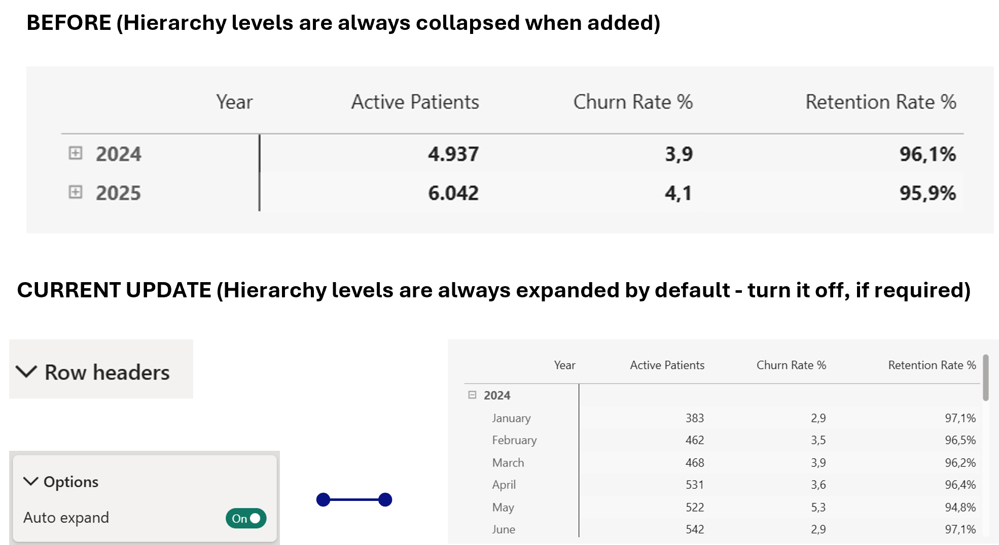
Matrix visuals now let you configure Auto expand for both row and column headers. When enabled, any new hierarchy levels added to the matrix - whether by the report developer or through Personalize this visual - are automatically expanded instead of appearing collapsed by default.
This creates a much smoother experience when exploring hierarchical data, removing the need for users to manually expand every newly added level before they can see the detail.
7. Conditional Formatting for Column width (Table & Matrix)
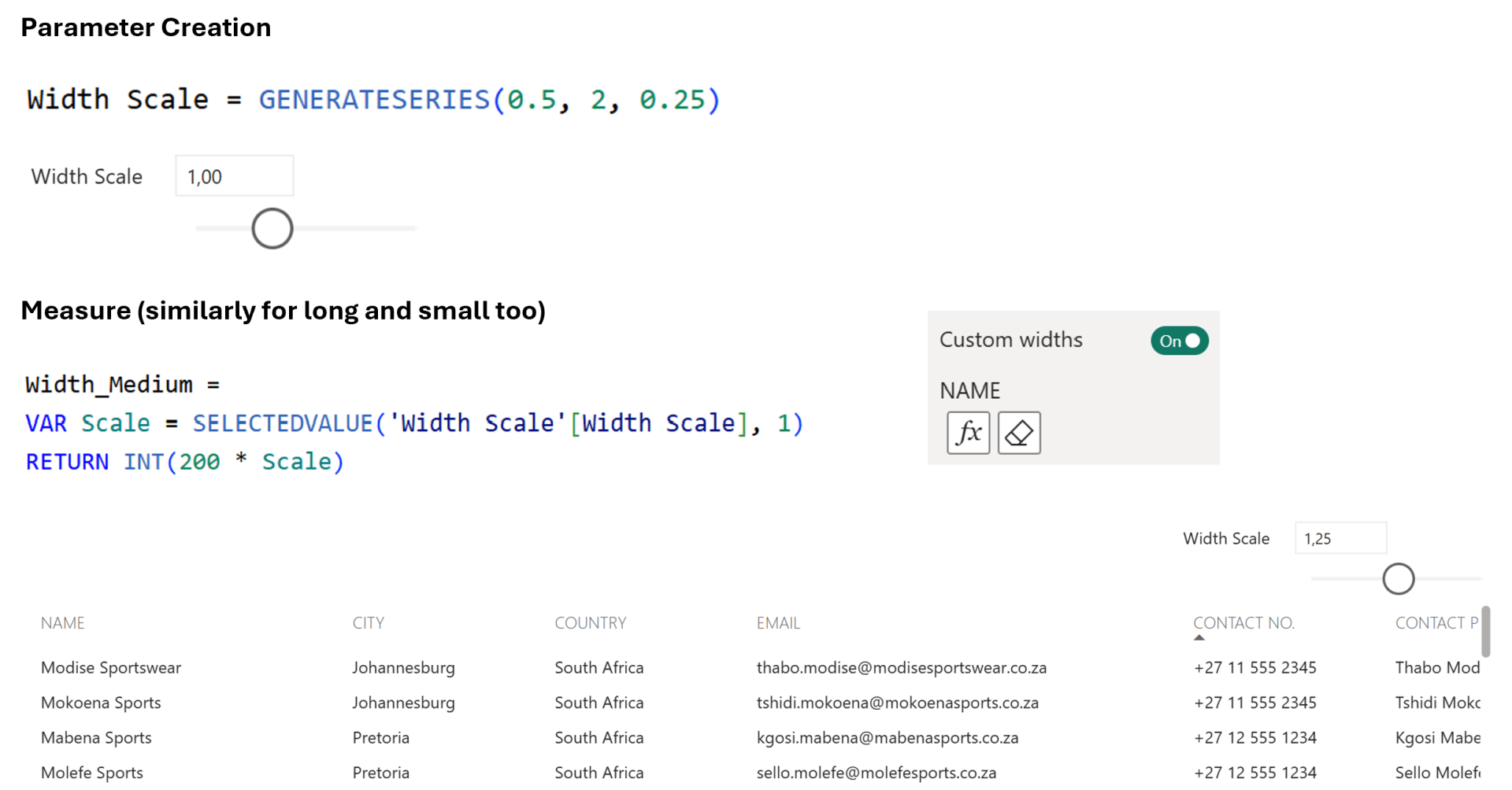
Following May's introduction of Custom Column Widths, June takes the feature a step further by adding conditional formatting for column widths.
Instead of defining fixed widths manually, you can now drive them dynamically using formatting rules - for example, by connecting them to a What-If parameter. This opens up interesting possibilities where report consumers can adjust column widths themselves or where layouts can adapt to different reporting scenarios.
I love seeing Microsoft iterate on features this quickly. May gave us manual control; June already makes it dynamic.
8. Slicer Selection Icon
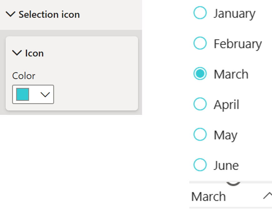
Slicers now let you customise the colour of their selection icons (checkboxes and radio buttons). Previously, these icons used a fixed colour, which could become difficult to see when working with dark themes or branded report designs.
With this update, you can choose colours that better match your report while maintaining clear visual feedback for users.
It's a tiny feature, but one most of them wanted for a while. If you've ever built a dark-themed report, you'll immediately appreciate it.
And there you go, my hot take for the Jun 2026 Power BI Update!
Hope you like it!
Give it a try and see how it works for you! I’d love to hear what you think or see how you use this trick in your own reports.