There are some interesting updates in July version - that make everyday report development smoother. Whether you're designing reports with consistent branding, creating more dynamic visuals, improving navigation, or writing DAX, these updates will matter more than you think.
Let's take a look at the reporting features that I think will have the biggest impact.
We'll be looking at
1. Customize theme in format pane (Preview)
2. Conditional Formatting for Line Charts & Legends (Generally Available)
3. Report Page Tab Navigation Improvements
4. DAX Query View – Triple-Slash (///) Comments
1. Update Your Report Defaults & Color Palettes (Preview)
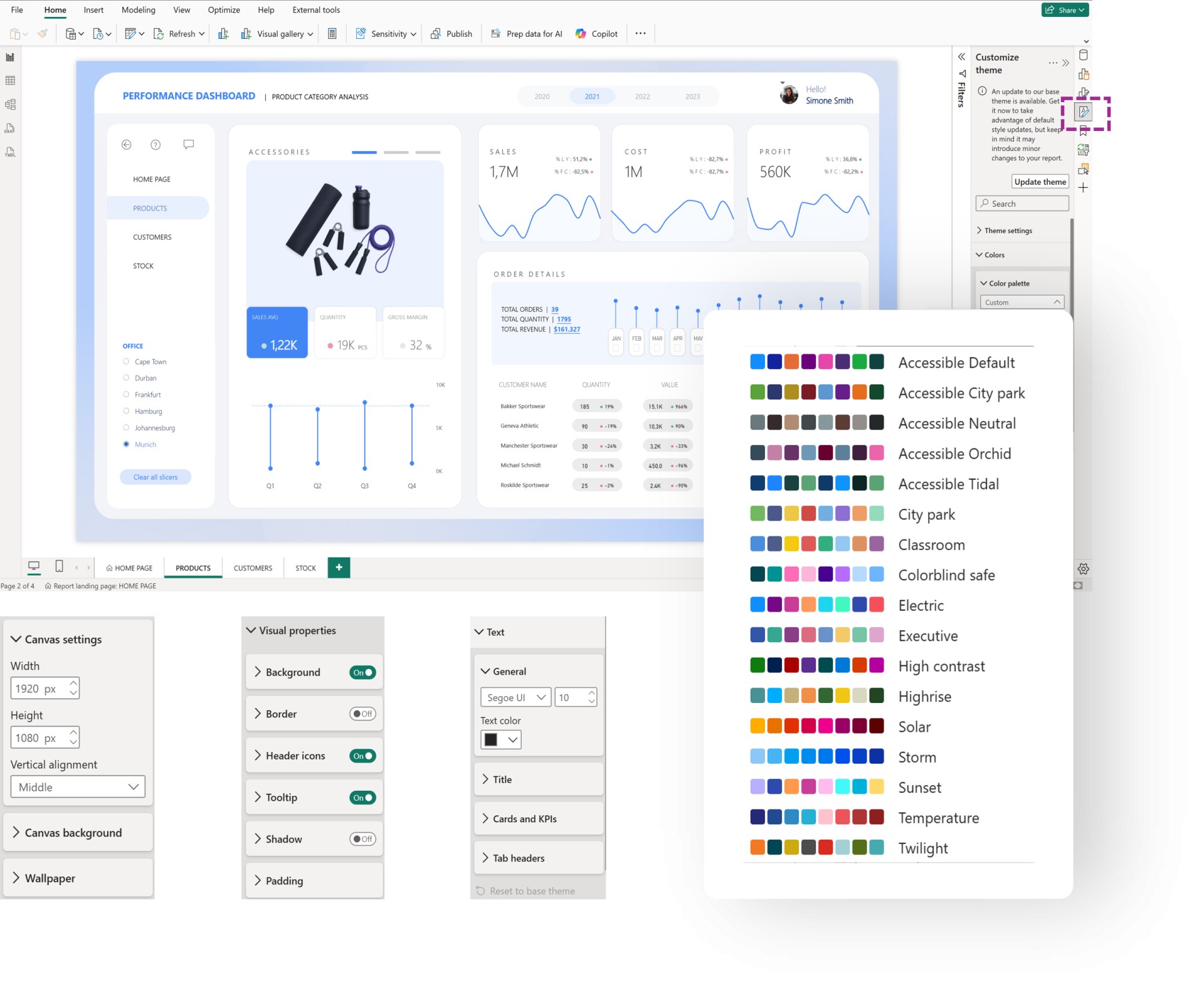
One of the standout additions in this month's update is the new Customize current theme experience, now available directly from the Format pane. When no visual is selected, you can access report-wide styling options, including built-in color palettes, as well as default settings for borders, headers, tooltips, shadows, padding, corner radius, and more.
One feature I particularly like is how the customizations are handled. Example, when you apply a new color palette, it doesn't overwrite your existing customizations, instead, it respects and preserves them while updating the report's overall look and feel. You can also update page-level settings such as the page size, background, and wallpaper, with new visuals automatically inheriting these defaults.
All of these changes are layered on top of your existing base theme, creating a customized theme that can be exported and shared across your organization for consistent report design.
Note: Turn on the feature from Preview features
2. Conditional Formatting for line charts & visuals with legends (GA)
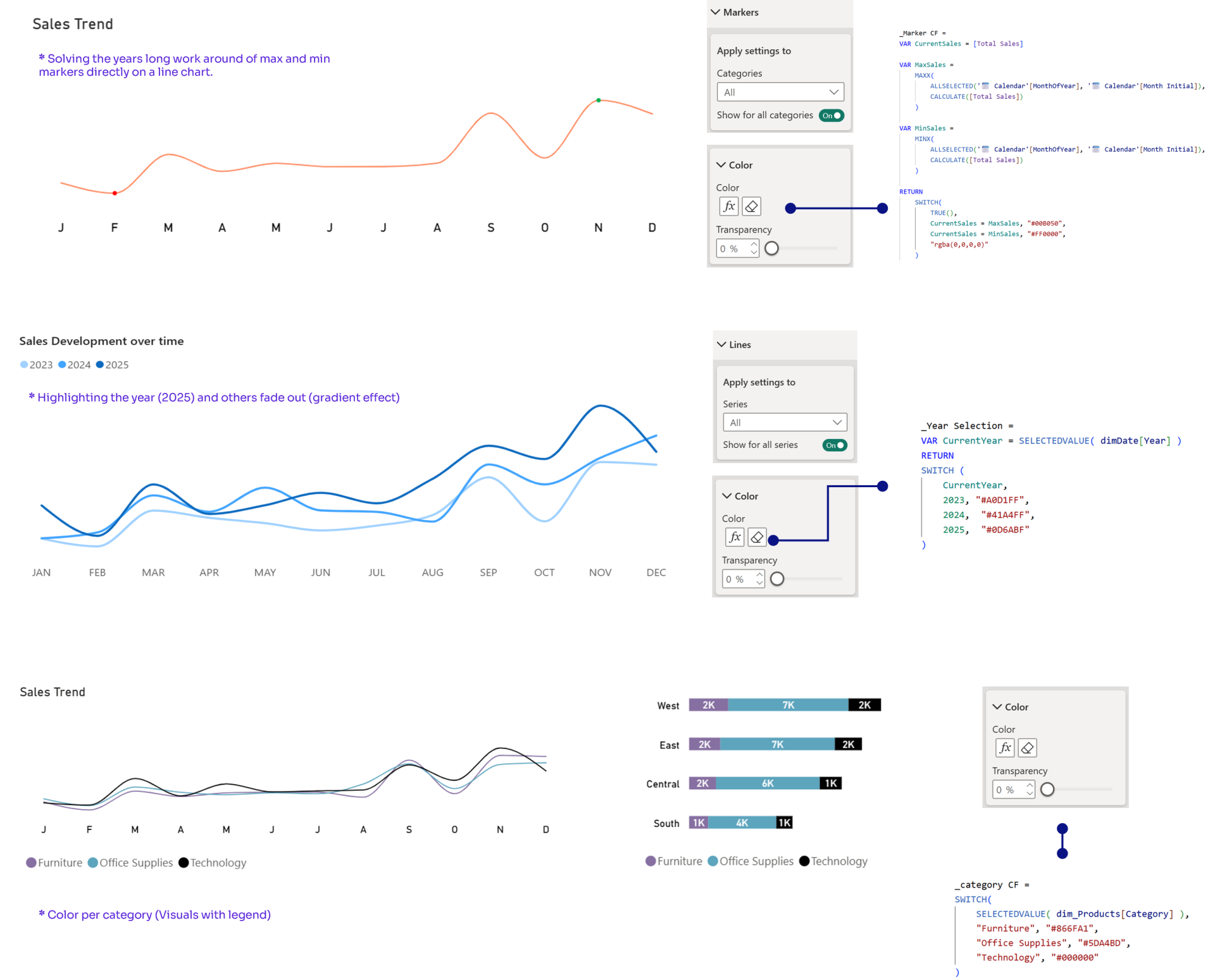
You can now dynamically format line colours in line charts, as well as colours for visuals that use legends, including bar, column, pie, donut, and line charts.
Previously, dynamic coloring often required workarounds (like converting to column chart and back, adding extra series, etc.) for these scenarios. Now, you can drive colours directly from your data, making it easier to highlight performance, thresholds, or categories without sacrificing consistency.
Things to note,
- Markers and series labels auto-inherit the formatting, unless set separately
- Legend visuals: color by a single DAX measure for consistent colors across all visuals (e.g., same segment = same color everywhere), Update the measure once, and every visual updates instantly
- Line Chart - Interesting thing to try with this new update is setting up gradient. Example, YOY comparisons / Categories (as legends)
A short video here.
3. DAX Query View – Triple-Slash Comments /// (GA)
A small but incredibly useful enhancement arrives in DAX Query View with support for triple-slash (///) comments that helps to create measure descriptions inline when writing DAX, making documentation easier.
Earlier it used to be a 2 step process - you write in DAX Query View, then navigate to Model View and add the description.
Now, you can
directly add the description in DAX Query view, by adding /// comments.
A short video
here.

4. Report Page Tab Navigation Improvements
This might seem tiny, but just imagine you have a 15+ report pages and suddenly you decide to switch the page 2 to page 13, all you have to do
Is - Drag, stop, scroll, repeat.
With the new update, you can keep
dragging and the tab
continues to scroll until you reach the intended page.
A short video
here.

And there you go, my hot take for the Jul 2026 Power BI Update!
Hope you like it!
Give it a try and see how it works for you! I’d love to hear what you think or see how you use this trick in your own reports.