Getting Started with the New Card VisualMake sure you're using the March 2025 version or later. You’ll need the updated
Card (new) visual to follow this tutorial.
We’ll build a dashboard showing employee profiles with slicers for search and filtering, dynamic images, and formatted text elements.
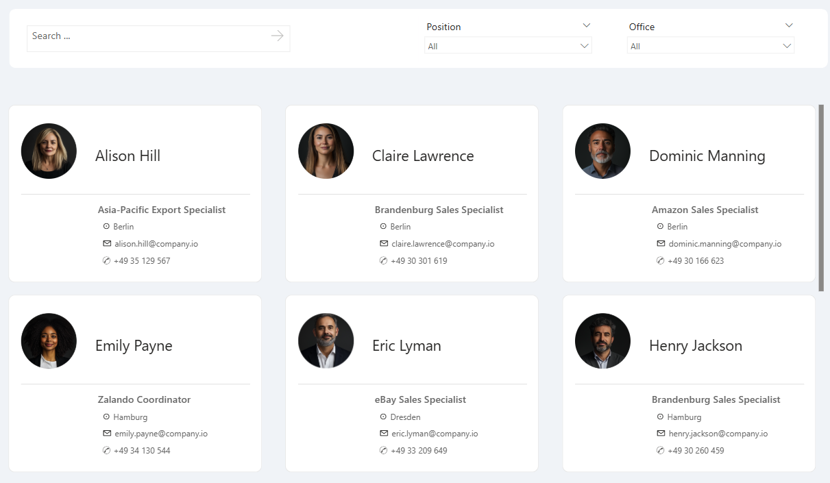
Setting Up Filters and SlicersStart by inserting the following slicers:
- Dropdown slicers for Office and Position.
- Text search slicer for employee names (a newer addition to Power BI).
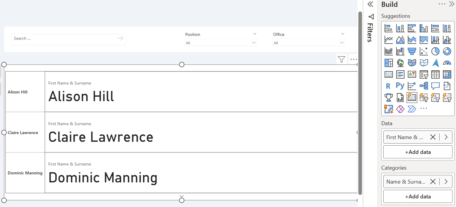
Inserting and Configuring the Card Visual
- Insert the new card visual.
- For the categories, select the employee name (e.g., "Name and Surname").
- Use the same field again for the callout value.
Next, let's make the magic happen.
Dynamic Colors Using Conditional Formatting
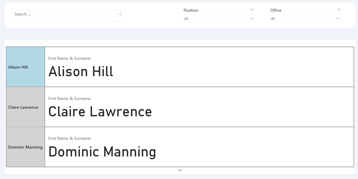
The March 2025 update lets us apply conditional formatting based on the filter context. You can now assign different colors or images depending on the current item.
1. Create a measure (e.g., CF test) that returns a color based on employee name.
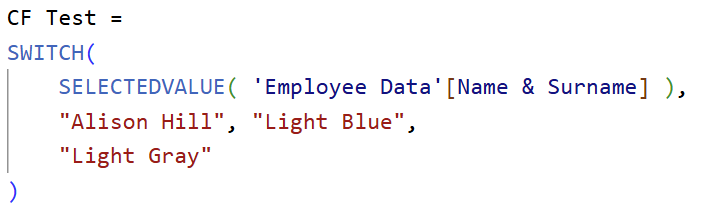
2. Go to
Formatting > Small Multiples Header > Background.
3. Turn on conditional formatting using the FX button and select your measure.
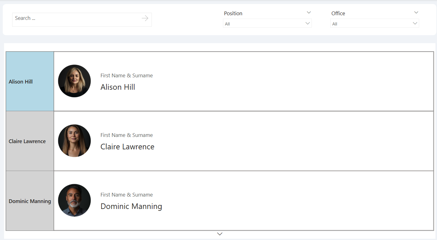
Adding Dynamic Images
To show a unique image for each employee:
- Go to Formatting > Images.
- Enable Image and switch to Image URL.
- Either use a measure that returns the correct URL or bind a column with image links.
Tip: Make sure your image URLs are publicly accessible.
Then style:
- Set image size to ~100px.
- Set image position to left of text.
- Add spacing between image and text (e.g., 30px).
Reference Labels for Additional Info
Let’s add more information like position, office, email, and phone.
- Go to Reference Labels.
- Select the series ("Name and Surname").
- Add the fields: Position, Office, Email, and Phone.
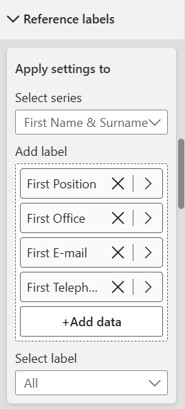
- Turn off the titles (e.g., "First Position", "First Office").
- Turn off the background color and borders.
- Change text color and font style as needed.
You can also emphasize specific fields, such as making the position bold with Segoe UI Semibold.
Final Layout Adjustments
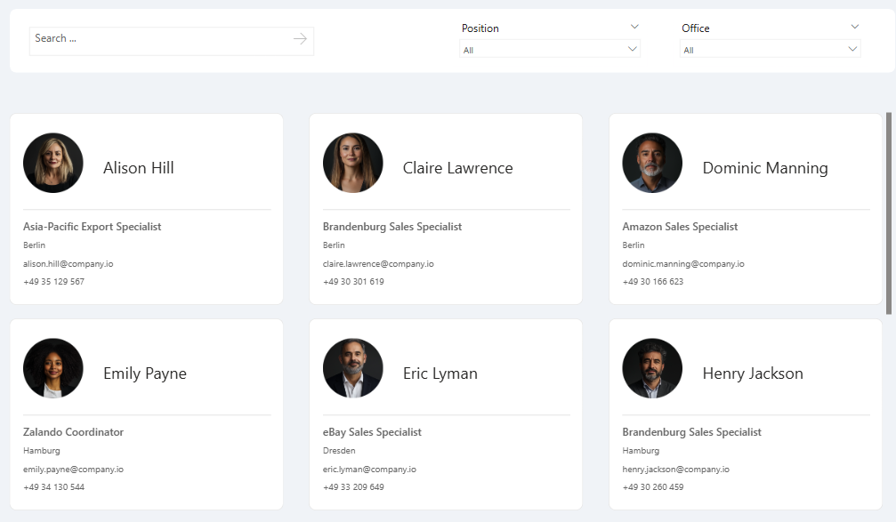
- Go to Small Multiples > Layout.
- Switch from single column to grid layout.
- Set max rows to 2 and columns to 3.
- Enable Continuous scroll (instead of paginated) to avoid hidden pages.
To keep all cards the same size:
- Turn on "Fix number of tiles" under layout options.
Also, customize:
- Row and column spacing.
- Card padding and border radius (e.g., 10px).
- Border colors and alignments.
Bonus: Add Icons to Reference LabelsMake your cards pop with icons:
- Turn on the title for a reference label (e.g., email).
- Set to Custom and paste a Unicode icon (via Win + .) or copy from a site like emptycharacter.com for spacing.
Repeat for phone, office, etc.
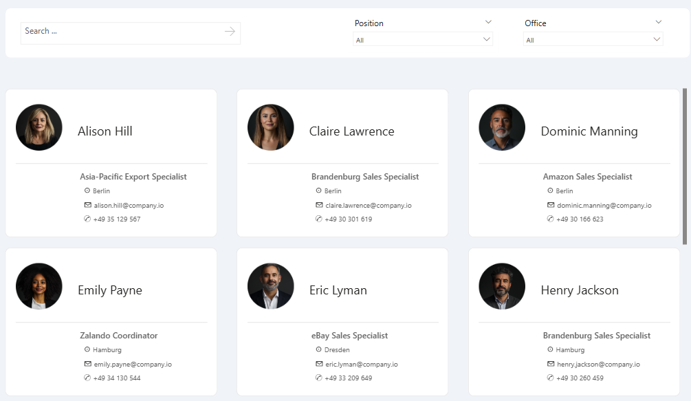
Tip: Add empty characters before the text to indent and align fields without changing layout.
Wrap-Up
This new version of the card visual unlocks interactive dashboards that were previously difficult or even impossible to build natively. Whether you're building dashboards for HR, projects, or products, this approach makes your reports smarter and more engaging.
Hope you like it!
Give it a try and see how it works for you! I’d love to hear what you think or see how you use this trick in your own reports.