Traditional bar charts are great for comparing totals, but they don't expose the individual records behind the numbers. A matrix-based unit chart solves this by representing each value as a collection of equally sized cells. Each cell can carry its own metadata, enabling rich interactions like tooltips and highlighting. Let's build this visualization from scratch and understand how the matrix layout makes it work.
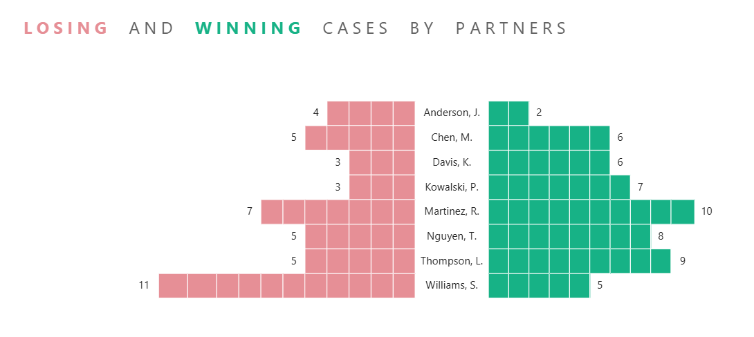
What we are building
This chart can be used for example when tracking won vs. lost cases by partner in a law firm or a factory tracking defect events per machine. Let's take the first example: Wins go right, losses go left, and hovering over any block surfaces the case details in a tooltip. The core of the visual is gonna be a matrix visual with a few tricks applied.
Step 1 - Create a helper table
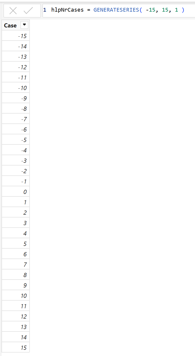
The whole chart depends on a disconnected helper table that defines your column range. Go to Modeling - New Table and enter as in image.
Step 2 - Create the necessary measures
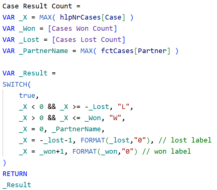
This is the core of the whole chart. In every cell, the measure asks: which column am I in? Based on that X value, it returns an L (lost square), a W (won square), the partner name at zero, a count label just outside the filled range, or blank everywhere else.
_X is the column number the measure is currently evaluating. If it falls within the loss range it returns "L", within the win range it returns "W", at zero it returns the partner name to create the tornado effect, and one step beyond each range it returns the count as a label.
Step 3 - Set up a matrix visual
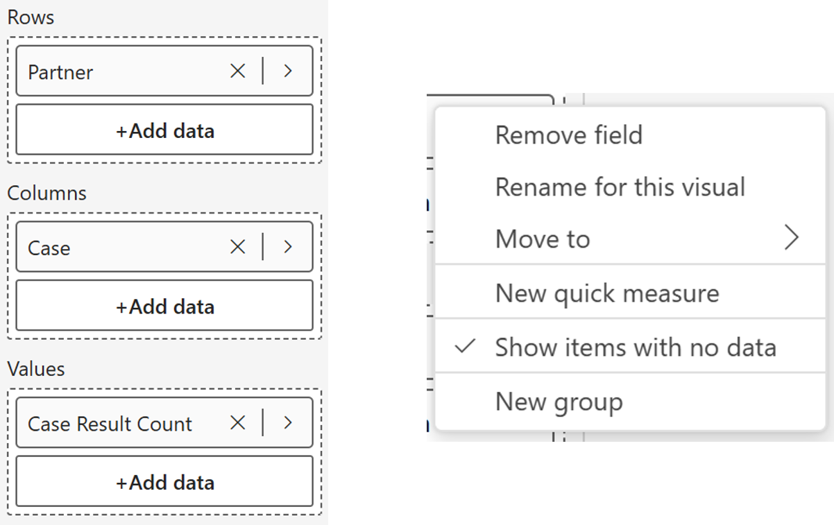
Insert a matrix visual and set it up as follows:
- Rows - Partner
- Columns - Case (from hlpNrCases)
- Values - Case Result Count
Once the fields are in, right-click on the Case column header in the matrix and turn on Show items with no data. This ensures all columns across the full range are visible even when a partner has fewer cases than the range allows.
Declutter the visual - Turn off row subtotals, column subtotals, and the visual title.
Step 4 - Apply conditional formatting
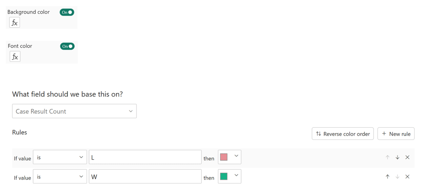
Go to Format → Cell elements → Background color → Turn on → fx (rule-based). Set rules based on the Case Result Count measure value:
- If value equals "L" - red background
- If value equals "W" - green background
Then apply the exact same rules to font color. This makes the W and L text invisible against their backgrounds, leaving you with clean colored blocks and nothing else.
Step 5 - Turn on gridlines
This is what makes it a waffle.
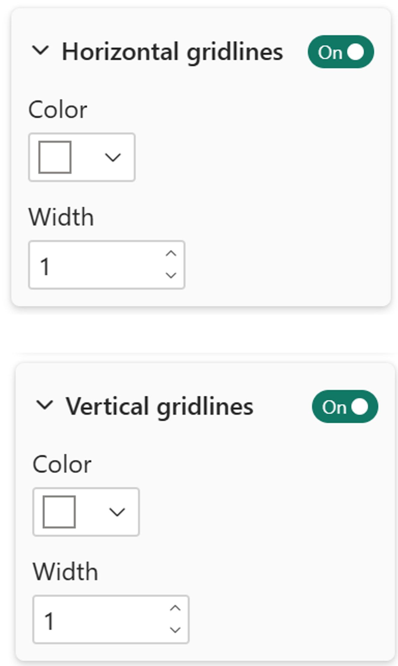
Go to Format - Grid
- Turn on both horizontal and vertical grid lines.
- Set both to white and adjust the width to taste.
- This is what creates the waffle effect between the blocks.
Step 6 - Clean up the headers
For row headers - turn off text wrap, then resize the row header width all the way down until it disappears. The partner names are already showing up inside the zero column blocks via the measure, so the row header is redundant.
For column headers - turn off text wrap, set the font color to white so the case numbers are hidden, and turn off the border under the column headers.
Then go to Values - Specific column and set the alignment to center for the partner name column so the names sit neatly in the middle of the chart.
Step 7 - Bonus: per-case tooltips
Here is the part that makes the tooltip possible. The helper table has no relationship to your cases table, so there is no natural way to connect a block in the matrix to a specific case row.
The solution is a calculated column that assigns each case a unique sequence number - negative for losses, positive for wins - that mirrors the column numbering in the matrix.
Add this to your cases table,
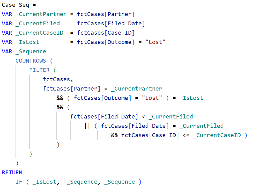
For each case row, this counts how many cases the same partner had with the same outcome filed on or before that date, and uses that count as the sequence number. Lost cases get a negative number, won cases get a positive one - matching exactly the column layout in the matrix.
Create the tooltip measuresWith Case Seq in place, you can now pull case-level details into a tooltip by matching the sequence number to the current matrix column. Lets create 2 separate measures for that.
Both measures filter the cases table to the row where Case Seq matches the column number being hovered, then return the value from that row. Simple idea, but it is what bridges the gap between a disconnected helper table and your actual case data.

Set up the tooltip page
Create a new report page, mark it as a tooltip page in the page settings. Add a visual with info you want. Then go back to your matrix visual on the main page, open Format - Tooltips, and point it to that tooltip page.
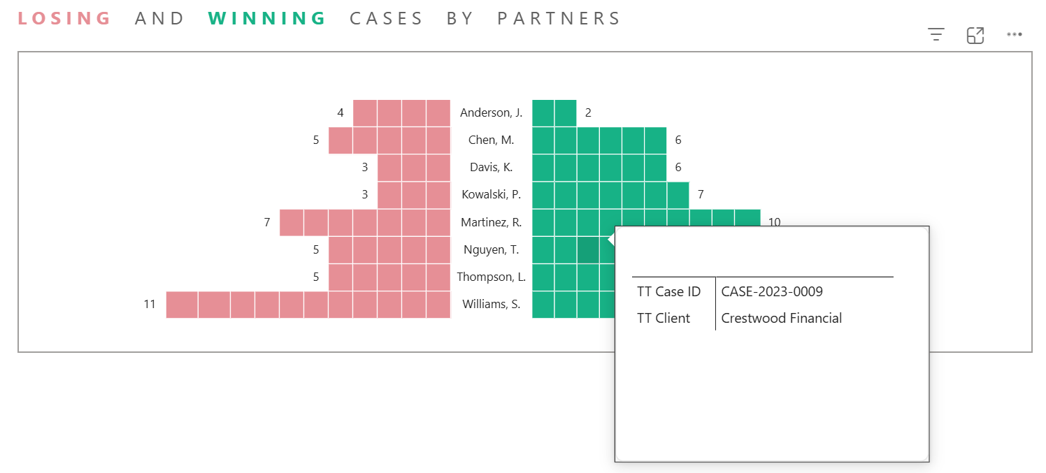
And there you go!
Clean overview with full detail on demand for every case (unit). That's what this visual does that a bar chart won't.
Hope you like it!
Give it a try and see how it works for you! I’d love to hear what you think or see how you use this trick in your own reports.