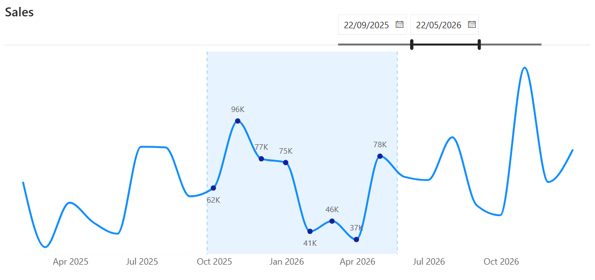
Your reader picks a start date and an end date. The range between them gets shaded, the data labels appear only inside it, and the rest of the line keeps running for context.
That's a focus range. Here's how to build it in Power BI.
Step 1: Set up the Visual
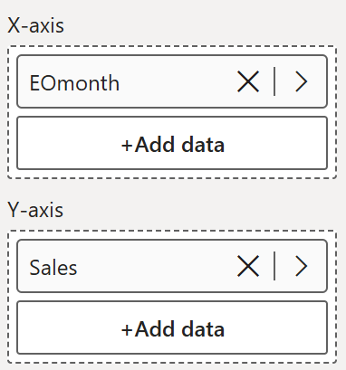
- Insert a line chart
- Add a continuous date field onto the x-axis (Here, end of month dates -> EOMonth)
- Add your measure (here Sales) onto the y-axis
That is the foundation everything else builds on.
Step 2: Set up a disconnected slicer
Here is something we need to set up first. The slicer that drives the focus range needs to be disconnected from the rest of the data model, otherwise it would filter the line chart.
In the data model, create a new table called dimDate Slicer. No connections to anything else, it just returns a list of all the date values you are using on your x-axis:
Once you have that, set up your slicer:
- Insert a slicer and use the Date Field from dimDate Slicer
- Set the slicer style to Between, this gives you the date picker
- Turn off the header and the background

One important thing - go to Format, Edit Interactions, and make sure the slicer is set to filter the line chart. It will not visually change what dates show on the chart, but the visual still needs to register the selection. That filter interaction is what makes everything else work.
Step 3: Add Start Date and End Date measures
Create these two measures, so that we will use them for our reference lines, and visual calculations later.


Step 4 : Add reference lines and shading
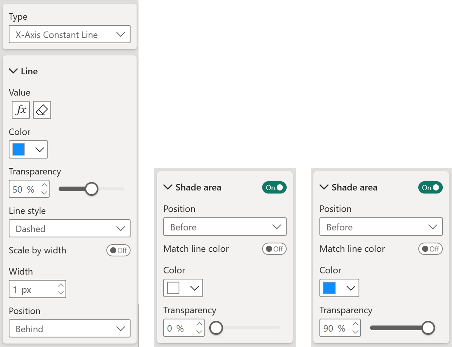
Go to the Formatting pane - Reference line and add two x-axis constant lines - one for the start date and one for the end date.
For each line:
- Set the line color, transparency as you like
- Set the line style to dashed, or style as you like
- Set the position to Behind so the line sits behind the data points
- Adjust the width to your preference
For the shaded area:
- Under each reference line, find the Shade Area setting and turn it on (the setup for shade area differs a bit for start and end date)
- For the end date set a light shade before the line so it frames the window without overpowering.
- For the start date also add the shade area before the line but make it white (or the same color as the chart background) with 0% transparency. This is the trick -> the start date's white shade overwrites the part of the end date's shade that extends past it, leaving only the window shaded.
Step 5 : Create the visual calculations
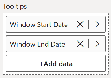
Now for the interesting part, add a visual calculation to the line y-axis. Before you do that we need to add the measures we created (start and end date) to the tooltips, since we are going to reference them in our visual calculation. (As we already know visual calculations use those that's already there in the visual)
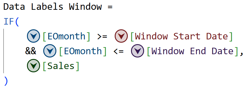
This visual calculation returns the period we select from the slicer.
At this point the chart has an extra line running across it, which looks a bit of a mess. Let's clean it up next.
Step 6 : Declutter the visual- Go to Lines and turn off the line for Data Labels Window
- Keep the Sales line on and set the style to Smooth and the width
- Go to Markers, select the Data Labels Window series, turn markers on and style them however you like - add borders to make them pop
- Turn off the legend, the axis titles, and the y-axis values
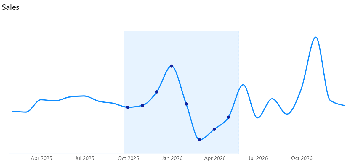
Step 7 : Add and format data labels
For the final touch, turn on data labels, but only for the Data Labels Window series. This keeps the labels clean and focused purely on the selected range.
Now go ahead and test it with the slicer. Change the start and end dates and you will see the markers appear and disappear within the selected window while the sales line runs continuously across the full time series.
That is it! A fully focused, dynamic line chart that highlights exactly what your user wants to see.
Hope you like it!
Give it a try and see how it works for you! I’d love to hear what you think or see how you use this trick in your own reports.