In this tutorial, you'll learn how to visualize and animate delivery routes using GPS data, time dimensions, and a dynamic play axis.
Step 1: Ensure You Have the Right Version
You’ll need the
November 2024 version or later.
Check your version via:
Help → About in Power BI Desktop.
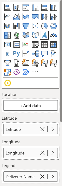
Step 2: Add the Azure Map Visual
- Insert an Azure Map visual from the visual pane.
- Resize it on your report canvas.
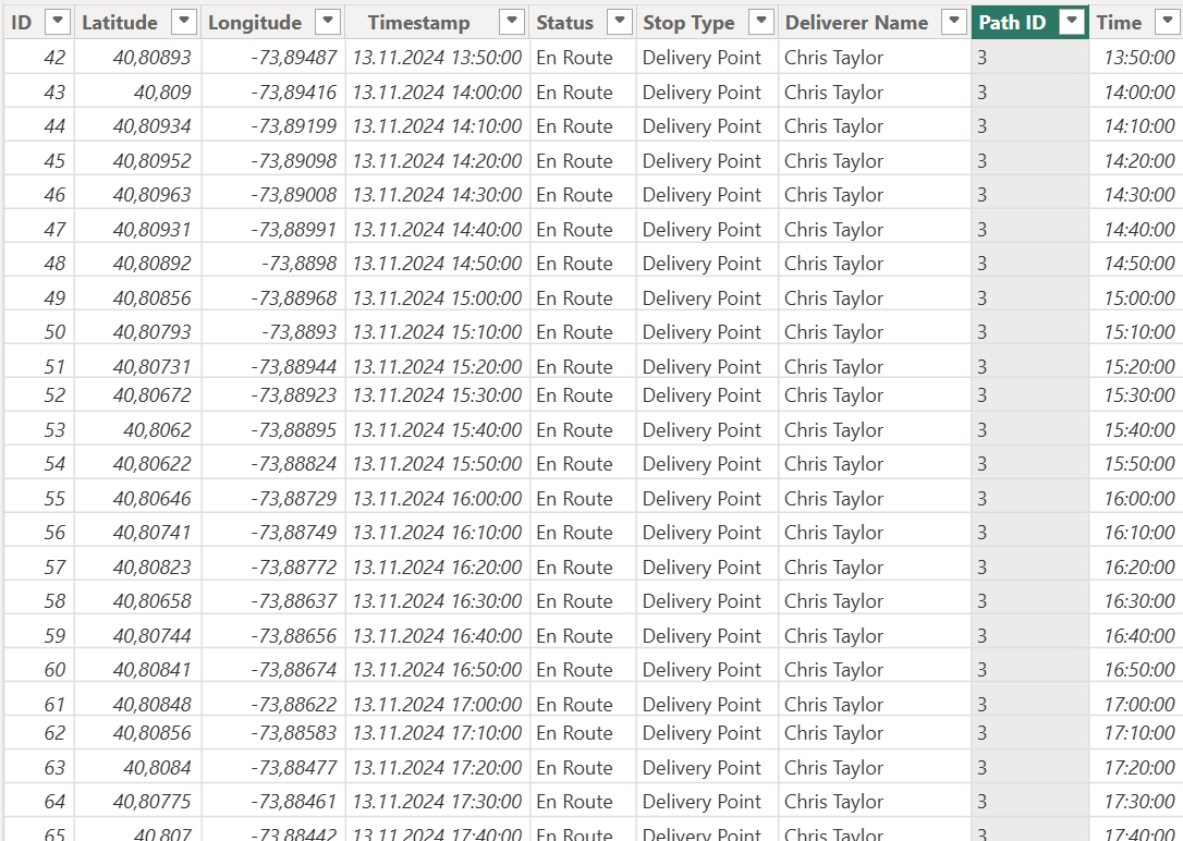
Step 3: Add Latitude and LongitudeFrom your dataset:
- Drag Latitude into the Latitude field.
- Drag Longitude into the Longitude field.
This plots all delivery points on the map.
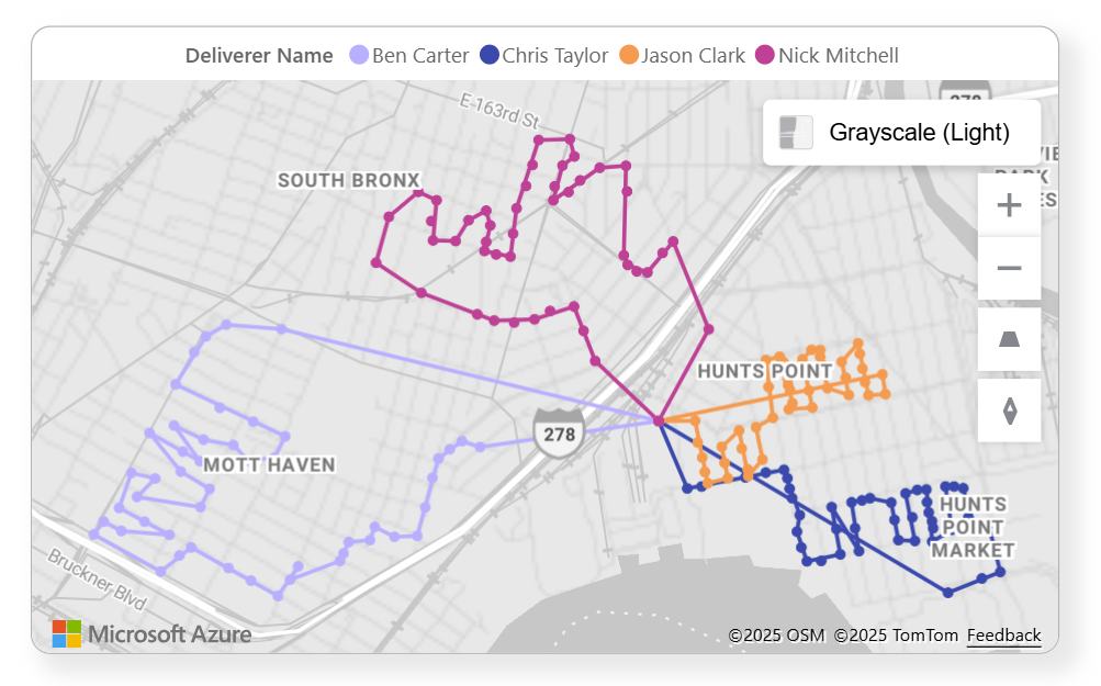
Step 4: Differentiate Delivery AgentsTo distinguish each route:
- Add Deliverer Name to the Legend field.
Step 5: Use Path Layer to Connect PointsTo draw lines between points:
- Use Path ID to define separate routes per agent.
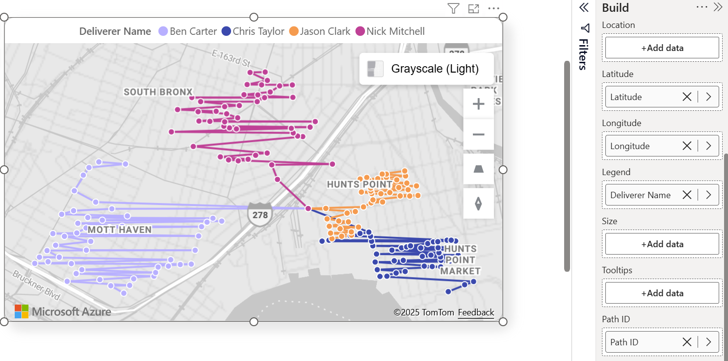
- Use Point Order to determine the sequence of each route.
From your data:
- Add a column (e.g. RouteID) to use as Path ID.
- Add a delivery sequence column (Time) to use as Point Order.
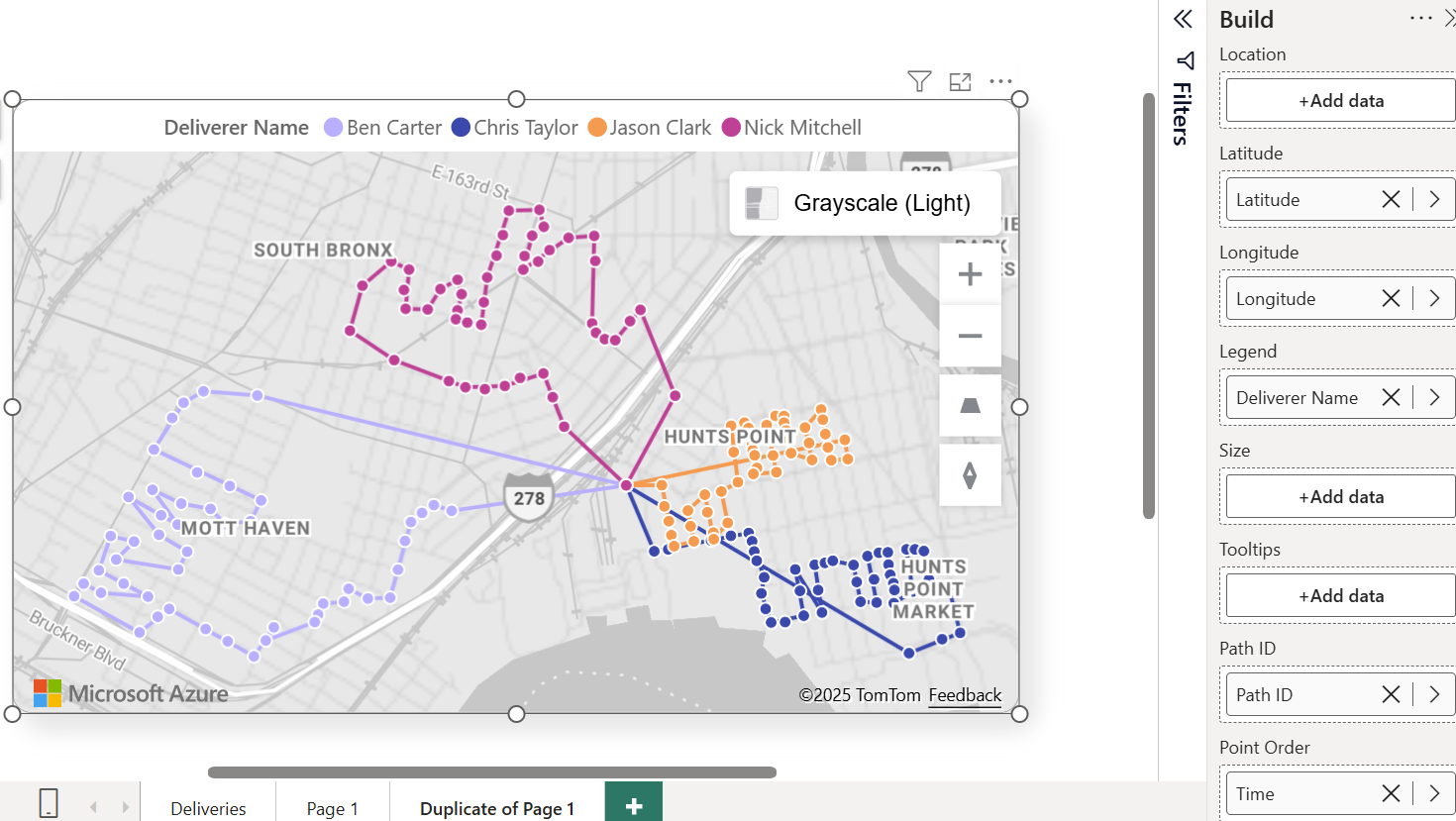
Step 6: Style the Map for ClarityAdjust the map look:
- Change base style to Grayscale Light.
- Remove borders from bubbles.
- Resize bubbles and adjust shadow effects.
- Center the legend and disable the title.
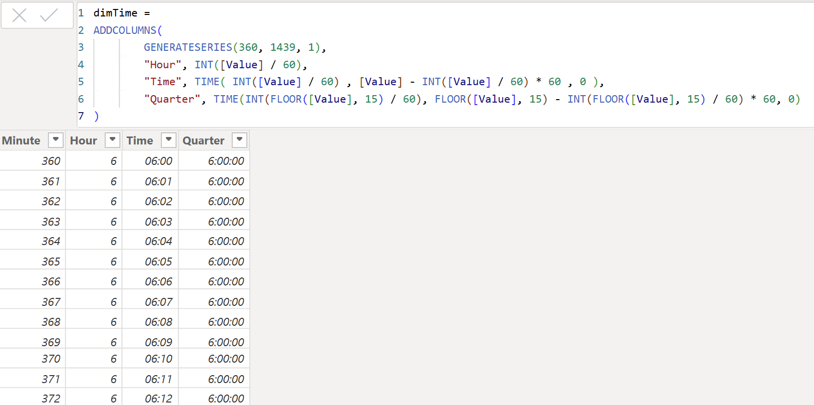
Step 7: Build a Time Dimension TableCreate a
Time table with:
- Time
- Hour
- Minute
- Optional: Quarter-hour buckets
Connect Time from the Time table to the delivery Time column with a one-to-many relationship (single filter direction).
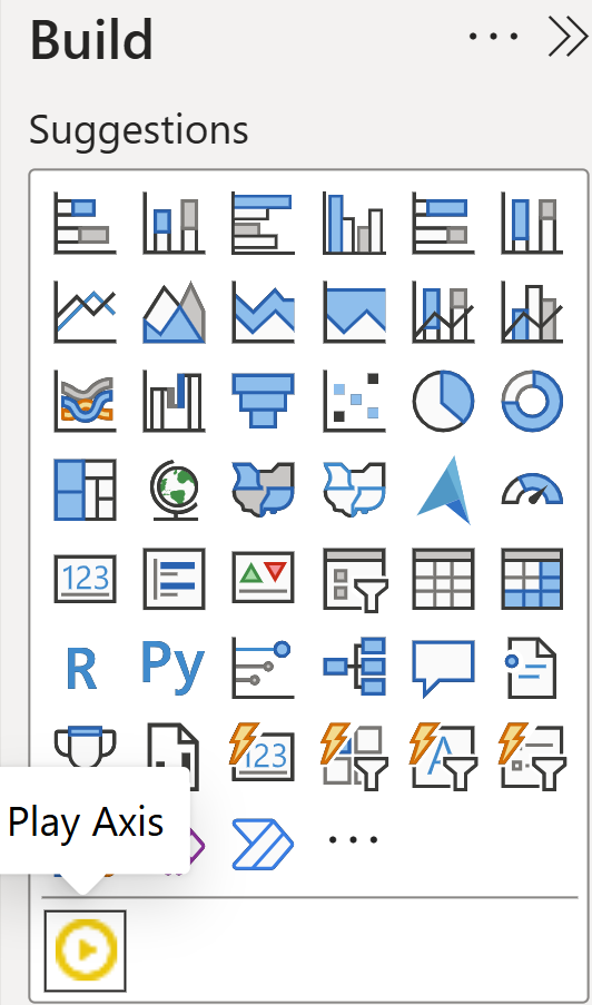
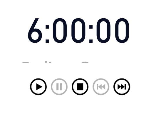
Step 8: Add the Play Axis Custom Visual1. Go to
Visuals > Get more visuals.
2. Search for Play Axis.
3. Add it and position it beside your map.
Use the quarter-hour bucket as the field.
Step 9: Display Current Time Filter with a CardAdd a
Card visual:
• Show the selected quarter-hour bucket from the time table.
Step 10: Filter Deliveries Using a DAX MeasureDisconnect the relationship between
Time and
Deliveries in model view.
Then create a filter measure in the Time table:
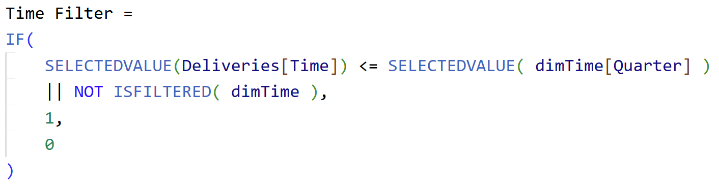
This ensures:
- Only deliveries up to the selected time are shown.
- All deliveries are shown when no filter is applied (static mode).
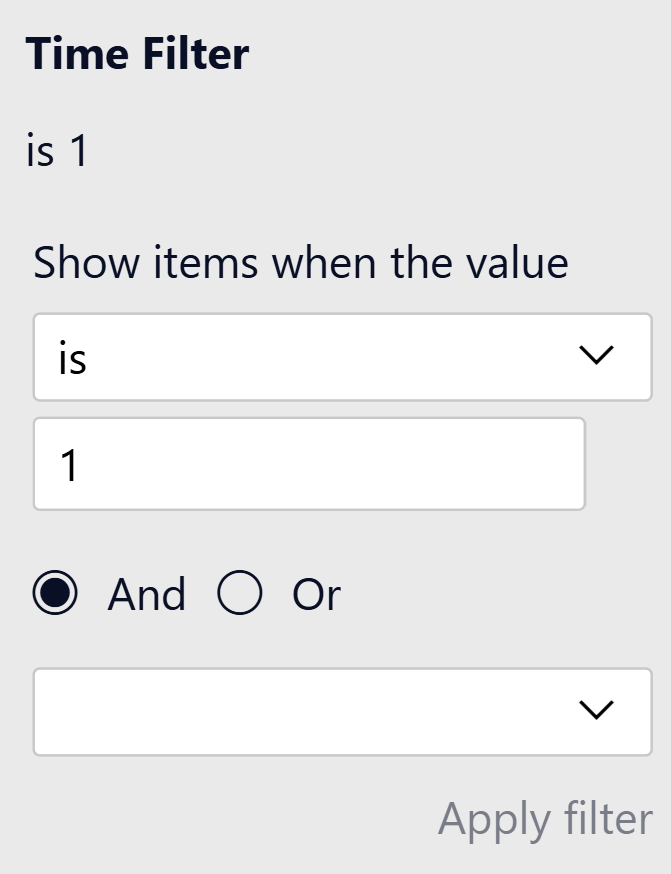
Step 11: Apply the Time Filter to the Map1. Select the
Map visual.
2. Open the Filter pane.
3. Add Time Filter to visual-level filters.
4. Set it to show only where value = 1.
Now play the animation and watch the lines appear as time progresses!
Optional: Tune Animation Speed and Layout- Reduce animation duration (e.g. 250 ms).
- Group visuals (Play Axis + Time Card + Map) for cleaner layout.
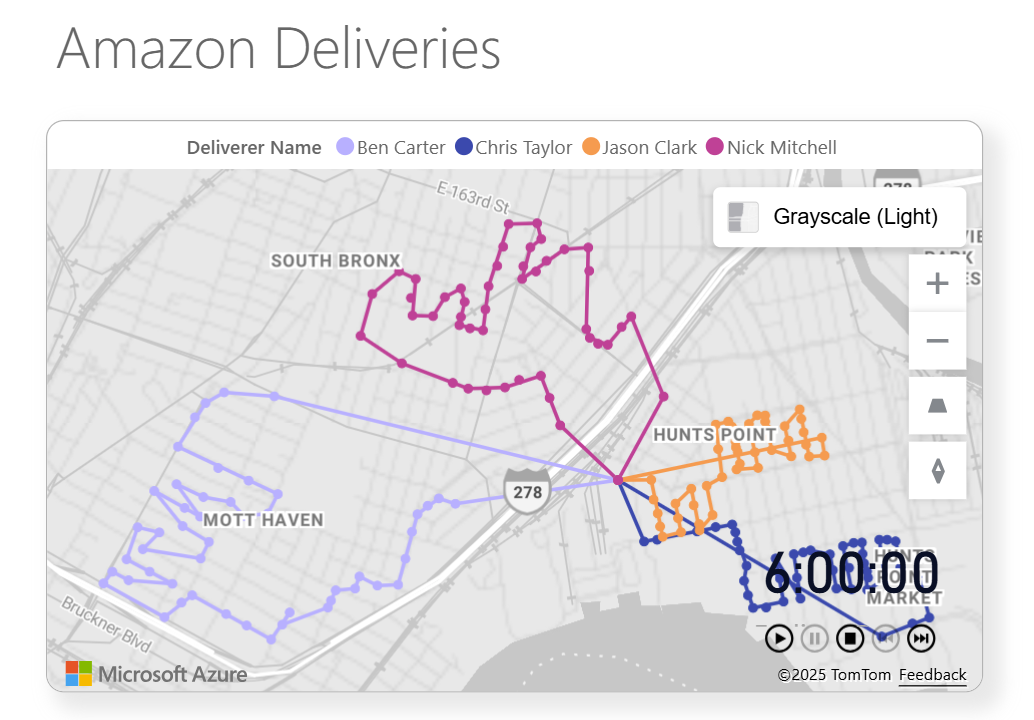
Final Result
Press play, and watch the delivery routes draw themselves on the map, updating in real-time as if you're tracking each courier live. It’s a visually stunning and functionally rich way to communicate time-based spatial data.
Hope you like it!
Give it a try and see how it works for you! I’d love to hear what you think or see how you use this trick in your own reports.

