In this article, I’ll walk you through a more advanced application of field parameters, including:
1. Dynamic metric selection with proper formatting
2. Using slicers as KPI cards
3. Grouping metrics (e.g., standard vs. running total)
4. Ensuring proper sorting across visual types
Let's dive into it.
1. Basic Setup of Field Parameters
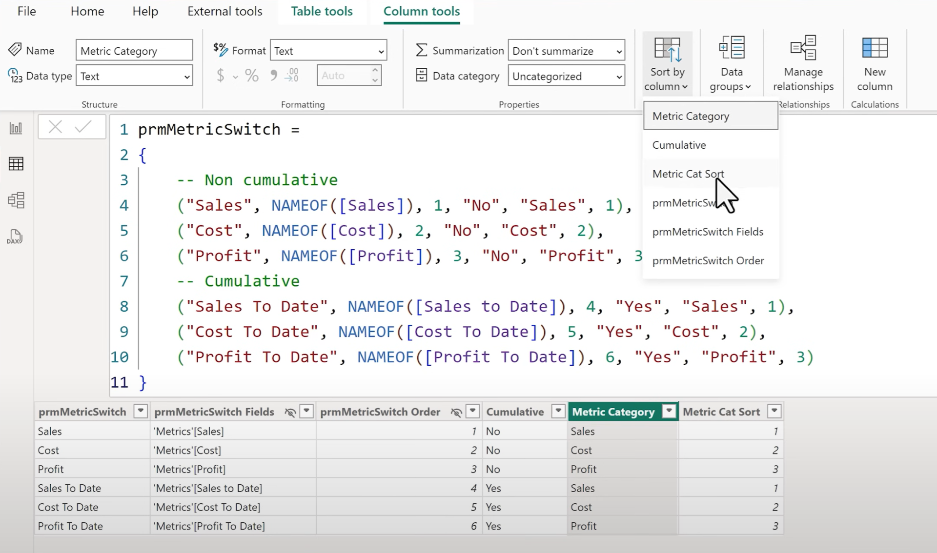
Start by creating a field parameter under the Modeling tab → New Parameter Fields. In this example, we include Sales, Cost, and Profit.
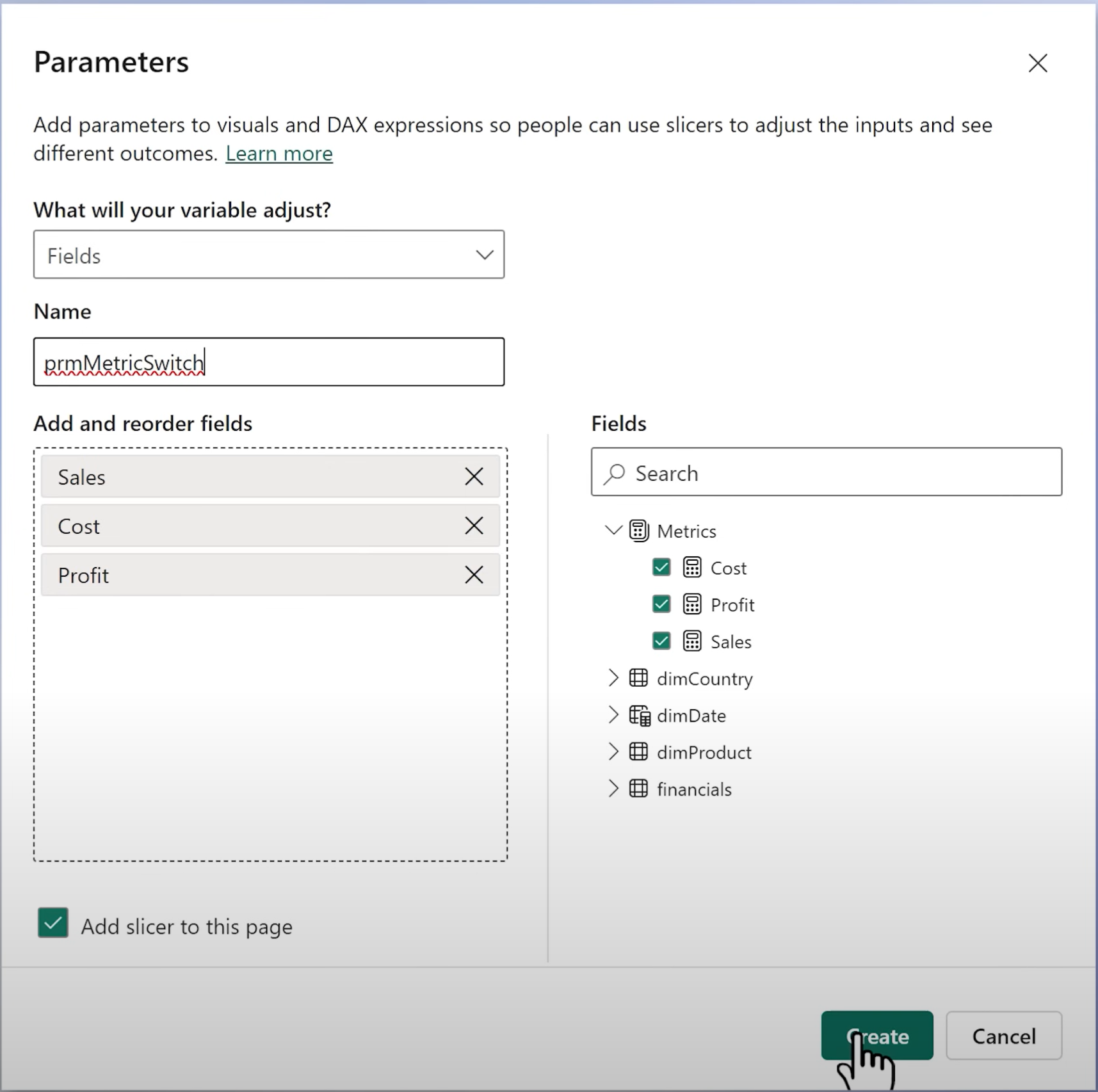
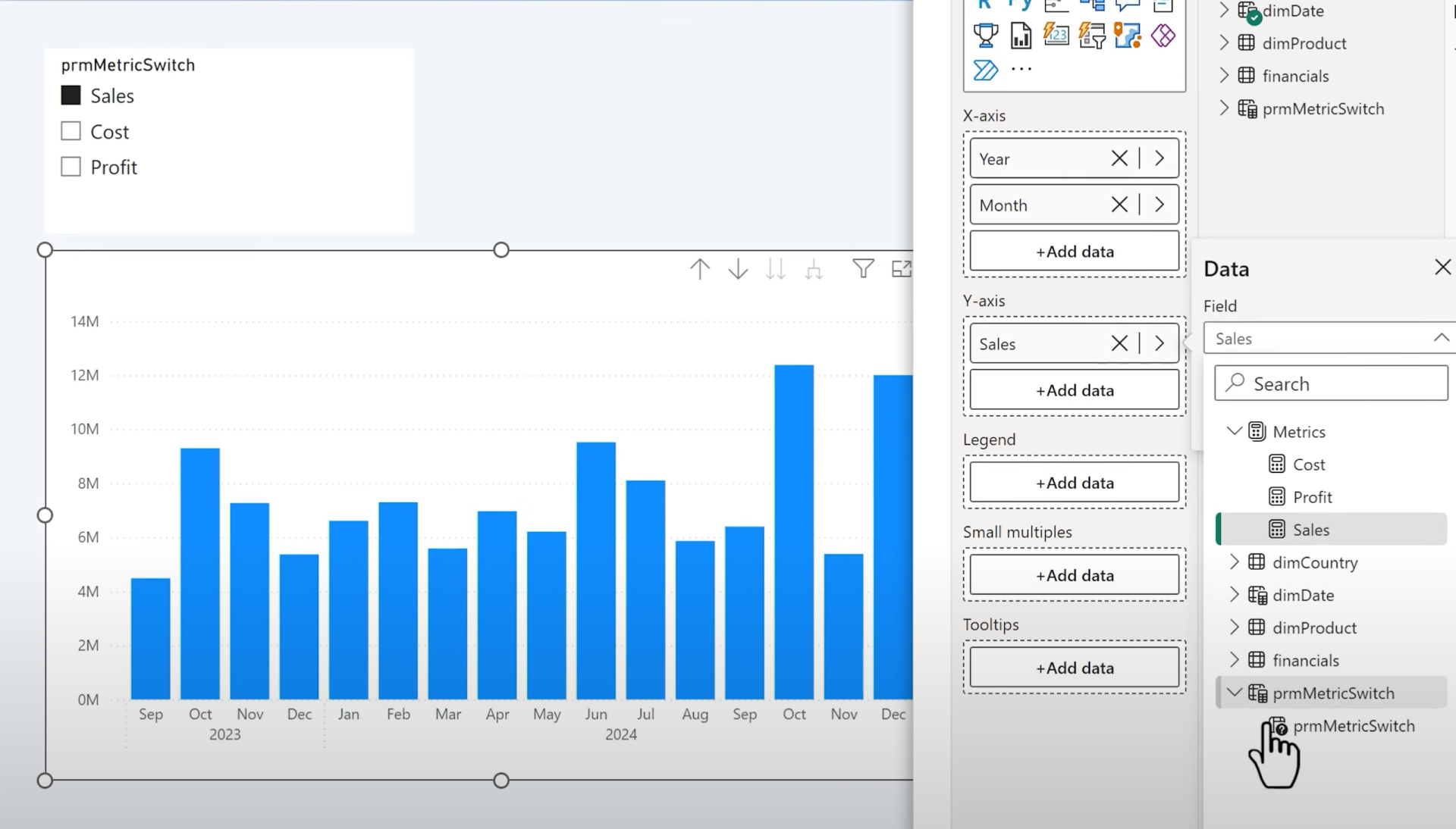
Name the parameter (e.g., prm_MetricSwitch) and enable the slicer checkbox. Once created, you'll see a slicer on the page.
Add a column chart with the new parameter field on the Y axis.
2. Style the Slicer for a Clean LookSwitch from the default slicer to a "
new style" slicer. Resize and format it:
- Hide the title
- Center the call-out value
- Add an accent bar only for the selected state
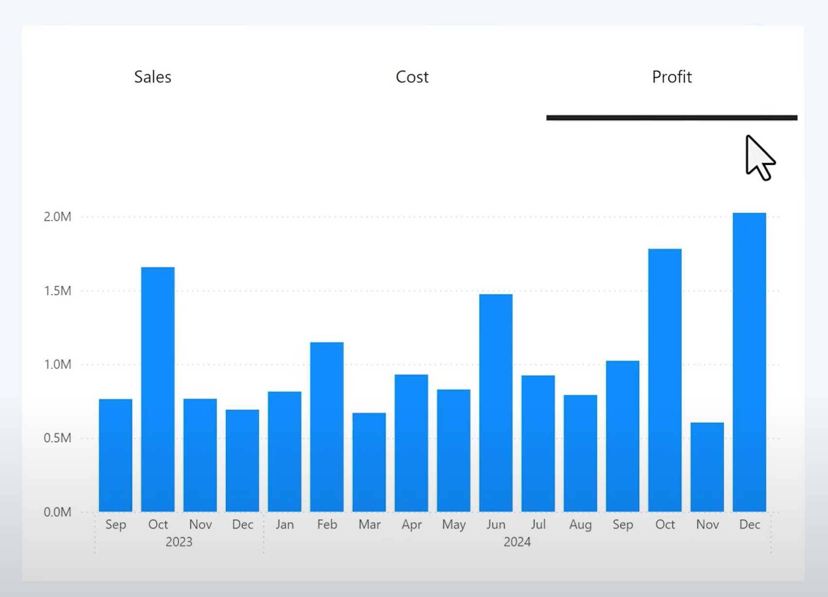
Make sure selected values are readable by adjusting the call-out text color to black.
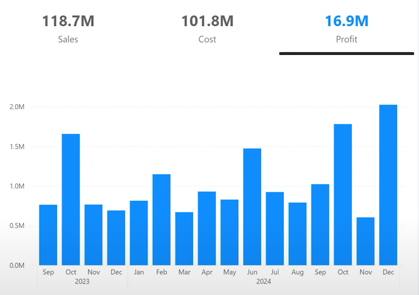
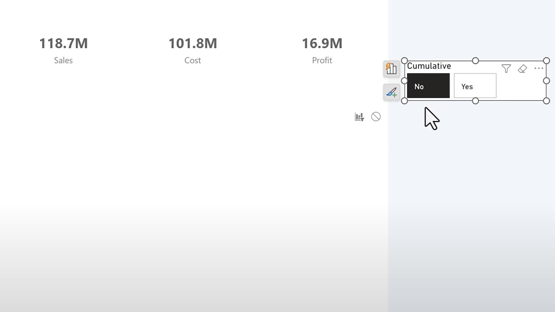
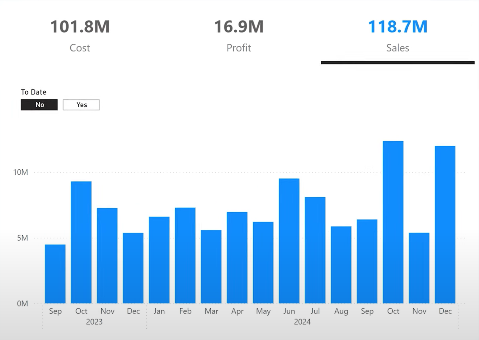
3. Turn the Slicer into a KPI Card
Use slicer call-out values to show the metric value directly on the button.
To do this, create a measure that dynamically returns the selected metric value. Use the MAX() function instead of SELECTEDVALUE() for field parameters (as the latter causes errors).
Wrap it in a SWITCH() to return the correct measure:
Selected Metric Value Formatted =
SWITCH(
MAX('prm_MetricSwitch'[Name]),
"Sales", FORMAT([Sales], "#,##0,,.0M"),
"Cost", FORMAT([Cost], "#,##0,,.0M"),
"Profit", FORMAT([Profit], "#,##0,,.0M")
)

Adjust the slicer label position and text size so that values appear above the field name. Make the metric values more prominent than the labels.
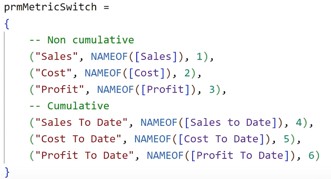
4. Add Running Total VariantsTo allow users to choose between normal values and running totals (e.g., Sales vs. Sales-to-date), you'll need
duplicate measures and add them to your parameter.
Sales To Date =
VAR MaxDate = MAX('DimDate'[Date])
VAR MinDate = CALCULATE(MIN('DimDate'[Date]), ALLSELECTED('DimDate'))
RETURN
CALCULATE(
[Sales],
REMOVEFILTERS(DimDate),
financials[Period] <= _SelMaxDate,
financials[Period] >= _MinDateOverall
)
Repeat this for Cost To Date and Profit To Date.
Then update the parameter table to include these new measures, assigning them higher sort order values (e.g., 4–6).
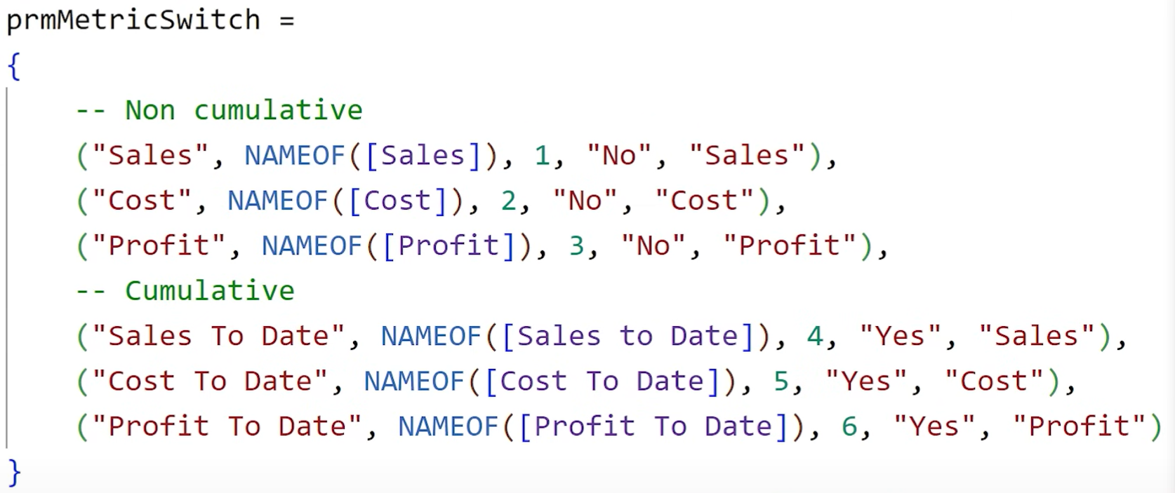
5. Group the Metrics: "Normal" vs. "To Date"
Create a new column in your parameter table (e.g., Cumulative) with values Yes or No depending on whether the field is a running total.
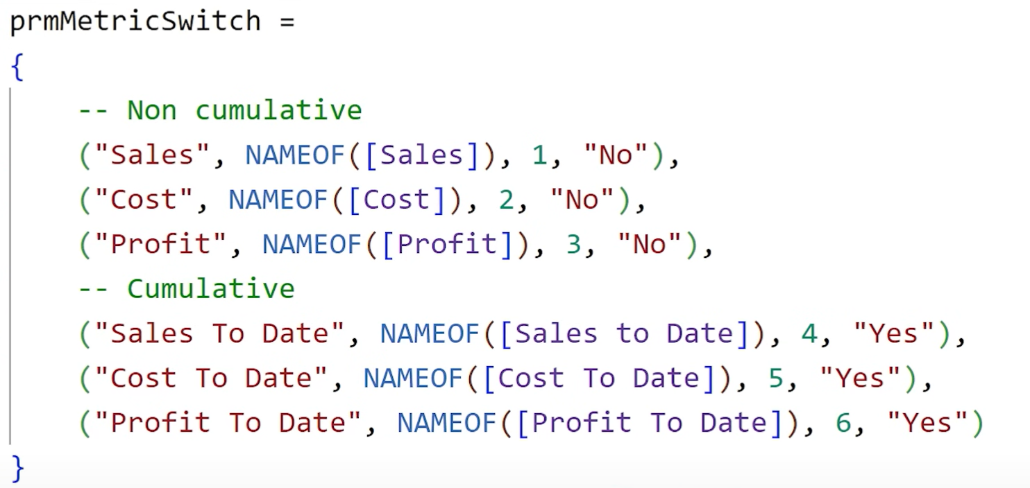
This allows you to add a second slicer where users can toggle cumulative vs. non-cumulative metrics.
Ensure both slicers work together without breaking visuals. If they conflict, add a "Category" column (e.g., Sales, Cost, Profit) and link slicers using this shared category.
6. Improve Formatting and Layout
Make room for the second slicer (To Date toggle) by adjusting padding and chart titles. You can also use empty titles/subtitles and white-colored text to push visuals downward.
Adjust slicer sizes, reduce button padding, and layout to a single row for a cleaner look.
7. Fix Sorting Issues in Charts
Some visuals, like column charts, lose their sort order when field parameters are used with multiple levels. For consistent sorting:
- Create a new unformatted measure (without FORMAT()), like Selected Metric Value (Raw)
- Add it to the Tooltips of the chart
- Sort the visual by that tooltip measure
This fixes sorting for column, bar, and even
table visuals.
Selected Metric Value =
SWITCH(
MAX( prmMetricSwitch[prmMetricSwitch] ),
"Sales", [Sales],
"Cost", [Cost],
"Profit", [Profit],
"Sales To Date", [Sales To Date],
"Cost To Date", [Cost To Date],
"Profit To Date", [Profit To Date]
)
8. Custom Sort Order for Categories
If you want to control the sort order of slicer buttons (e.g., Sales → Cost → Profit), add a custom sort column to your parameter table.
Then sort the category field by this new column.
In table visuals, you can hide helper columns (like Selected Metric Value) by reducing their width and disabling text wrap.
Conclusion
This tutorial showed how to go beyond basic field parameters to deliver a more flexible, user-friendly, and visually clean Power BI report. By combining dynamic metric switching, slicer-as-card design, group toggles, and advanced sorting, you gain full control over the user experience.
Want to go further? Explore additional tips in the Power BI videos linked in the original content or check out advanced design trainings by the video author.
Hope you like it!
Give it a try and see how it works for you! I’d love to hear what you think or see how you use this trick in your own reports.

