In this article, you'll learn how to build a fully dynamic histogram from scratch. We’ll walk through calculating sales frequencies, creating bucket logic, enabling user input, and formatting a clean, interactive visual that updates on-the-fly.
Step 1: Understand the GoalWe want to categorize products based on how frequently they’re sold for example:
• Not frequent (e.g., 0–100 orders)
• Sometimes (e.g., 100–200)
• Very frequent (e.g., 200+)
To achieve this, we’ll:
1. Count sales orders per product.
2. Assign them to frequency buckets.
3. Allow the user to control the bucket size (e.g., 25, 50, 100).
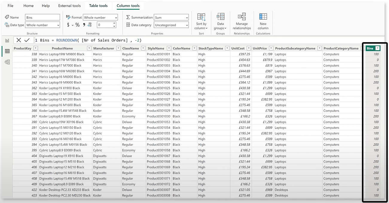
Step 2: Create a Static Bins Column (Optional First Step)In Power BI’s Data View:
1. Open your Product table.
2. Create a new column to calculate sales order count:
Sales Orders Count = [Nr of Sales Orders]
3. Use ROUNDDOWN() to group them into static buckets:
Bins = ROUNDDOWN([Sales Orders Count], -2)
This gives you static buckets (e.g., 0–99, 100–199).
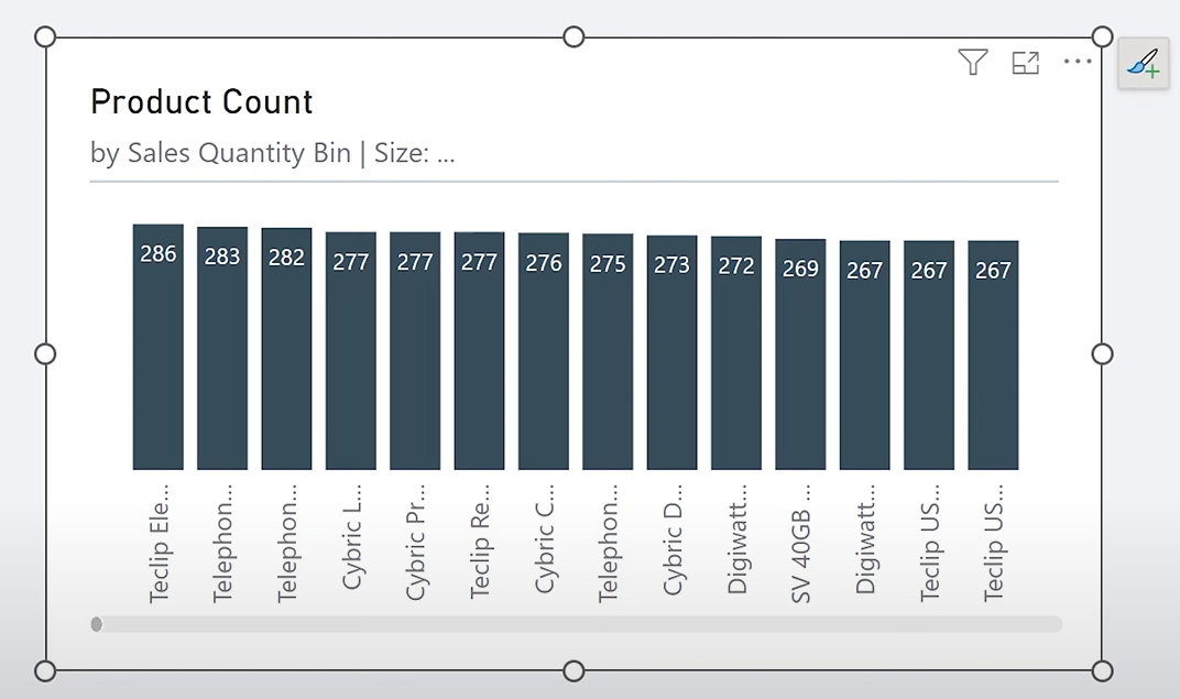
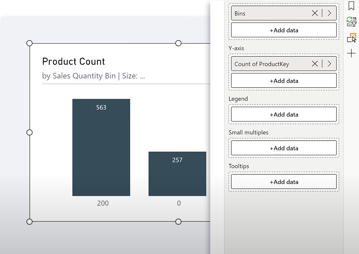
Then create a visual with these bins on the X-axis and count how many products fall in each. Put the Bins on the X-axis and distinct count of the ProductKey on the Y-axis.
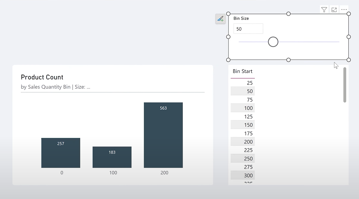
Step 3: Create a Table for Bin Start ValuesTo make the bins dynamic, create a helper table with all possible bin start values.
Go to Modeling > New Table, and use:
Bin Start = GENERATESERIES(0, 1000, 25)
Rename the column to Bin Start.
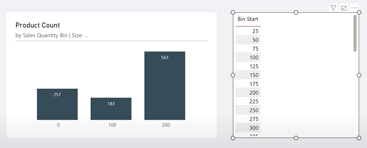
In column tools, set "Do not summarize" for Bin Start column.
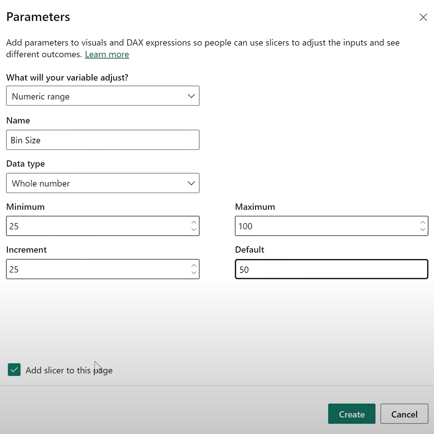
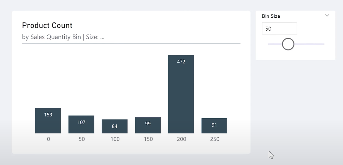
Step 4: Add a Parameter for Bin Size
Now, let the user control the bin size:
1. Go to Modeling > New Parameter > Numeric Range
2. Name it Bin Size
3. Set min = 25, max = 100, increment = 25
4. Add slicer to page
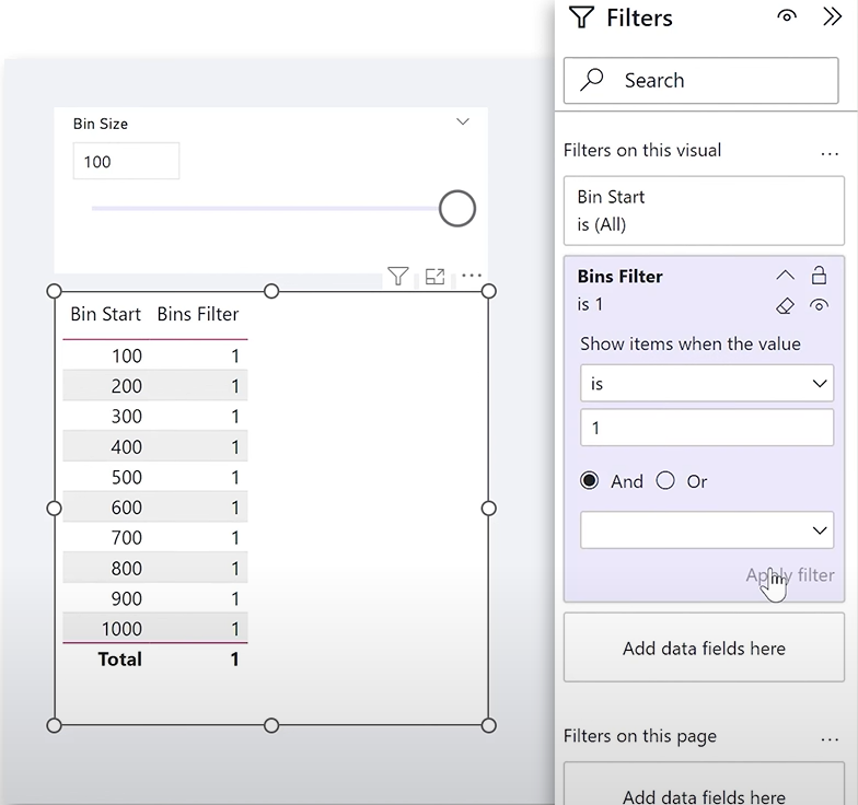
Step 5: Filter Bin Start Table Using the Bin Size
Create a measure to only show bin starts that match the selected step:
Bins Filter =
VAR _BinSize = [Bin Size Value]
VAR _BinsToKeep =
SELECTEDVALUE('Bin Start'[Bin Start]) / _BinSize =
ROUND(SELECTEDVALUE('Bin Start'[Bin Start]) / _BinSize, 0)
VAR _BinsFilter =
IF(
_BinsToKeep,
1,
0
)
RETURN
_BinsFilter
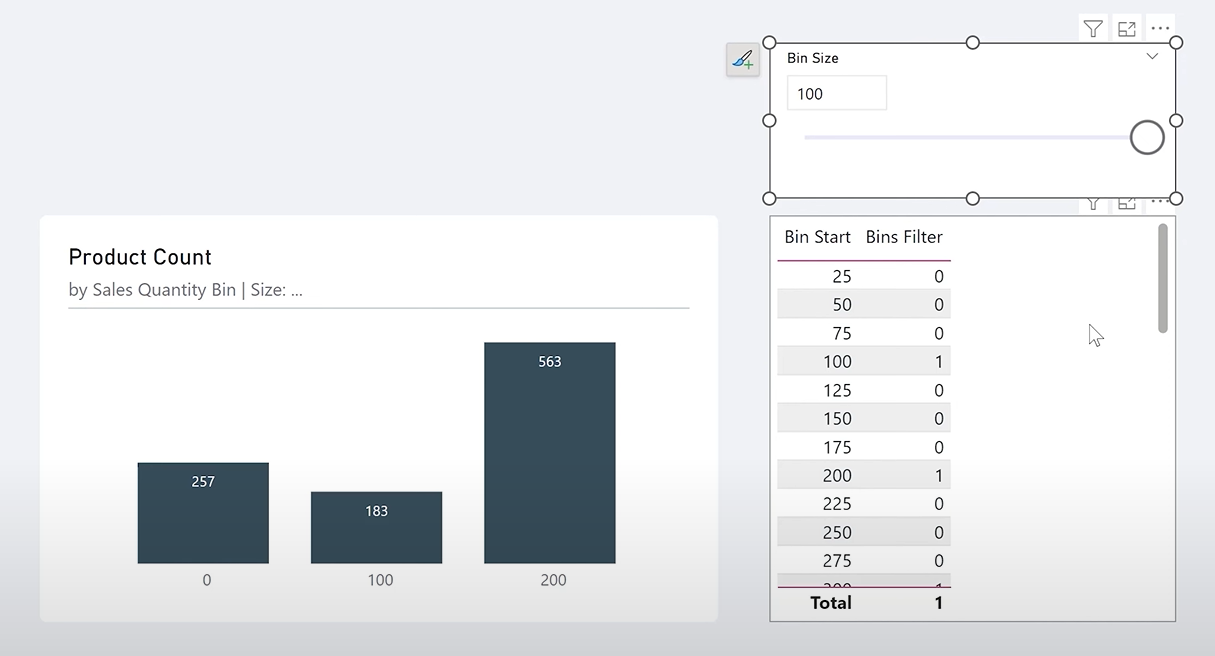
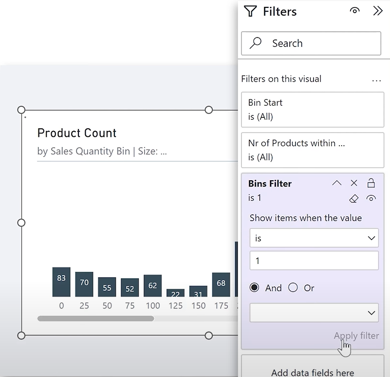
Use this measure as a filter on visuals: Where Bins Filter = 1
Step 6: Calculate Products Within Each BinNow, add a new measure to count how many products fall in each bucket:
Nr of Products within Bin =
VAR _BinSize_Start = SELECTEDVALUE('Bin Start'[Bin Start])
VAR _BinSize_End = _BinSize_Start + [Bin Size Value] -1
VAR _SalesNr =
SUMX(
ALLSELECTED(dimProduct[ProductName]),
IF(
[Nr of Sales Orders] >= _BinSize_Start
&& [Nr of Sales Orders] <= _BinSize_End,
1,
)
)
RETURN
_SalesNr
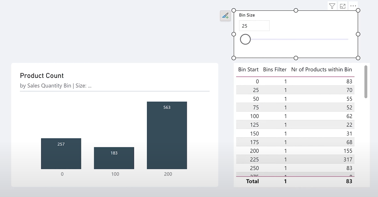
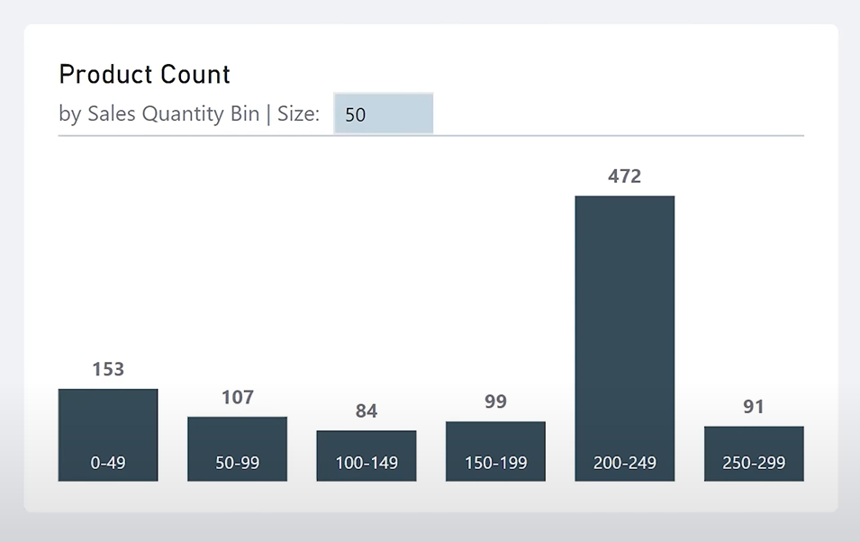
Step 7: Build the Dynamic HistogramNow that your logic is in place, adjust a bar chart:
1. X-axis: Bin Start
2. Y-axis: Nr of Products Within Bin
3. Apply filter: Bins Filter = 1
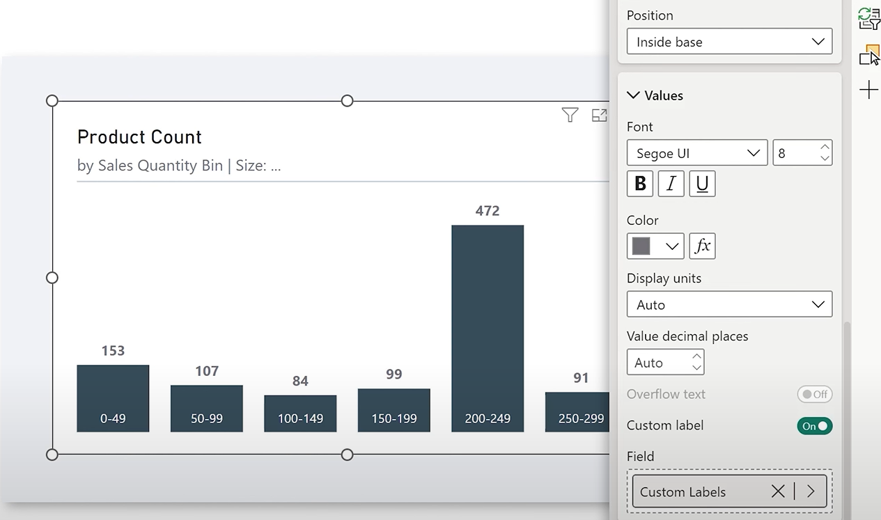
Step 8: Add Custom Labels for Ranges (Optional Enhancement)To make the chart more readable:
1. Remove X-axis labels
2. Create a new measure:
Custom Labels =
VAR _BinSize_Start = SELECTEDVALUE('Bin Start'[Bin Start])
VAR _BinSize_End = _BinSize_Start + [Bin Size Value] - 1
VAR _Label = _BinSize_Start & "-" & _BinSize_End
RETURN
_Label
Use this as custom data label for the bars. You need to enable Total Labels on by adding a Dummy = Blank() measure on the X axis.
Final Touches
• You can style the slicer to blend with the chart.
• Disable responsiveness to prevent axis clipping.
• Remove visual headers for a cleaner look.
Why This Matters
Allowing users to control bin sizes gives them powerful flexibility to analyze the data at multiple levels of granularity. With just a few clicks, they can uncover patterns that would otherwise remain hidden.
This dynamic histogram setup also introduces key techniques in Power BI like:
• Using parameters for interactivity
• Dynamic filtering with DAX
• Advanced label customization
Hope you like it!
Give it a try and see how it works for you! I’d love to hear what you think or see how you use this trick in your own reports.

