Why Donut Charts (Sometimes) Work?
It’s true, pie and donut charts aren’t always the best choice. But if they’re used thoughtfully - for the right audience, with the right context - they can be powerful. The trick is to make them look clean and purposeful, not cluttered. That’s exactly what these variations aim to do.
Let's discuss about the 3 variations that you can try immediately and make it look better.
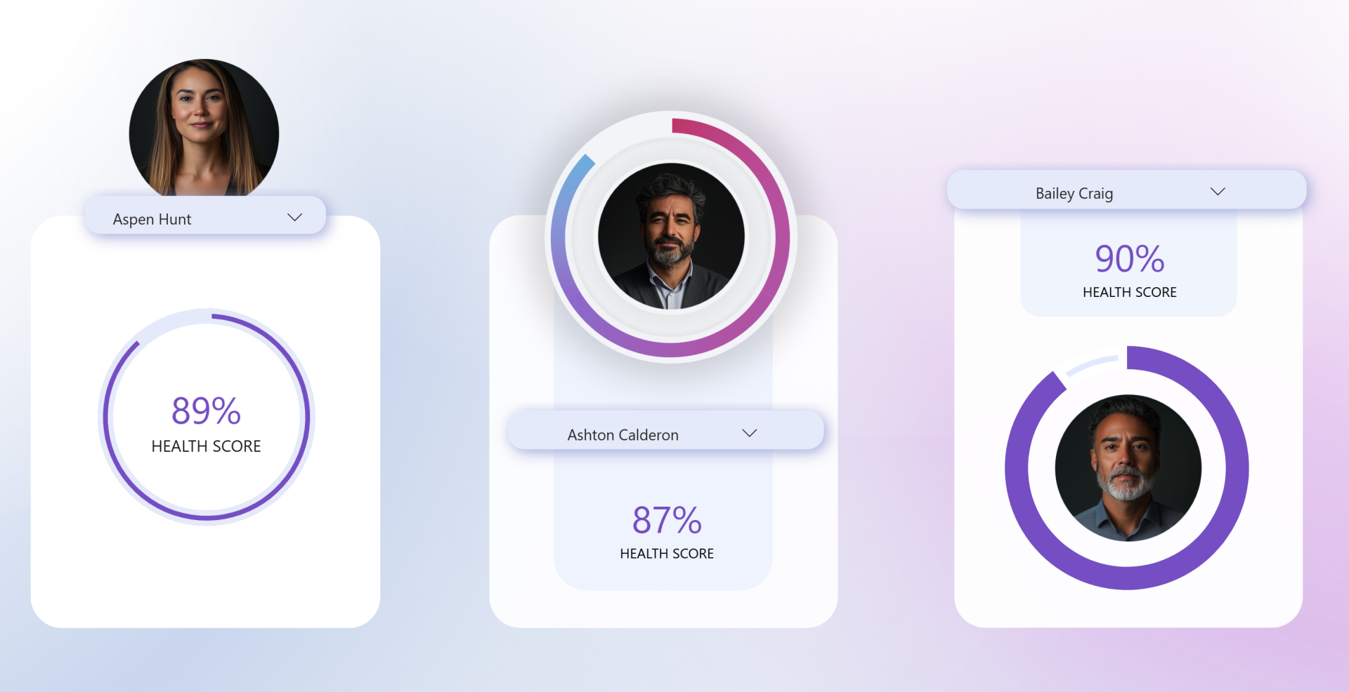
Variation 1: KPI Value in the Centre
The first variation places a KPI right at the center of the donut, with the outer circle (donut chart) showing the progress/score visually.
- First check your version: Go to Help > About in Power BI and confirm you’re on the July 2025 version or later.
- Insert a donut chart: Place it alongside your existing visuals (e.g. picture, slicer, KPI card).
- Set up values: Add your KPI measure (in this example, a health score) to Values. Then add a second measure that calculates the remainder up to 100%. (in my case, see example below)

- Clean up formatting: Remove the title, legend, and data labels. Adjust the slice spacing to make the ring thinner.
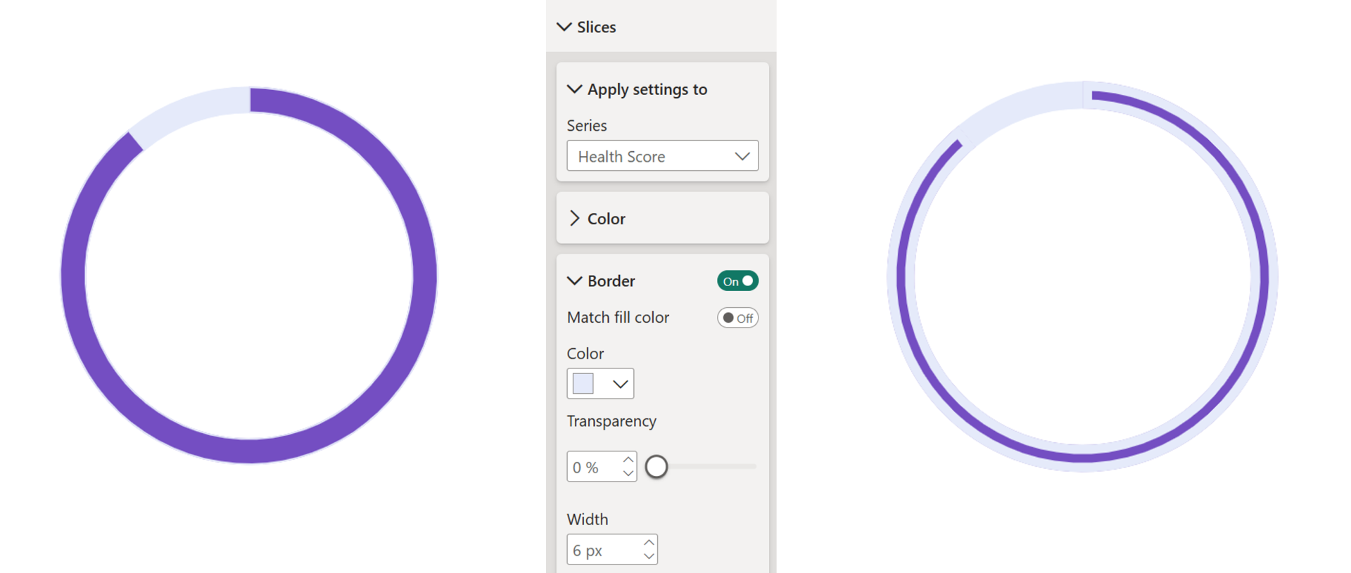
- Apply colors: Use a bold color (here purple) for your KPI value and a lighter shade for the remainder.
- Add borders for emphasis: In the Slices formatting pane, turn on Border, apply it to the KPI slice, and set it to the same light color as your remainder. Increase the border thickness until the contrast looks just right.
- Final touches: Remove the background and resize the chart to sit neatly around your KPI card.
The result is a clean, modern donut chart.

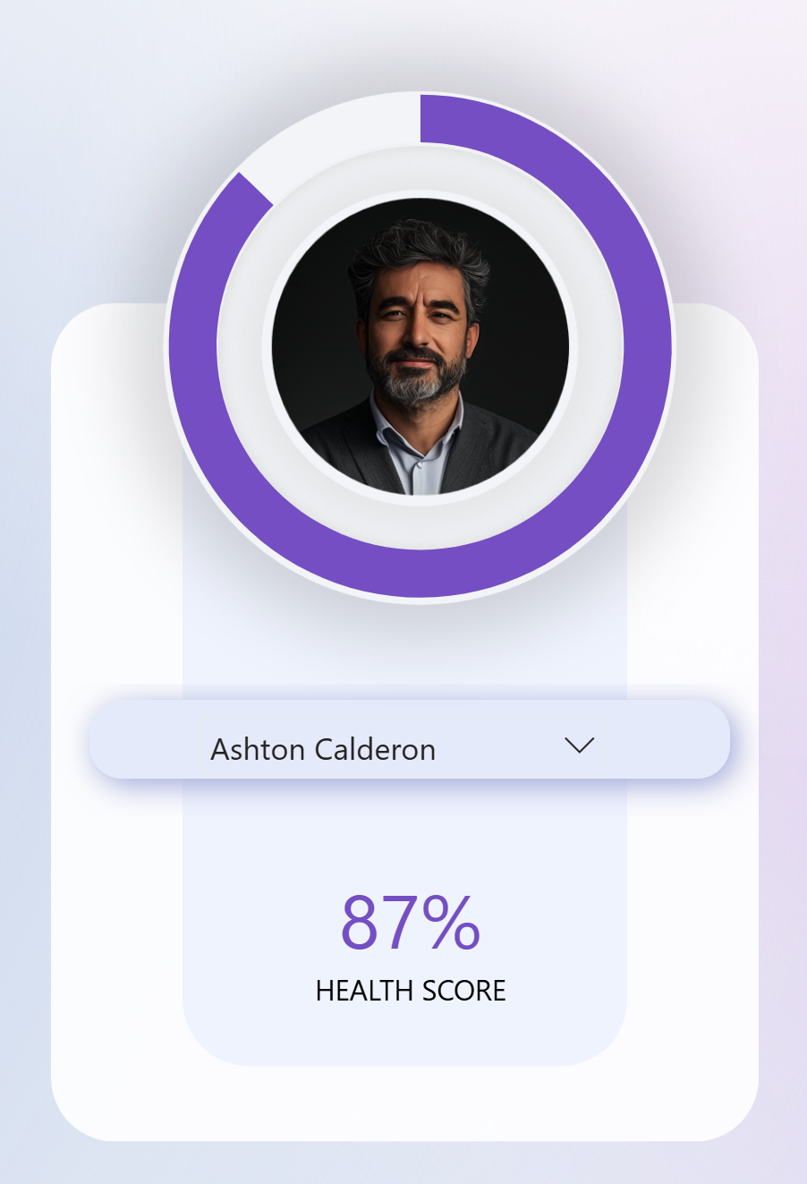
Variation 2: Donut Around an Image
In this variation, the donut frames an image , such as an employee photo or product icon, making the metric more personal or contextual.
- Copy your first donut setup: Duplicate and place it around the image you’d like to highlight.
- Switch border placement: Instead of applying the border to the KPI slice like our previous example, we will now apply it to the “remainder” slice.

- Match the background: Set the border color to the same as your report background (often white) to make the donut appear as if it’s hugging the image.
A quick note: Transparency on the border doesn’t behave as expected - it overlays instead of cutting out - so the cleanest way is to exactly match your background color.
This variation creates a polished, profile-style visual that works well in dashboards showcasing individual performance or personalized KPIs.

Variation 3: Gradient Background Trick
Power BI doesn’t yet support gradients natively for donut charts, but with a simple hack, you can achieve the effect.
- Insert a gradient image: Create a circular gradient background in a tool like PowerPoint. Export it as a PNG or SVG and insert it into Power BI.

- Layer visuals: Place the image behind your target (such as an employee picture) and adjust its size.
- Overlay the donut chart: Copy your existing donut and position it on top of the gradient.

- Use transparency creatively: Make the KPI slice fully transparent, keeping only the remainder visible in a solid color (like white). This way, the gradient shines through where needed.
- Fine-tune positioning: Use the size and position settings to align everything perfectly.
This trick creates a dynamic, modern look without overcomplicating the setup.
Wrap up
These three variations - KPI-centered donuts, image-framing donuts, and gradient-backed donuts are all now possible. With just a few formatting tricks, your donut charts can go from ordinary to unmissable.
Hope you like it!
Give it a try and see how it works for you! I’d love to hear what you think or see how you use this trick in your own reports.