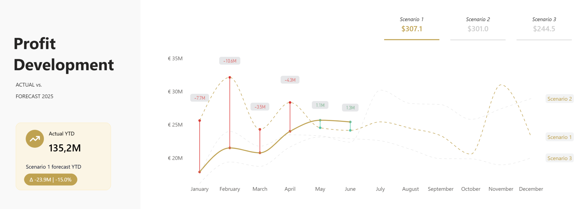
Imagine trying to compare actual performance against three different forecasts. You want users to see every scenario for context, but you also want them to focus on the one that matters. Finding that balance between context and clarity is exactly what this reporting pattern solves.
Here, we'll build an interactive line chart that compares Actuals against three forecast scenarios. Users can select the scenario they want to focus on, while the remaining scenarios stay visible in the background for context.
To make the comparison even clearer, we'll combine Field Parameters, Error Bars, Series Labels, and dynamic data labels to highlight the selected forecast, quantify the variance, and create a interactive report experience.
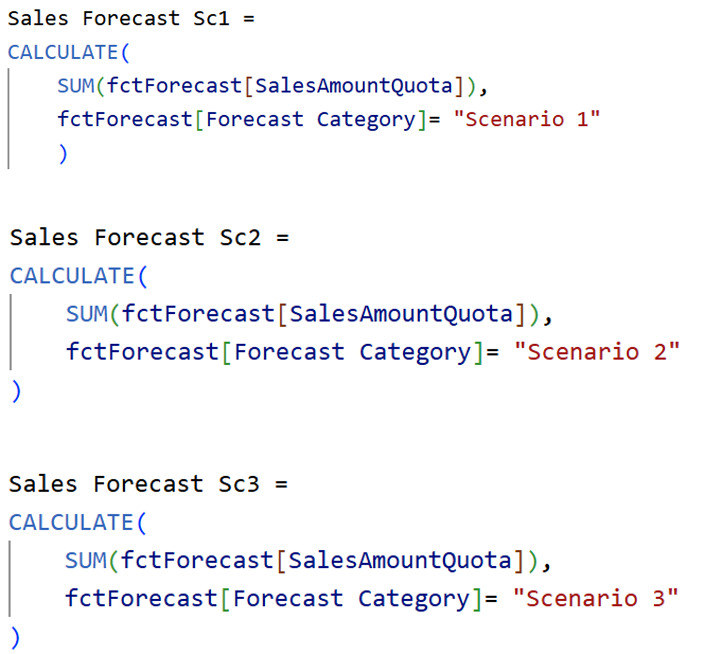
Step 1: Create the Base Measures
Build the necessary forecast measures for each Scenario, 3 in our example.
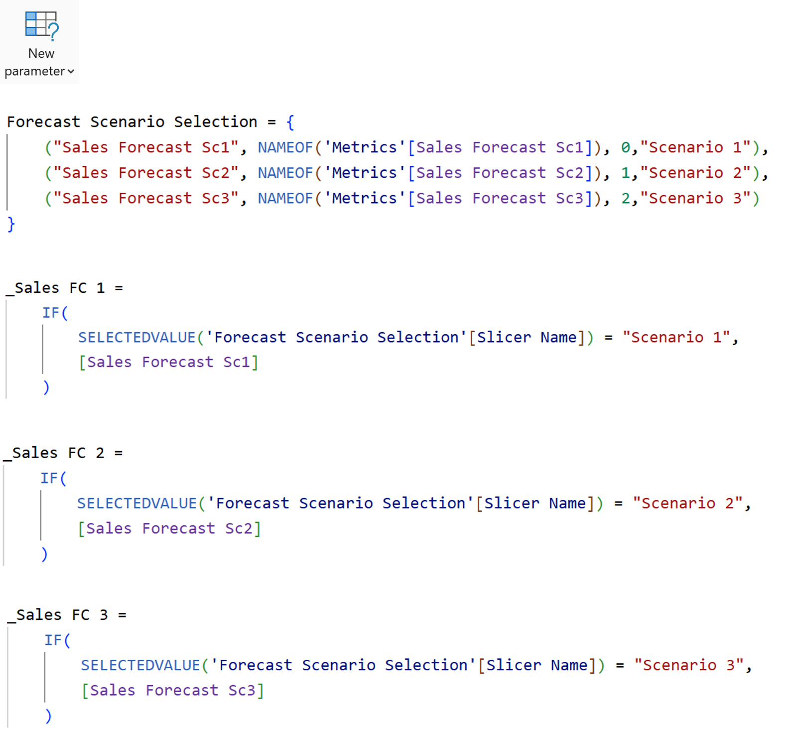
Step 2: Create a Field Parameter
Create a field parameter with the 3 forecast measures we just created. This parameter will drive which forecast scenario is highlighted throughout the report. Add the slicer to the report page and design it as you wish.
Once the parameter is created, build the measures referencing the parameter that return only the selected scenario, 3 such measures will be built.
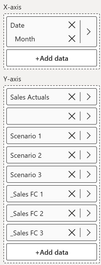
Step 3: Setup the Visual
- Insert a Line Chart
- Add Month to the X-axis
- Add the Sales Actual measure
- Add a dummy Actual measure that will later be used for the error bars
- Add the above created 6 measures
Rename the series where necessary to provide cleaner legend names.
Step 4: Format the Lines
The goal is to keep every scenario visible while clearly emphasizing the selected one.
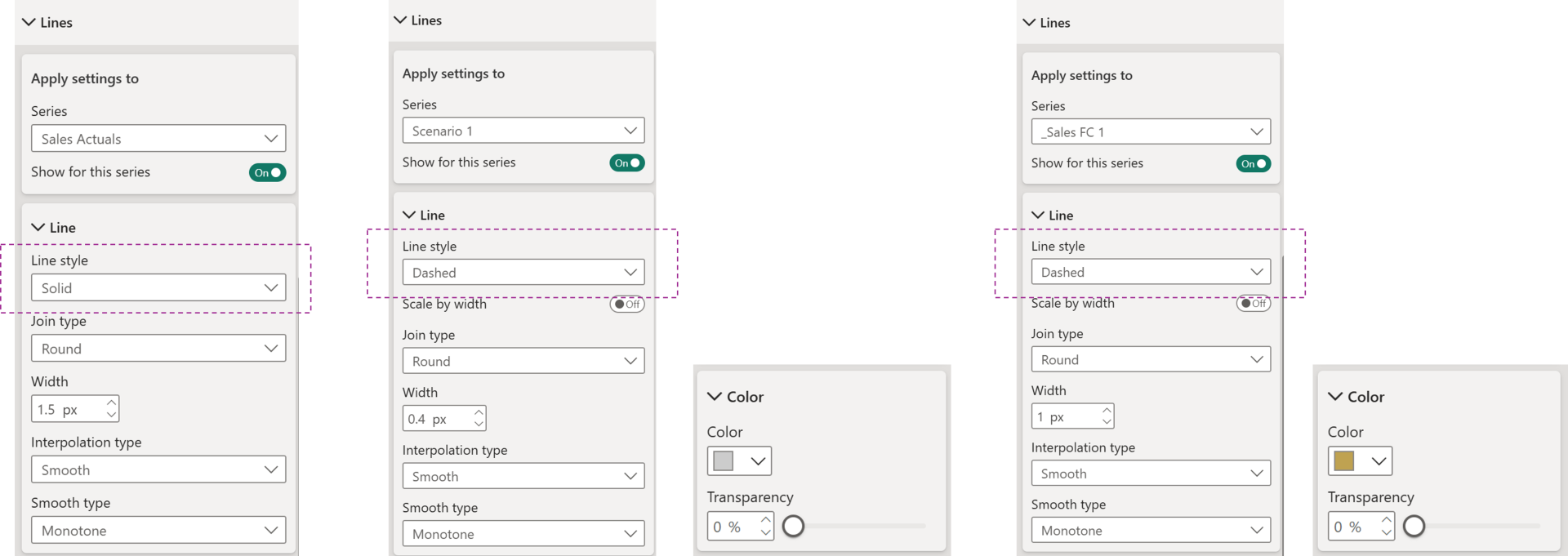
Configure the series as follows (turn on the series only for the below):
- Sales Actuals → solid line, 1.5 width, and Smooth
- Forecast scenarios (Scenario 1, 2 & 3) → dashed lines, 0.4 width, Smooth
- Selected scenario (Either one of _Sales FC 1, 2, or 3) → dashed, 1 width, Smooth & highlighted using colour
- Unselected scenarios → muted grey
This allows users to retain context without creating unnecessary visual clutter.
Step 5: Add Error BarsCreate the
measures to calculate the Upper and Lower Bound and use them to configure the Error Bars.
Error bars become the visual connector between Actuals and the selected Forecast.
- Enable the Errors Bars for the Sales Actual (Positive) and dummy Sales Actual (Negative) Series
- Add the Upper and Lower Bound measures for each series
- Color the positive values green and negative values red
- Adjust the Width and Border
The result is an immediate visual indication of whether Actuals are above or below the selected Forecast. 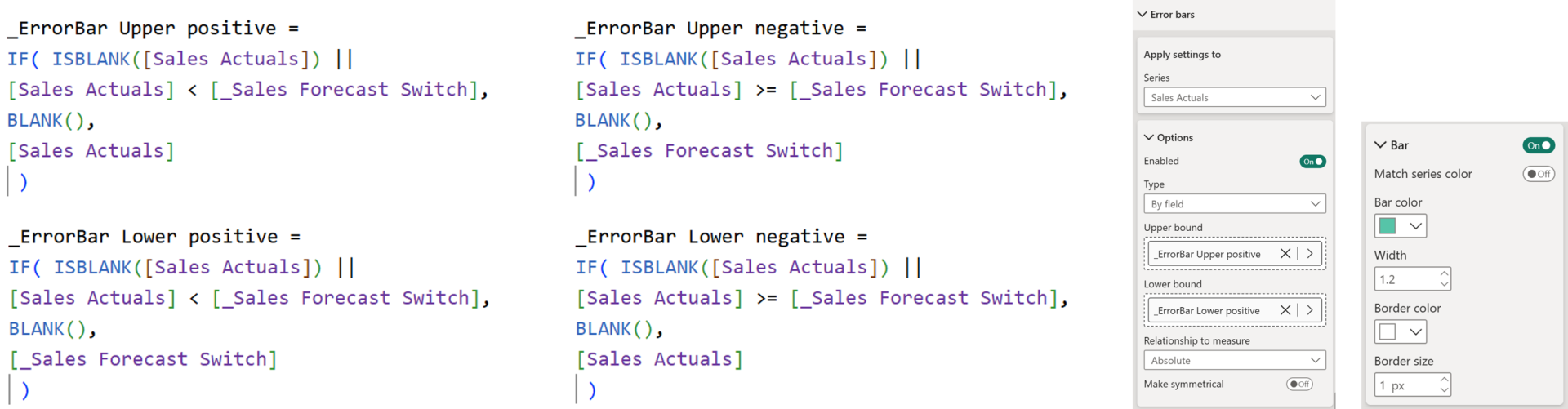
Step 6: Add Series Labels
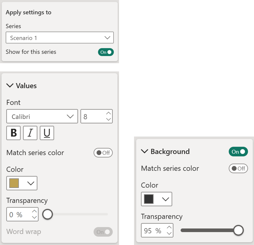
Turn on Series Labels for each forecast scenario (Scenario 1, 2 & 3).
Format the labels,
- labels use a subtle background
- The text matches the line color (optional)
This removes the chaos of identifying the series.
Step 7: Add Data Labels
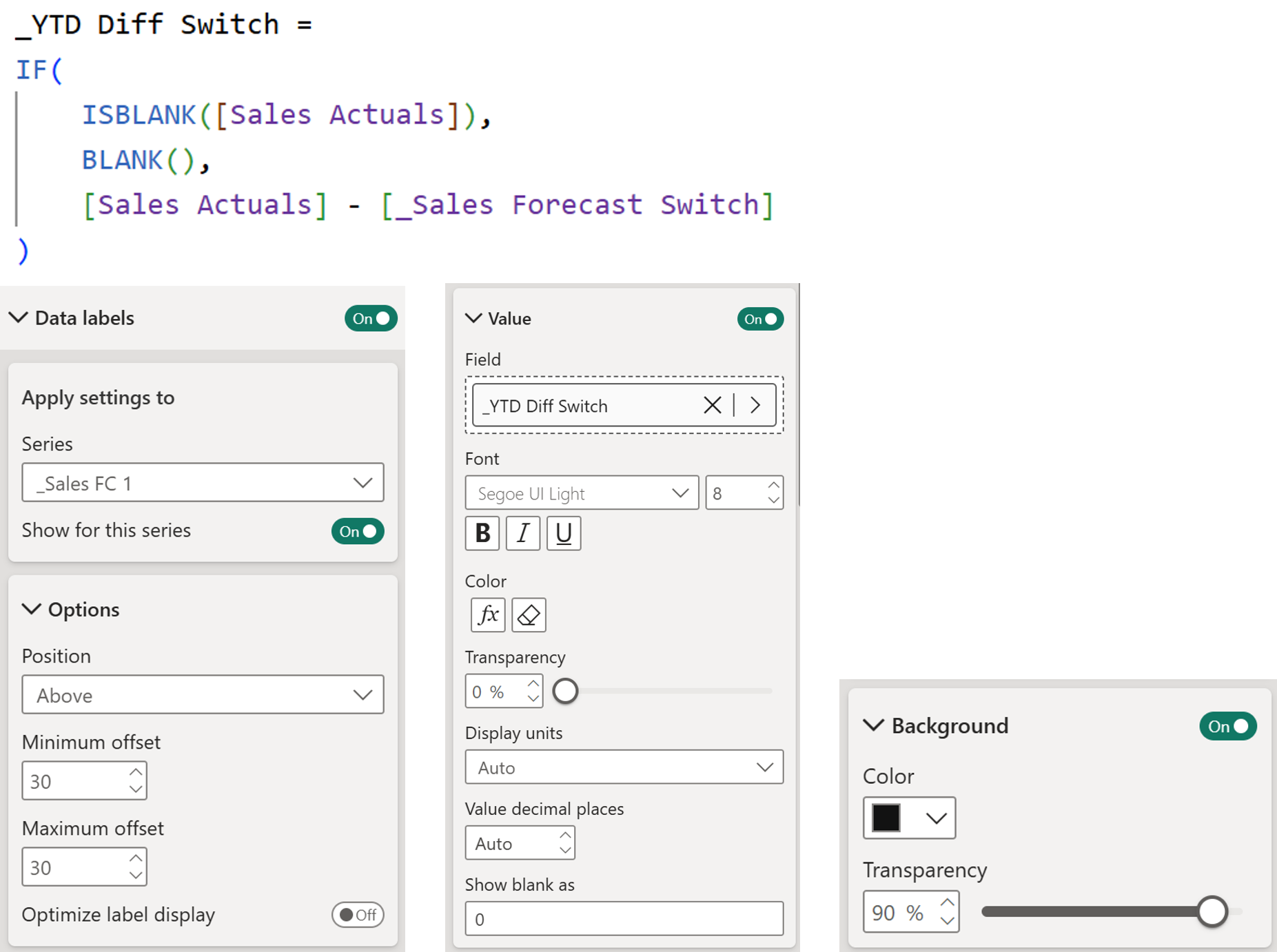
Create a measure to display the variance between Actuals and the selected Forecast. The Measure returns Blank() wherever Actuals are missing.
- Turn on Data Labels only for the highlight forecast Measures
- Apply this measures to the Value
- Adjust the position so that it remains above the series
- Add a semi-transparent background
- Adjust the font size
- Add conditional formatting of colors based on measures / rules (Rules in this example)
Hope you like it!
Give it a try and see how it works for you! I’d love to hear what you think or see how you use this trick in your own reports.