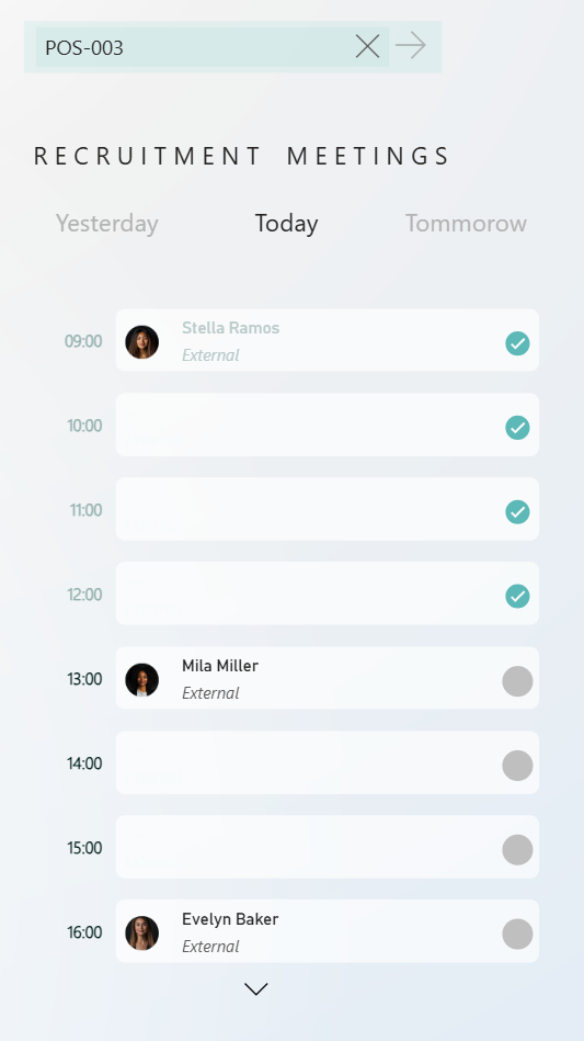
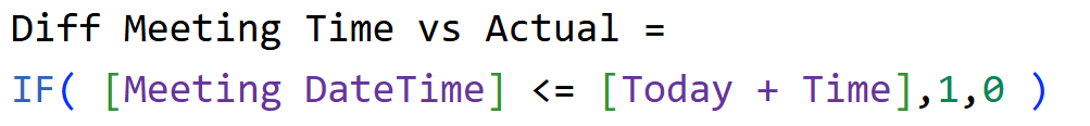
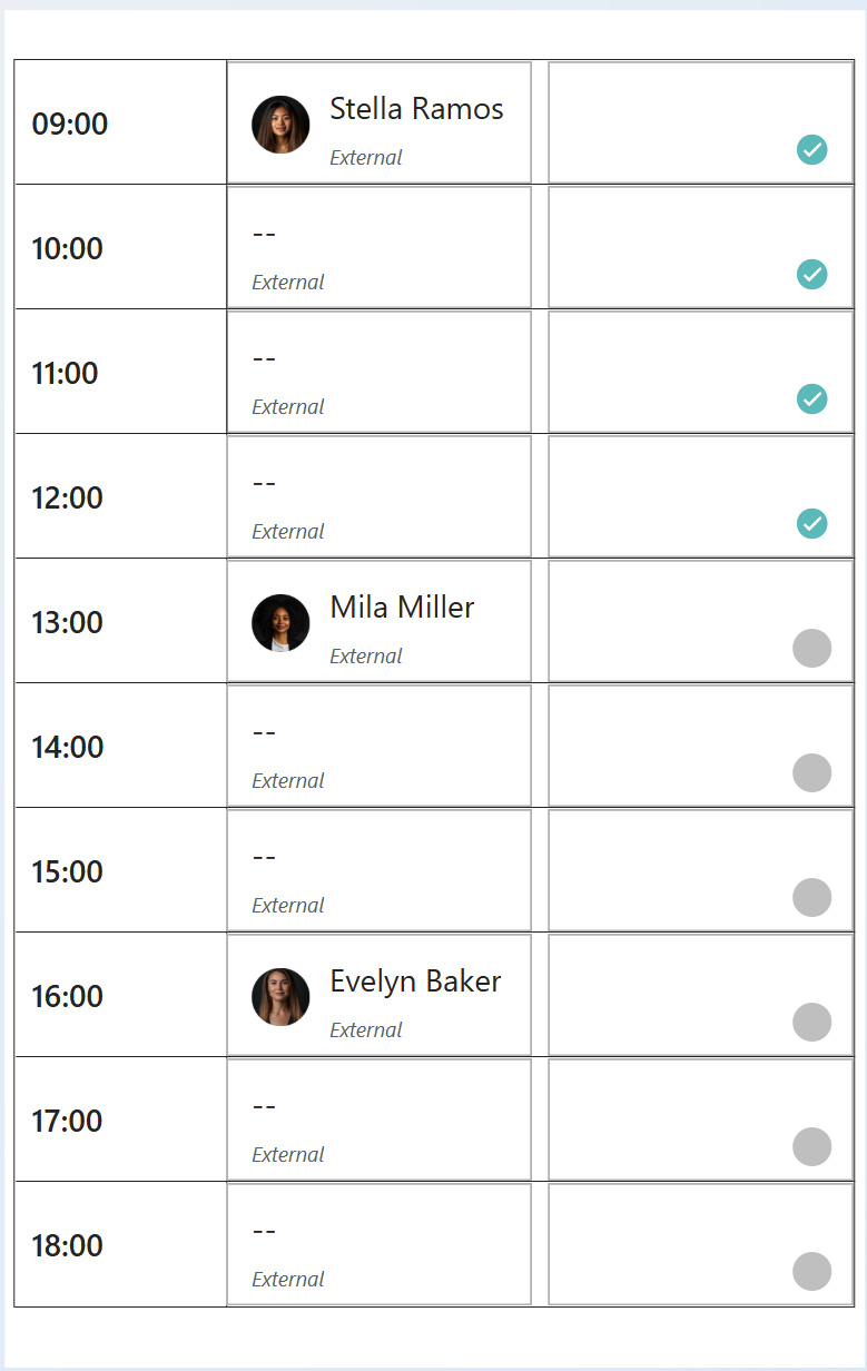
We’ll build a calendar view where:
- The left side shows the hours of the day.
- Each card displays:
- The candidate’s name.
- Their photo.
- A small icon indicating whether the meeting has already taken place.
This example uses HR data, but you can apply the same setup to any Power BI report.
Step 1: Card Visual
Insert the new card visual and resize appropriately as needed.
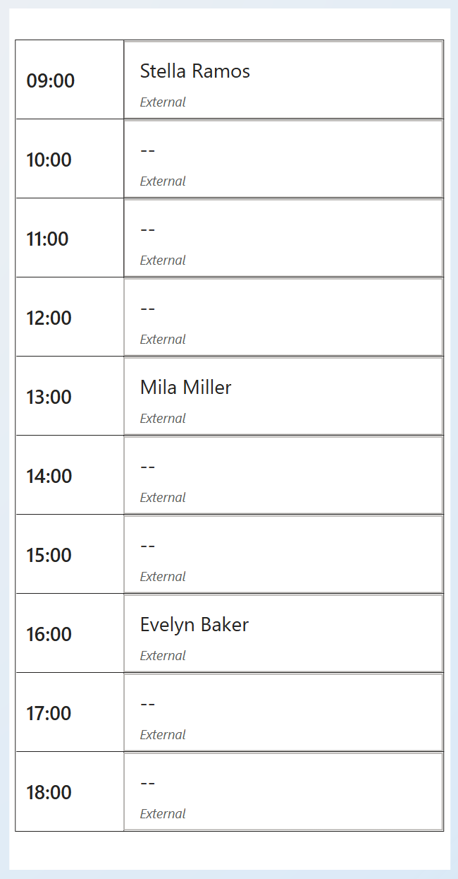
Step 2: Showing all items
1. Add Candidate Name to the Data field.
→ It’ll show only the first one alphabetically for now - that’s fine.
2. Add Meeting Time to Categories.
→ This enables small multiples, creating separate cards per time slot.
You’ll now see time-split cards (e.g., 9:00, 1:00, 4:00).
To ensure all times appear, even without meetings:
3. Right-click Meeting Time → Show items with no data.
Step 3: Display all time slots vertically
By default, only a few cards are visible.
To see all times:
1. Go to Format → Multi-category layout.
2. Set:
Arrangement → Vertical
Max small multiples to show → 12
Now you’ll see the full day view.
Step 4: Adjust Text and Labels
1. Under values, change:
- Font → Segoe UI (or your preferred font)
- Value font size → 12
2. Under Labels, reduce font size for clarity.
3. Change the Label field:
- Replace the default “First Candidate Name” with Recruitment Type.
4. Position the label:
- Under Label position → Below value.
5. Make labels italic for visual contrast.
Step 5: Add Images
Add two images:
- The candidate’s photo.
- A meeting status icon (past).
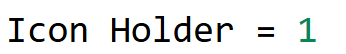
As a first step, Add an Icon Placeholder
1. Create a dummy measure (e.g., Icon Holder) to use as a placeholder - which will help us have the second image (the icon that shows meeting has passed or is yet to happen)
2. Add it to Data - You’ll now see two card series.
3. Hide its values:
- Go to Values → Transparency = 100%.
- Turn off Label under Label settings.
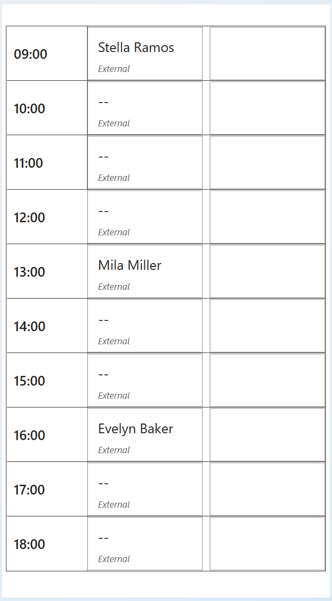
To add Images to both the series,
Go to Images → Select series: Icon Holder.
Turn Images ON.
Set:
- Image Type → Image URL
- URL Field → Table Icon (a measure returning icon links)
4. Resize: Image size → around 20px.
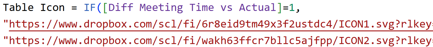
Go back to Images → Select series: First Candidate Name.
Turn Images ON.
Set:
- Image URL field → Candidate Img.
Finally, adjust image size and spacing (e.g., 10px between image and text).
Step 6: Conditional Formatting
1. Select the Card (New) visual → Format pane → Color values.
2. Choose the Candidate Name series.
3. Click FX next to Values color → Format style: Field value → point to the measure created.
This results in,
- Empty time slots appear transparent/blank.
- Past meetings show lighter text.
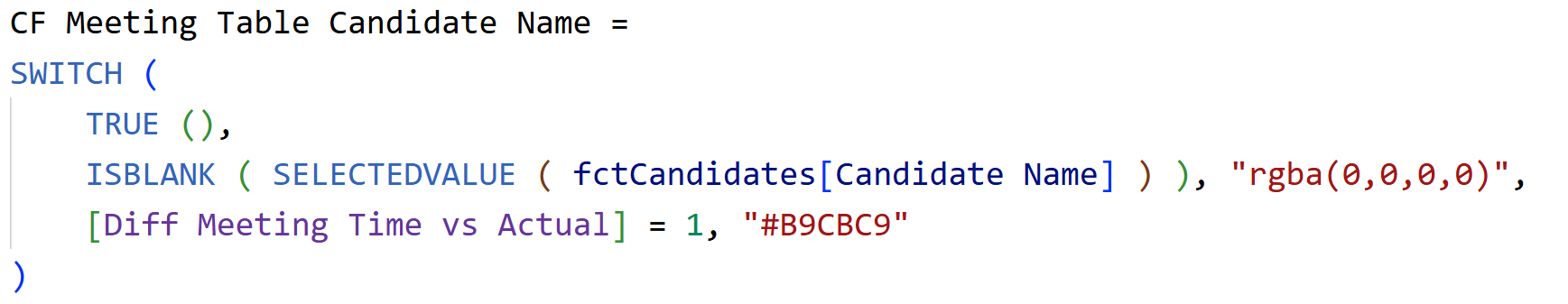
Repeat the same for Labels by adding conditional formatting for colors with the below measure.
We are almost there, with a few tweaks and final cleanup, we will get there.
Step 7: Clean up & Final refinementCreate a clean, minimal layout focusing attention on content.
Settings to play around:
1. Size and style → Background → Off (removes the overall visual background).
2. Cards → Fill → Off and Cards → Border → Off (removes per-card fills/borders).
Small multiple headers → Background → Off (no header strip).
3. Multi-card layout → Background → On:
• Background - Set Transparency (e.g., 30%) for a soft feel.
• Border radius (e.g., 10) for rounded corners around the inner panel.
4. Multi-category layout → Grid lines:
• Increase Width to 12 (example) to create spacing between small multiples.
• Then set Transparency = 100% so the lines disappear but the spacing remains.
5. Small multiple headers → Title:
• Font: Segoe UI (or your standard)
• Alignment: Center
• Size: Small (e.g., 10–12)
6. Title → Color → FX → Field value:
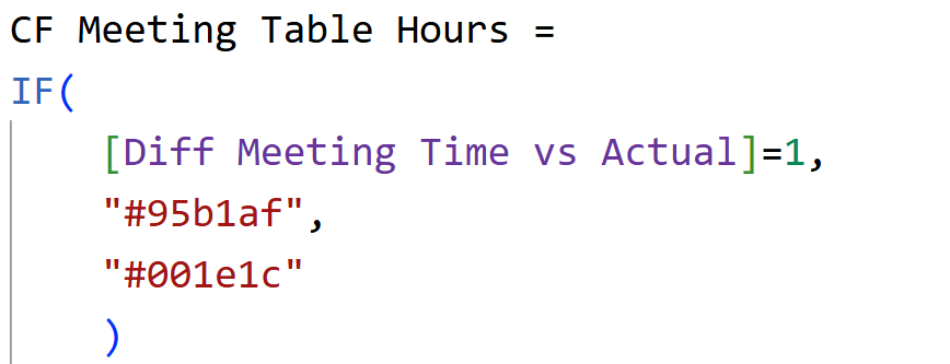
• Select the measure (lighten past hours – The one we used earlier – CF Meeting Table Hours measure for icons).
7. Callout value → Label spacing = 0 (reduces gap between value and label).
8. Cards → Padding → Custom:
• Increase Left padding to push content inward (e.g., 20 px).
• Set Right padding (e.g., 10 px).
• Tweak Top/Bottom to balance vertical spacing.
9. Images (per series):
• Select Icon Holder series → Images → Vertical alignment: Center.
• If icons sit slightly low/high, fine-tune by:
- Temporarily enabling Label and adjusting Value font size down a touch.
- Then set Label transparency = 100% to hide it again.
And there we go – we now have a clean visual as expected.
Hope you like it!
Give it a try and see how it works for you! I’d love to hear what you think or see how you use this trick in your own reports.