In this tutorial, you’ll learn three less common but incredibly useful applications of calculation groups:
- Dynamic summary statistics
- Switching relationships (like order date vs. delivery date)
- Applying conditional formatting logic across multiple measures
Let’s dive in.
1. Dynamic Summary Statistics Without Cluttering Your Model
Instead of writing separate measures for SUM, AVERAGE, MIN, MAX across each metric (like Sales, Discount, Forecast), you can create one calculation group that applies all of them dynamically.
Steps:
- Go to Model View.
- Create a new Calculation Group called Summary Statistics.
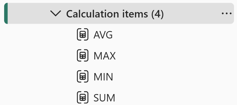
- Add 4 calculation items:
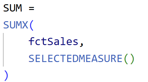
- Sum: Use SUMX(Sales, SELECTEDMEASURE())
- Average, Max, Min: Replace SUMX with appropriate aggregators.
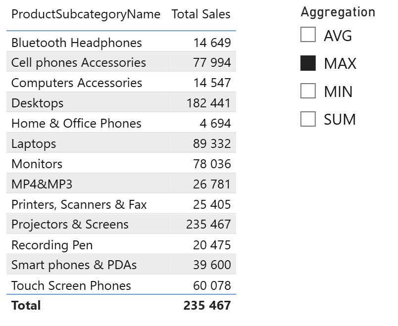
4. Add a slicer to your report using the new Aggregation column from the group.
5. Apply it next to your matrix/table.
Benefits:
- Reuse across any measure
- Clean model, fewer redundant measures
- Easier report maintenance
2. Switch Relationships Dynamically (Order Date vs. Delivery Date)
Sometimes your data model contains multiple date fields, such as Order Date and Delivery Date, but Power BI only allows one active relationship at a time. With Calculation Groups, you can toggle between them.
Steps:
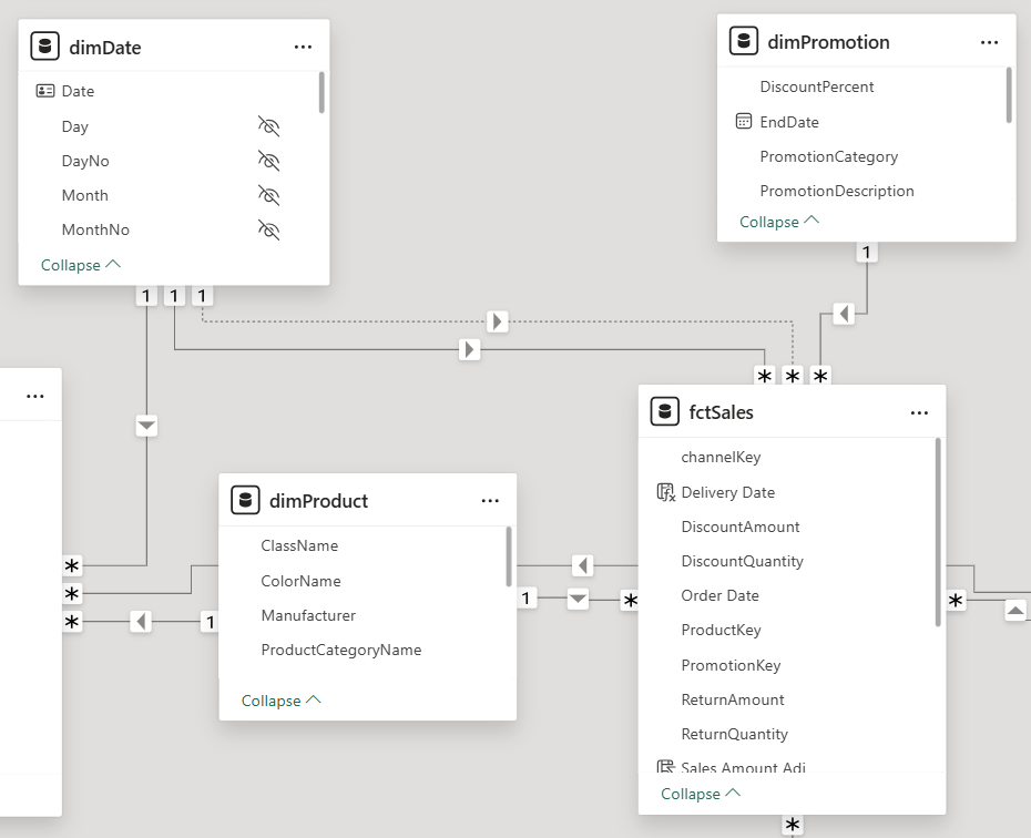
1. In Model view, set up two relationships between Date table and your fact table:
- Order Date (active)
- Delivery Date (inactive)
2. Create a measure using CALCULATE(..., USERELATIONSHIP(...)) to activate the inactive one.
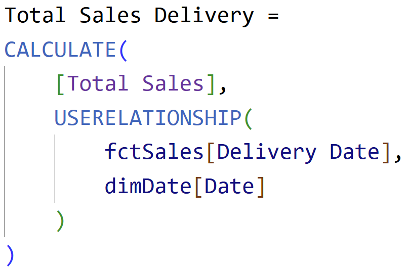
3. Create a Calculation Group with two items:
- Order Date: regular relationship
- Delivery Date: with USERELATIONSHIP
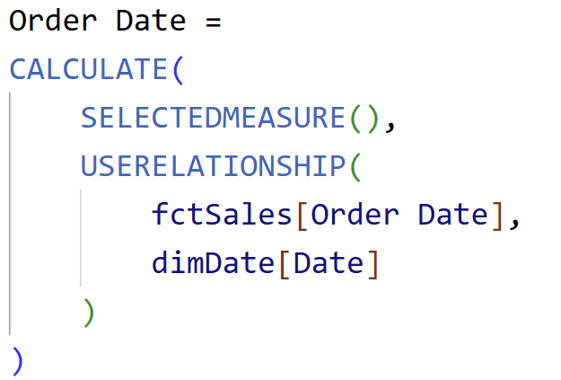
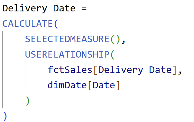
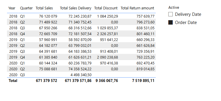
4. Add a slicer with this new “Active” dimension.
Now users can dynamically toggle whether they want to analyze by order or delivery date. The same logic can be reused across any measure (e.g., Total Sales, Discount, Returns).
3. Universal Conditional Formatting
Let’s say you want to highlight quarters with the highest or lowest sales. Normally you’d write a custom measure for each visual and each metric. With Calculation Groups, one dynamic DAX pattern can apply to everything.
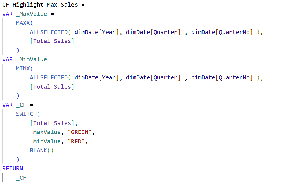
Basic Approach:
- Write a measure using MAXX, MINX, or AVERAGEX at a given granularity.
- Create a dummy measure to handle conditional formatting.
Optimized Approach with Calculation Groups:
1. Create a Calculation Group called Conditional Formatting Rules.
2. Add items for:
- Max/Min
- Above Avg
- Below Avg
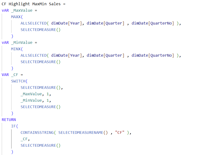
Each item:
- Evaluates the selected measure
- Returns 1 when condition is met
- Returns actual value otherwise
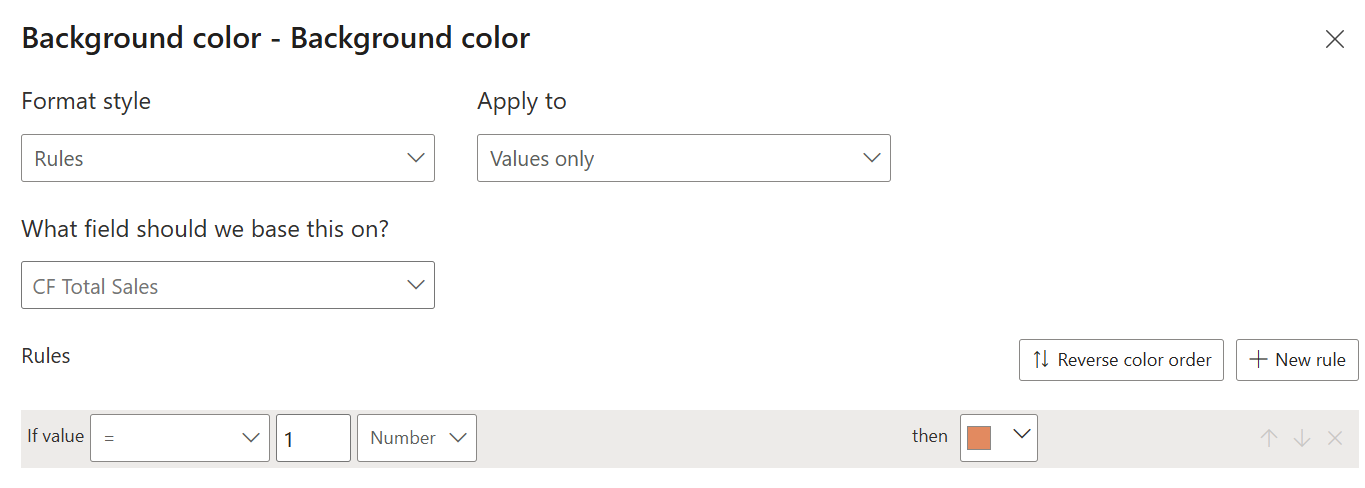
3. Create dummy CF measures for each base measure and use it as a background color:

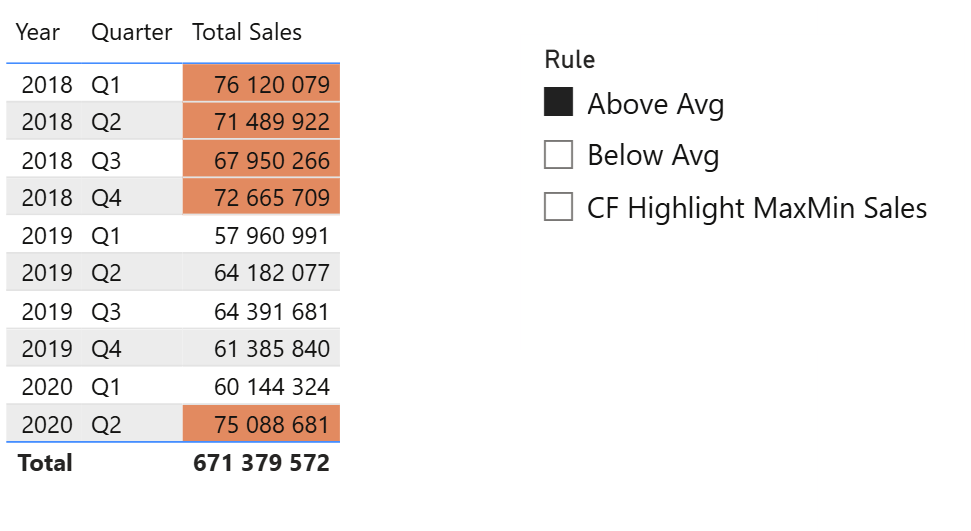
4. Add a slicer to let users pick which rule to apply.
Final Thoughts
These three examples show how Calculation Groups can dramatically simplify your Power BI models while unlocking new interactivity:
- Apply consistent logic across metrics
- Minimize repetitive DAX
- Enhance the user experience with dynamic visuals
Hope you like it!
Try implementing them in your next report and see the difference for yourself. I’d love to hear what you think or see how you use this in your own reports.