It is the kind of detail that makes users feel like the report was built with care, and it takes just a few minutes to set up once you know where to look.
Here is how to build it in Power BI step by step. Let’s dive in!
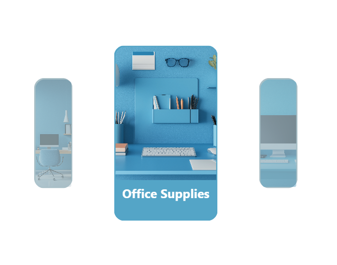
What we are building
A button slicer with one button per product category. When a category is selected, it pops forward with a solid background and a clean look. The unselected ones shrink back using a shadow effect, creating the illusion of depth and focus. The whole thing is driven by a simple image URL measure that assigns a background image to each category button.
In our example
We have three product categories - Furniture, Office Supplies, and Technology. Each has its own image hosted online and referenced in a DAX measure.
Step 1 - Create the image measure
This measure returns the image URL for whichever category is in context. Swap in your own image URLs for each category.
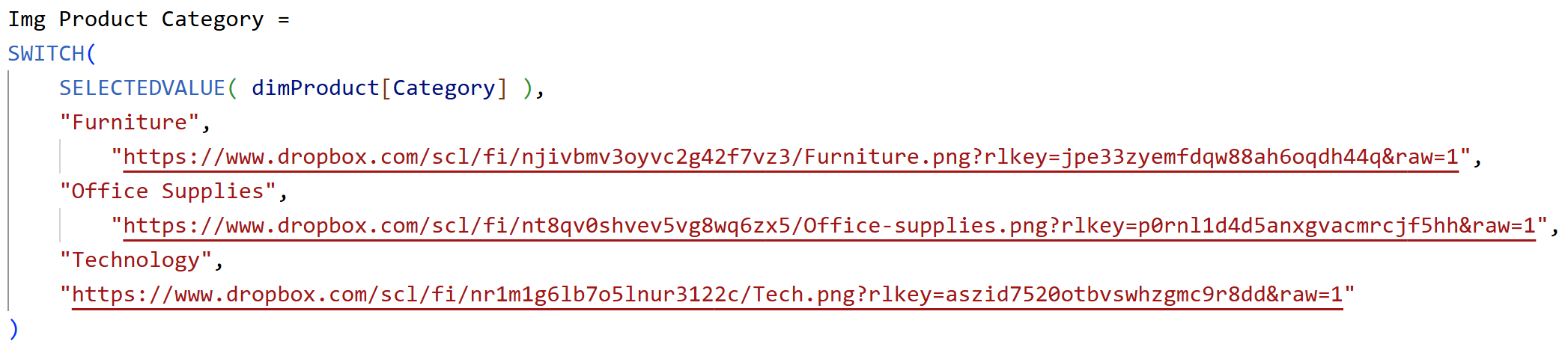
Step 2 - Insert a button slicer and set up the layout
Insert a button slicer and add Category to the Value field well. Clean it up straight away:
- Turn off the title
- Turn off the border
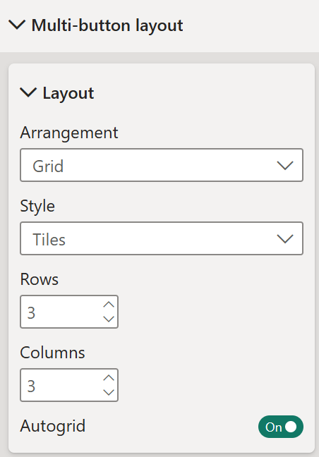
Then go to Multi-button layout - Layout and set it up:
- Arrangement - Grid
- Style - Tiles
- Rows - 3
- Columns - 3
- Turn on Autogrid
- Gap - Uniform gaps 8px
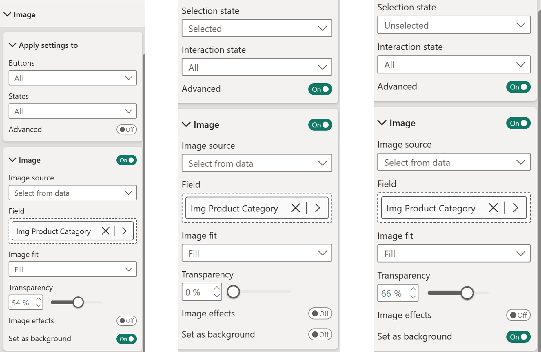
Step 3 - Set up the Image
Go to Image. This is where you assign the category image and control how it appears across each state.
All states (Advanced off):
- Turn on Image
- Image source - Select from data
- Field - Img Product Category
- Image fit - Fill
- Transparency - 54%
- Image effects - off
- Set as background - on
- Ignore padding - off
Turn on Advanced to access the Selected and Unselected states.
Selected state (Advanced on, Selection state - Selected):
- Turn on Image
- Image source - Select from data
- Field - Img Product Category
- Image fit - Fill
- Transparency - 0%
- Image effects - off
- Set as background - off
Unselected state (Advanced on, Selection state - Unselected):
- Turn on Image
- Image source - Select from data
- Field - Img Product Category
- Image fit - Fill
- Transparency - 66%
- Image effects - off
- Set as background – on
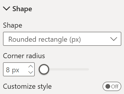
Step 4 - Set the button shape
Go to Buttons, set Buttons to All, States to Pressed, Advanced off.
- Shape - Rounded Rectangle
- Corner radius - 8px
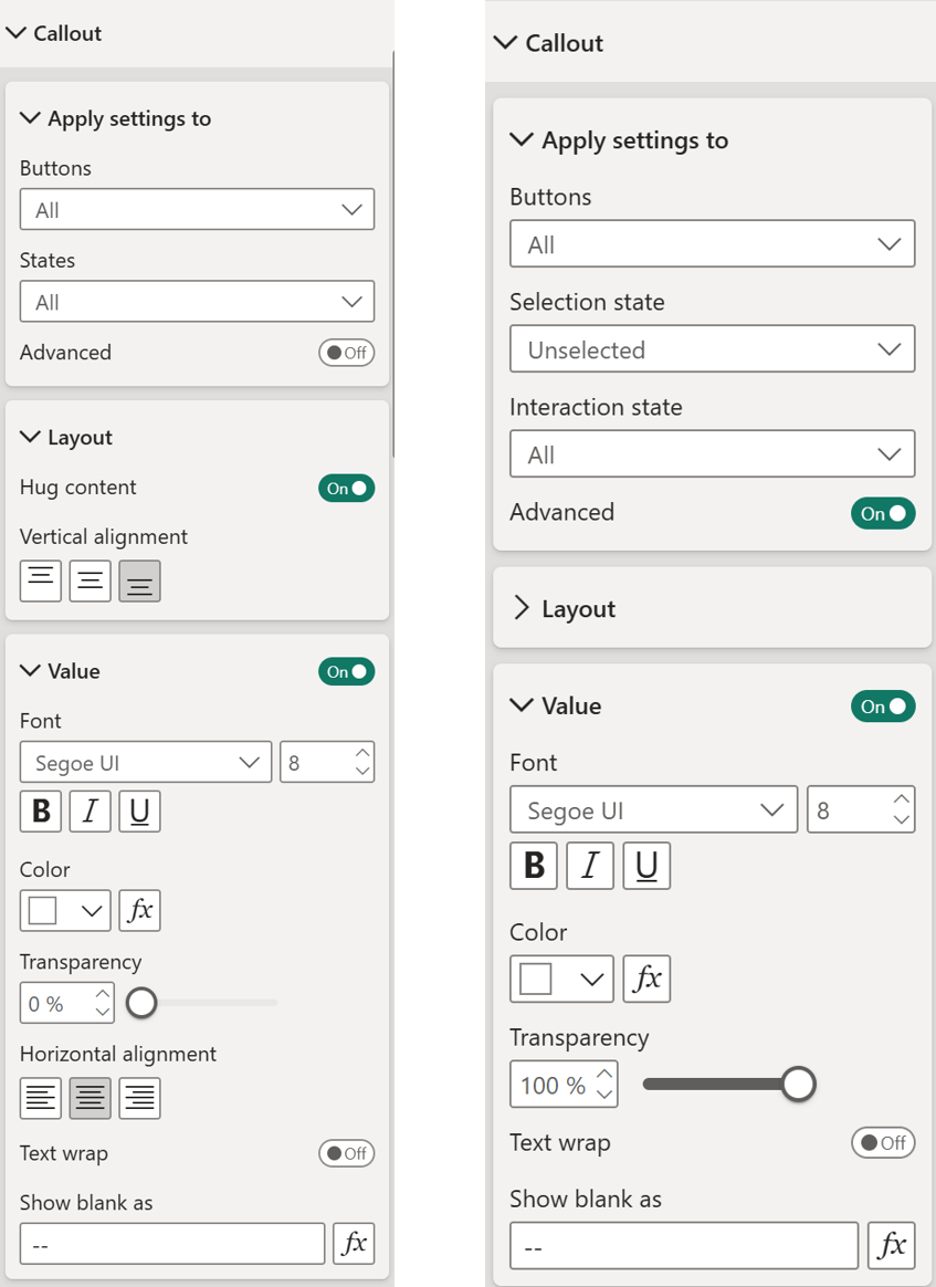
Step 5 - Set up the CalloutGo to Callout >
All states (States - All, Advanced off):Under Layout:
- Hug content – on, Vertical alignment - Bottom
Under Value:
- Turn on Value, Set color and transparency - 0%
- Horizontal alignment – Center
Turn on Advanced to access the Selected and Unselected states.
Selected state (Advanced on, Selection state - Selected, Interaction state - All):
Unselected state, Interaction state - All (Advanced on):
- All setup same as selected state but under Value – set transparency to 100%
Unselected state, Interaction state - Hover (Advanced on):
- Same setup as Selected state and transparency is 0%
Unselected state, Interaction state - Pressed (Advanced on):
- All setup same as Interaction state – All but under Value – set transparency to 100%
Step 6 - Format the Buttons
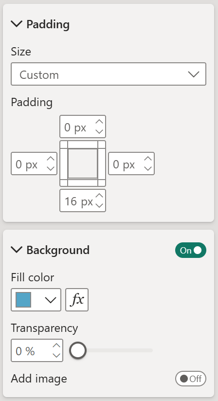
Go to Buttons and turn on Advanced.
Selected state, Interaction state - All:
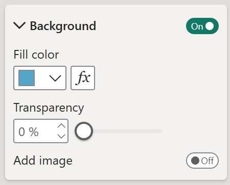
- Padding - custom, Top 0, Left 0, Right 0, Bottom 16px
- Background - on, light blue, transparency 0%
- Shadow – off
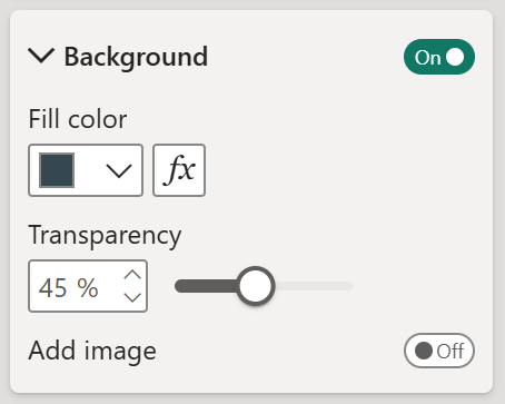
Selected state, Interaction state - Hover:
- Padding - same as above
- Background – on, transparency 45%
- Shadow – off
Selected state, Interaction state - Pressed:
- Padding - same as above
- Background – on, transparency 0%
- Shadow – off
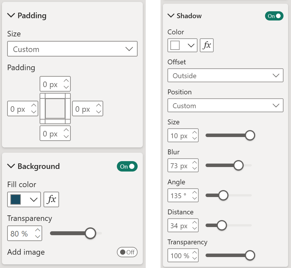
Unselected state, Interaction state - All:- Padding - custom, all 0
- Background – on, transparency 80%
- Shadow - on, color white, offset outside, position custom, size 10px, blur 73px, angle 135 degrees, distance 34px, transparency 100%
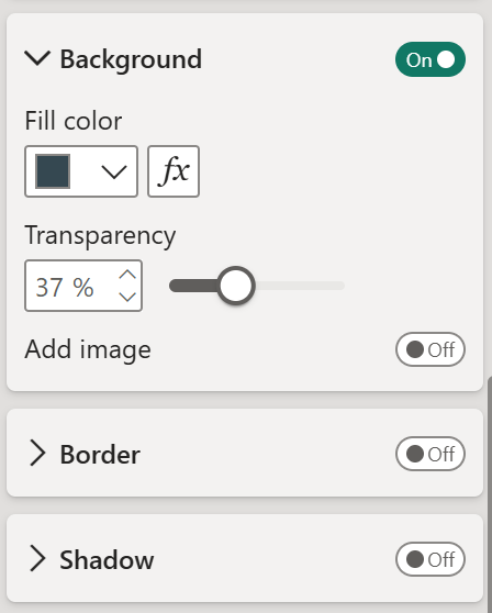
Unselected state, Interaction state - Hover:- Padding - same as above
- Background - on, transparency 37%
- Shadow – off
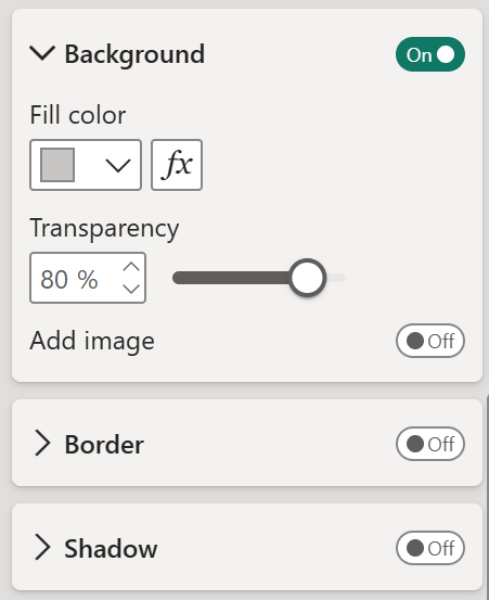
Unselected state, Interaction state - Pressed:- Padding - same as above
- Background - on, transparency 80%
- Shadow – off
And there you go! A slicer that feels alive. Click a category and it steps forward into focus - solid, clear, and prominent. The others quietly step back!
Hope you like it!
Give it a try and see how it works for you! I’d love to hear what you think or see how you use this trick in your own reports.