In this article, you’ll learn how to:
- Enable the new button slicer
- Style it with full formatting options
- Use images for categories
- Create a toggle-style slicer
- Build advanced layouts similar to modern web design
Let's dive into each example step by step.
1. Enabling the Button Slicer Feature
Before using button slicers, you need to enable them.
- Go to File > Options and Settings > Options
- Under Preview Features, check New Button Slicer
- Restart Power BI
2. Comparing Old vs New Slicer
Create an old slicer for comparison:
- Add a slicer to your report
- Use a field like Product Category
- Format it using the Tile style
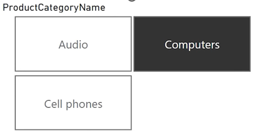
Limitations:
- Fixed layout behavior
- Cannot change shape, color, or add icons
- Always black for the selected item
3. Insert and Style the New Button Slicer
- Insert the New Button Slicer
- Assign the same field (Product Category)
- Go to Format > Layout
- Set Rows: 1, Columns: (match item count)
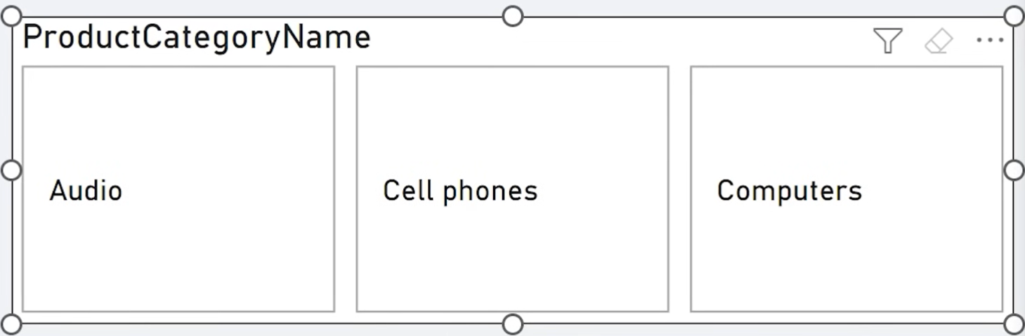
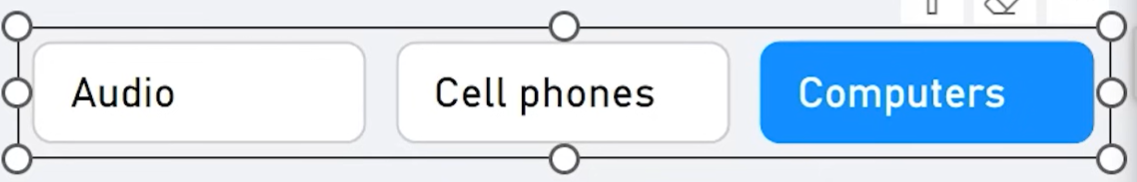
Now customize:
- Turn off Title
- Under Buttons, configure fill and border for each state: Default, Hover, Selected
- Set selected fill to blue, default to white or light gray
- Adjust borders, padding, font size, alignment, and shape
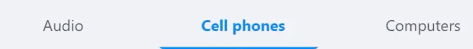
4. Adding Accent Bars
You can add accent bars to your buttons for extra visual emphasis.
- Go to Buttons > Accent Bar
- Enable it for selected state
- Choose color and position (e.g., bottom)
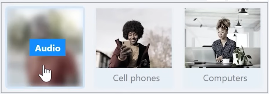
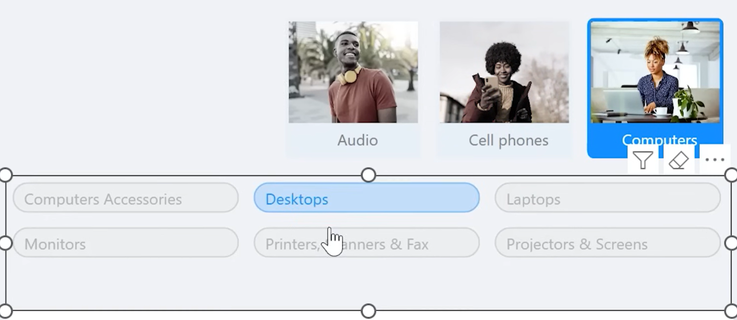
5. Using Images for Each Button
You can dynamically display category icons:
- Save icons (e.g., from PowerPoint > Stock Images) in Dropbox or OneDrive
- Create a measure:
Image Product Category =
SWITCH(
MAX('Product'[Category]),
"Audio", "https://www.dropbox.com/s/image1.png?raw=1",
"Computers", "https://www.dropbox.com/s/image2.png?raw=1",
"Cell Phones", "https://www.dropbox.com/s/image3.png?raw=1"
) - Assign this measure under Format > Images > Image field

Customize image background, saturation, transparency, blur effects, and stacking order.
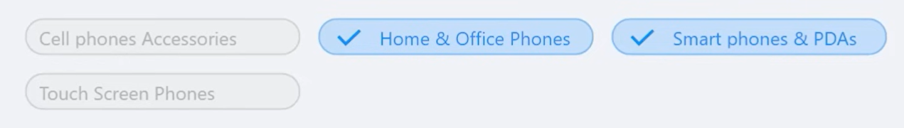
6. Building a Web-Style Subcategory Slicer
Create a slicer with multiple buttons:
- 1. Insert new button slicer for Subcategory
- 2. Use rounded rectangle shape
- 3. Reduce font size
- 4. Customize layout with Custom Padding
- 5. Keep Overflow = Continuous Scroll
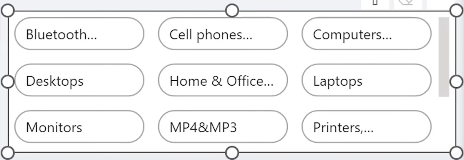
You can make the slicer look like clickable tags with subtle shadows, hover effects, and icons.
7. Adding a Checkmark Icon on Selection
To make selected buttons more intuitive:
- Insert a checkmark icon in PowerPoint (Icons > Checkmark)

- Export as PNG with transparent background
- Upload it to Dropbox and adjust the end of the URL to ?raw=1
- Create a new measure returning that URL

- Apply the image only to Selected State via Format > Images, and play around with the "Set as background" settings and image transparency to fine-tune how the image appears.
Use image alignment and spacing to shift text to the right when selected.
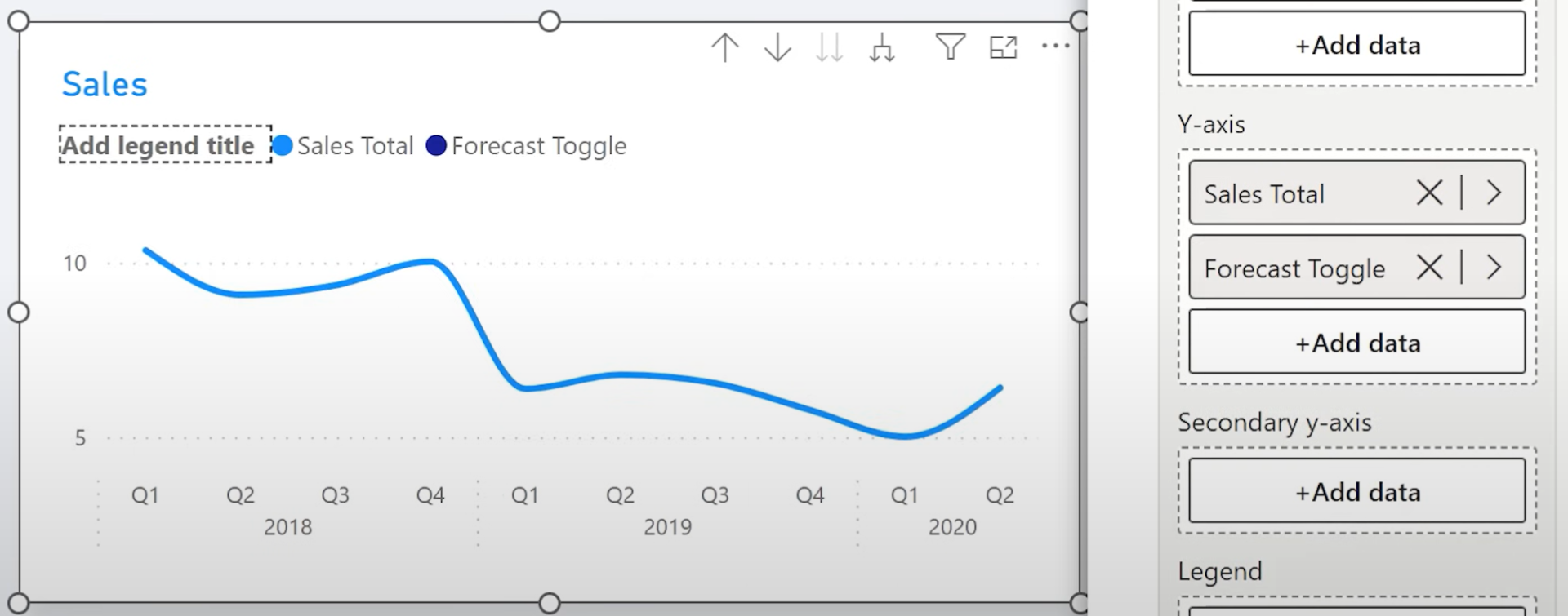
8. Creating a Toggle Button SlicerYou can create an interactive toggle (e.g. to show/hide forecast line):
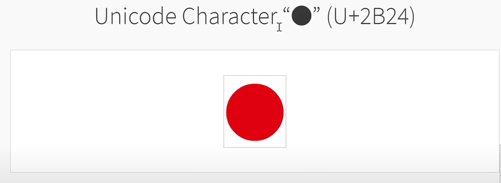
- Create a table with a single Unicode circle character (Insert manually or copy-paste from Unicode table)
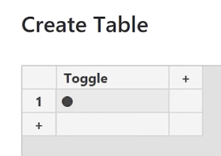
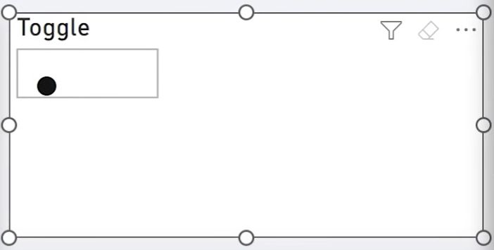
- Style the button as a small rounded switch (rows = 1, columns = 1)
- Align callout to left (off) and right (on)
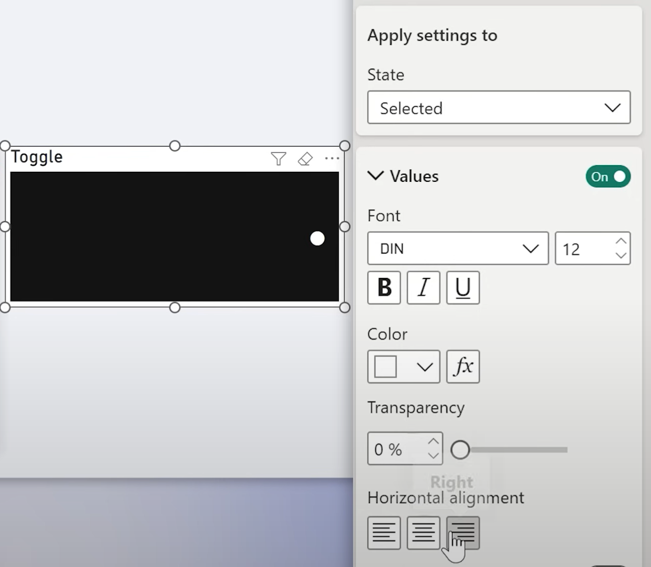
Play around with the formatting settings:

Then create a measure:
Forecast Toggle =
IF(
ISFILTERED('Toggle Table'[Toggle]),
[Sales Target],
BLANK()
)
Replace your line visual’s target with this measure.
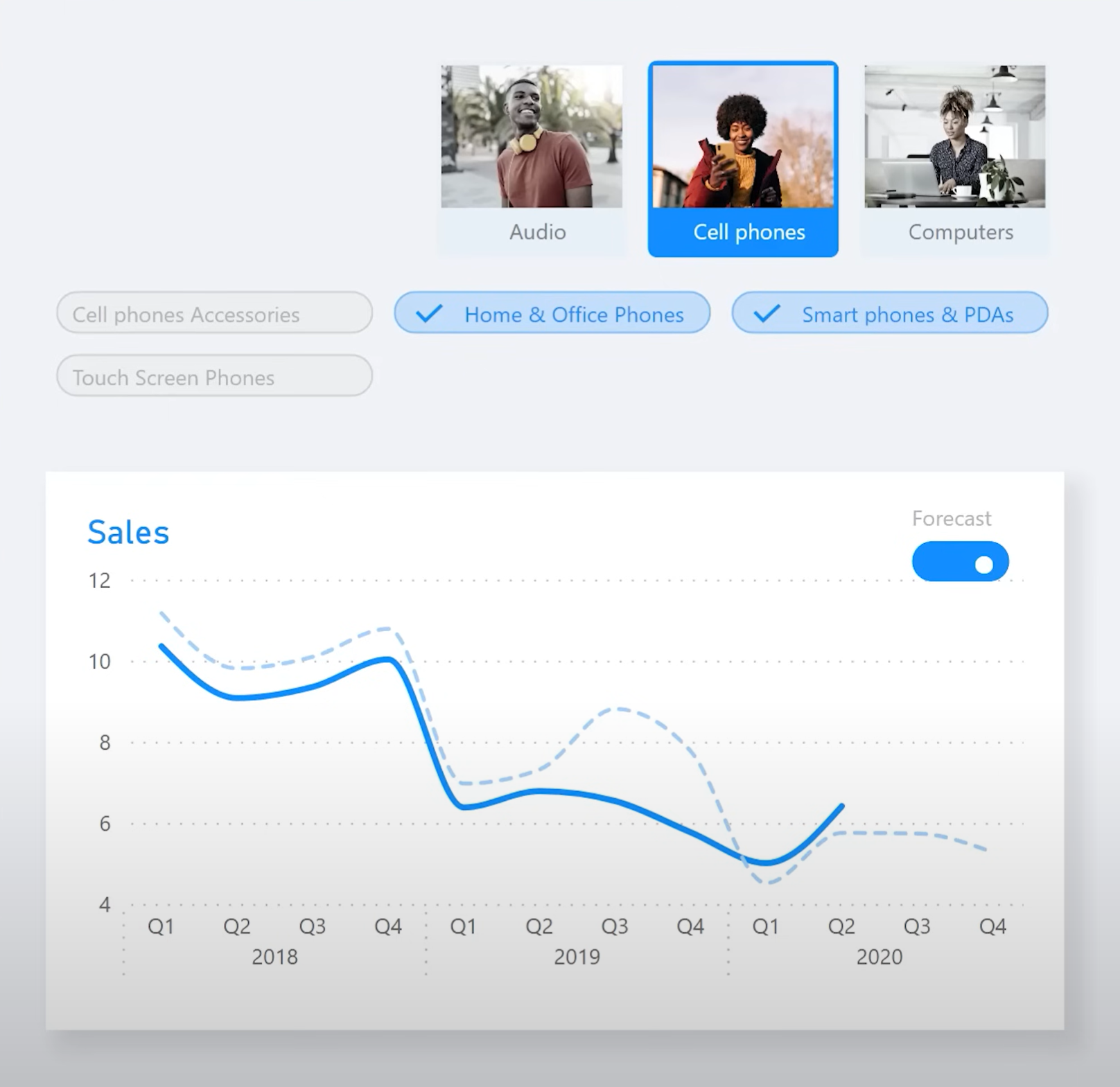
9. Optional: Use Image Toggle Instead
If you prefer visuals:
- Upload two images (on/off states)
- Use Images per state in slicer formatting options
Final Thoughts
The new button slicer gives you unmatched control over how filters are presented in Power BI. You can now create sleek, modern, web-like filters with icons, hover states, animations, and toggles.
If you haven't explored the possibilities yet, this is the perfect time to dive in.
Hope you like it!
Give it a try and see how it works for you! I’d love to hear what you think or see how you use this trick in your own reports.