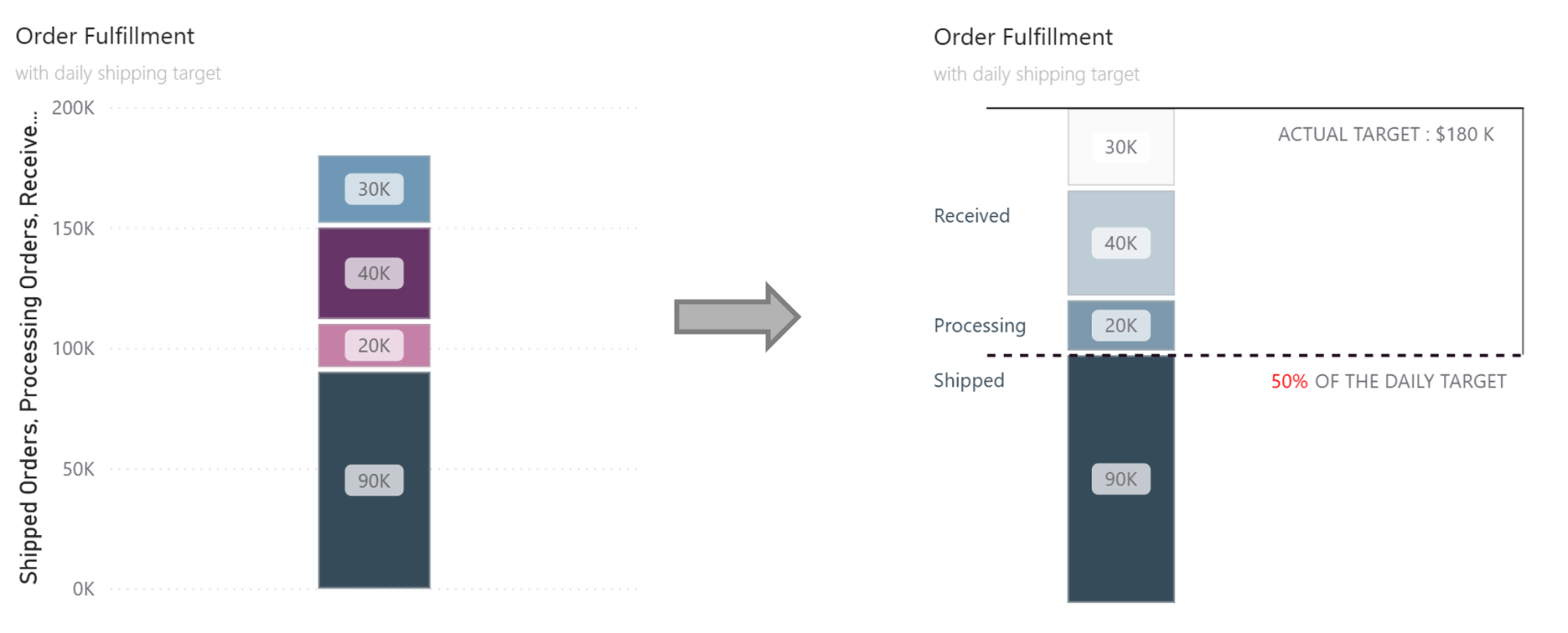
How far are we from the target if we consider what's done, in progress, and queued up? This question pops up everywhere:
Finance: Cash collected + accounts receivable + work in progress
Sales: Closed deals + pipeline + qualified Leads
or like in my example below for logistics
Shipped orders (what's done)
Processing orders (what's in progress)
Received orders (what's queued up)
To answer this we could put together a basic visual like on the left or you put in a bit more effort and make it easier to read, more insightful and look better (chart on the right).
Step 1: Choose the Right Chart Type
Start with a Line and Stacked Column Chart. Why? Because we need those horizontal lines later for the target and actuals - you can't get that effect with just columns.
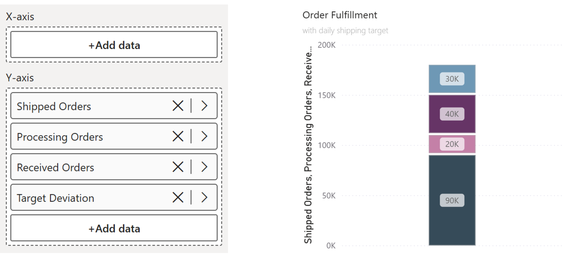
Step 2: Create Space for Labels
We need room on the left and right for labels. To do that we need a small workaround.
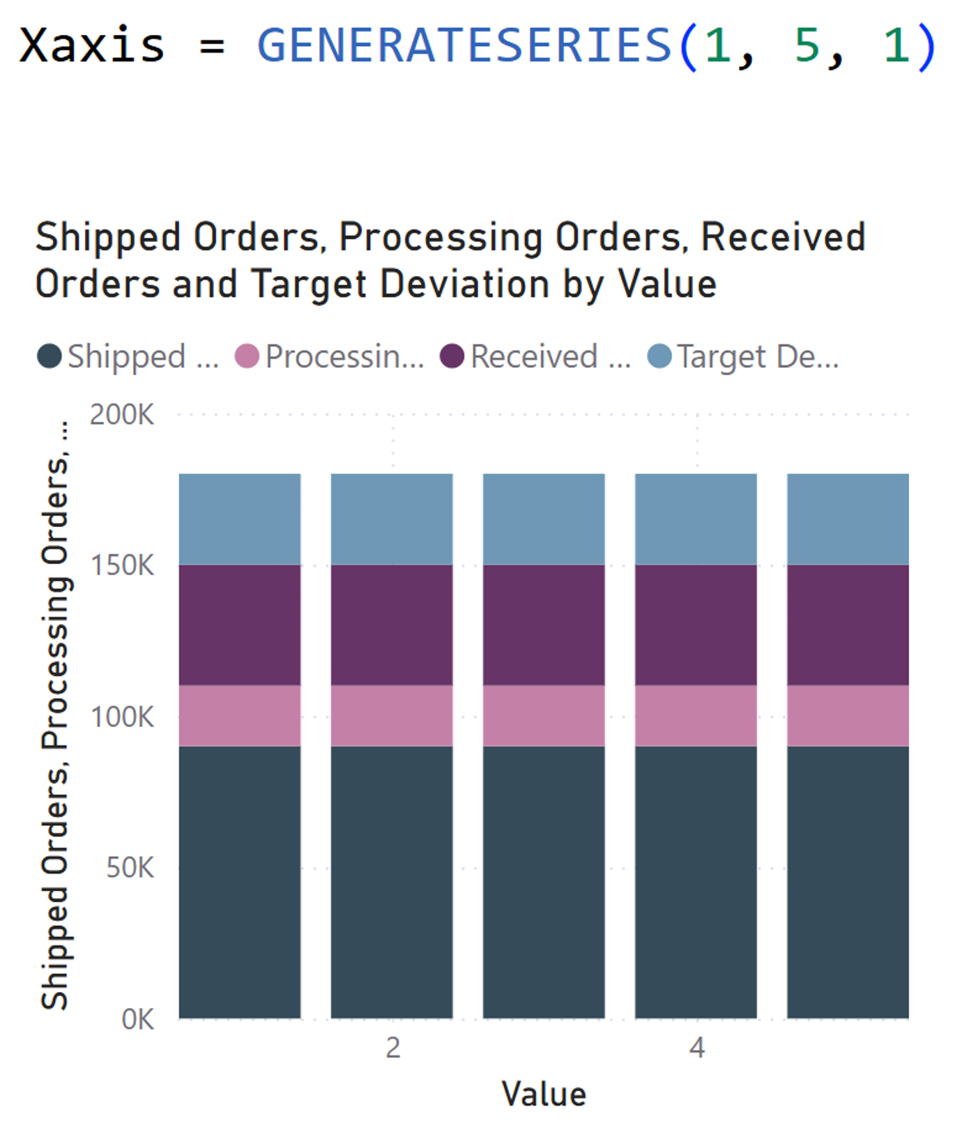
Go to Modeling → New Table to create a helper table with a simple column that has the values from 1 to 5. Drag that value column onto your x-axis.
Now you'll see your stacked column repeated five times. Not what we want... yet.
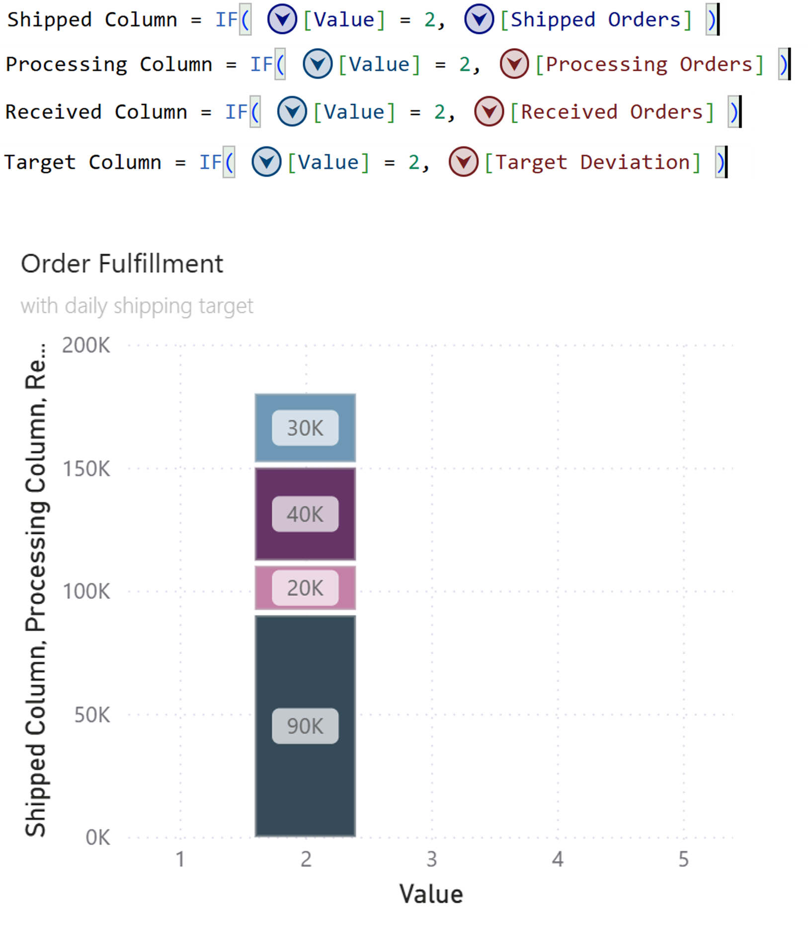
Step 3: Show Columns Only Where You Want Them
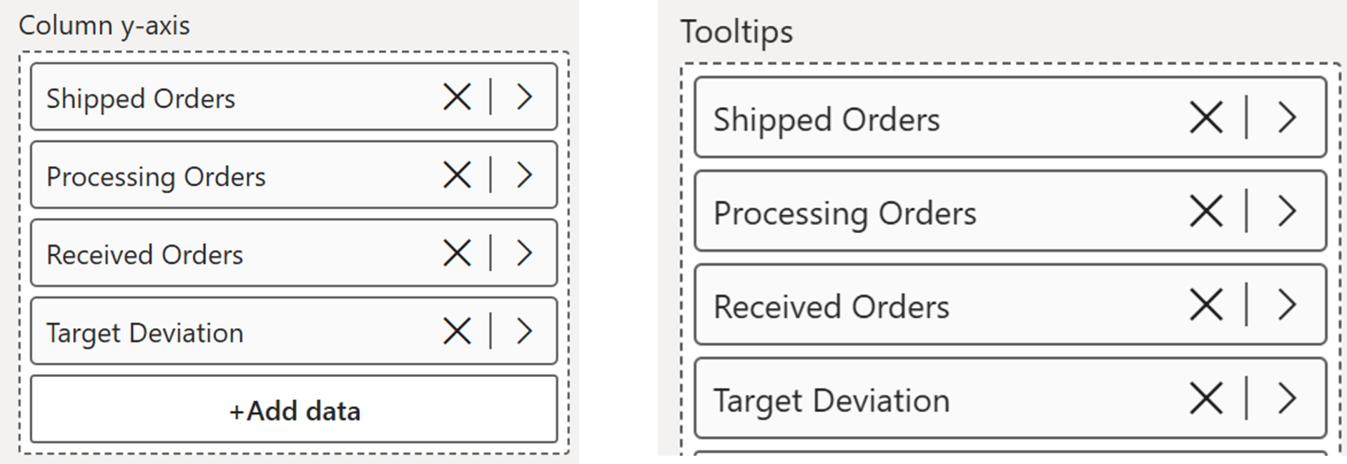
Drag all your order fields (Shipped, Processing, Received, Target) onto the Tooltip section.
Now we can use visual calculations to only show the columns where the x axis is 2 otherwise we leave it blank (the space we can use for lines and labels)
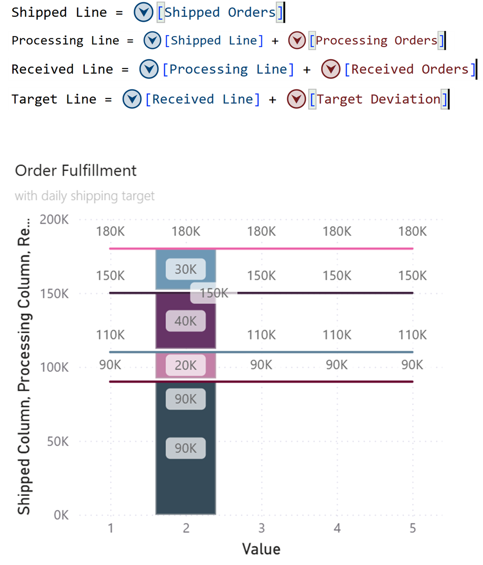
Step 4: Draw Horizontal Lines
Now we can add the lines in a similar way with visual calculations.
Note: Lines aren't stacked like columns, so for each subsequent line, you need to add the previous values.
Now you've got your horizontal reference lines stretching across the chart.
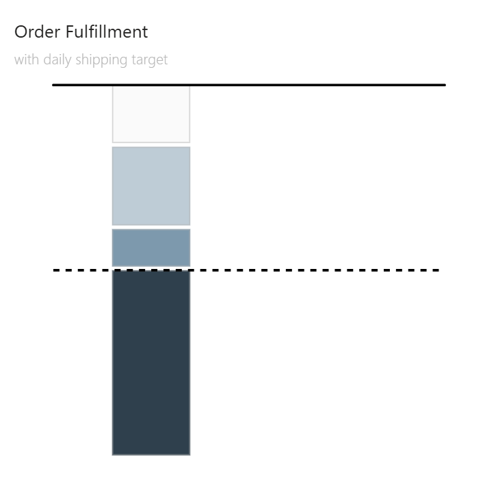
Step 5: Clean It Up
Time to declutter:
- Turn off the legend.
- Turn off data labels except for the lines next to which we want to show labels later.
- Hide the middle lines (Processing Line, Received Line) if you only want top and bottom lines.
- Turn off both axis titles and values
Step 6: Formatting
Change colors and set the style of the line. In this example, I have set it to “solid” for the top target line and “dashed” for the bottom shipped line.
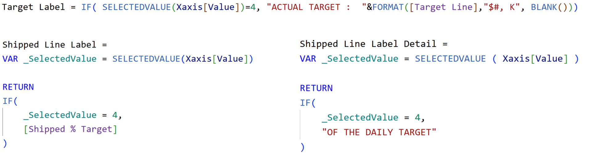
Step 7: Add Smart labels
For the horizontal lines, use Data Labels with custom measures.
Position them under the line. You can split into Value and Detail for more flexibility - and apply conditional formatting (green if above target, red if below).
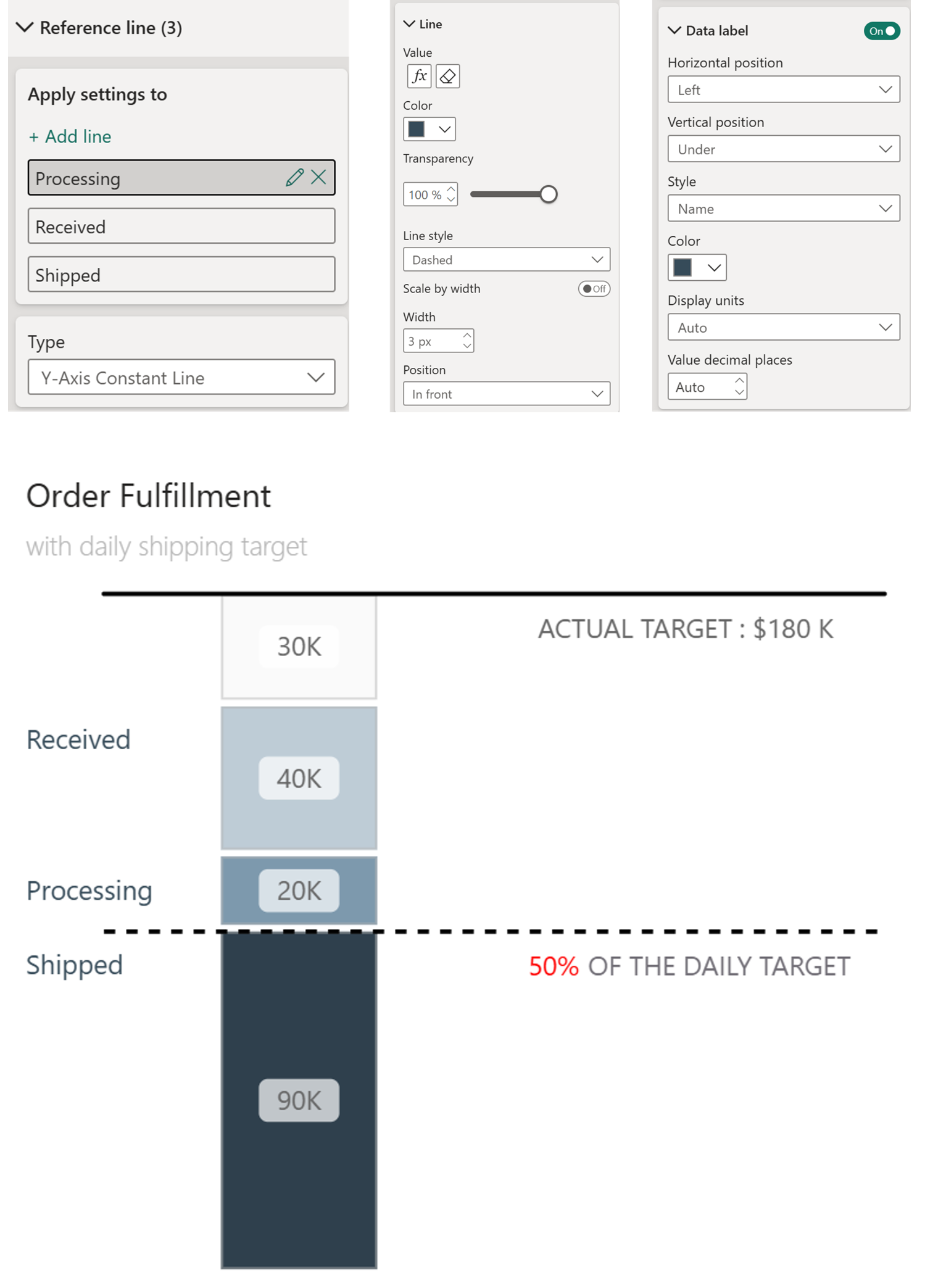
Step 8: Reference Lines for Column Labels
To label each bucket on the left side you could use labels, however you can't have multiple labels to 1 single line. So we could add more and make them invisible or use reference Lines like below:
- Go to Format → Reference Lines
- Add three Y-axis constant lines
- Rename them as you want the text in the visual. Here is went for Shipped, Processing, Received
- Click the fx button to set each line's value to the corresponding measure
- Enable Data Labels, position left, show the name (not Data Value)
- Set line transparency to 100% (we only want the data label)
And now we have labels on the left.
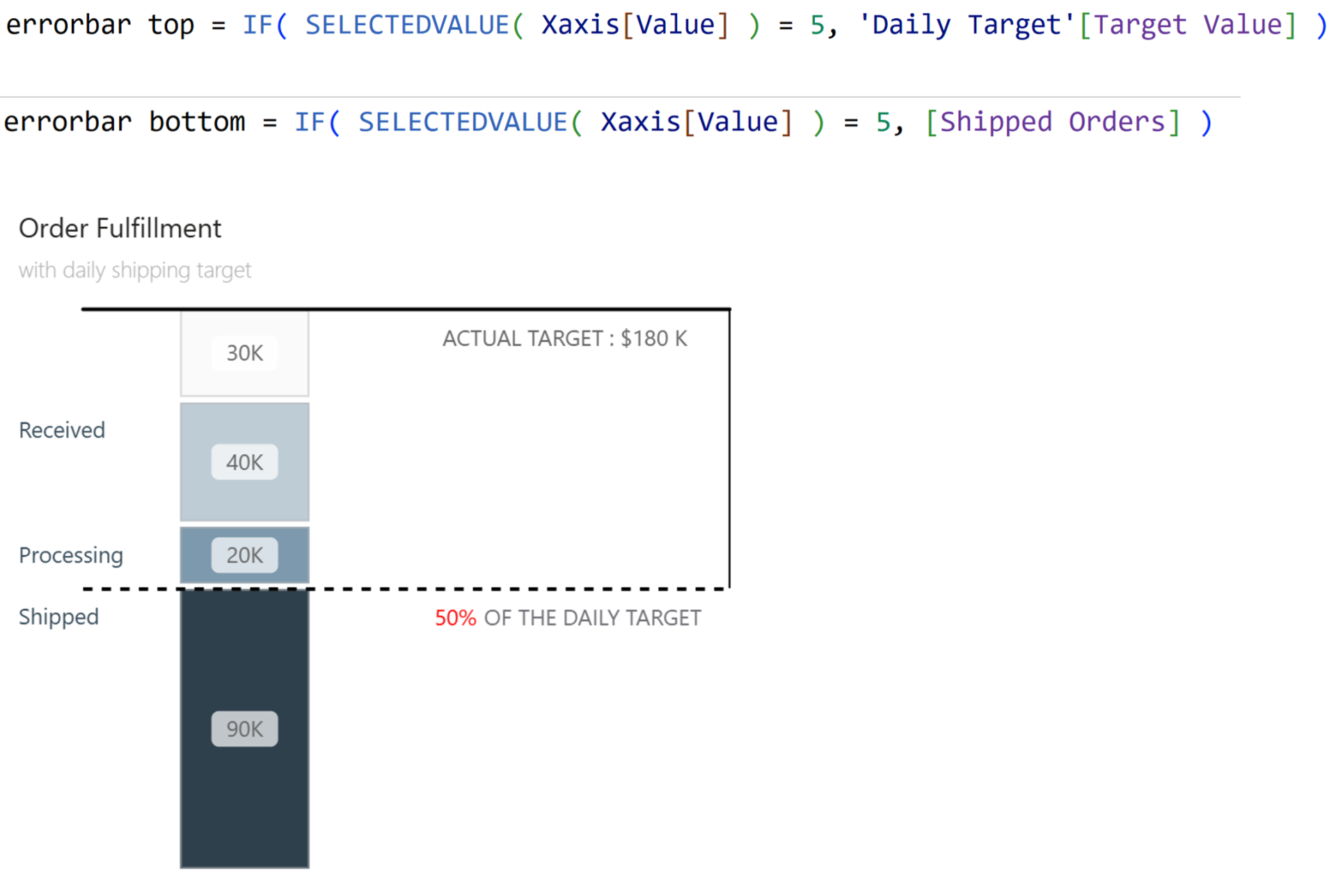
Bonus: Connect the Lines with Error Bars
If you want to visually connect your target line to your actuals? Use Error Bars.
- Enable error bars on the Target Line
- Create measures for upper and lower bounds
- Format: solid black, no markers
Now you have a clean connector showing the gap between where you are and where you need to be.
And that’s it. Of course can play around with the placement of the labels and the number of lines you would like to have.
Hope you like it!
Give it a try and see how it works for you! I’d love to hear what you think or see how you use this trick in your own reports.

