The Pareto Principle, commonly known as the 80/20 rule, states that roughly 80% of outcomes are often driven by just 20% of the causes. In business, this typically means that a small number of products, customers, or regions generate the majority of your revenue, profit, or other key performance indicators.
One of the most common ways to apply the Pareto Principle is through ABC classification, which groups items based on their cumulative contribution to a chosen metric. Category A contains your highest-impact items, B represents the next most significant group, and C captures the remaining long tail of lower contributors. This makes it easy to prioritize your analysis and focus on what matters most.
It is a simple but powerful way to decide where to focus your energy and where to stop over-investing. Here, we'll build a dynamic Pareto chart in Power BI that combines cumulative contribution with ABC classification. Along the way, you'll also see how Visual Calculations can simplify the implementation.
Here is how to build it in Power BI, Let’s dive in!
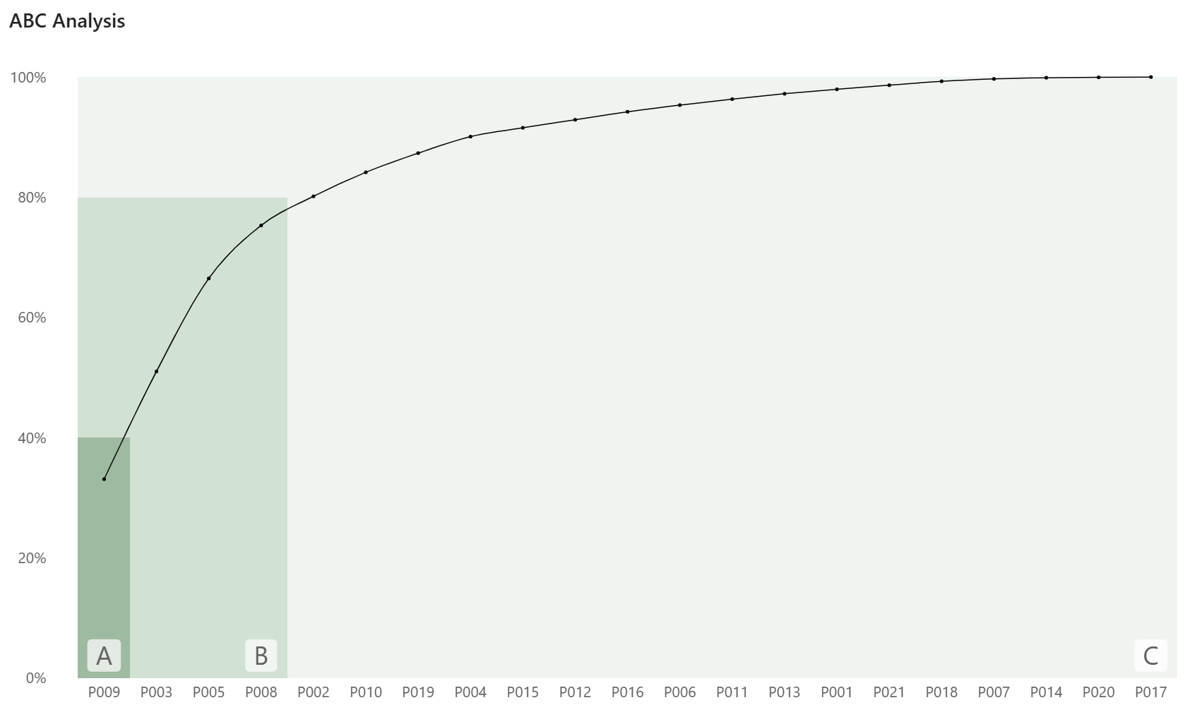
What we are building
A line and clustered column chart showing products ranked by total sales, with a cumulative running sum line overlaid. Three shaded background zones mark the A, B, and C groups, and a letter label sits at the boundary of each group. The sorting, grouping, and cumulative logic are all handled by visual calculations - no complex DAX measures needed.
In our example
We have a product sales table with a Product ID and a Total Sales measure. That is all you need to follow along.
Step 1 - Set up the base visual
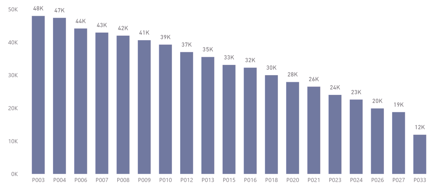
Insert a line and clustered column chart.
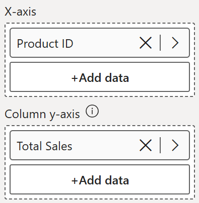
• X-axis - Product ID
• Column y-axis - Total Sales
At this point you have a standard column chart. Take a look at the bars here though - this is where you get a feel for where the natural revenue cutoffs sit and decide on your group thresholds.
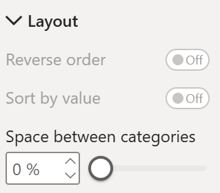
Go to Columns > Layout and adjust the space between categories to 0
Step 2 - Add the visual calculations (Pct of total & Running Sum)
Go to the visual, click the visual calculations button, and add them in this order.
Percent of Grand Total - calculates each product's share of total sales. Add this to the column y-axis.
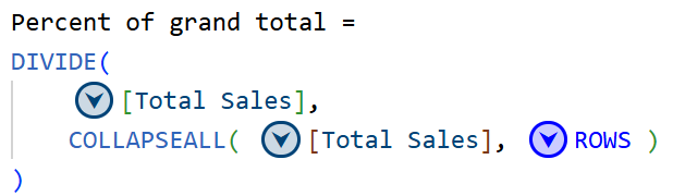
Running Sum - calculates the cumulative percentage, ordered by Total Sales descending. This is what sorts the products from highest to lowest and builds the curve. Add this to the line y-axis.
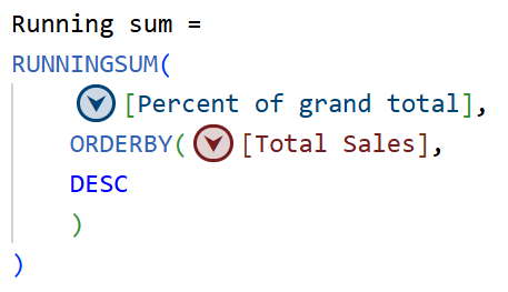
By now, you will have a traditional pareto chart. Now, lets build further from here to achieve the ABC Classification.
Step 3 - Hide the base series
Total Sales and Percent of Grand Total are no longer needed as visible columns - they were only needed to feed the visual calculations. Hide Percent of Grand total series from the column y-axis and move the Total Sales to the tooltips.
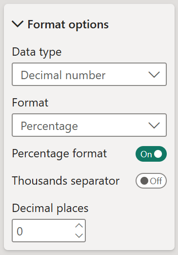
Few Adjustments: Format the percent of grand total & Running sum series to % via the Properties - Data Format - Format Options.
Step 4 - Add further visual calculations for the grouping & Label
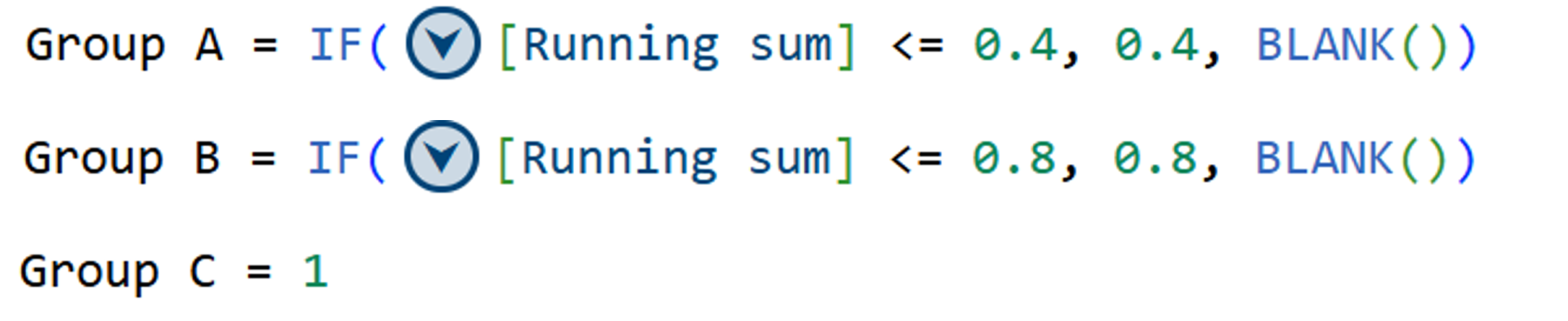
Create 3 visual calculations,
Group A - fills the background up to the 40% threshold
Group B - fills the background up to the 80% threshold
Group C - always returns 1, filling the remaining background
Add Group A, Group B, and Group C to the column y-axis.
Create 3 more similar visual calculations,
A - detects the last product in Group A, where the running sum crosses the 40% threshold
B - detects the last product in Group B
C - detects the last product in Group C
Add A, B, and C to the line y-axis.

Step 4 - Format the columns
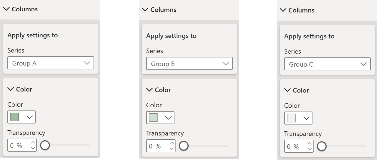
The Group A, B, and C columns create the shaded background zones. Give each a different shade of green - darker for A, medium for B, lighter for C - to visually distinguish the three tiers.
For the A, B, and C label series, set transparency to 100% so they are completely invisible. They are only there to carry the data labels in the next step.
Step 5 - Format the line
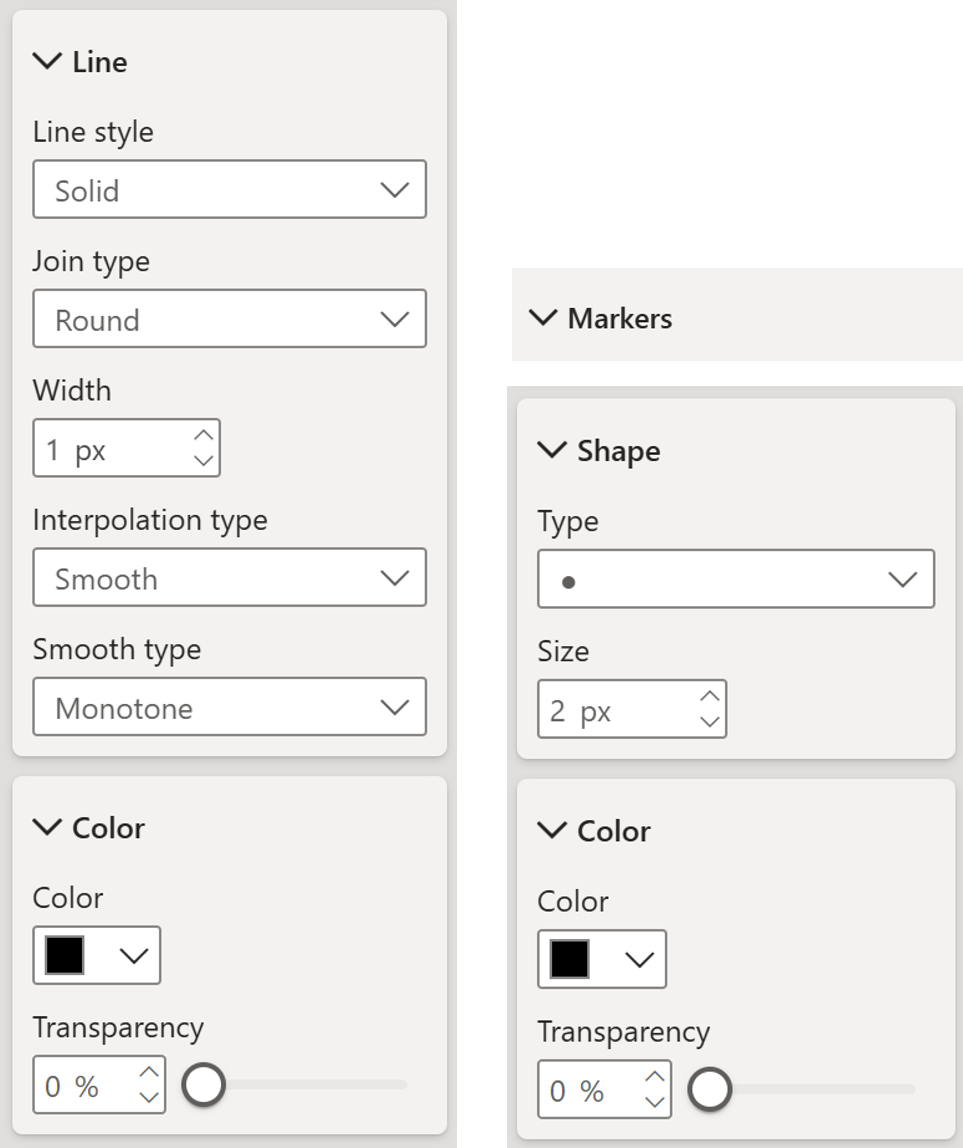
Select the Running Sum line series:
- Line style - solid
- Line type - round
- Width - 1
- Turn on markers, set marker width to 2
- Set the line and marker color to your preference
Step 6 - Add data labels
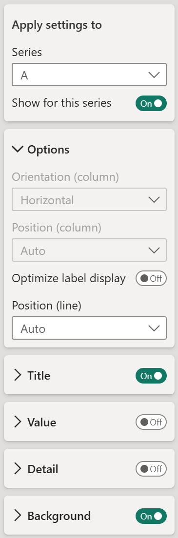
Turn on data labels only for the A, B, and C series. Turn them off for everything else.
For each of the three series:
• Turn on Title, turn off Value
• The title will show the series name - A, B, or C - sitting at the bottom of the column right at the group boundary
(The Image shows for series “A”, likewise set it up for “B” & “C” Series as well)
Step 7 - Final cleanup
- Rename the title ABC Analysis
- Turn off axis titles
- Turn off the legend
- Turn off gridlines
And there you go!
Hope you like it!
Give it a try and see how it works for you! I’d love to hear what you think or see how you use this trick in your own reports.