
4 ways to use error bars in Power BI - small feature, big impact
Error bars in Power BI are hiding in plain sight. Most people set them up once for a standard chart and never think about them again - but there is a lot more going on under the hood. Used creatively, error bars can reshape a visual entirely, adding elements that would otherwise require custom visuals or complex workarounds.
Apr 8
/
datatraining
Here are four ways to use Error bars creatively and to avoid custom visuals or complex DAX measures.
Let’s dive in!
Example 1 - Data Flags
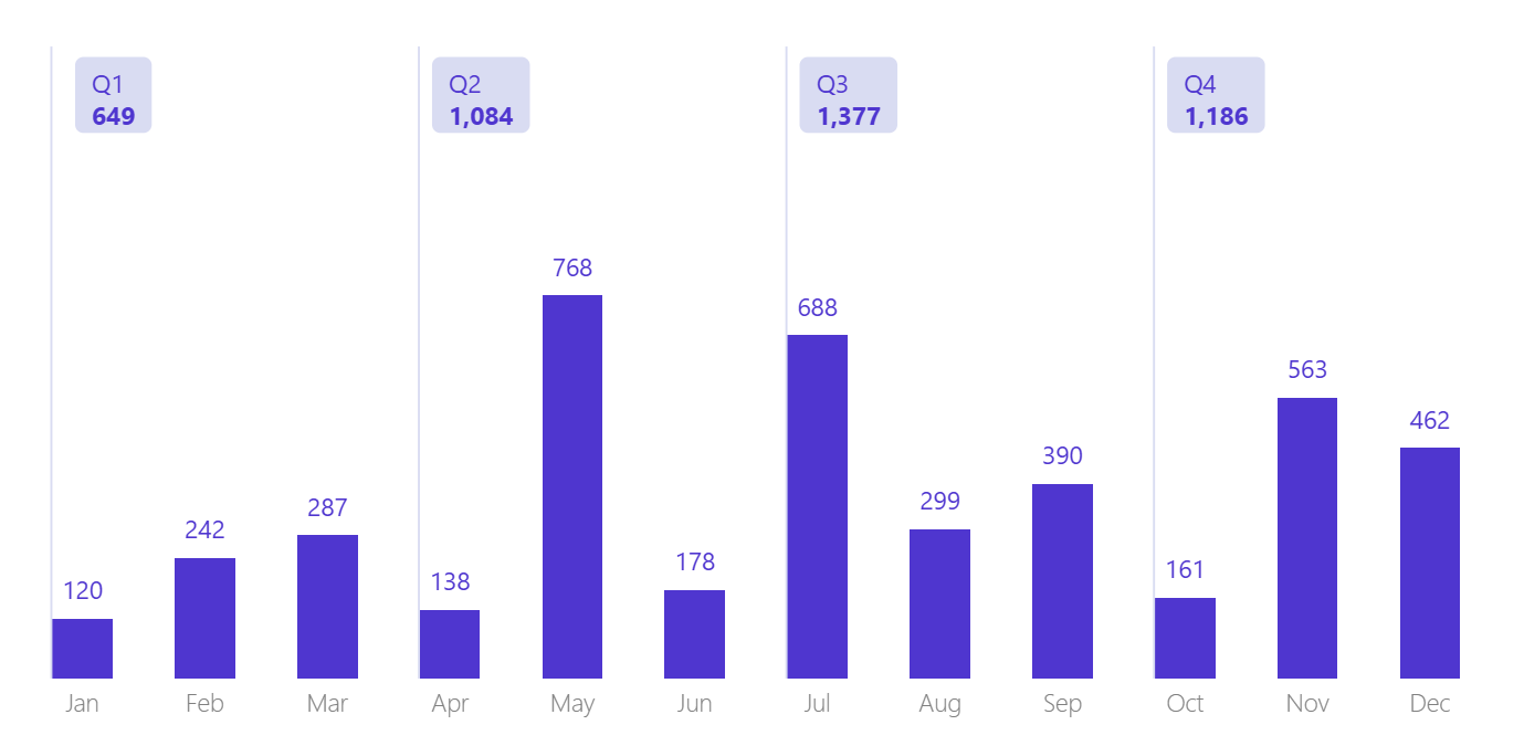
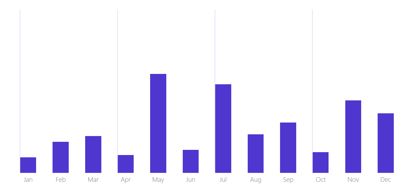
A data flag is a vertical line that pops up at a specific point in a chart, carrying a label with summary information. In this example, a flag appears at the start of each quarter showing the quarter name and total likes for that period. Clean, contextual, and built entirely with error bars.
What we are building
Example 1 - Data Flags
A data flag is a vertical line that pops up at a specific point in a chart, carrying a label with summary information. In this example, a flag appears at the start of each quarter showing the quarter name and total likes for that period. Clean, contextual, and built entirely with error bars.
What we are building
A column chart showing monthly social media likes, with a vertical flag at the start of each quarter. Each flag shows the quarter label and the total likes for that quarter.
Step 1 - Create the measures
You need five measures before touching the visual.
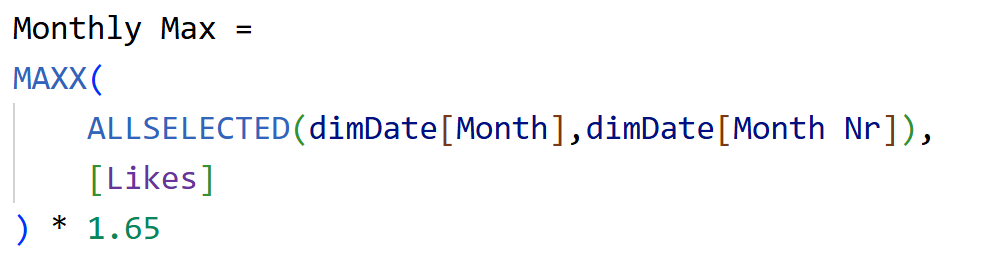
Monthly Max - finds the highest likes value across all selected months and scales it up. This controls how tall the flag line appears.
Monthly Max - finds the highest likes value across all selected months and scales it up. This controls how tall the flag line appears.
Dummy0 - always returns zero. Used as the lower bound of the error bar so the line starts from the bottom.

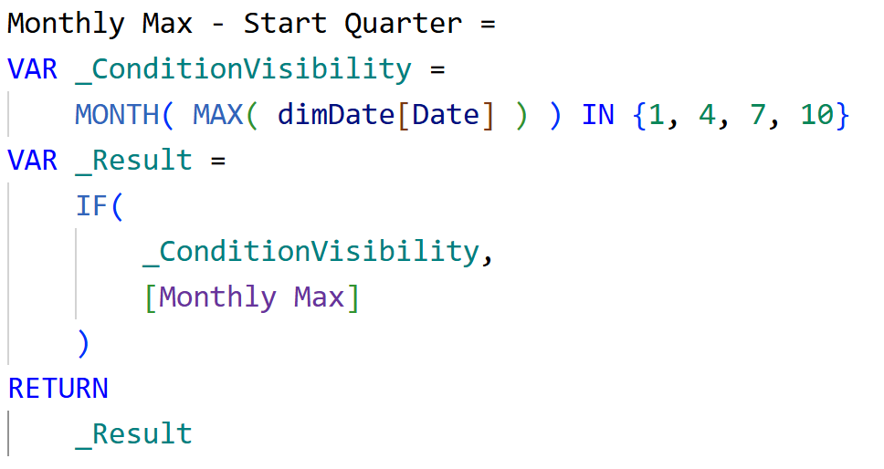
Monthly Max - Start Quarter - returns the Monthly Max value only at the start of each quarter. This is what controls where the flags appear.
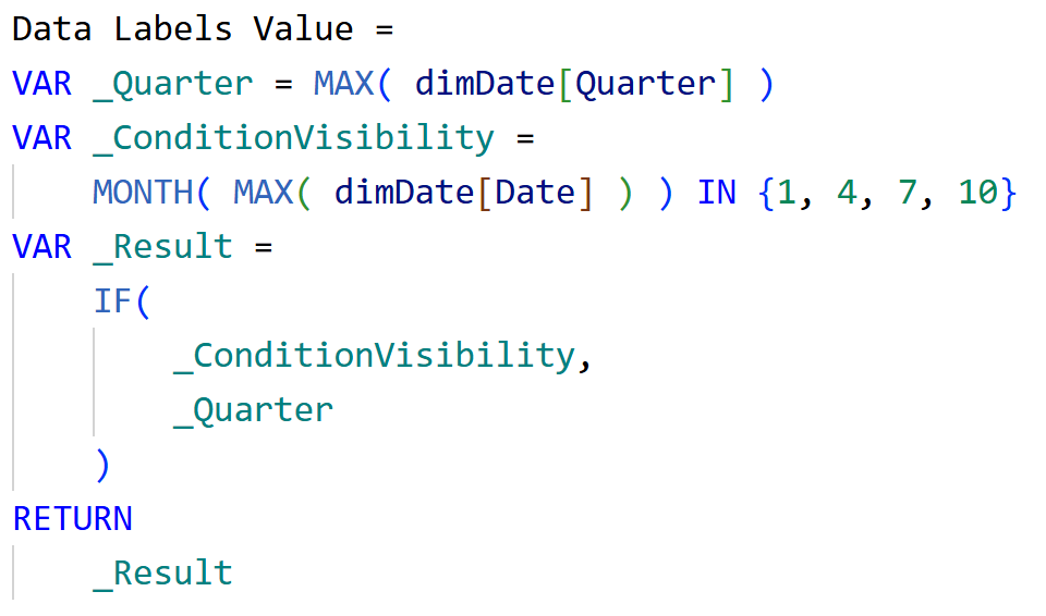
Data Labels Value - returns the quarter label (Q1, Q2 etc.) only at quarter starts. This is the main text on the flag.
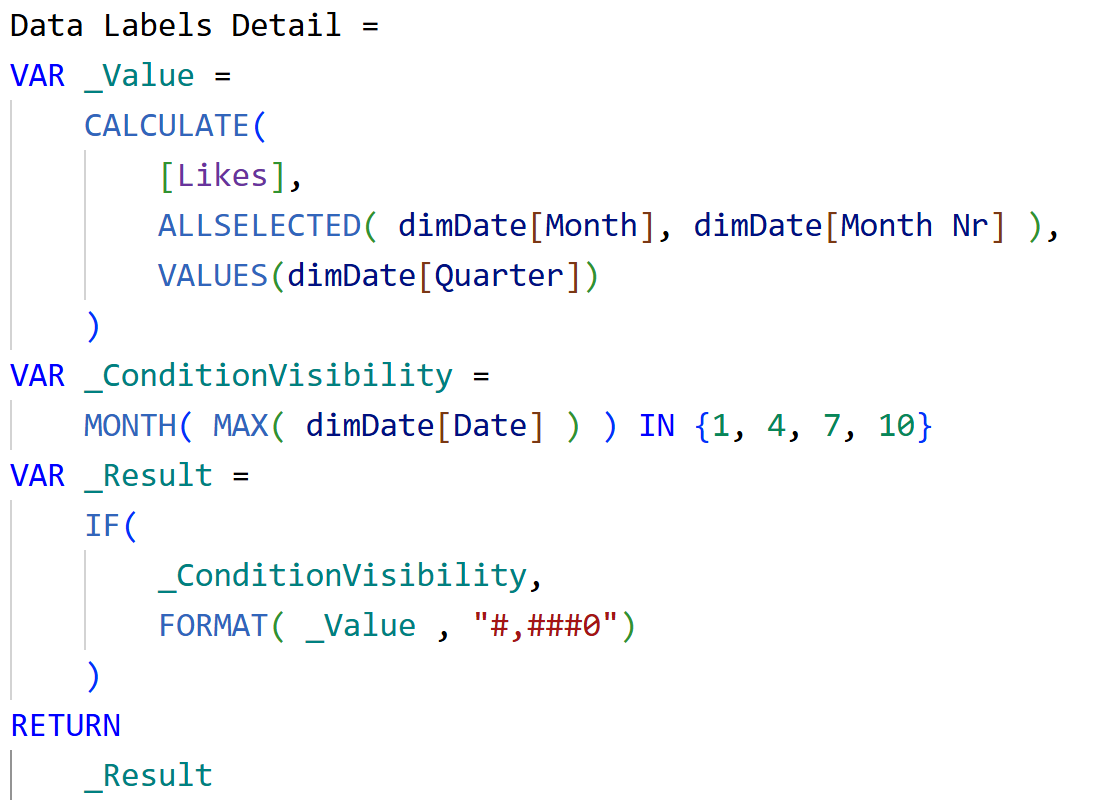
Data Labels Detail - returns the total likes for that quarter, formatted with thousand separators, only at quarter starts. This is the detail line below the quarter label on the flag.
Step 2 - Set up the visual
Insert a clustered column chart.
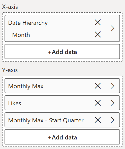
- X-axis - Month
- Y-axis - add the three series in this order >> Monthly Max, Likes, Monthly Max - Start Quarter
Step 3 - Make the flag series transparent
The Monthly Max and Monthly Max - Start Quarter series need to be invisible - they are just anchors for the error bars and data labels.
The Monthly Max and Monthly Max - Start Quarter series need to be invisible - they are just anchors for the error bars and data labels.
- Go to Format - Columns - select Monthly Max series - set transparency to 100%
- Do the same for Monthly Max - Start Quarter series
Now only the Likes columns are visible.
Step 4 - Reduce spacing to align the flag lines
Attaching error bars directly to the Likes series centers the lines on the columns and they overlap the data labels. Instead, the error bars are attached to the Monthly Max series which sits alongside the columns. To make sure the flag lines land in the right position:
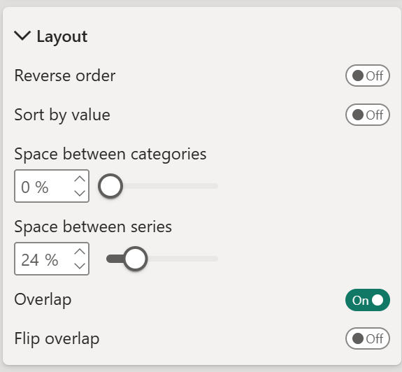
- Go to Format - Columns - Layout
- Reduce the space between series to around 25%
This overlaps the series so the Monthly Max series aligns closely with the Likes columns.
Step 5 - Add error bars
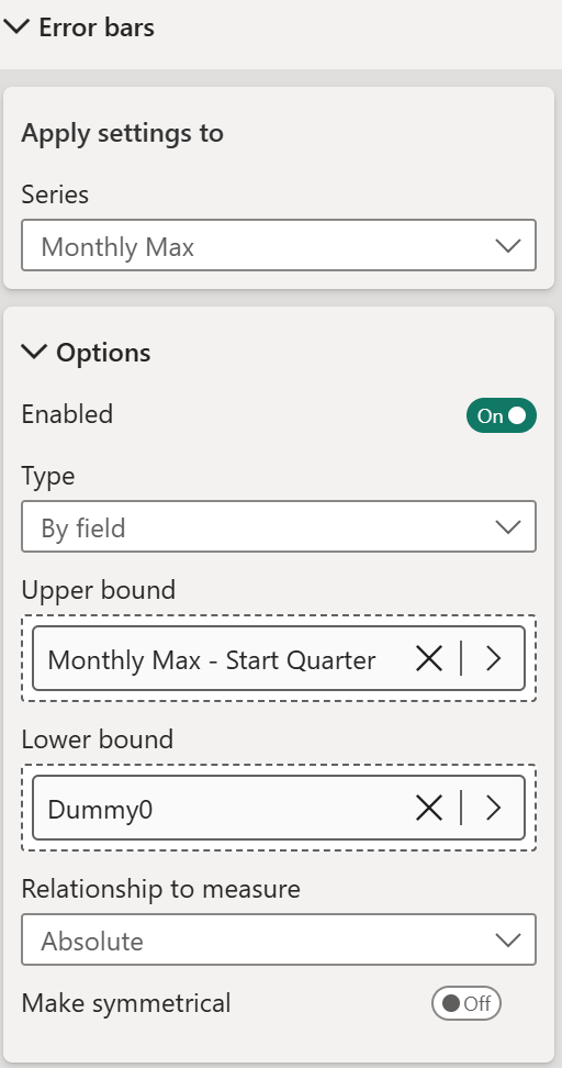
Go to Format - Error bars.
- Select the Monthly Max series
- Turn on Enable
- Set Type to By Field
- Set Upper bound to Monthly Max - Start Quarter
- Set Lower bound to Dummy0
- Go to Bar - turn it on and style the color and width as you like
- Turn off borders and markers
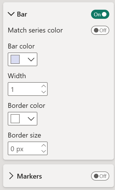
Because Monthly Max - Start Quarter only returns a value at January, April, July, and October, the error bar has nothing to draw for all other months - so the flags appear only at quarter starts automatically.
Step 6 - Add data labels
Go to Format - Data labels.
• Select the Monthly Max - Start Quarter series
• Turn on Show for this series
• Turn off Title
• Under Value - set Field to Data Labels Value, set font & color to your preference.
• Under Detail - turn it on and set Data to Data Labels Detail
• Under Background - turn it on and set a light background color to give the flag that card-like appearance
• Set text alignment to left
• Set layout to “Multi-line”

And we have a clean column chart where the monthly data speaks for itself, and the quarterly summary floats above it as a flag - no extra table, no tooltip hunting, no cluttered annotations. Just the right information, exactly where the eye naturally goes.
Example 2 – Rounded Bars
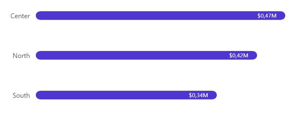
Power BI does not have a native rounded bar option. But with a small error bar trick, you can make it convincingly - a filled circle marker at each end of the bar creates the illusion of rounded caps, and the result looks polished enough!
What we are building
A horizontal bar chart with rounded ends on both sides, giving each bar a clean, pill-like appearance.
Step 1 - Set up the base visual
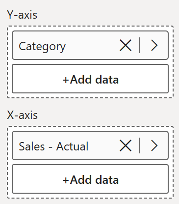
Insert a clustered bar chart.
- Y-axis - Category
- X-axis - Sales Actual
Step 2 - Add error bars
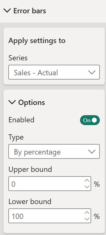
Go to Format - Error bars and select the Sales Actual series.
- Turn on Enable
- Set Type to By Percentage
- Set Upper bound to 0%
- Set Lower bound to 100%
This is what turns the plain error bar into a rounded cap.
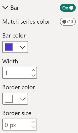
Under Bar:
- Turn on Bar
- Set bar color to match your main bar color
- Set width to 1
- Set border size to 0px
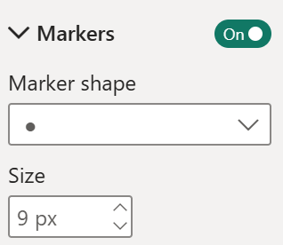
Under Markers: - Turn on Markers
- Set marker shape to filled circle
- Set size to 10px
The filled circle at each end is what creates the rounded appearance. Make sure the marker color matches your bar color so it blends in seamlessly.
Step 3 - Add Spacing
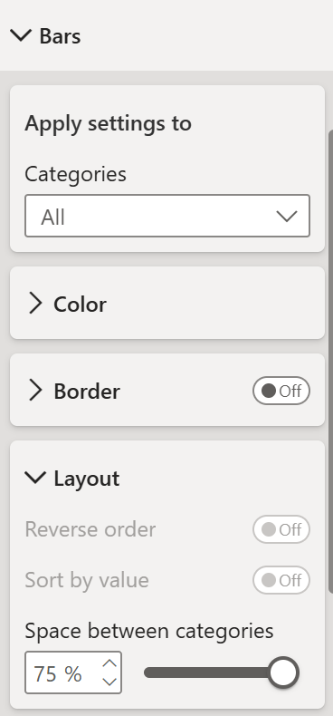
Go to Format > Bars > Layout and increase the "Space between Categories".
Play around until it aligns with the error bar circles.
Step 4 - Adjust the x-axis range
Go to X Axis and define your min and max range. You can create a measure for these values with a buffer - visual calculations are great for this.
This creates just enough breathing room on the left for the rounded cap to show fully.
For the maximum, set it high enough that the right cap is not clipped either. Rather than hardcoding a number, consider using a dynamic measure that finds the maximum value in your data and adds a small buffer - that way the axis adjusts automatically as your data changes.
A bar chart that looks like it came from a custom visual library but is built entirely with native Power BI formatting. Clean, smooth, and surprisingly simple once you know the trick.
Example 3 – Dumbbell
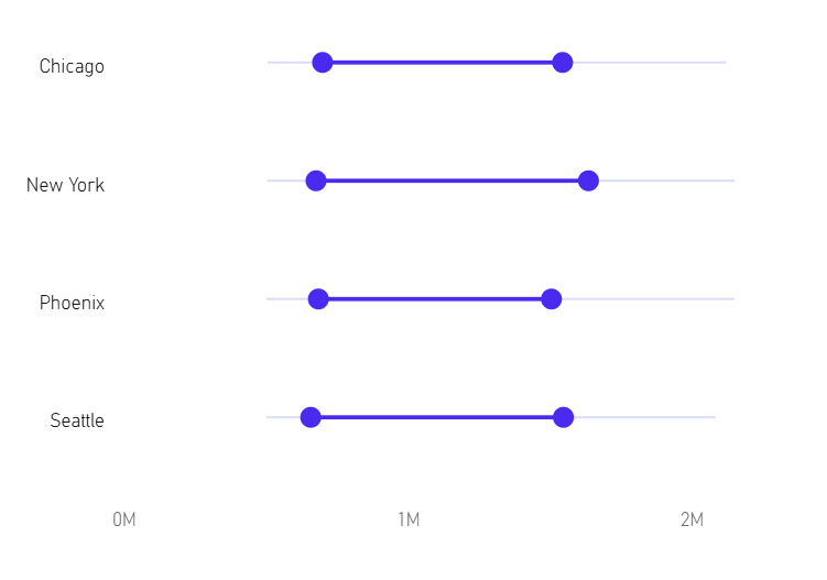
A dumbbell chart shows a range or spread between two points per category - great for before and after comparisons, price ranges, or any scenario where the gap between two values tells the real story. This one is built entirely with error bars on a clustered bar chart, with no actual bar values showing at all.
What we are building
A horizontal dumbbell chart showing property price ranges by city, using only available properties. The connecting line spans from the minimum to the maximum price, with the interquartile range highlighted in the middle.
Step 1 - Create the measures
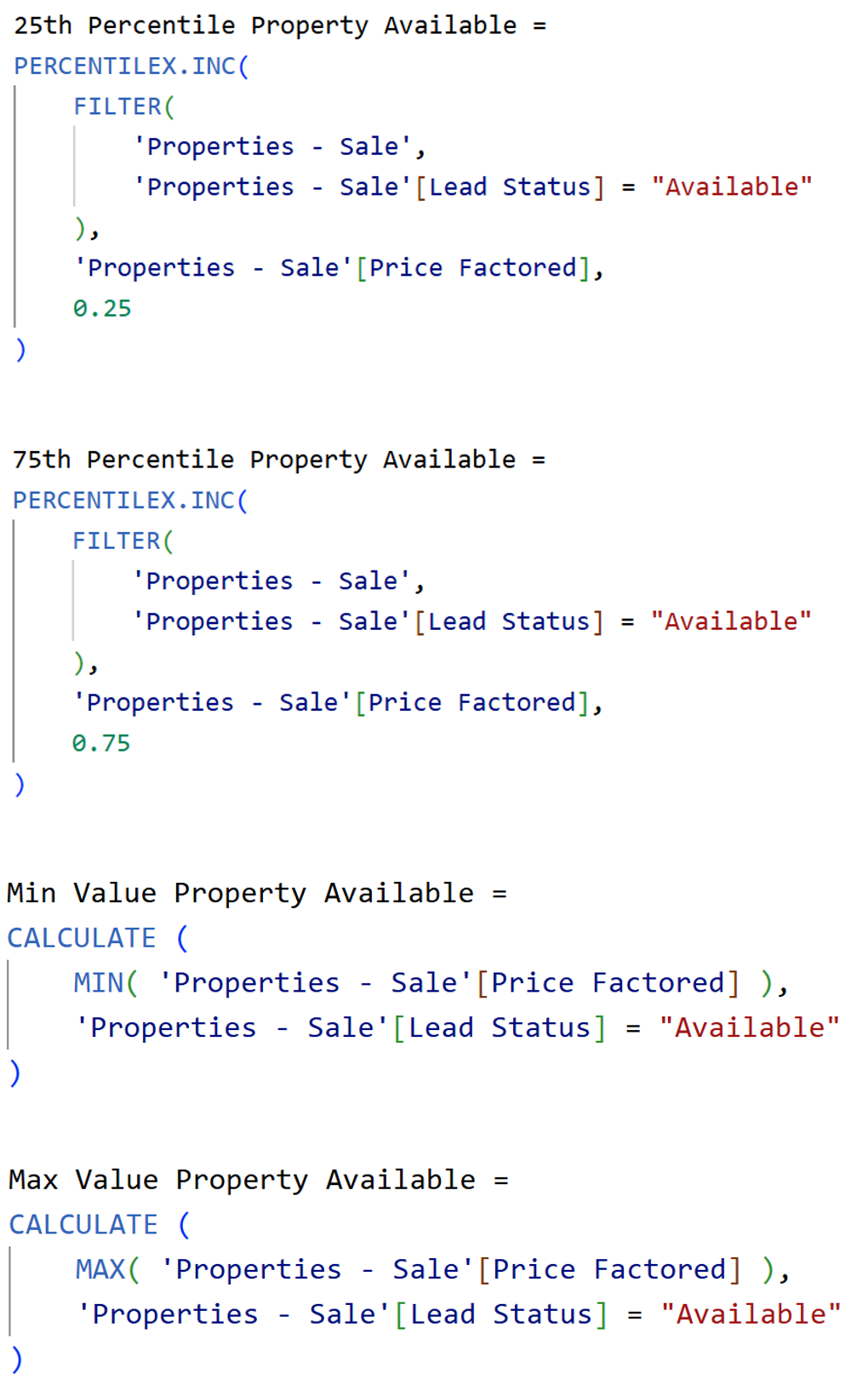
All three starting point measures return zero - they are invisible anchors that carry the error bars.
The error bar measures filter only properties with Lead Status = "Available"
Step 2 - Set up the visual
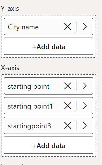
Insert a clustered bar chart.
- Y-axis - City Name
- X-axis - add in this order >> starting point, starting point1, startingpoint3
Step 3 - Declutter the visual
Step 4 - Set up the layout
Go to Format - Bars - Layout:
- Turn off the title
- Turn off all axis titles
- Turn off the legend
Step 4 - Set up the layout
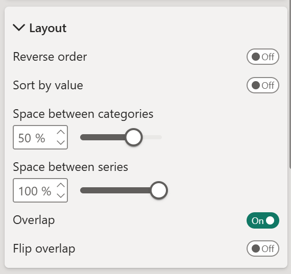
Go to Format - Bars - Layout:
- Space between categories - 50%
- Space between series - 100%
- Turn on Overlap
Step 5 - Set up error bars
Three error bars are needed - one for the lower whisker, one for the upper whisker, and one for the IQR connecting bar in the middle.
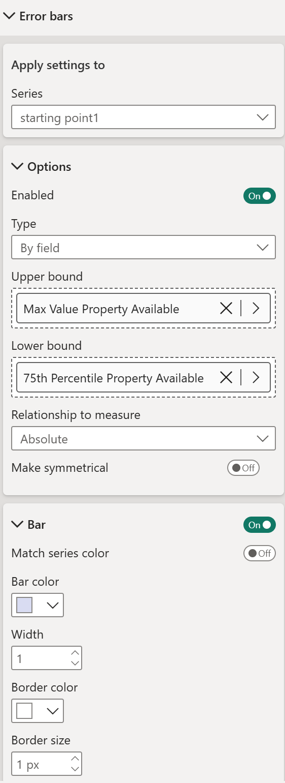
starting point1 - upper whisker (P75 to max):
Three error bars are needed - one for the lower whisker, one for the upper whisker, and one for the IQR connecting bar in the middle.
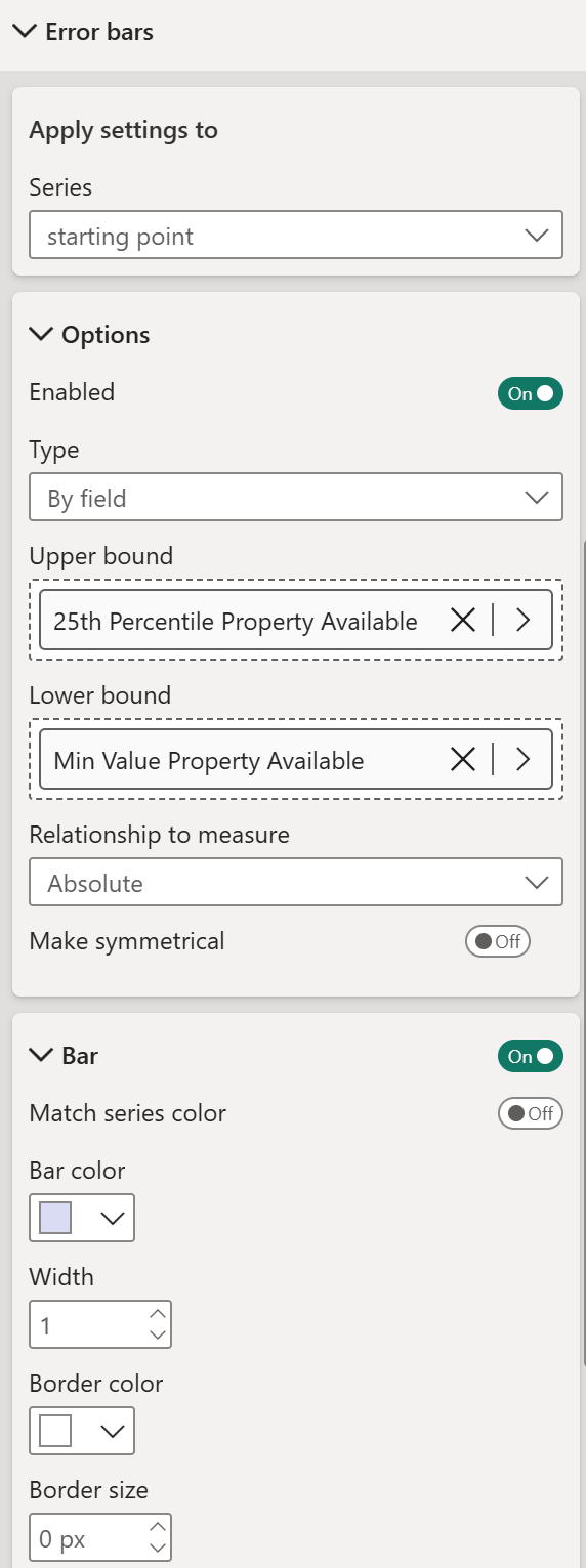
starting point - lower whisker (min to P25):
- Turn on Enable
- Upper bound - 25th Percentile Property Available
- Lower bound - Min Value Property Available
- Bar - on, match series color off, bar color light purple, width 1, border size 0px
starting point1 - upper whisker (P75 to max):
- Turn on Enable
- Upper bound - Max Value Property Available
- Lower bound - 75th Percentile Property Available
- Bar - on, match series color off, bar color light purple, width 1, border size 1px
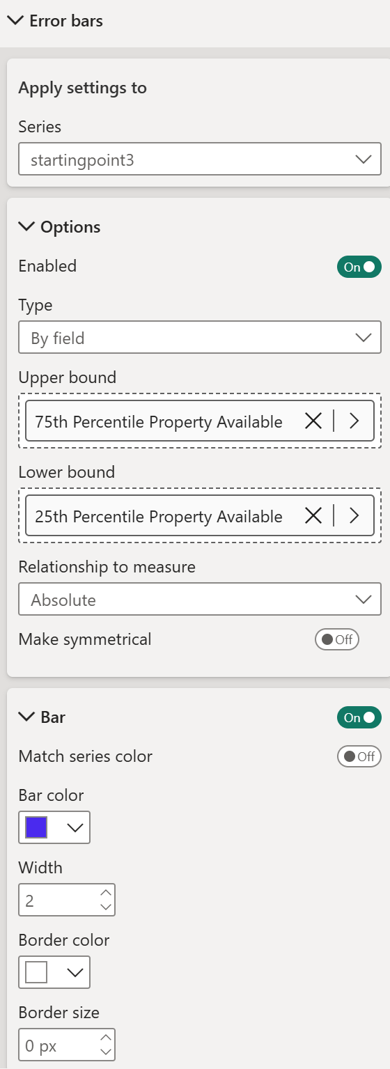
startingpoint3 - IQR connecting bar (P25 to P75):
- Turn on Enable
- Upper bound - 75th Percentile Property Available
- Lower bound - 25th Percentile Property Available
- Bar - on, match series color off, bar color darker purple, width 2, border size 0px
A clean horizontal range chart. No custom visual, no complex DAX - just three invisible series and three carefully configured error bars doing all the work.
Example 4 – Boxplot
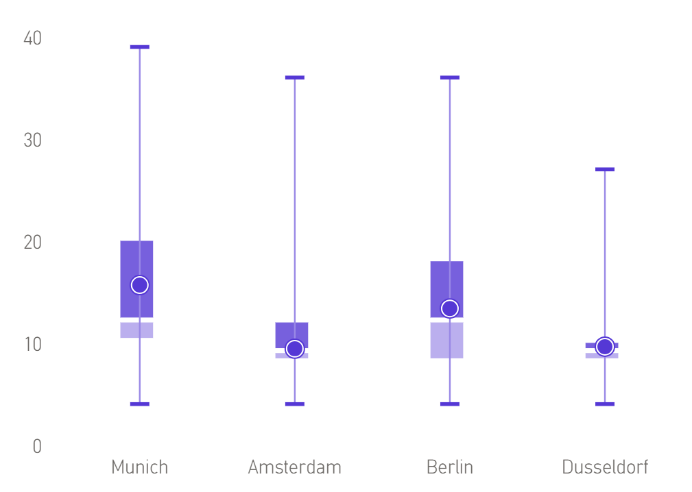
Power BI does not have a native boxplot visual, but you can build a convincing one using a line and stacked column chart combined with error bars. The result shows the full distribution - minimum, maximum, interquartile range, median, and average - all in one clean visual.
What we are building
A horizontal dumbbell chart showing property price ranges by city, using only available properties. The connecting line spans from the minimum to the maximum price, with the interquartile range highlighted in the middle.
Step 1 - Create the measures
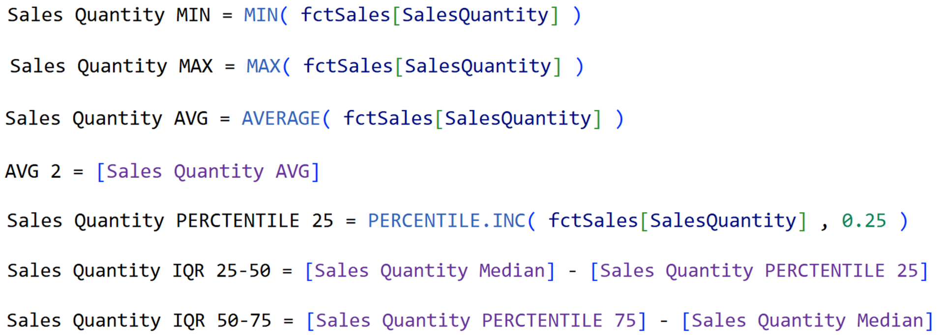
AVG 2 is a duplicate of the AVG measure - needed because two different marker styles are applied to the same value to create the layered ring effect on the average marker.
Step 2 - Set up the visual
Insert a line and stacked column chart.
- X-axis - City
- Column y-axis - add in this order >> Sales Quantity PERCENTILE 25, Sales Quantity IQR 25-50, Sales Quantity IQR 50-75
- Line y-axis - add in this order >> AVG 2, Sales Quantity MIN, Sales Quantity MAX, Sales Quantity AVG
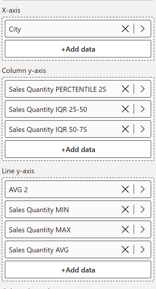
Step 3 - Declutter the visual
- Turn off the title
- Turn off all axis titles
- Turn off the lines for all line series
- Turn off gridlines
- Turn off the legend
Step 4 - Format the columns
The stacked columns build the IQR box. The first series is invisible.
- Sales Quantity PERCENTILE 25 - set color to white (invisible spacer)
- Sales Quantity IQR 25-50 - set to a light shade of your chosen color
- Sales Quantity IQR 50-75 - set to the darker shade of the same color
Go to Layout:
- Set space between categories to 75%
- Set space between series to 3px
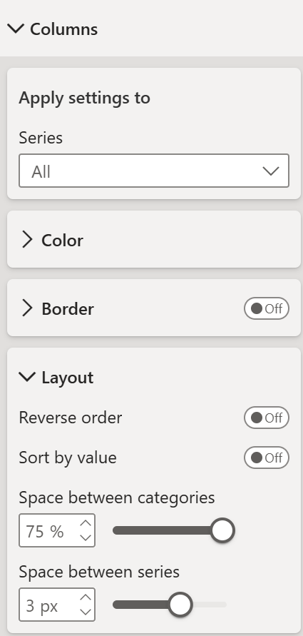
Step 5 - Set up markers
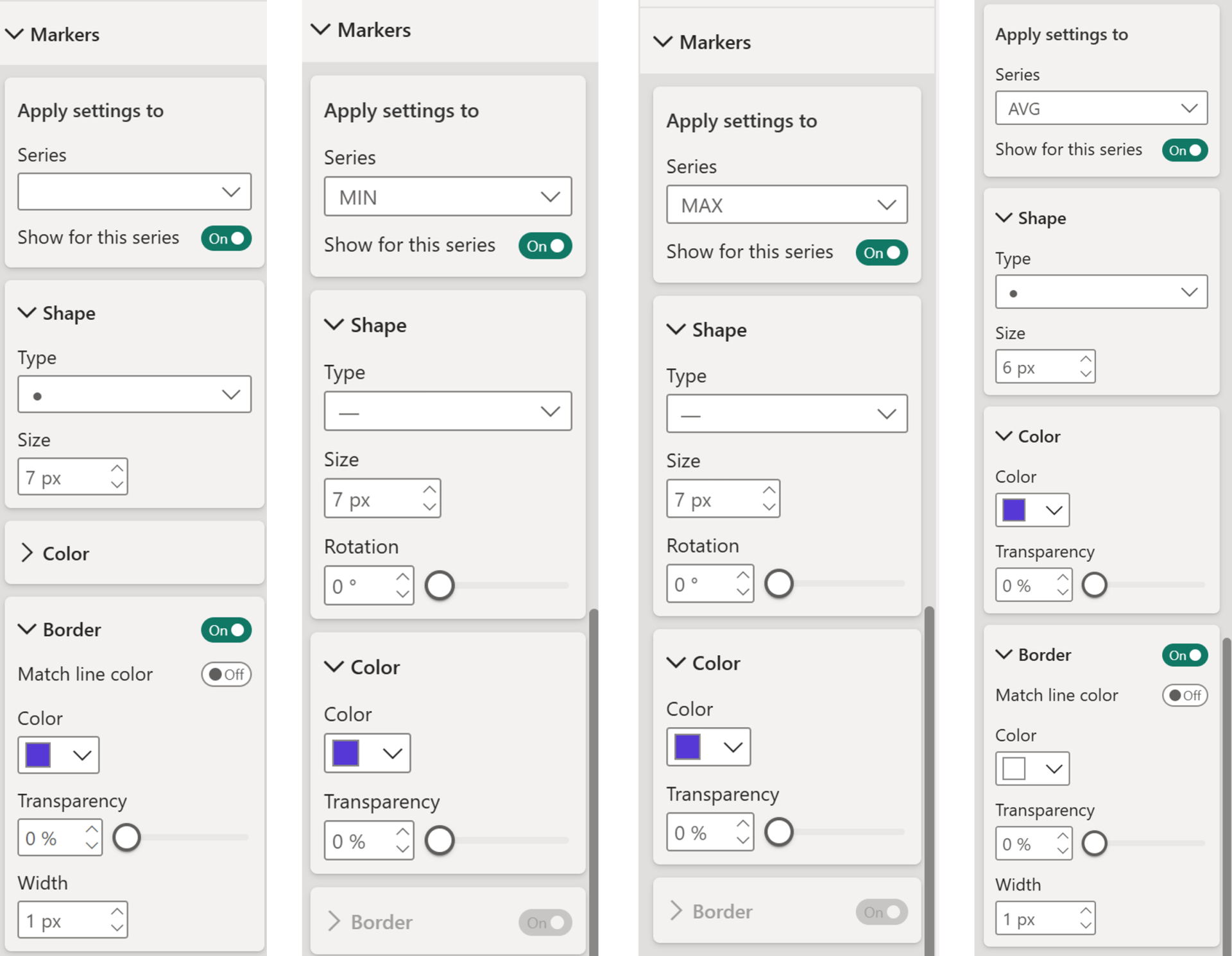
The average marker is built from two overlapping circles - a slightly larger outer ring and a smaller inner dot - giving it that distinctive ringed appearance.
The average marker is built from two overlapping circles - a slightly larger outer ring and a smaller inner dot - giving it that distinctive ringed appearance.
For AVG 2 (outer ring):
- Turn on markers
- Shape - filled circle, 7px
- Border - on, match line color off, border color purple, border width 1px
For Sales Quantity MIN:
- Turn on markers
- Shape - dash, 7px, rotation 0
- Color - purple, transparency 0%
- Border - off
For Sales Quantity MAX:
- Turn on markers
- Shape - dash, 7px, rotation 0
- Color - purple, transparency 0%
- Border - off
For Sales Quantity AVG (inner dot):
- Turn on markers
- Shape - filled circle, 6px
- Border - on, match line color off, border color white, border width 1px
Step 6 - Add error bars
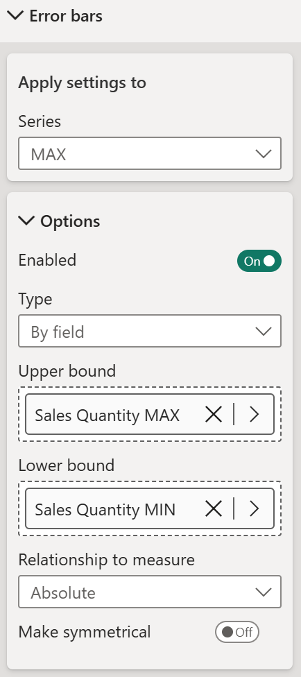
The whiskers - the vertical lines from minimum to maximum - are drawn using error bars on the MAX series.
The whiskers - the vertical lines from minimum to maximum - are drawn using error bars on the MAX series.
Go to Format - Error bars, select the MAX series:
- Turn on Enable
- Set Upper bound to Sales Quantity MAX
- Set Lower bound to Sales Quantity MIN
- Set Relationship to measure to Absolute
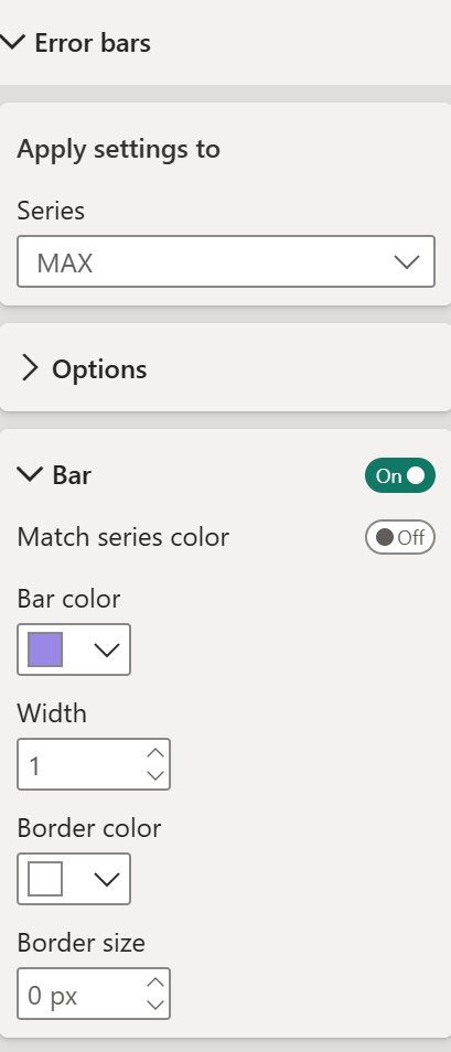
Under Bar:
- Turn on Bar
- Turn off Match series color
- Set bar color to your preferred color
- Set width to 1
- Set border size to 0px
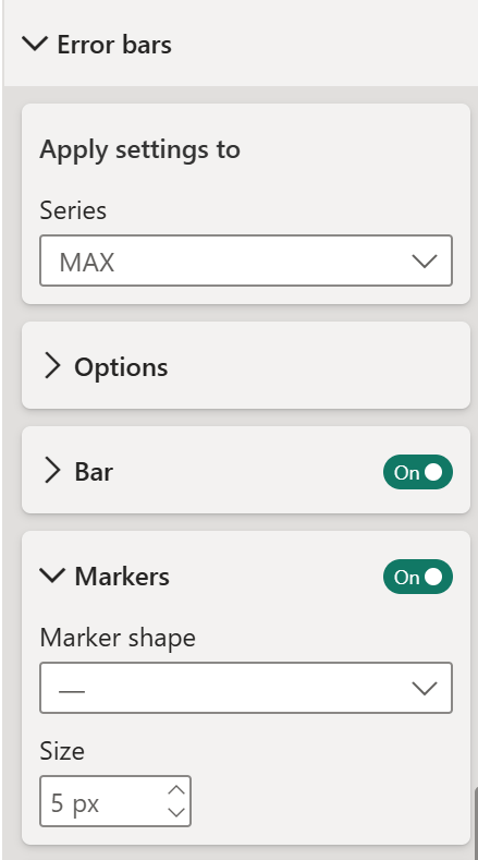
Under Markers:
- Turn on markers
- Set marker shape to dash
- Set size to 5px
A fully native boxplot showing the complete distribution of your data. No custom visual needed, no external dependencies - just a line and stacked column chart with a few clever tricks applied.
And there you go, 4 really useful use cases!
Hope you like it!
Give it a try and see how it works for you! I’d love to hear what you think or see how you use this trick in your own reports.
How to Power BI

COMPANY
Write your awesome label here.
Embedding Power BI in Power Point
Intro Session