Which one’s “easiest” depends on your situation (do you have the actual files or only URLs? fixed cards or scrolling tables?). Let’s have a look together.
Quick Decision Guide
|
Situation
|
Best Option
|
|
You have a
handful of local image files and can update them once
|
A. Pre‑process
images (PowerPoint or Python)
|
|
Images are always in a fixed position on the page (e.g.,
a card header)
|
B. Circular overlay (mask)
|
|
You only
have image URLs, need images inside tables or lists, and content changes
regularly
|
C. SVG
measure with Base64 images
|
Circular Images in PowerPoint (when you have the files)
Ideal scenario: you have direct access to the image files used in your report (not just URLs). Example: the images live on your laptop or a shared drive.
Steps:
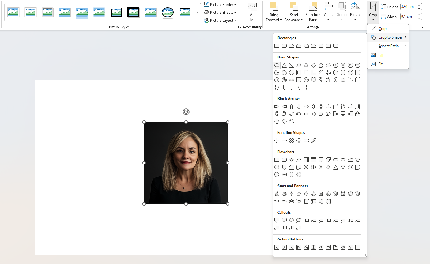
1. Open PowerPoint and insert the image.
2. Go to Picture Format → Crop to Shape → Oval. (Resize as needed; hold Shift to keep it perfectly round.)
3. Right click → Save as Picture… (PNG recommended). Repeat for the images you need.
4. Host the new circular images where your model can reach them (e.g., Dropbox/OneDrive/SharePoint).

- Original links column (example): Img Link
- New links column (example): Img Circle Link
5. Use the circular URLs in Power BI:
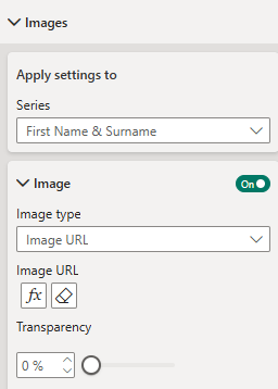
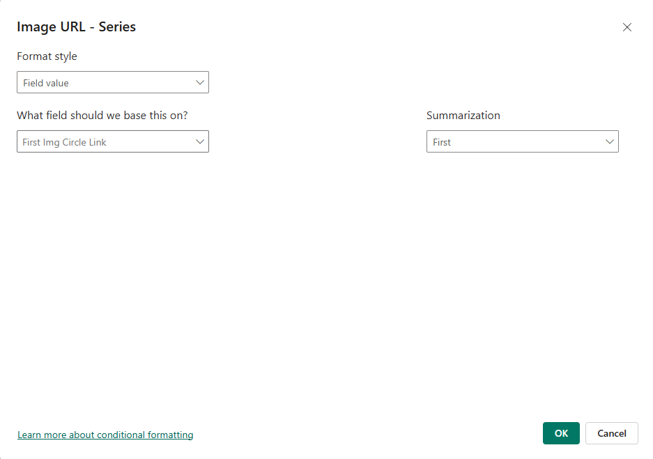
- In Power BI Desktop → View/Column tools, set the Data category for Img Circle Link to Image URL.
- In the Card (or another visual) turn Images = On → Image type = Image URL → click fx → Field value → select ImageURL_Circle.
That’s it - your visuals now render the circular assets.
Pros: quick, no code.
Cons: manual; not scalable for hundreds of images.

Python Script (batch process many local files)
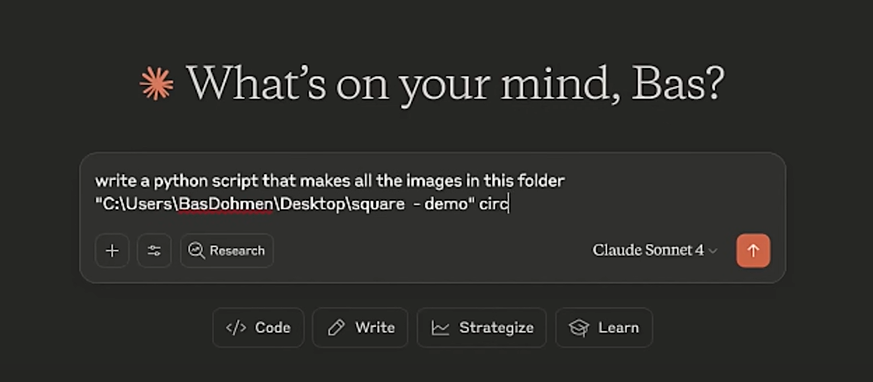
When you’ve got lots of images, you can
batch‑convert them to circles. You don’t need to “know Python” to run a simple
script. You can just use Chatgpt or Claude to generate the script.
Of course to
do this, you need to have the right libraries installed but just prompt to
write a python script to make all the images in the folder circular.
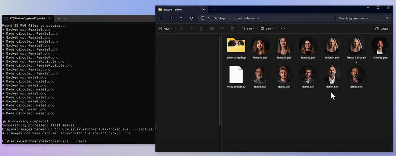
Now go to
the command prompt, go to the folder and run the generated script. That is it,
there we have the circular version of them. If you need to also generate a list
of URLs programmatically, use a second small script.
Next, we do not have the files directly on the laptop. Then how do we approach? Here we have 2 routes – the easy way and a tricker one but flexible.
Let’s look at the easy route first.
Circular Overlay (mask) in the report
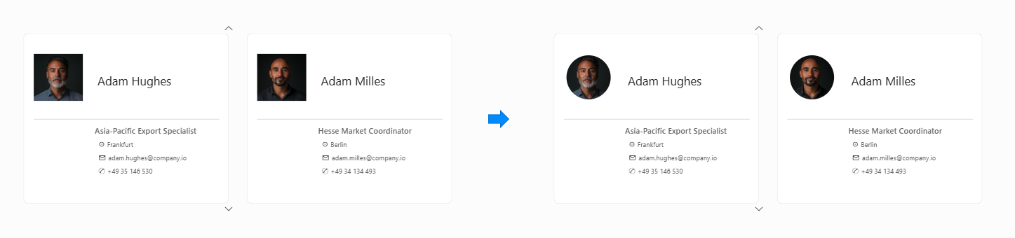
In this variation, the donut frames an image , such as an employee photo or product icon, making the metric more personal or contextual.
Let’s not over complicate it. If your images always show in the same position (e.g., in a profile card), a circular overlay can do the trick.
Steps:
1. Create a mask PNG: white on the outside, transparent in the middle (a circular “hole”).
2. In Power BI Desktop → Insert → Image, add the mask PNG, resize, and place it over the square image until it aligns.
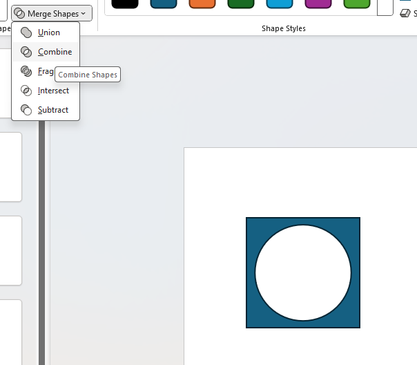
How to make the mask in PowerPoint
1. Draw a square/rectangle (slide size).
2. Insert a circle where the image should show.
3. Shape Format → Merge Shapes → Combine to punch the hole.
4. Set Fill to match your report background (e.g., white). No outline. Save as PNG.
Note: This won’t work in tables/matrices - when you scroll, the overlay stays put while rows move. Use it for static placements only.
Once we overlay, it looks perfect when static as in first image here, however when we attempt to scroll (in table, etc.), it doesn't and so it takes us to our next option.
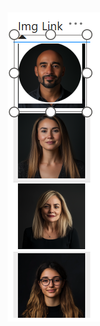
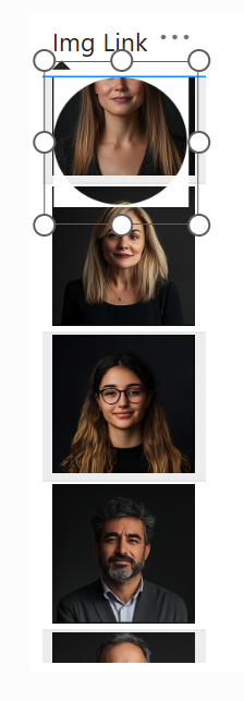
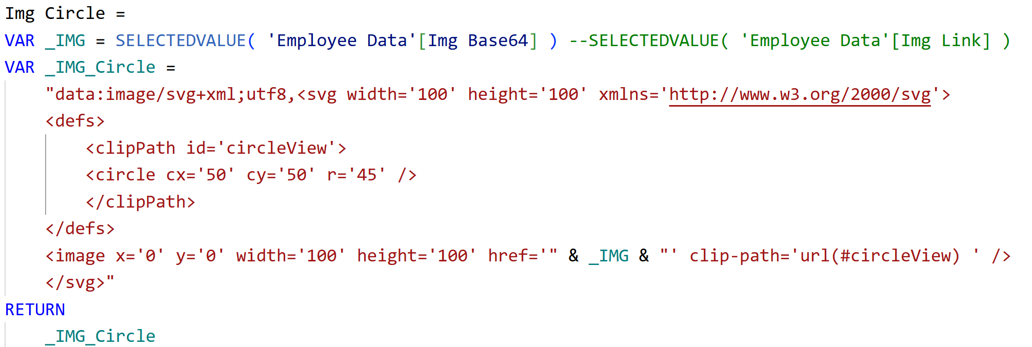
Image Circle Measure (SVG), when you only have URLs
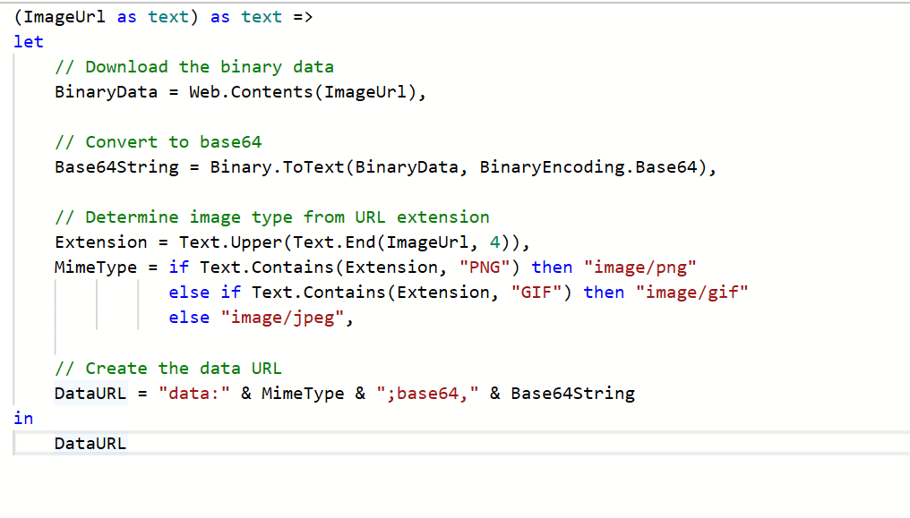
What if you just have the image links? This is the trickier solution but very effective. If you only have image URLs and need circles inside tables/lists, use a DAX measure that renders an SVG with a circular clip.
There’s one catch: Power BI typically blocks external URLs inside SVG. The workaround is to embed the image as Base64.
Convert URL → Base64 in Power Query
Home → New source → Blank query → Advanced Editor and write a function like:
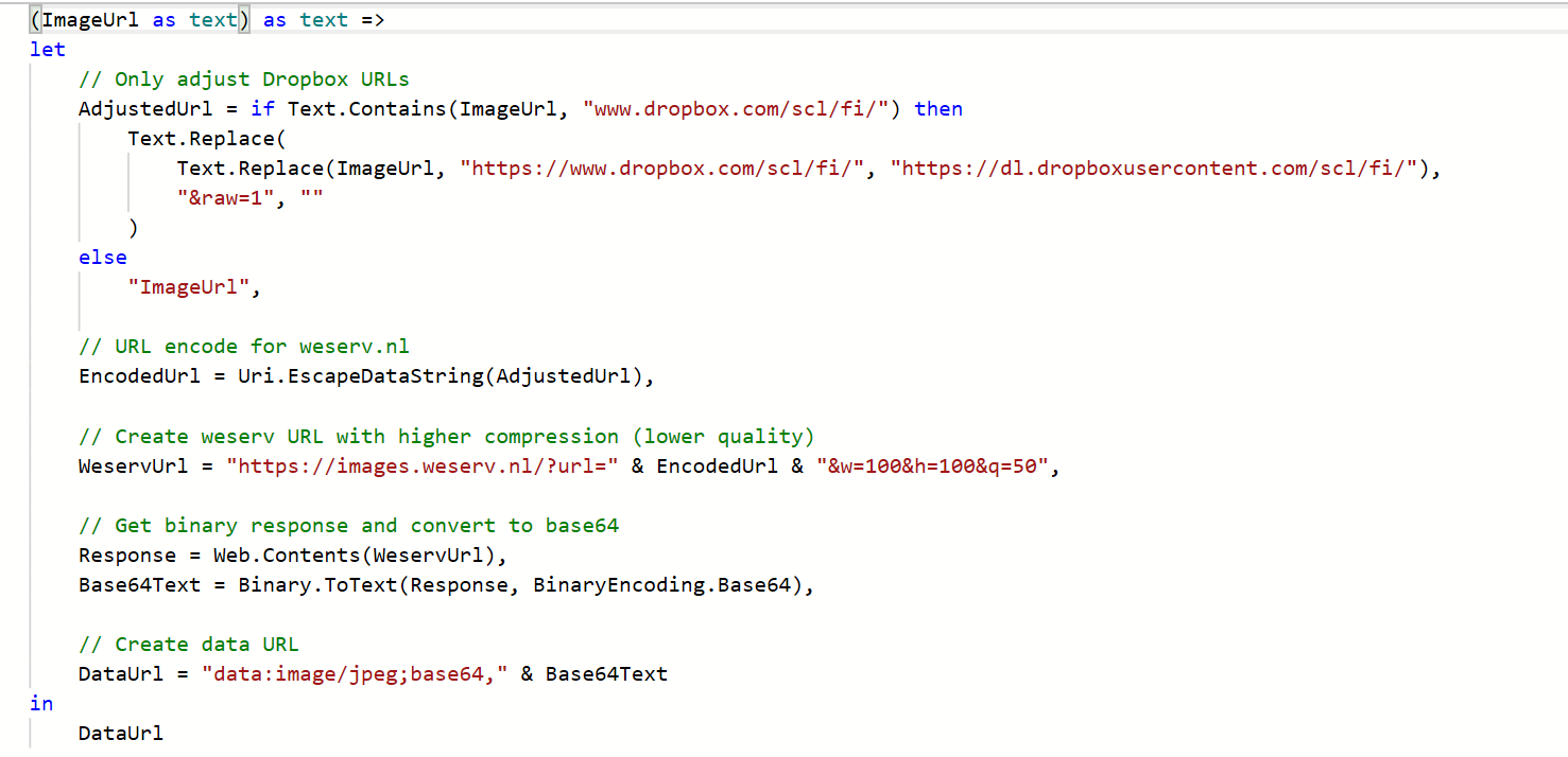
- Invoke the function for your URL column to create a new Base64 column (e.g., ImageBase64) and then use this in the measure and check.
- If your strings are too long (practical text limit ~32k characters), resize/compress before encoding (I use a external tool here) example shown below but it also depends on if you can use external tool for your case. But this is just another way to do. In my example, I have then modified the function to handle this by an external one.
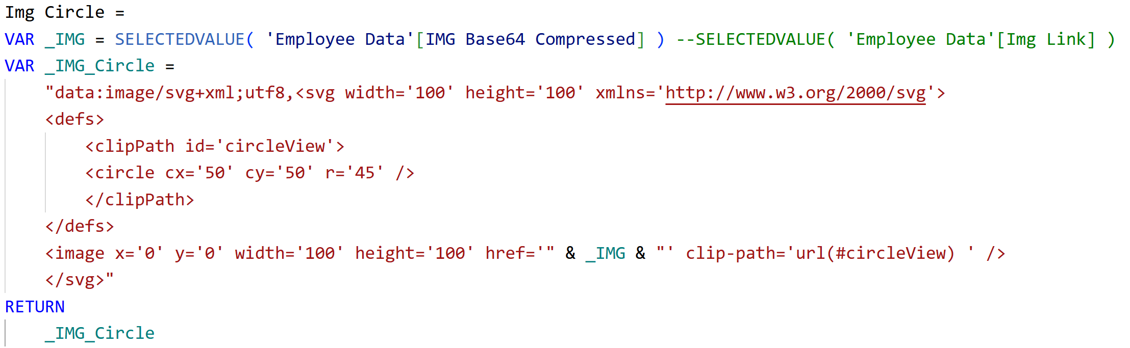
Once the changes are made, we can use this in our measure and there we have the circular version of the image. We have to definitely double check if it's fine to use that external one with those images that you're visualizing.
Wrap up
Pick the lightest option that fits your scenario. With a small, focused tweak, you’ll bring the look you expect to life.
Hope you like it!
Give it a try and see how it works for you! I’d love to hear what you think or see how you use this trick in your own reports.

